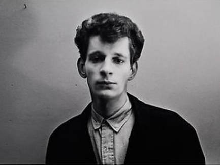
1. PORTRAITURE- Lighting Workshop:
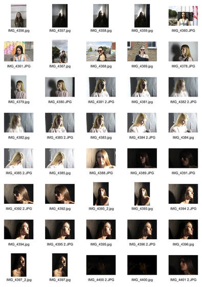
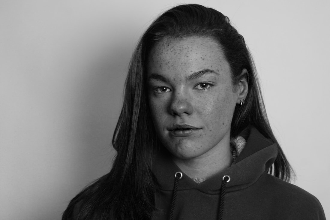
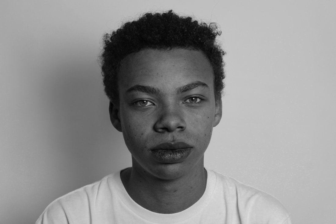
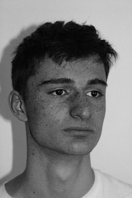
In this set task I was told to take different picture in different environments with different types of lighting for example, in the studio we had set up different types of lighting, two using bright white lights in different stands projecting either straight onto the model or onto the side of the studio, which then reflected onto the model's face and created a shadow. We also used a type of yellower hot light which made the shadow.
|
|
Exhibition visits:
The Tate- SOUL OF A NATION: ART IN THE AGE OF BLACK POWER
This exhibition celebrates the work of Black artists working in America in the two decades after 1963. During this turbulent time, these artists answered and asked many questions. How should an artist respond to political and cultural changes? Was there a 'Black art' or 'Black aesthetic'?. This exhibition looks at all these questions, while showing strong communities and robust artistic dialogues, it also reveals necessary disagreements about what it is meant to be a black artist at this time. The artists in Soul of a Nation were profoundly aware of the political visions and different senses of self, and each took an aesthetic position in relation to them.
 Romare Bearden, Conjur Woman (1964)
Romare Bearden, Conjur Woman (1964)
The image is another Conjur Woman by Bearden, completed in 1964. It’s only 9×7 inches, and was created with snippets from newspapers and magazines such as Ebony and the Saturday Evening Post. Bearden’s Projections were a sensation because they made his tiny collages into huge, graphically powerful black and white “prints.” Enlarging his small collages into Photostat black and white reproductions, which he called PROJECTIONS allowed Bearden to turn light skin into dark skin, and to reproduce clippings from Ebony, Life and Look magazines. The ideas behind these collages where to present the struggles and experiences of the Black Power movement and represents the idea that all the events the movement went through were part of a grand scheme aiming for the equality of Black people in America.
The image is another Conjur Woman by Bearden, completed in 1964. It’s only 9×7 inches, and was created with snippets from newspapers and magazines such as Ebony and the Saturday Evening Post. Bearden’s Projections were a sensation because they made his tiny collages into huge, graphically powerful black and white “prints.” Enlarging his small collages into Photostat black and white reproductions, which he called PROJECTIONS allowed Bearden to turn light skin into dark skin, and to reproduce clippings from Ebony, Life and Look magazines. The ideas behind these collages where to present the struggles and experiences of the Black Power movement and represents the idea that all the events the movement went through were part of a grand scheme aiming for the equality of Black people in America.
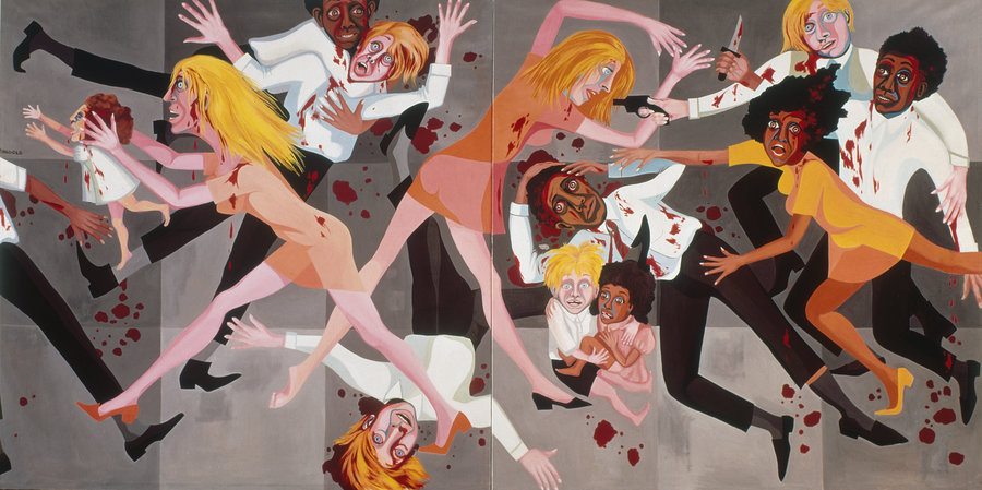
Faith Ringgold - American People Series #20: Die 1967
The frenzied spectacle of the American people series 20, depicts and evokes the race riots that engulfed the United States in the 1960s. Ringgold's decision to present the figures of Die in business attire and fashionable dresses speaks to the hidden racial antagonisms that permeate even the most well-to-do segments of American society. The work was intended not only to address the tense race relations of the moment when it was made but also to express the artist's fear that racial violence would continue to escalate in the future.
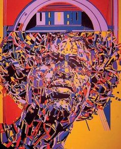 Nelson Stevens (American, born 1938). Uhuru, 1971.
Nelson Stevens (American, born 1938). Uhuru, 1971.
Nelson Stevens was a member of the Chicago-based collective AfriCOBRA (African Commune of Bad Relevant Artists). AfriCOBRA used what they called “coolade colors” to create empowering images of African Americans—which they deemed “Superreal images for Superreal people.” Here a woman with an afro (then a highly political hairstyle) casts her gaze upward, as if envisioning a day when African Americans would be truly free. The word uhuru means “freedom” in Swahili, and the choice of language signaled the group’s Afrocentric politics. This image is constructed as a screen print and the bright and contrasting colours come together to create an interesting composition which clearly depicts the need for Black power and strength and acts as pro-Black propaganda.
Nelson Stevens was a member of the Chicago-based collective AfriCOBRA (African Commune of Bad Relevant Artists). AfriCOBRA used what they called “coolade colors” to create empowering images of African Americans—which they deemed “Superreal images for Superreal people.” Here a woman with an afro (then a highly political hairstyle) casts her gaze upward, as if envisioning a day when African Americans would be truly free. The word uhuru means “freedom” in Swahili, and the choice of language signaled the group’s Afrocentric politics. This image is constructed as a screen print and the bright and contrasting colours come together to create an interesting composition which clearly depicts the need for Black power and strength and acts as pro-Black propaganda.
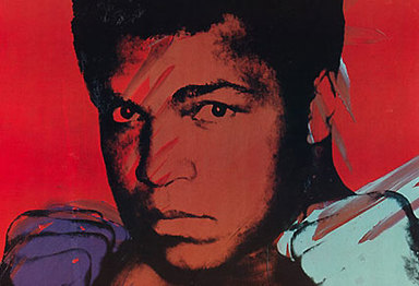 Andy Warhol 'Muhammad Ali' 1978
Andy Warhol 'Muhammad Ali' 1978
Warhol photographed the boxer, Muhammad Ali, in 1977 as part of his 'Athletes' series. The project was initiated by the art collector and sports enthusiast, Richard Weisman, and featured the likes of the footballer, Pelé, and golfer, Jack Nicklaus. At first Warhol was unfamiliar with the sports stars but characteristic of his obsession with fame, he recalled: “I really got to love the athletes because they are the really big stars”. Ali was not an easy subject but Warhol managed to capture a powerful shot with the boxer’s fists poised, ready to punch. In the screenprint reproduced here, prior to printing the image Warhol worked into the surface with paint to create the impression of movement. Ali’s fixed stare mimics the concentration required during a fight.
Warhol photographed the boxer, Muhammad Ali, in 1977 as part of his 'Athletes' series. The project was initiated by the art collector and sports enthusiast, Richard Weisman, and featured the likes of the footballer, Pelé, and golfer, Jack Nicklaus. At first Warhol was unfamiliar with the sports stars but characteristic of his obsession with fame, he recalled: “I really got to love the athletes because they are the really big stars”. Ali was not an easy subject but Warhol managed to capture a powerful shot with the boxer’s fists poised, ready to punch. In the screenprint reproduced here, prior to printing the image Warhol worked into the surface with paint to create the impression of movement. Ali’s fixed stare mimics the concentration required during a fight.
The Photographer's Gallery - Gregory Crewdson: Cathedral of the Pines
Exhibition of Photographer Gregory Crewdson exposes his rooms of gloomy morbidity. New York-based fine photographer Gregory Crewdson plumbs the American psyche in his latest body of work, Cathedral of the Pines, which will go on display at The Photographer's Gallery in early 2017. Forest clearings, wraith-like coupkes, careworn interiors and blankets of mist mingle to crete an atmosphere riddled with longing an dread. “I am fundamentally interested in the uncanny, which is almost by definition like trying to find an unexpected mystery in everyday life,”. His photographs are carefully staged, with a filmic quality which aids the narrative by providing it with a disturbing, melancholic air. Having been exhibited at the Gagosian Gallery, New York in 2016, Cathedral of the Pines, is moving to London. The exhibition is comprised of 31 digital prints taken in Massachusetts with the aid of a large cinematic crew.
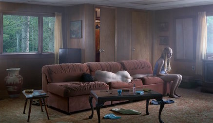 Gregory Crewdson, The Den (2013)
Images by Crewdson often include nudity and harsh lighting, which work together to create scary and almost harrowing tones to the image. Crewdson's photographs usually take place in small-town America, but are dramatic and cinematic. They feature often disturbing, surreal events. His photographs are elaborately staged and lit using crews familiar with motion picture production and lighting large scenes using motion picture film equipment and techniques.
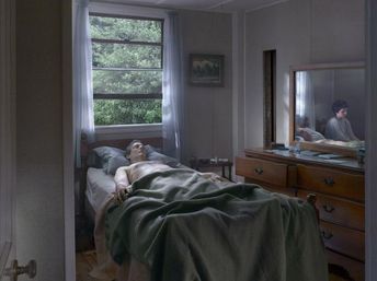
The image to the left depicts an ill father with his son by his side, however the depth of the image goes further as you can see that in the mirror the son shows sad and tired expression clearly showing the struggles he's experiences. The fact that Crewdson uses the mirror to show the expressions instead of the son being straight in the image creates a tone of depression as it seems the son cannot reach the dad despite being right next to him. After years of exploring the idea of cinematic photography, Sanctuary was Crewdson’s return to photography, his original hobby and technical training. Most recently, Crewdson has created Cathedral of the Pines, similar to Beneath the Roses and Twilight, a distanced interpretation of exaggerated drama by an intervention into natural in its most synergetic state.
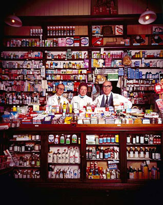
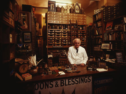
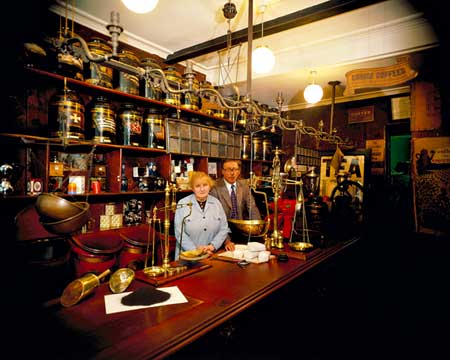
2. John Londei
Shutting up Shop is a tribute to an era that has all but disappeared: the traditional small shops that feature have now almost all gone.
In all there are 60 shops. Each one is unique, and their range diverse: from Flowers to Condoms, from tea to tobacco. As well as shops from London the series covers many regions of the UK everywhere from the Isle of Harris to the Isle of Wight.
In all there are 60 shops. Each one is unique, and their range diverse: from Flowers to Condoms, from tea to tobacco. As well as shops from London the series covers many regions of the UK everywhere from the Isle of Harris to the Isle of Wight.
My response:
Personal Brief
When deciding what to incorporate for my photography piece I decided to use the main fashion photographers from the curatorship task such as Corinne Day, British fashion photographer, documentary photographer, and fashion model, Larry Clark, American Film director, photographer and writer, And Juergen Teller German artist, Fine-art and fashion photographer. I also decided to find modern photographers who incorporated the ideas of modern beauty and the ways in which the modern youth communicate, which I thought would mix well with the more 'noughties' and heroin chic style images. I thought mixing both modern and 00's ideas I could find a way to represent these ideas and show the differences but also similarities. The modern images based on selfies and the female identity explore more natural and subtle images, which are used to show the idea of self acceptance and self love in which the photographer is boosting confidence, contrasting with the images of Day and Clark who both explore raw and gritty realism during the AIDs epidemic. My main idea is to photograph adolescence, or the ideals that come with growing up in modern society, for example the ideas of loving your flaws and exploring the ideas of youth.
3. First response and ideas
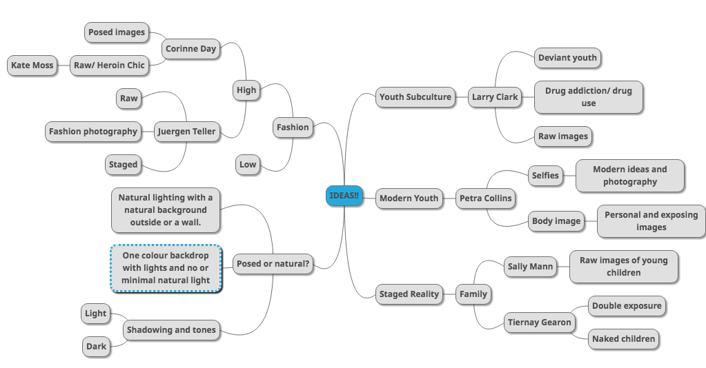
When looking at all the ideas and themes incorporated in my initial spider diagram, I used the main subjects that the nine photographers. Main aspects incorporated in my chosen photographers was fashion, staged realities, and youth subcultures. This allowed me to decide that I should try concentrating on photography of people and mainly the ways their faces and emotions are portrayed in the photography.
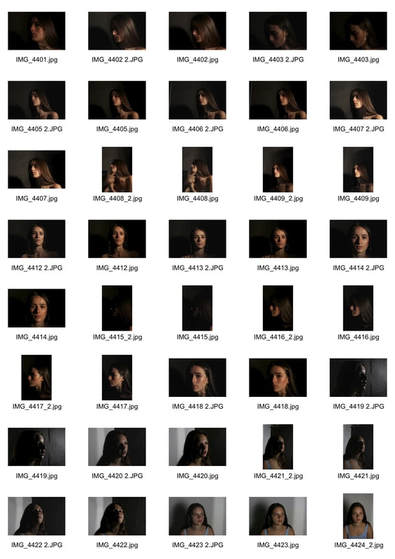
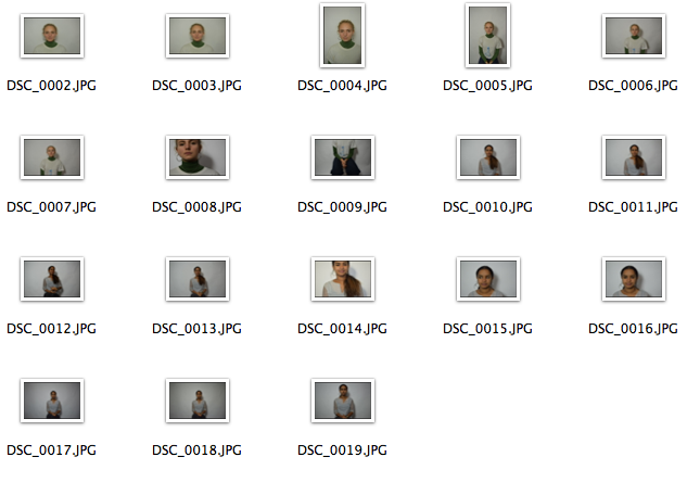
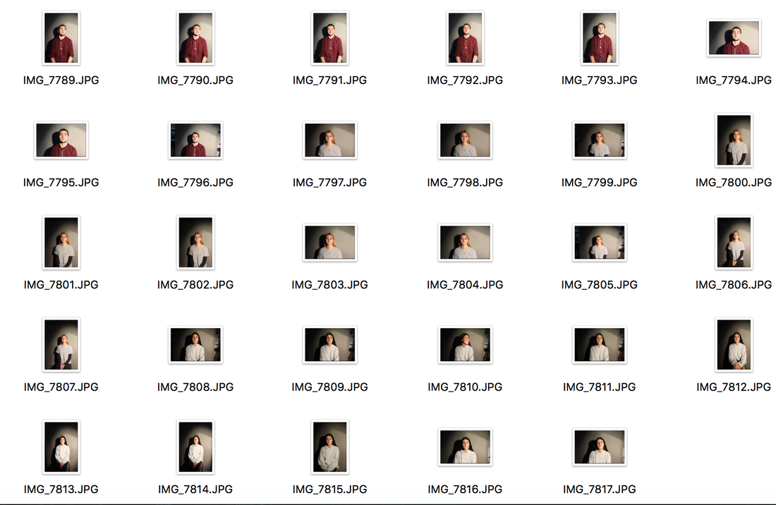
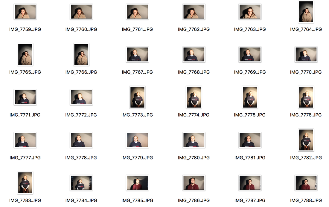
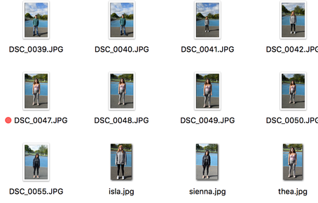
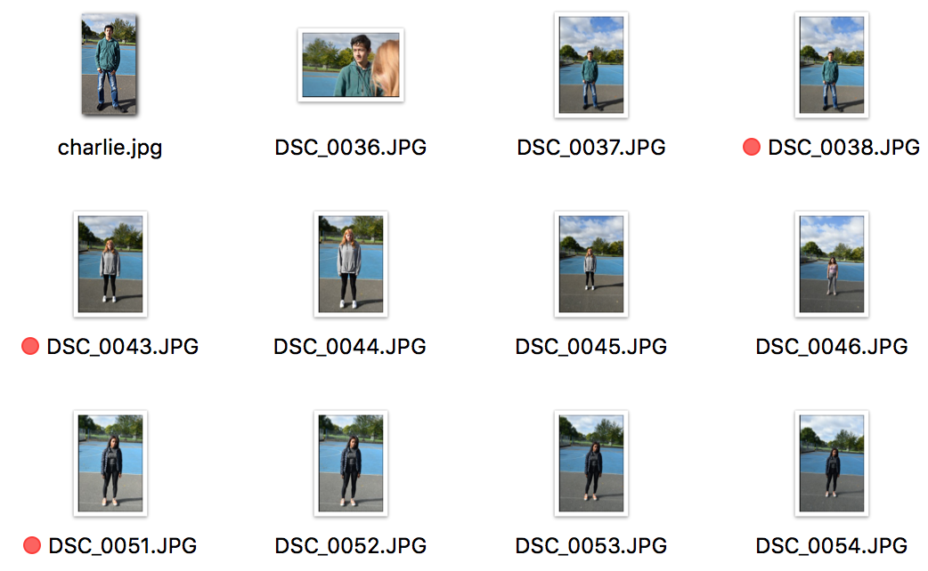
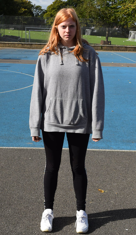
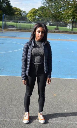
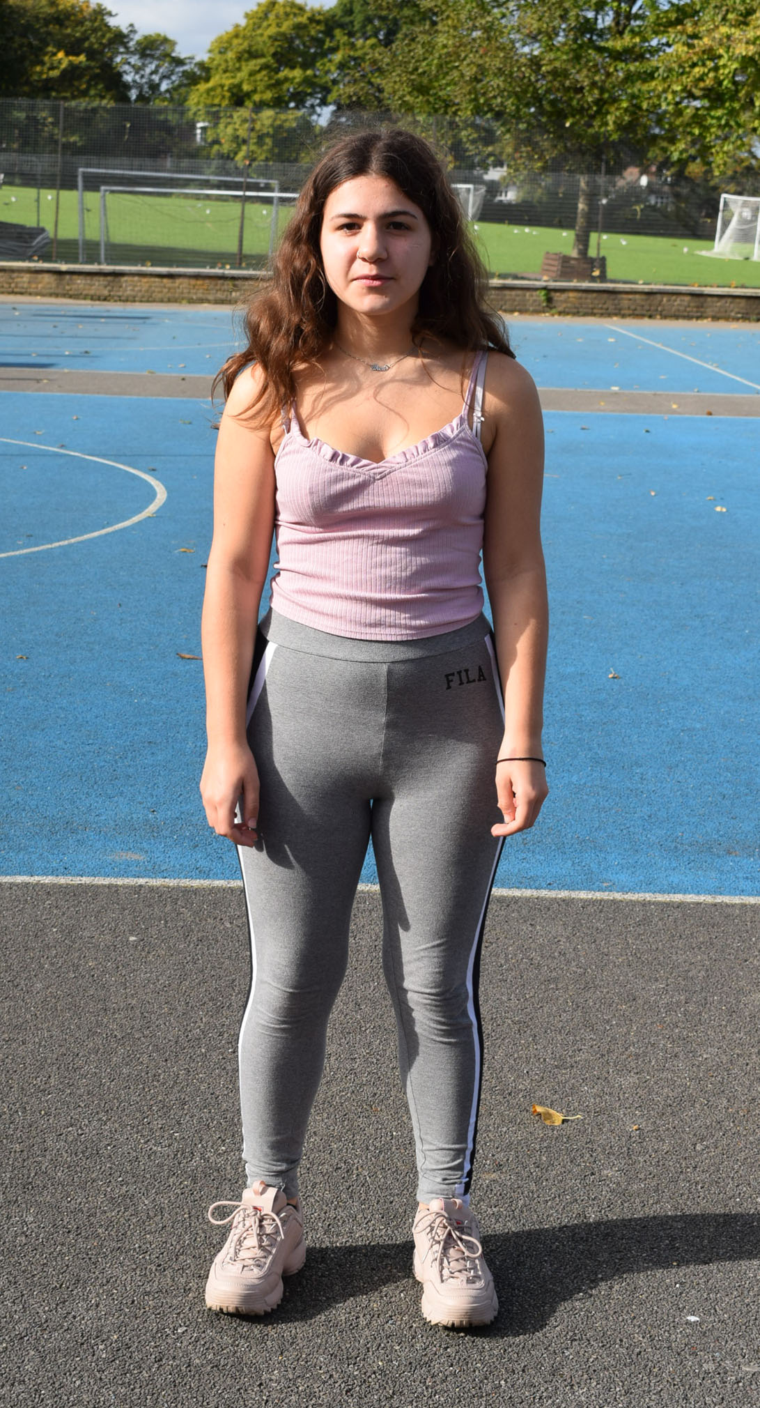
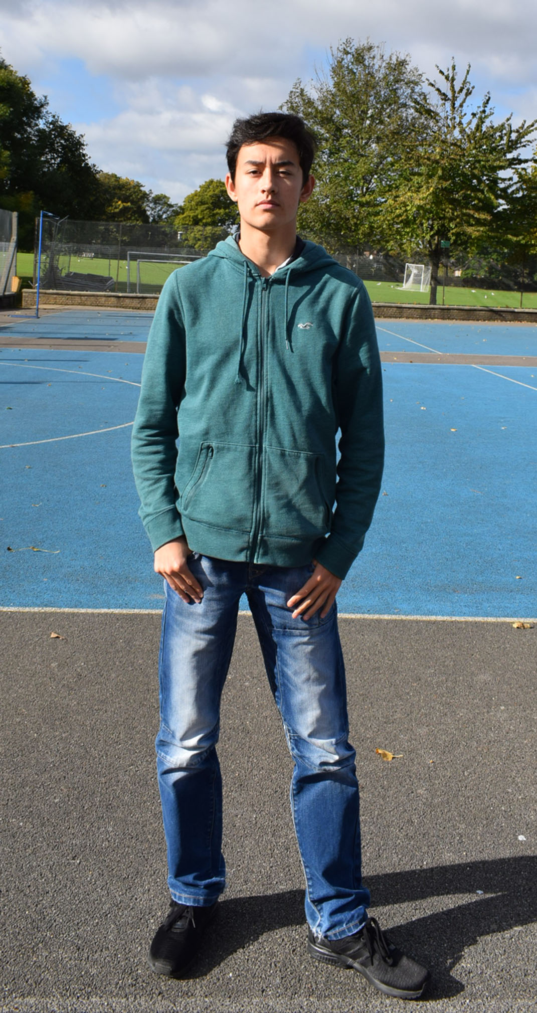
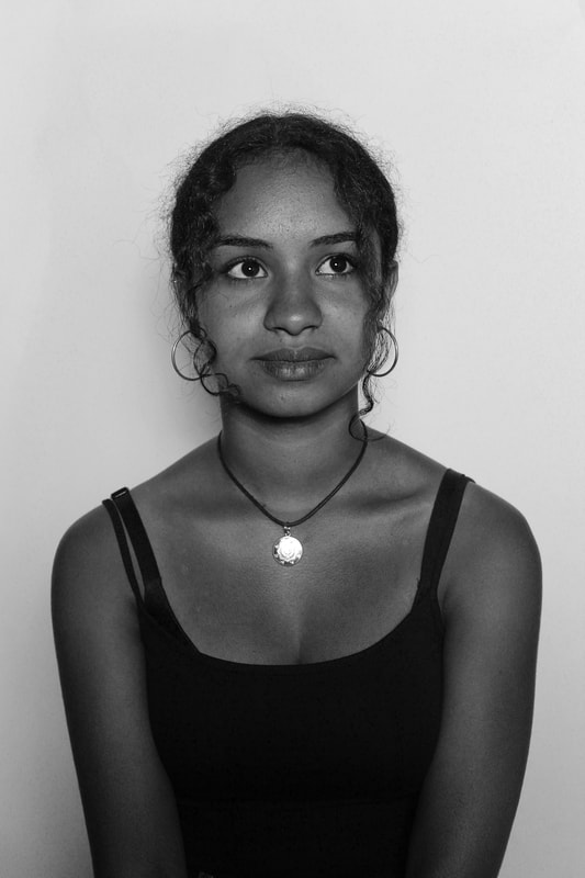
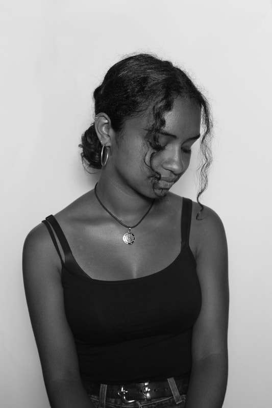
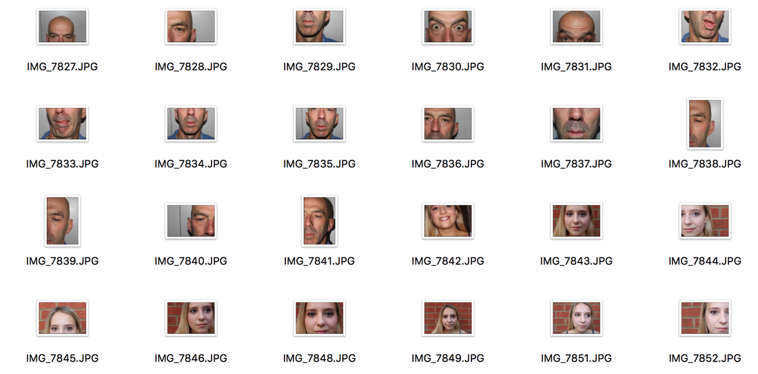
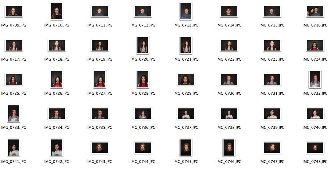
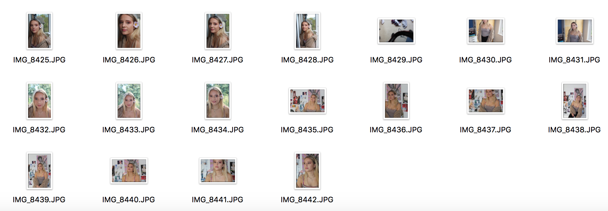
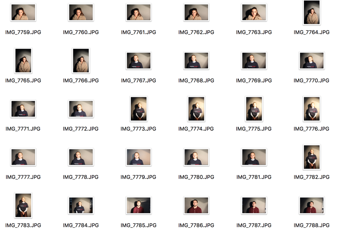
For the first response I decided to take portrait pictures of people. I started off using a backdrop with lights to see what the portraits come out as when they're naturally posed, but staged in a studio. The aim of these images was to show the youth subcultures and the modern ones, and to show the ways in which the styles have changed and how people in the "modern" day dress. I wanted to incorporate the specific parts of people's outfits and materialistic items that make the people themselves and make them stand out or blend in.
For the first response I decided to take portrait pictures of people. I started off using a backdrop with lights to see what the portraits come out as when they're naturally posed, but staged in a studio. The aim of these images was to show the youth subcultures and the modern ones, and to show the ways in which the styles have changed and how people in the "modern" day dress. I wanted to incorporate the specific parts of people's outfits and materialistic items that make the people themselves and make them stand out or blend in.
|
|
|
|
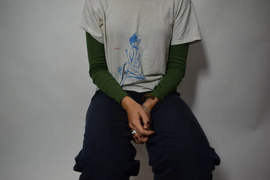
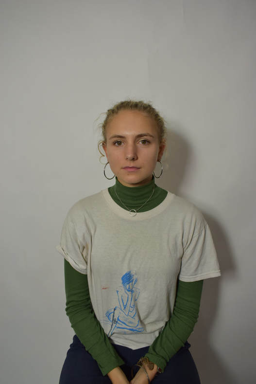
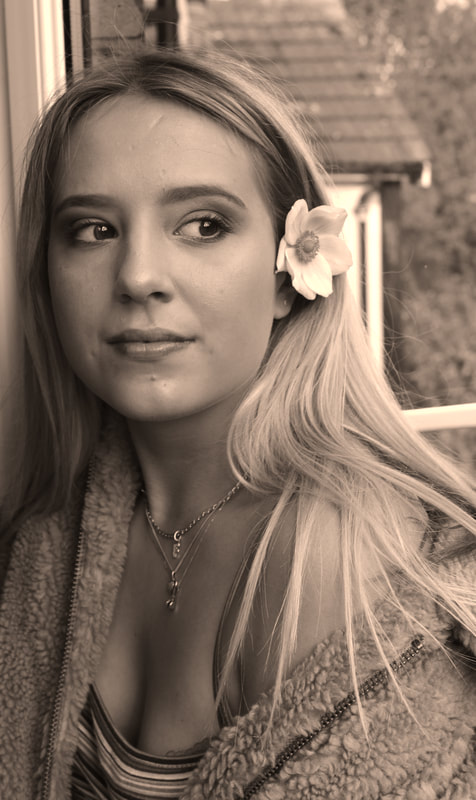
The two images above show how when taking a picture inside the studio, the images looks rather boring, there is also a shadow to the right of the model. When taking these images I wanted to incorporate mainly the clothing that the model was wearing as that is the basis of the images, to find out and discover more about the youth subcultures and modern youth subcultures and the clothing they wear. In these images I like the fact that it focuses mainly on the model and the clothes they are wearing, rather than the backdrop and the things going on the background. A criticism of this style of photography is the fact that the image is the shadowing and crumpling of the backdrop can be seen, however this could be edited out. Another criticism is that the image does not necessarily show the model in a natural position, which is one of the things I want to get, natural images.
Overall, after developing these images in different places with different backdrops, I decided that these types of images with the white backdrop, and the studio set up with the lights pointing not directly, but slightly off the face of the subject, giving the clothing and the face of the subject a flattering light and flattened style. I also liked taking the image of the subject and then another individual image of the subjects clothing. To develop this style further I will try taking portrait images of the model and then a separate one of the outfit and photoshopping them onto each other, or using this same style with a film camera and double exposure.
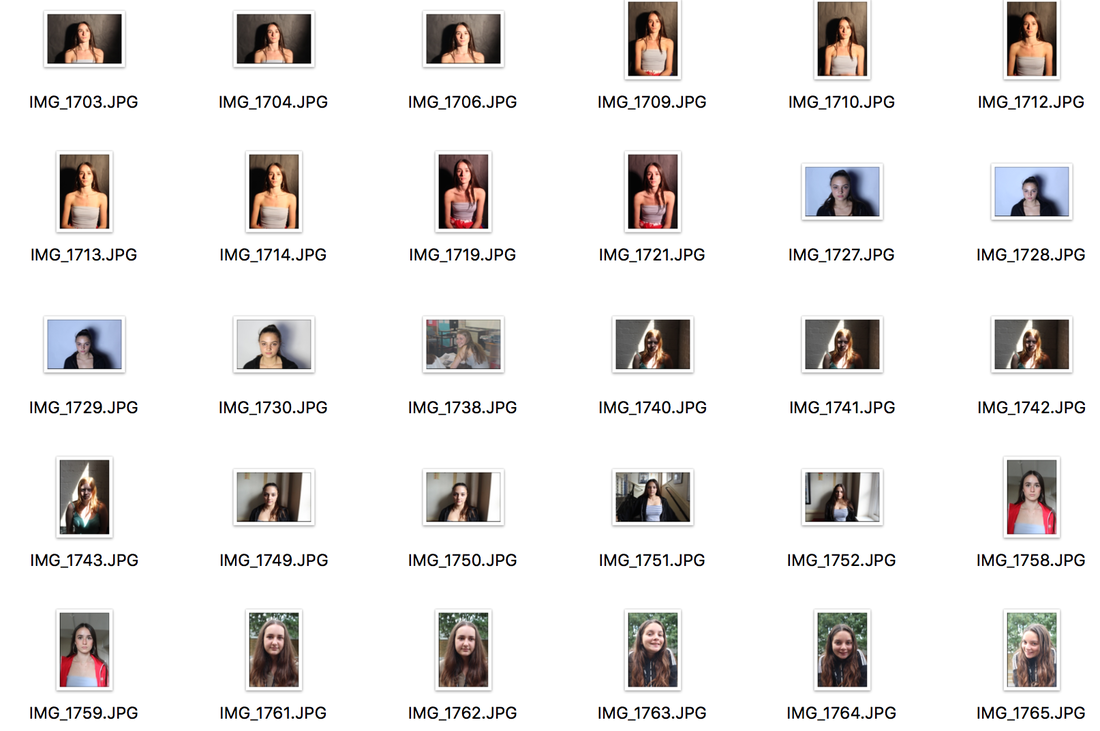
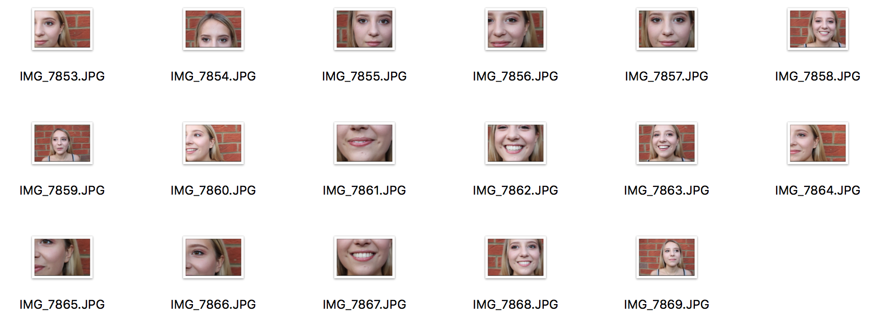
Next I took the camera outside and decided to take the images with a brick wall as a backdrop:
Overall, after developing these images in different places with different backdrops, I decided that these types of images with the white backdrop, and the studio set up with the lights pointing not directly, but slightly off the face of the subject, giving the clothing and the face of the subject a flattering light and flattened style. I also liked taking the image of the subject and then another individual image of the subjects clothing. To develop this style further I will try taking portrait images of the model and then a separate one of the outfit and photoshopping them onto each other, or using this same style with a film camera and double exposure.
Next I took the camera outside and decided to take the images with a brick wall as a backdrop:
4. Development
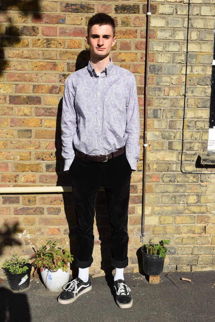
The result of this, as you can see to the left, was that the light was too bright in the models faces, leading to the "panda eye" effect where the shadows are too strong around the eyes. It also meant that the clothes with block colours became darker and lead to the texture of the clothing being lost. The shadowing of the images was too strong and it draws attention away from the dress of the subject of the image. The brick backdrop also didn't work as, like the shadowing, it distracts the viewer from the main focus of the image. If I could find another brick backdrop with less light, I would be able to use my own flash, to make the images brighter, without the shadows being so distracting. A plain brick backdrop is also not very original. Overall these images I took with the brick background looked less appealing comparing to the above images, I find that the studio set up makes the images more aesthetically pleasing and composed.
|
|
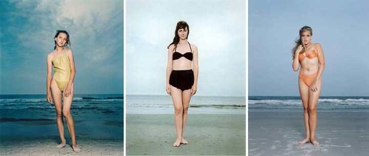
5. Rineke Dijkstra
Dutch photographer and video artist Rineke Dijkstra’s frank and compelling portraits capture her subjects in moments that are both self-conscious and unwittingly revealing, illustrating the complexity of human beings. She mostly works in series of portraits, drawing not only on the history of documentary portrait photography represented by August Sander and others, but also on the history of portrait painting and each model’s desire to present his or her own imagined image. It's important to comment on her composition. It is always the same which draws the images together as a series rather than disparate photographs- even when the locations are different.
|
|
These images below are the result of me trying to imitate Dijkstra's style of the plain by creating images which are all set in the same place with the same backgrounds but different lightings. I found that it was hard to find a background which, like the beach, allowed the concentration of the image to be on the student, I found that picking an outside background was hard when using the surrounding of the school. Dijkstra's style is increasingly hard to imitate due to the raw emotions the settings of the images produce and I feel she does not connect well with my initial ideas and styles. The images I took are not successful in portraying similar ideas Dijkstra's images as mine look very unprofessional. The background does not fit the Dijkstra's style and if I would have taken these images again I would use a tripod and set out a better place to take the images, or even set them up in a studio and edit in the background on Adobe Photoshop.
|
|
|
|
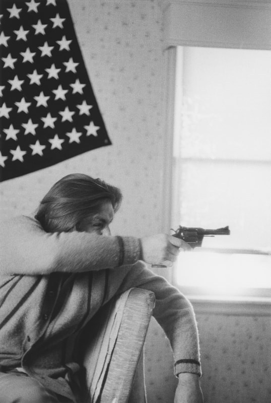
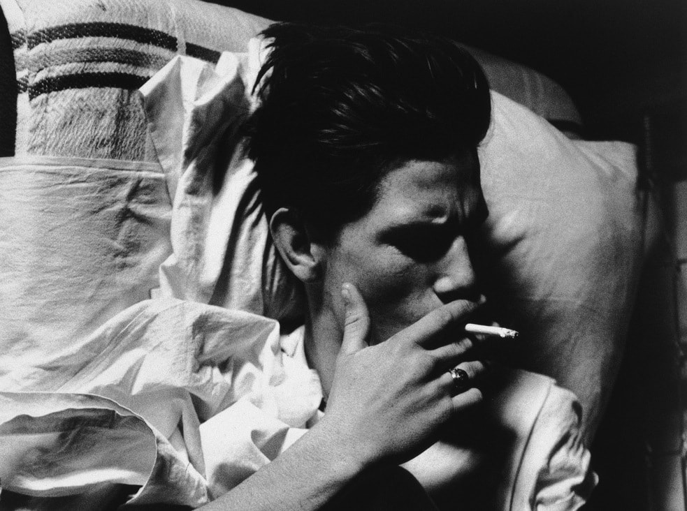
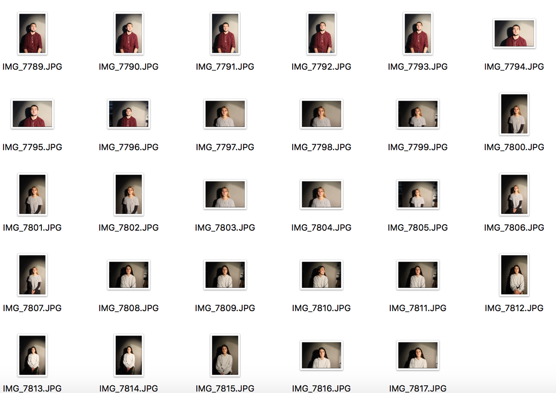
6. Larry Clark
Larry Clark was born in Tulsa, Oklahoma in 1943. While a teenager Clark developed his photography skills working as an assistant to his mother, a door-to-door baby photographer. He later spent two years at a commercial photography school. Larry Clark achieved both fame and notoriety with the publication of his first book Tulsa in 1971. Shot sporadically between 1963 and 1971, the book graphically documented the hard drug underworld of Tulsa. Although drug use, sex and violence are the main themes, the images are often beautifully composed and his subjects are sympathetically presented.
|
|
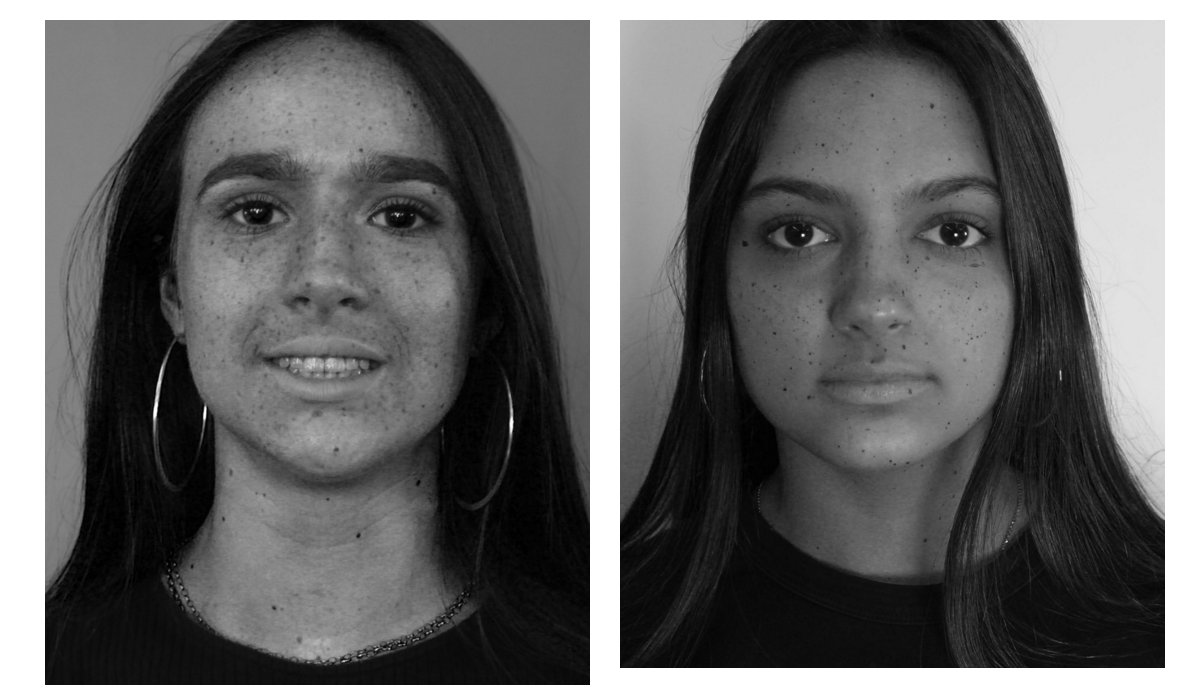
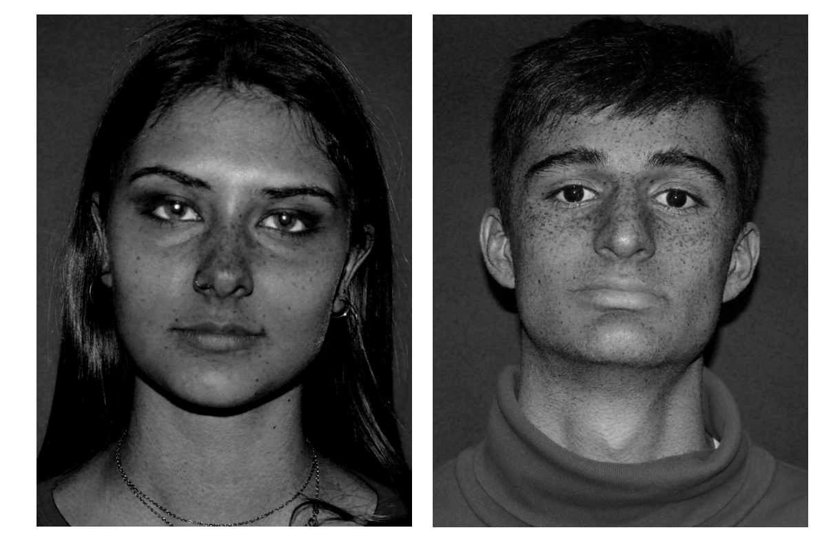
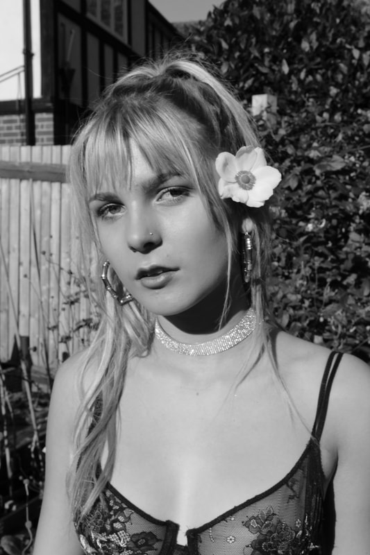
I decided to start to photograph models using the raw and black and white style that Larry Clark seems to present in some of his most infamous images. I decided I would take some natural and candid images of subjects with a white backdrop and some natural lighting in a studio below. I tried to use the rawness of the plain studio background to allow the concentration of the image to be based more around the face and body of the subject, mainly centred on the facial expressions and poses of the models. I tried to get minimal shadows in the images to create the flatness of the image that brings out the grittiest side of the images.
Below are the results after I took the images and put them into Adobe Photoshop and created and developed the images to be more styled like Clark's images with the Black and White effect. To create this Larry Clark styled images I used the Black and White tool on photoshop and messed around with the colour tools by increased and decreased the colours that where most prominent in my images such as yellows, blues and magentas. The effect this had on the images meant that the 'flaws' and details on the face where enhanced and made more defined by the editing, giving the image an increased raw tone and gritty feel therefore connecting and comparing well with Larry Clark's images. I am thoroughly happy with the outcome of these images in representing Larry Clark's photography and his style of photography which shows the grittier side to people, specifically the youth subcultures of his time allowing for emotions to be explored within the images rather than photoshopping out the originality and flaws of the subject.
|
|
|
|
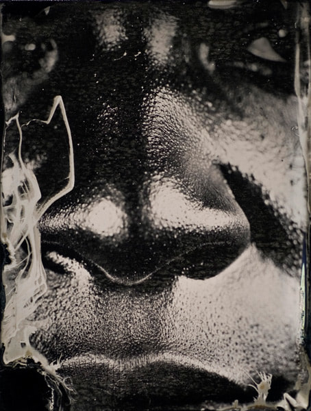
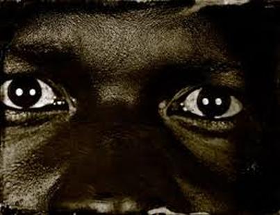
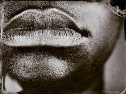
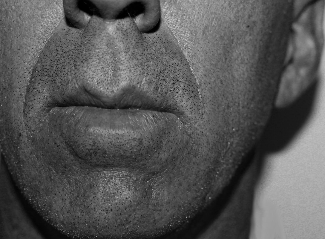
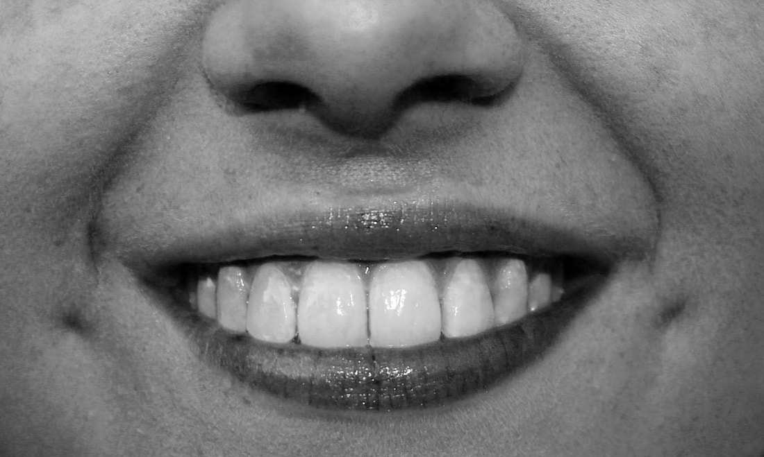
7. Myra Greene
Myra Greene is an American artist who has worked on a number of projects, mostly photographic. Through her work, Greene prompts thought-provoking questions about how individuals are often judged based on skin color and other physical characteristics rather than on their character. Greene's use of high contrast black glass ambrotypes prompts viewers to consider the unidimensional way black individuals are viewed in society. In a response to her feelings about how society first and foremost categorized her by her skin-color rather than judging her by who she is as a person, Greene's close-up and tightly framed images of portions of her own face prompt an uncomfortable answer to the questions the collection's title implies about whether she, and black people in general, are judged by their skin color rather than by their character.
|
|
1.
3.
|
2.
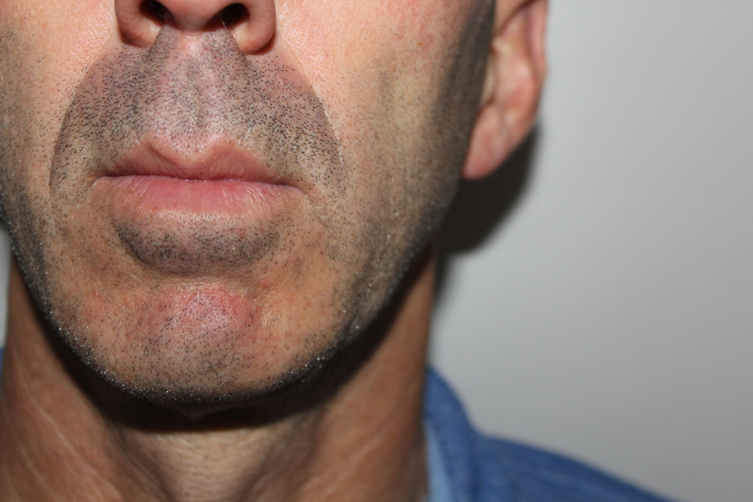
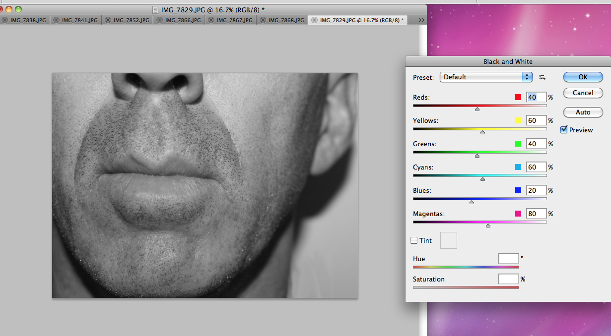
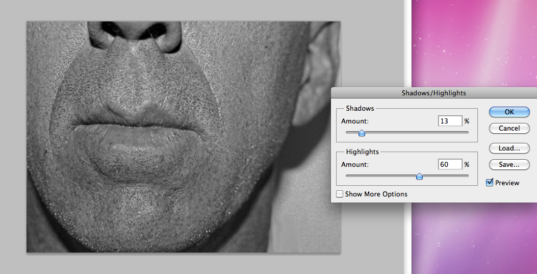
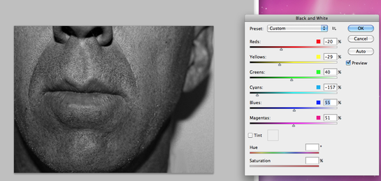
Here you can see I have taken an image close up of a subject's mouth,chin and nose and incorporated the ear as a side subject. In picture 1 I changed the original image to black and white to show the effect the black and white filter has on the image. In picture 2 I changed the levels of the coloured tones in the image for example lowering the levels of reds, yellows and cyans, this created a darker and more contrasted image which puts emphasis on the flaws of the subject just as Myra Greene intended in her images. In picture 3 I took the second image and decreased the shadows and increased the highlights of the image. This created a more lighter toned image which still emphasised the flaws but with a flatter tone. Overall I think image 2 best presents flaws effectively and is the best image out of the three.
|
|
|
|
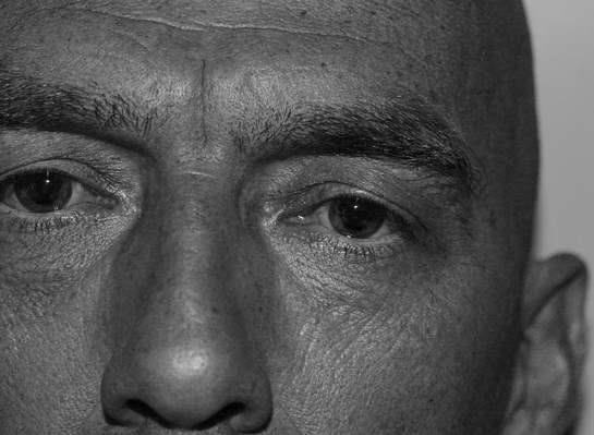
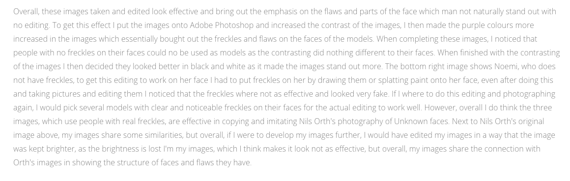
Overall, the images that I then took and put into Adobe Photoshop are all edited using the same style of black and white whilst mixing around the saturation of specific colours from specific shadows in the faces of the subjects. The effects created from this sort of editing adds a very natural and raw effect to the images and brings out natural blemishes. Connecting to the images of Greene as they bring out the straight edges as to speak of the images and outlines imperfections. Also linking to Larry Clark in which both mine and his images successfully portray raw positions of subjects and I have picked out specific parts of the faces of the subjects and brought out the flaws in the images. I am happy with the overall outcome of these images and think they link to the ideas of being more anonymous as they only focus on smaller parts of the face, not all of it. Finally, the one main theme I noticed from this shoot was the fact that the older subjects where better for editing as the flaws and creases within the skin are deeper and are therefore easier to pick up on the camera and specifically on the Photoshop editing software as it can find the shadows in the images extremely well. I have decided to continue this way of editing as it is also particularly interesting when the subject of the image has moles or freckles as they are excebtusted when edited this same way on photoshop.
|
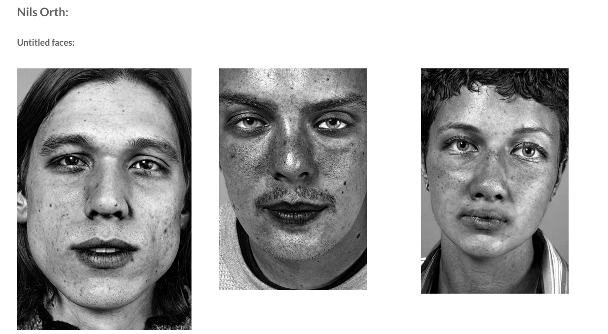
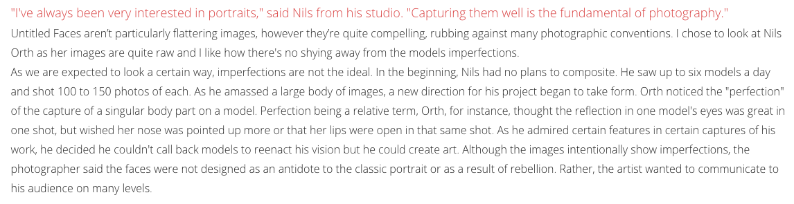
8. Flaws Nils Orth
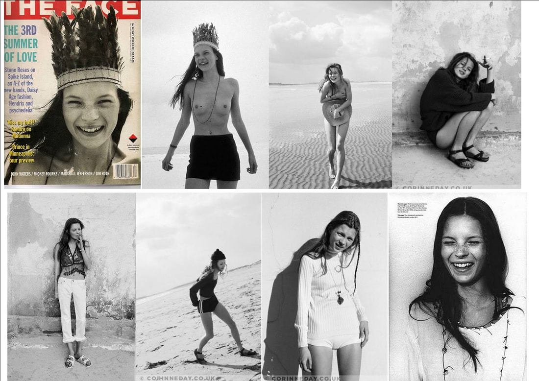
9. Corinne Day
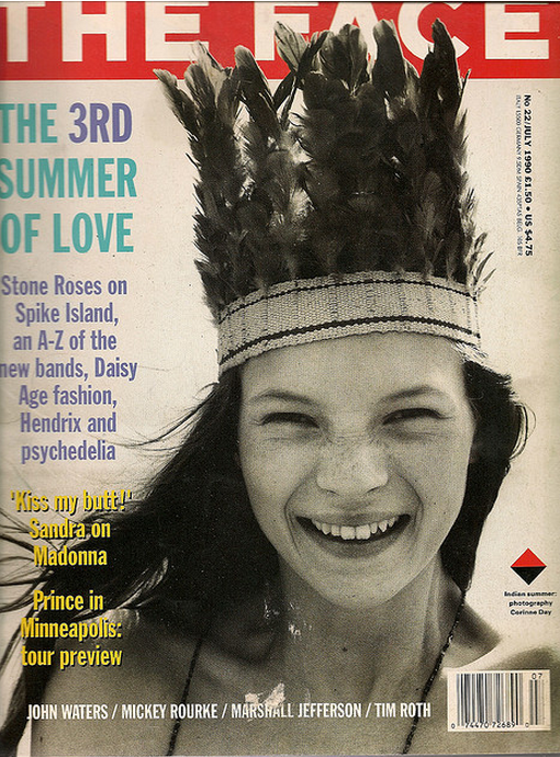
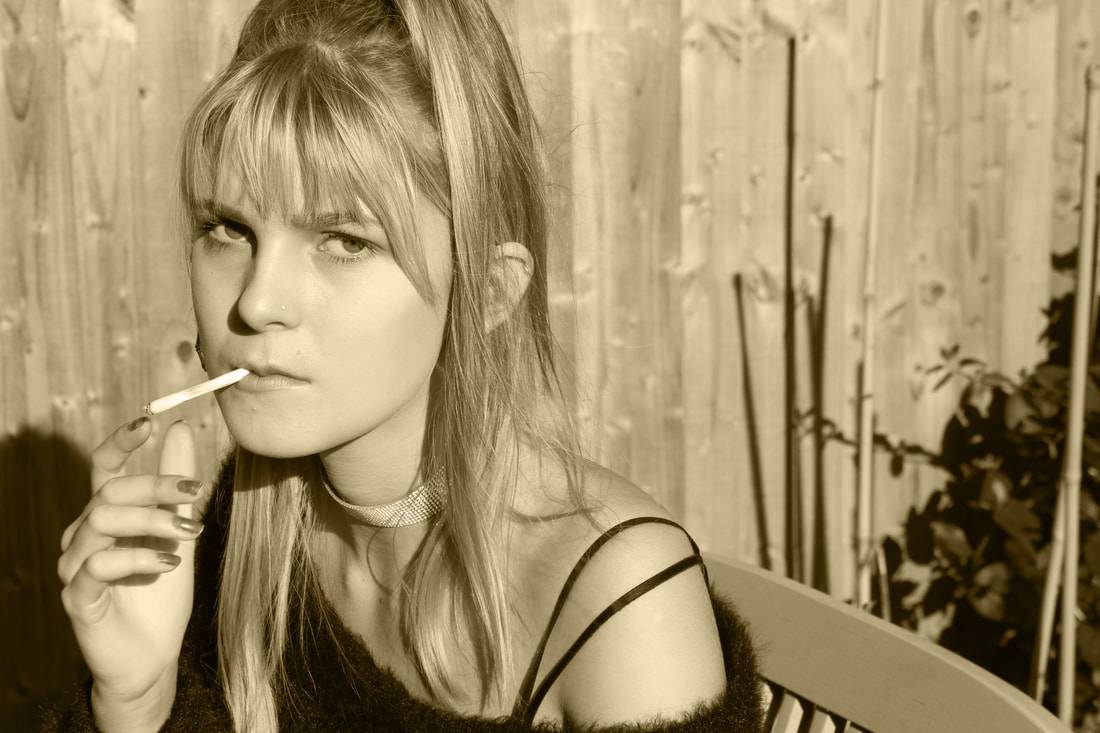
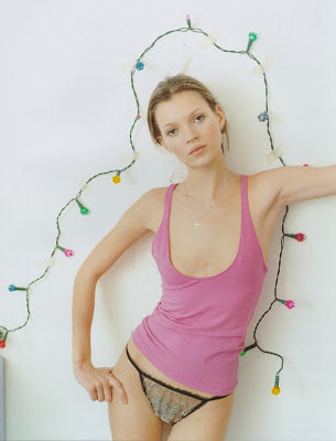
Self taught, Day brought a more documentary look to fashion imagery, in which she often included autobiographical elements. She was known for forming long and close relationships with many of her muses including Kate Moss, Rosemary Ferguson, George Clements, Georgina Cooper, Sarah Murray, Tanya Court, and Tara St Hill, a way of working which resulted in candid and intimate portraits. Her first published work was for The Face magazine in 1990 - photographs of Kate Moss in an editorial titled the ‘3rd Summer of Love’. Day’s approach to fashion photography in the 90s, came to be known as ‘grunge’ and grew into an international style. The above is the iconic issue of The Face from July 1990 - Kate Moss was fifteen when she shot the story, styled by Melanie Ward, which launched her career. The photographs were taken on Camber Sands in England, a traditional seaside resort, and were astonishing for their raw, verité feel; an antidote to the glossy Vogue supermodels. The images were seen by Fabien Baron, and Moss’s relationship with Calvin Klein began. It’s difficult to over emphasise how influential this story was at the time. These sort of images inspire the looks of natural and raw images, edited into black and white with browny undertones to create an a one with nature look. I photographed so images of two subjects in specific natural positions in the garden and natural but bright sunlight. I have tried to keep the images quite posed but in natural settings so they don't seem too posed or forced.
|
|
The images above are edited images from the photo shoot of two subjects out and inside a house on a bright sunny day. I took the original images from the shoot and edited them on Adobe Photoshop, picking specific tones and colours for the whole image to be. Corinne Day often took her original images in black and white and other toned films giving the images an emotive tone. In my images I too have tried to copy this style by choosing fitting colours such as black and white, brown and grey tones in my images. These images are clearly staged shown by the flower and poses that the subjects take, this aspect of the images is the one thing I would like to change due to the fact that the authenticity of the images is lost when the subjects are obviously posed. Next time I take my images I need to take into consideration the poses the subjects make, to make sure my images look more natural and less subjective.
|
|
Exhibition visit in Berlin:
MARIO TESTINO- UNDRESSED
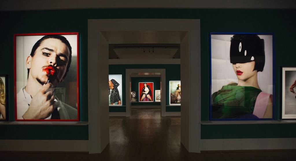
Blurring the boundaries between fashion, eroticism and art, Undressed subverts conventions and explores different modes of undressing. 54 larger-than-life images are affixed directly to the walls in three of the Foundation’s exhibition halls, reaching into the corners of the room and up to the ceiling, filling the rooms with bodies and emotions to create an imposing human landscape.
From this exhibition there was one main video in which Mario Testino is being interviewed about his work. From this video I took notes on the main feature that I liked the most. Mario Testino states that "Love is born from wanting to give and ends up with wanting to get. Love becomes needy and you need to more than you appreciate it" and he believes that "Magic comes from an association with people". Testino also states that "Nudity is letting go being free sexuality temptation flirtation honesty openness privacy intimacy forbidden" he believes that "Vulnerability comes from the place of judgement. Thinking the intention are only visual and there are wrong intentions behind it" and that we wants to be part of it. Testino believes that "We are driven by risk".
In his photography Testino show "Sides of people we don't normally see. The end of a party. Not looking perfect. What's left over". Testino also believes "Photographers strength of work comes from the weakness of the person. I try to capture the moment of strength and power." Testino states that "Discovering makes me happy. Obsessed with finding the newest artists and obsessed with discovering. It makes me happy." Testino is "seduced by humour and beauty. Impressed by some people are so perfect and beautiful. Beauty on its own bores me. I like to seduce more than be seduced". Finally Testino finishes by stating "I want every single day to be the best day of my life".
This exhibition allowed me to understand more thoroughly the ways in which photographers such as Testino acquire their inspirations from and how they take the fantastic pictures that they take. In my own photography I will take inspiration from the block colours and angles from Testino's images to further develop my own images. Testino's presentation, using massive prints of his images, draws the viewers attention to his images, whilst using the large life-sized prints in order for the images to have the best effect visually on the viewers. Having blown up naked pictures destroys the taboo brought with being naked as the viewer is forced to confront the images.
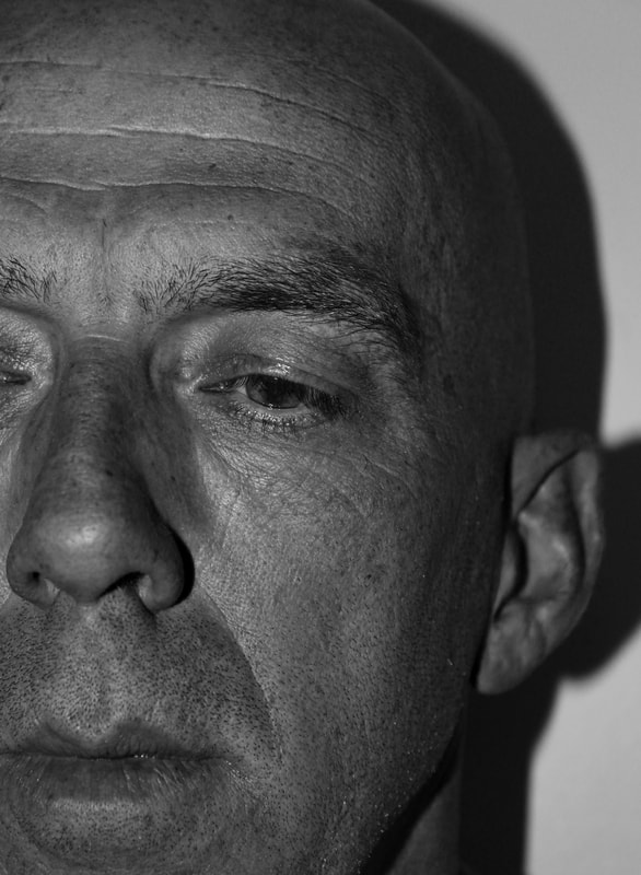
10. Nicolas Guerin
|
|
|
Nicolas Guérin is a portrait photographer who captures truly bold portrait images, he often finds himself photographing in Cannes and Berlin. He often photographs Actors and Actresses from the Film Industry and has other photography using polaroid cameras of naked women for fashion magazines.who loves cinema and enjoys taking pictures. The majority of Guérin's photography includes the colour grey and it has a brilliant impact on his images. Guérin's techniques seems to be using a bright light straight onto the subject, but incorporating a darker background as to concentrate the majority of the focus onto the stunning aspects of the subject's face.
I have tried to photograph a few subjects using the same darker background/backdrop with a light almost focused on the face, however I decided to make the images slightly lighter than Guérin's photography, as his images are quite clearly edited to be made a more black and white tone in the face of the subject's whilst still incorporating the key features of the face. My photographs use a light focused slightly to one side of the face more than the other. The light itself is a square shaped light so the light projects with a shadow onto the subject and the backdrop. This light did lead to the images having a shadow in them, however this did not matter as I quite liked the effect it gave off.
I have tried to photograph a few subjects using the same darker background/backdrop with a light almost focused on the face, however I decided to make the images slightly lighter than Guérin's photography, as his images are quite clearly edited to be made a more black and white tone in the face of the subject's whilst still incorporating the key features of the face. My photographs use a light focused slightly to one side of the face more than the other. The light itself is a square shaped light so the light projects with a shadow onto the subject and the backdrop. This light did lead to the images having a shadow in them, however this did not matter as I quite liked the effect it gave off.
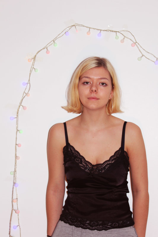
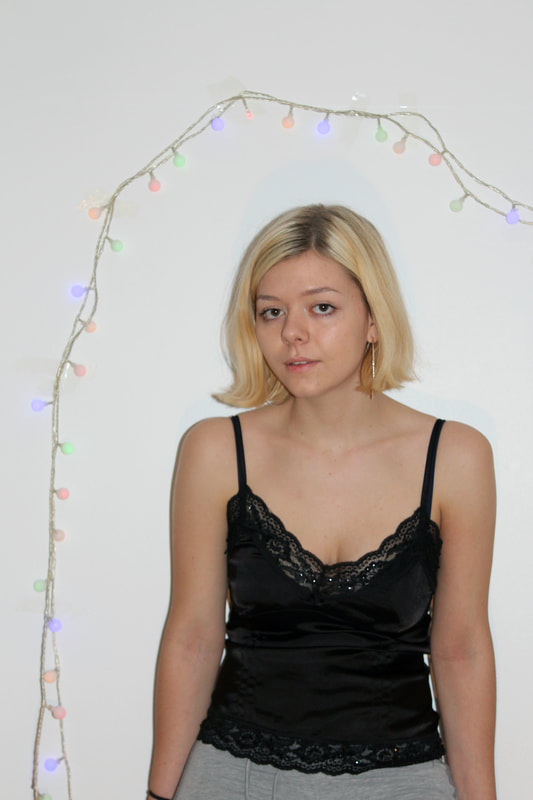
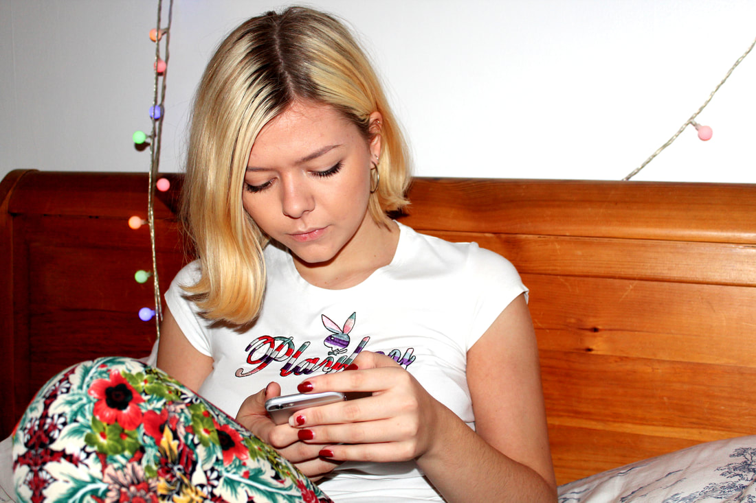
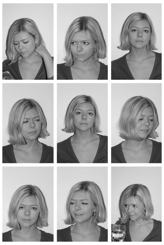
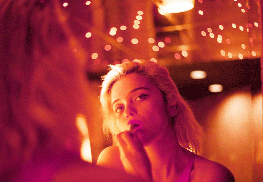
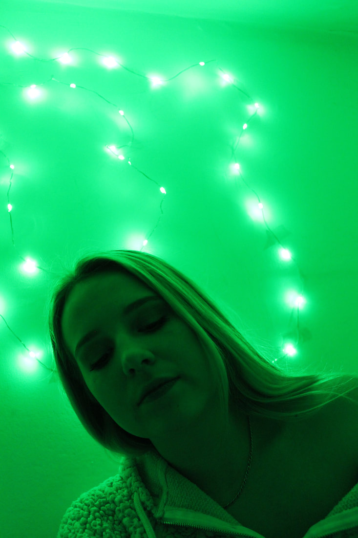
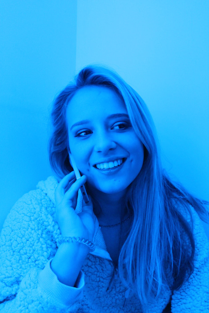
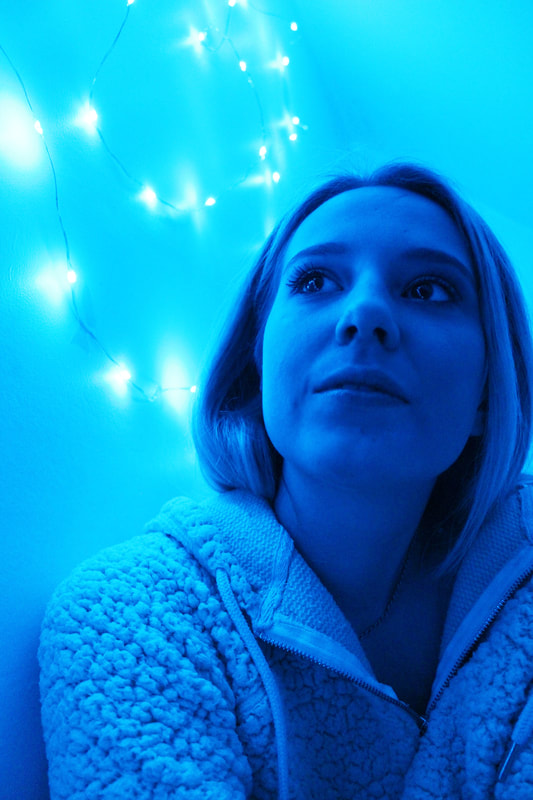
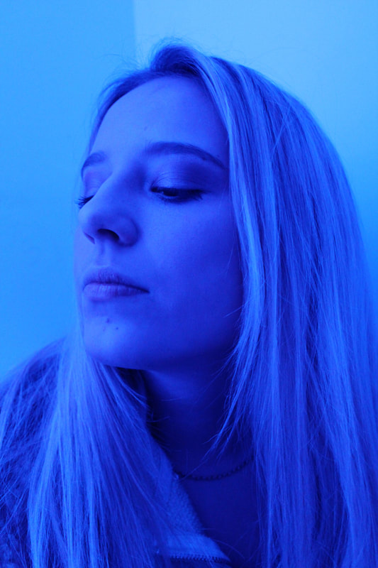
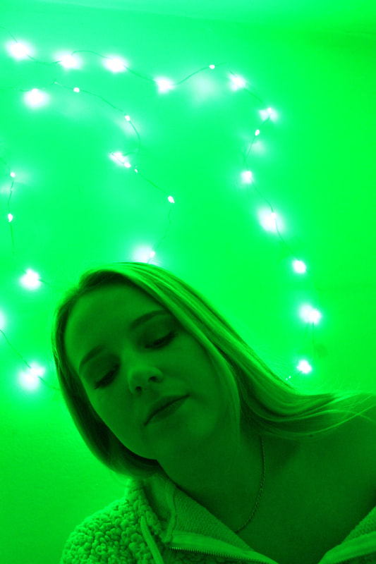
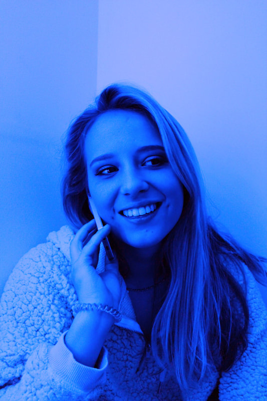
11. Corinne Day re-visited
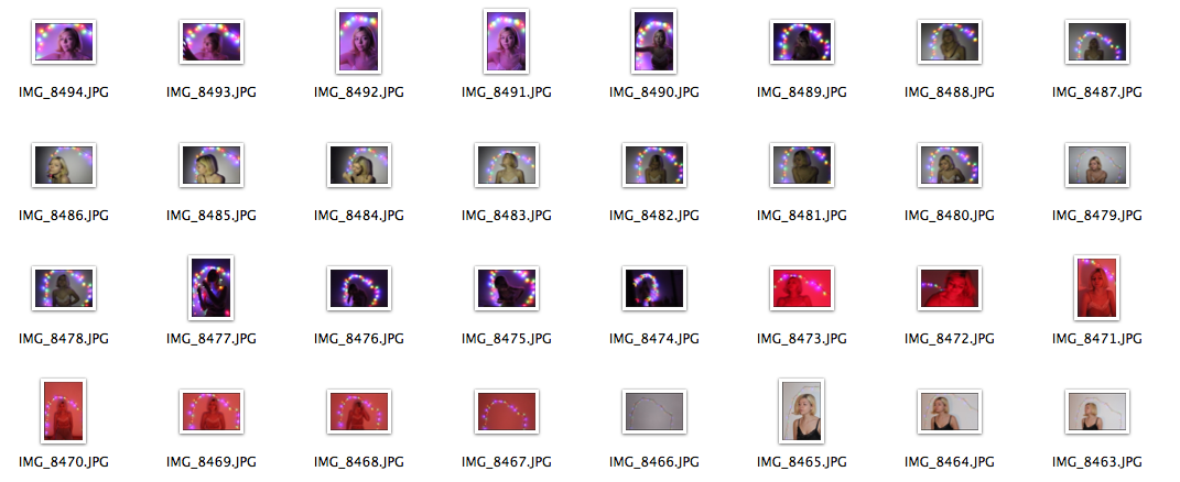
I have decided to re-visit and go back to the image style of Corinne Day, inspired by heroin chic and the gritty and raw concepts of the mid 1990s due to the fact that I like the style of images she takes and the detail she involves in every photograph she takes. I decided to find a subject with blonde hair and similar traits to Kate Moss to insure that my images would look as aesthetic as possible and tried imitating the images Day took of Kate Moss in the 1990's. However instead of taking the images in a studio or with professional lighting as Day would have done, I took my pictures in a bedroom with the subject wearing similar and simple clothes. When photographing the subject I tried taking numerous images using different perspectives and colouring to ensure that the images where original , however at the same time I imitates the images that Day had taken of Moss, for example the photograph booth images and the images of Moss with fairy lights behind her.

|
|
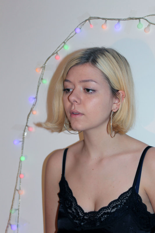
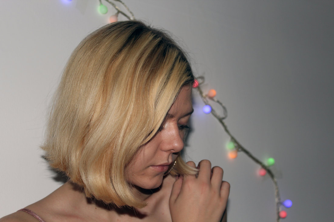
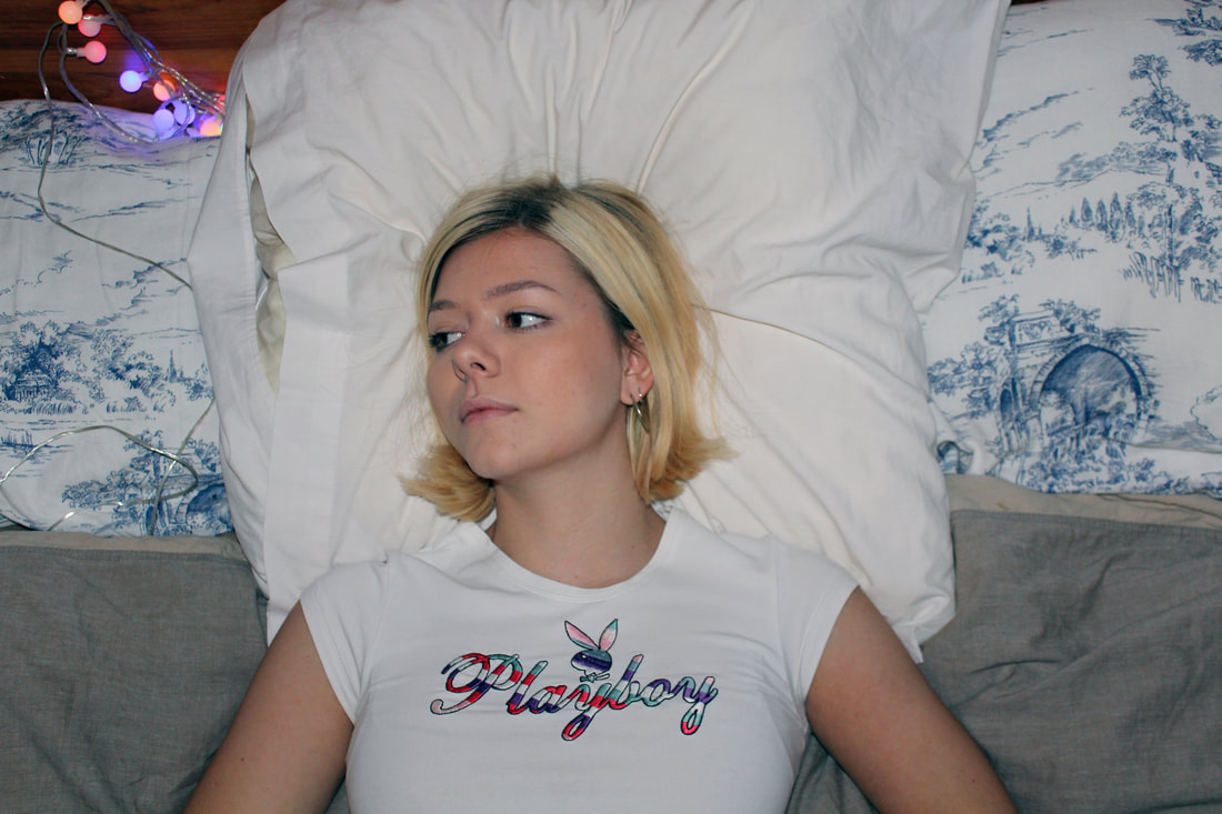
Overall, the images I have produced using the inspiration of Corinne Day's 1990 images of a very young Kate Moss came out effectively and portrayed a sense of youthful rawness, just as artists such as Juergen Teller and Larry Clark have. However I did find when photographing the subject that the images were too closely based around Moss' poses and Day's inspirations, meaning my own images looked less effective as it is hard to completely mirror photographs taken with specialist equipment and photoshopping tools. However I do think these images are effective in portraying a sense of rawness within the youth subcultures, but next time I will try to be more original with my images as I believe they will look better when the photography is genuinely candid, which is often hard to capture. Overall, these images are successful but I have decided to try a newer photographer to inspire me for my next set of photographs.
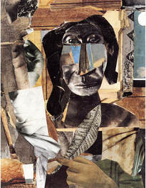
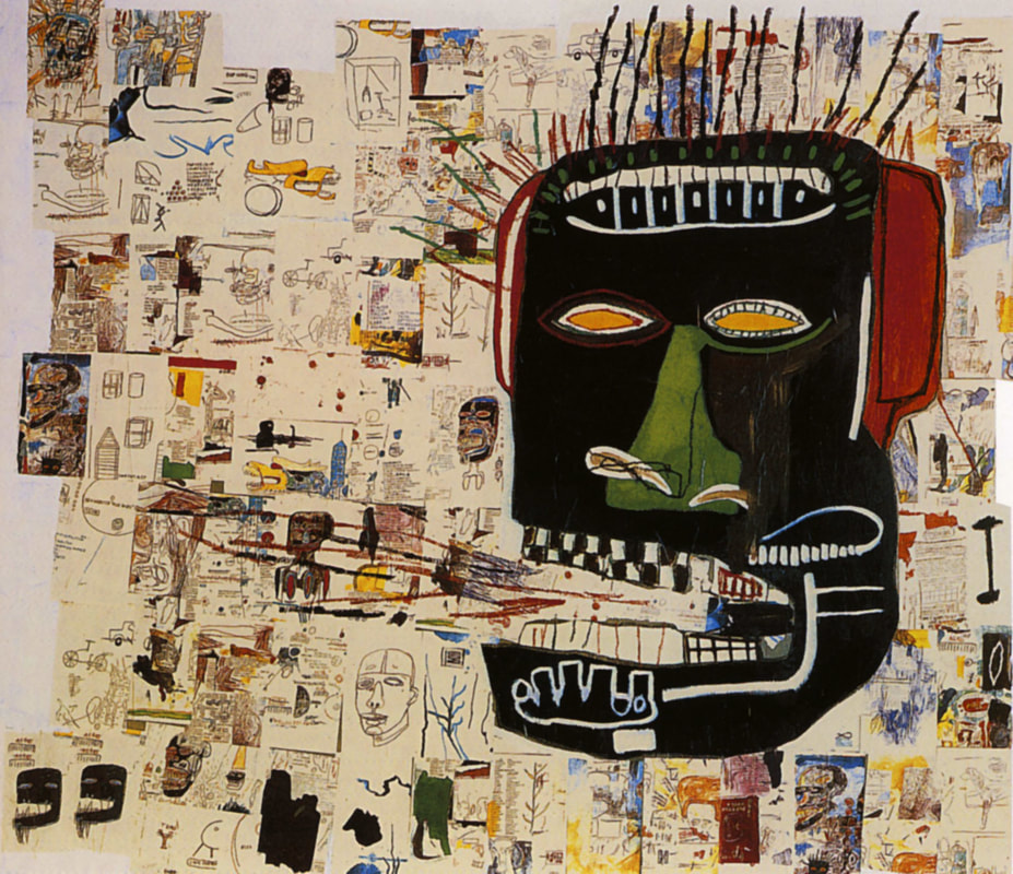
12. Basquiat exhibition: Boom for real: The Barbican
The first large-scale exhibition in the UK of the work of American artist Jean-Michel Basquiat (1960—1988) One of the most significant painters of the 20th century, Basquiat came of age in the late 1970s in the post-punk underground art scene in downtown New York. By 1982, he had gained international recognition and was the youngest ever artist to participate in Documenta 7 in Kassel. His vibrant, raw imagery, abounding with fragments of bold capitalised text, offers insights into both his encyclopaedic interests and his experience as a young black artist with no formal training. Since his tragic death in 1988, Basquiat has had remarkably little exposure in the UK; not a single work of his is held in a public collection. Drawing from international museums and private collections, Basquiat: Boom for Real brings together an outstanding selection of more than 100 works, many never seen before in the UK.
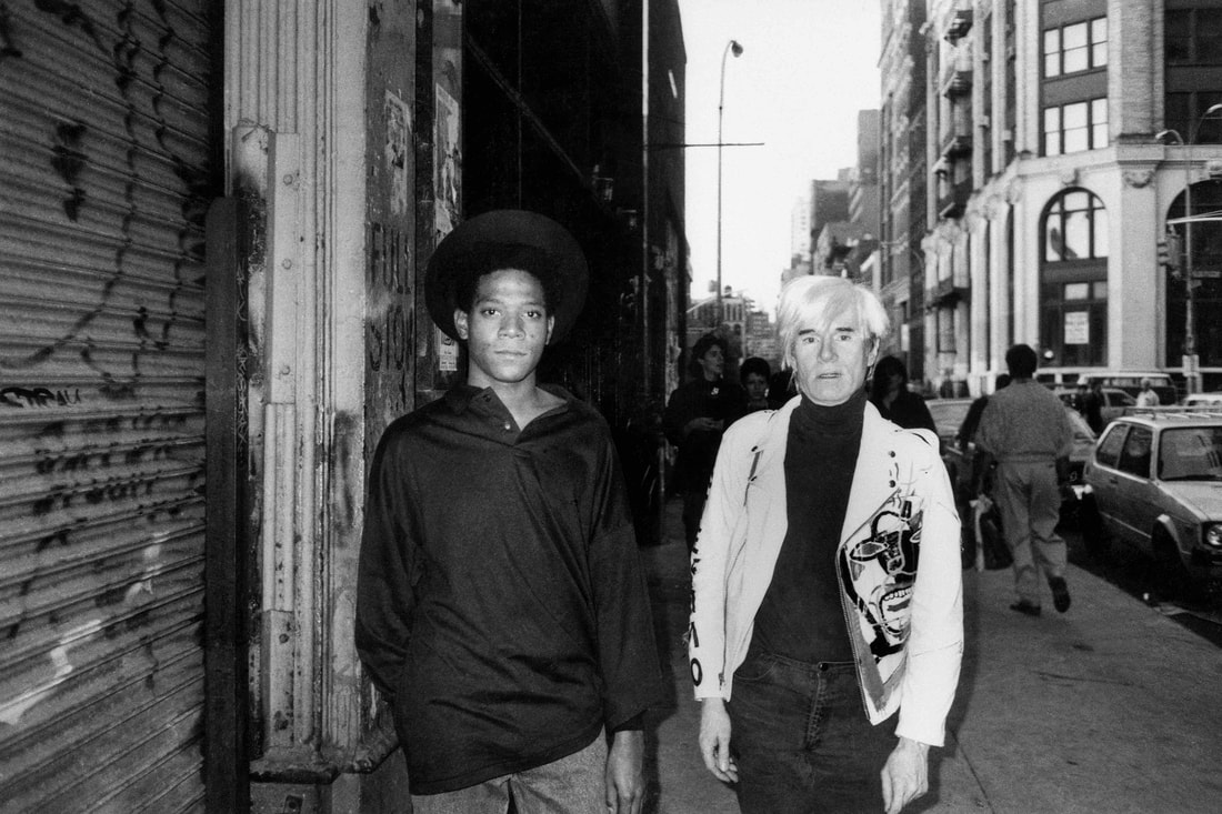
Basquiat's exhibition at the Barbican showed me a sense behind photographers such as Larry Clark, Juergen Teller and Corinne Day's inspirations for their photographs. Within this exhibition the young face of Basquiat looms large presented in giant photographs and videos. He sits with Andy Warhol, who has his arm around his protege, in a clip from Warhol’s TV show. On the contrary, taking drugs fitted the myth of a “raw” street genius. Untutored – he never went to art school – and naturally gifted, Basquiat was celebrated as some kind of spontaneous wild child. Even today, this curious and racist filter distorts the way his art is seen.
Basquiat was an art-world darling from his early days as part of cryptically snarky graffiti duo SAMO© short for same old shit, through to his collaborations with Andy Warhol and his big later canvases. He was constantly collected and endlessly celebrated, and this his show, the first major retrospective in the UK ever, unpicks all the elements that made him so special.
A lot of his work is a mess, but that mess often creates his images into a joyful, angry, pulsating mass of colour and symbolism. ‘Ishtar’ is electric with blue-greens, hieroglyphs and clenched jaws. The massive ‘Glenn’ whacks a giant fire-breathing head over pages of sketches. Some of this is thrilling, other bits descend into indistinguishable chaos.
'Glenn' - Basquiat
|
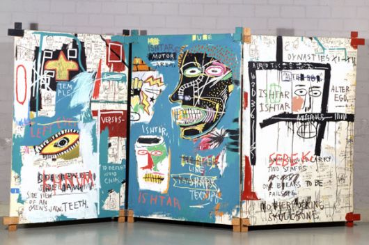
'Ishtar' - Basquiat
|
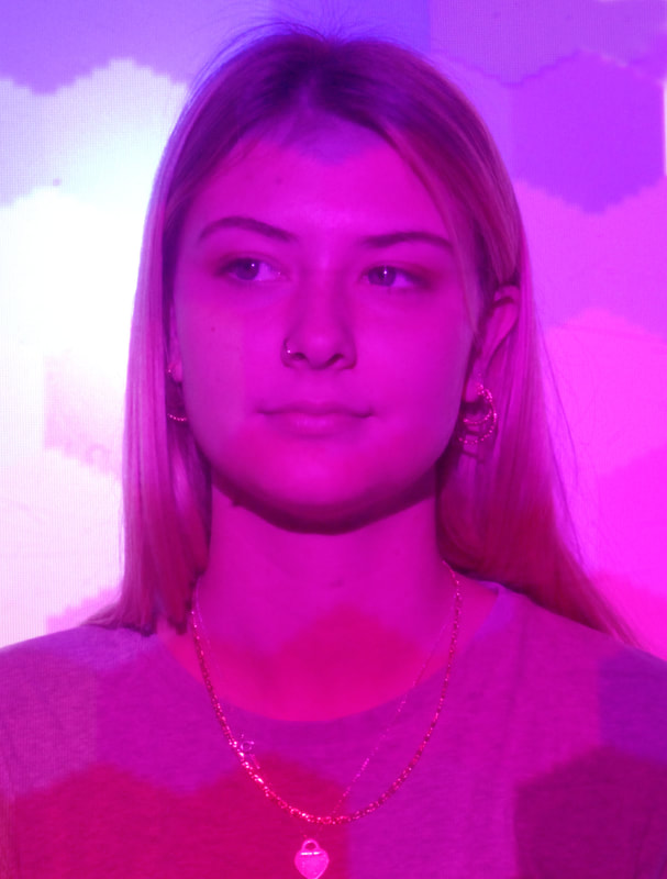
13. Petra Collins
24 Hour Psycho: Petra Collins’ pastel-tinged photographs have always focused heavily on the female experience. Whether she’s calling out body-based cliches or capturing the world’s most famous women, the Toronto-born artist offers a fresh perspective on contemporary womanhood. It’s a skill she rolls out in her new series, 24 Hour Psycho. Scrapping the fourth wave’s fixation with nip slips and body hair, Collins instead turns her lens to mental health: celebrating the complexities of the female psyche through close-up portraiture. “Women's emotions are constantly labeled,” she explains. “Any slight deviation from ‘pleasantness’, and we are labeled as hysterical. When we are angry, sad, depressed, or manic, we are immediately seen as unfeminine, or ugly, or weak.” According to Collins, the project came from personal experience. “My mother struggled immensely with mental illness and so did I,” the photographer reveals. “She grew up bipolar, but it was never diagnosed nor recognized. It was shrugged off like a ‘symptom’ of being female – of her being weak. I also experienced this growing up: I felt that the great pain I experienced was a dramatisation.”
When taking these images and using the equipment available to me I found it difficult to successfully attain the similar colours that Petra Collins has. For example, the colours in Collin's images incorporate two tones from separate sources of light, my images however either use one block colour made a sheet of coloured plastic and a big light, or multi-coloured images, which however do not mix and change to the shadows as a projector was used. However, after taking the images I decided to put the images into Adobe Photoshop and edit them according to the main colours in the images, making the colours stand out more. I will be finding better lights to use to take more effective images of my subjects, and get the subjects to pose with emotion in their faces,for example crying or happy to bring more expression to the images. The colours and patterns incorporated in my images so far are too blocked making the images look less effective as they look less emotive.
|
|
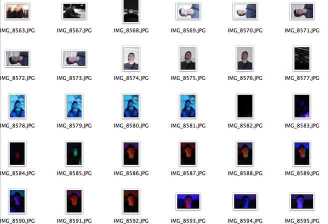
14. Block Colours- using lights :
These images are a few of the original images I took but put into Adobe Photoshop, when taking these images I noticed the coloured plastic sheets I used where not projecting the colours bright enough. This meant that I edited the colours of images to become brighter and bolder. In the first three images, I even edited the shadow out of the image and changed the backdrop to the shadow colour. I noticed that these images seemed to give off a darker tone and led the colouring of the colour on the subject being darker. The second lot of image I took, I decided to not edit out the shadow and keep it, leading to the backdrop being a mixture of the original colour and a darker shadow. I found these images where more aesthetically pleasing as they brought up a lighter tone to the image and made the whole set of images brighter and more eye catching.
|
|
15. Multi-colours - using projector:
|
In the second lot of image I took, I abandoned the dull colours from the lights and used the overhead projector and images found on the internet to take my images. These images automatically came out much more brighter than the original images as the images used where vivid and also had multiple colours in them, however not all the projected images used are ultimately appropriate for the style that I was trying to achieve by imitating Petra Collin's images. For example the top right picture of Caprice has a subtler effect on the picture as a whole.
|
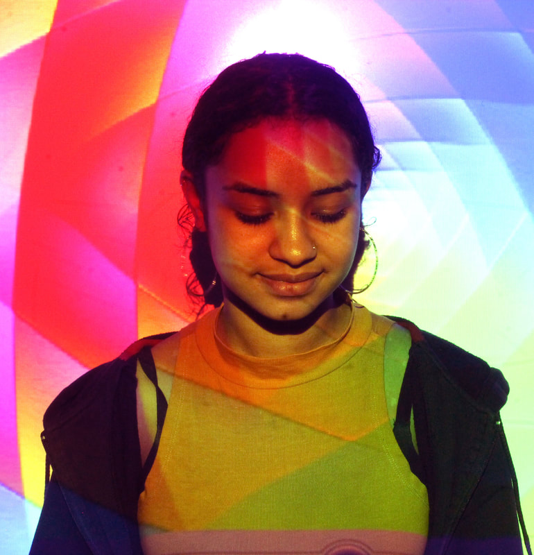
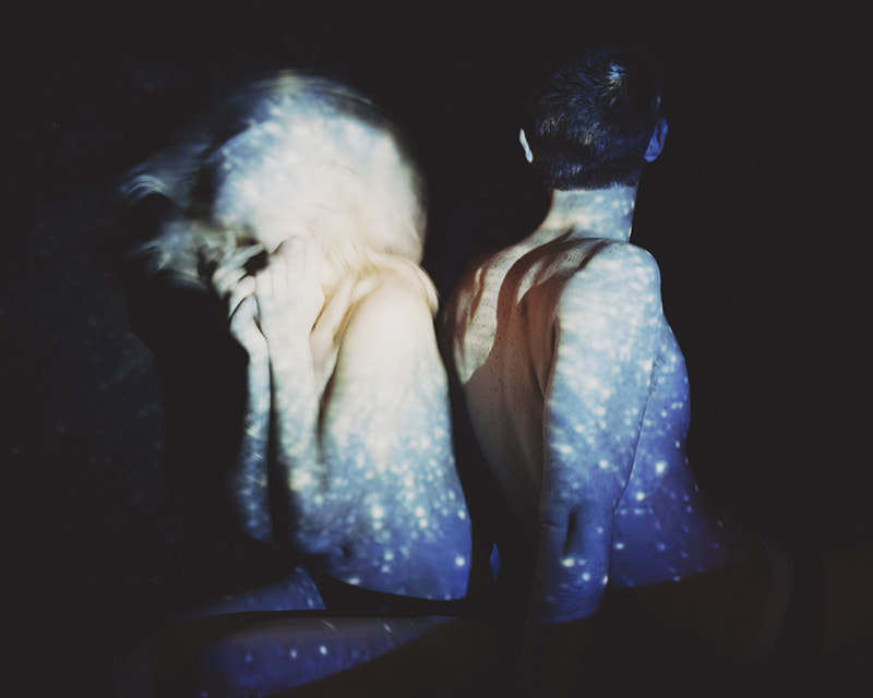
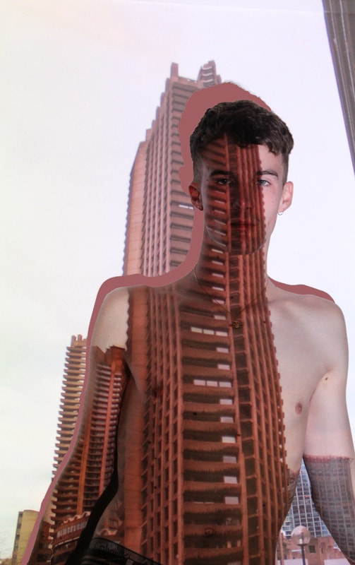
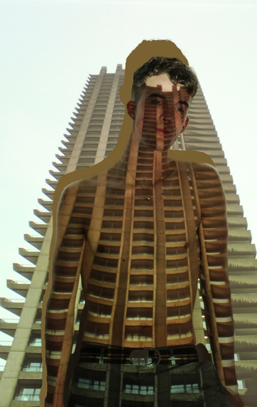
16. Brutalist images projected - Davis Ayre
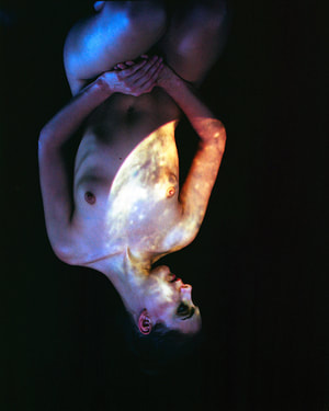
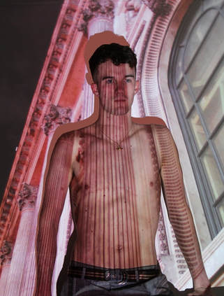
Born and raised in Austin, Texas, Davis Ayer began taking photos in 2007. Coming from a background in architectural history, he was originally drawn to space, shapes, and abstract compositions. Finding truth in the emulsion, Ayer set forth on a journey of self discovery that continues to this day. Currently based in Los Angeles, and available for work worldwide. Known for his dreamy creations, Davis Ayer comes back with a magnificent, surreal series called ‘Time Travel’, where the LA-based photographer illuminates the memories on nude bodies. Compressing emotions, time and consciousness, Ayer creates hazy photographs of vintage images projected on naked bodies. Trees blowing in the summer breeze, the impressions of big cities and blurry traces of the past create a map of personal experience. However, while exploring our connection with memories, the photographer does something unexpected: the memories illuminated on the body are not necessarily identified with this person’s life. Playing with concepts, the artist studies how much we can emphasize with other people’s experience and with past in general.
|
|
When looking at the other photographs using the projector and colours, I found that the ones using patterned colours did not look effective. To try and find what sort of images would look good I went to brutalist buildings around London and photographed them, I tried to incorporate structure as a theme and base my images on Davis Ayer's 'Time Travel', trying to find buildings that looked like structures that could be bodies. For example the long Barbican buildings fit as a spine on someones back.
I then found used a found a subject and got them to pose topless in front of these structural images. I took loads of images and when taking the images I would try and places the photographs so that the buildings matched up with the subjects body. Due to the long body majority of the images fit perfectly onto the body to create effective pieces of photography.
I then found used a found a subject and got them to pose topless in front of these structural images. I took loads of images and when taking the images I would try and places the photographs so that the buildings matched up with the subjects body. Due to the long body majority of the images fit perfectly onto the body to create effective pieces of photography.
The images below are the best outcomes of a my representation of Davis Ayer's 'Time Travel' photoshoot. Using a projector on a plain white wall I projected the most effective images onto my brother. Over all I am really happy with the out-come of these images, the colouring of them go really well with the skin tone of the subject. The shadow given by the subject also stands out and makes the images more defined. When the images came out like this, I decided to try and edit the shadows out however due to the fact that they are black, I used Adobe Photoshop to edit the shadow and used the colouring tool to copy a colour from the image and use it on the the shadow from the subject seen below aswell.
|
|
|
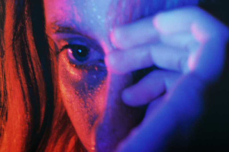
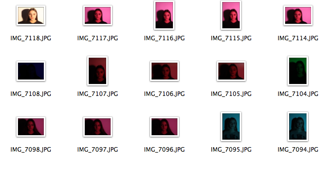
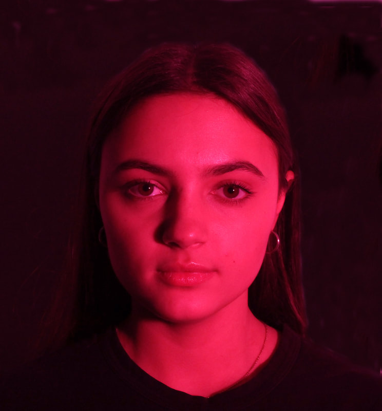
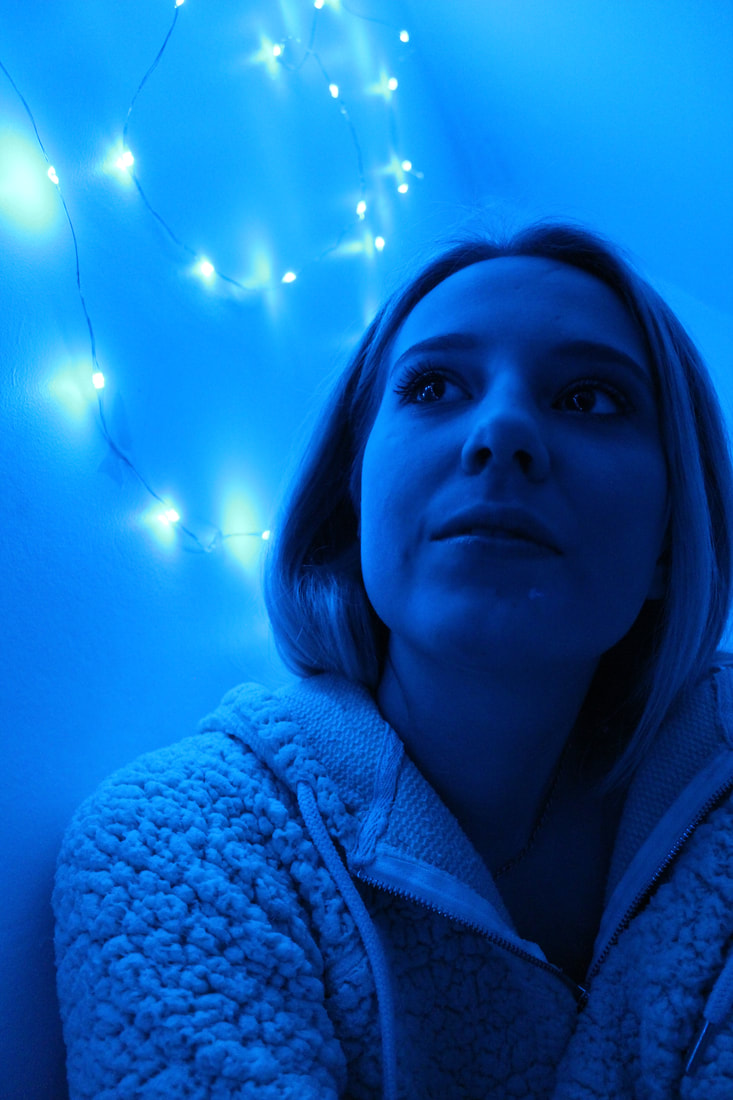
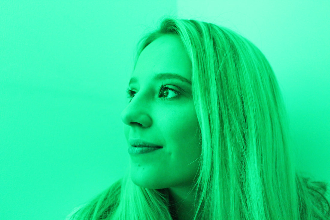
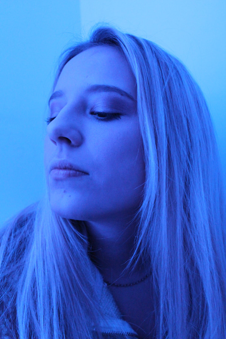
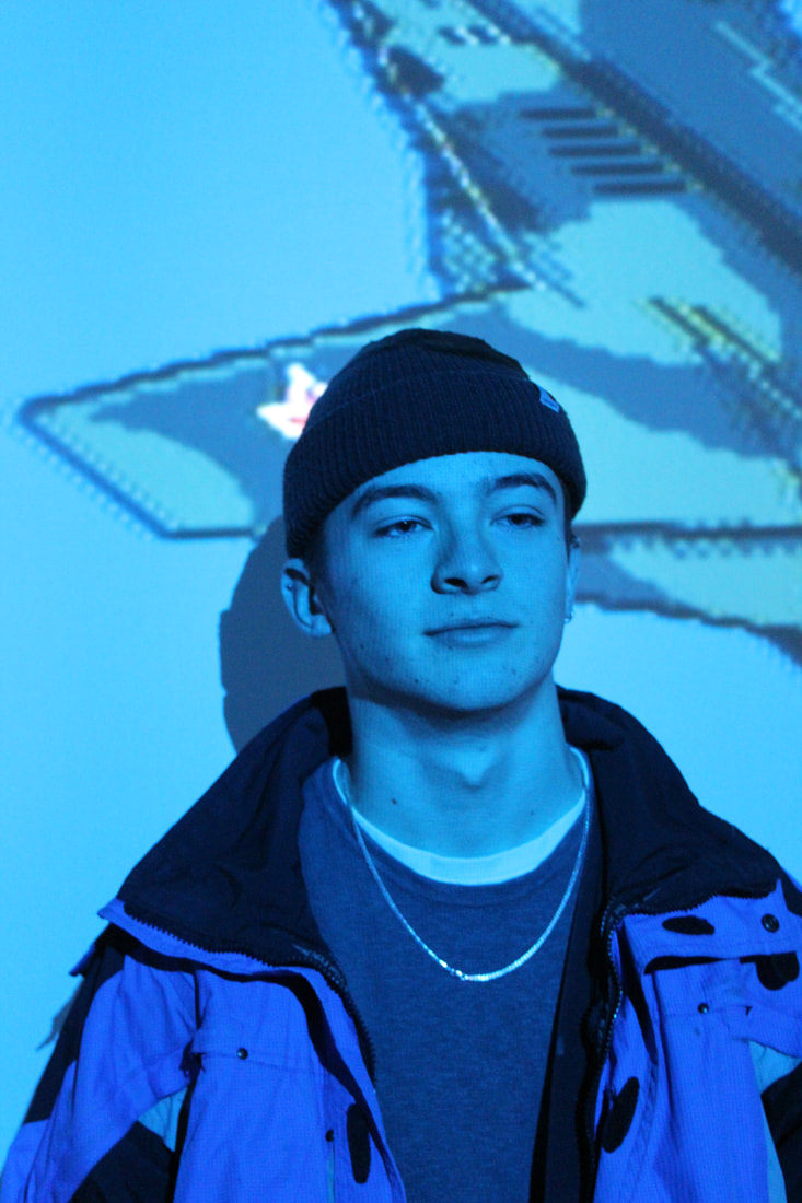
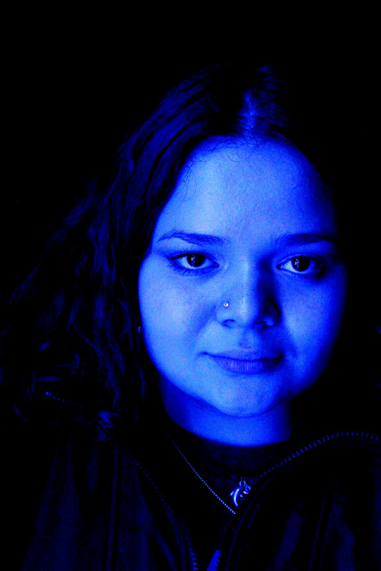
17. More coloured portraits
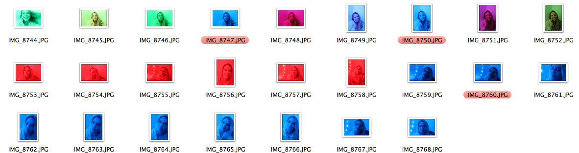
Here, I decided to celotape some coloured lights onto a wall to create essentially projected colours for me to then take pictures with my subject in front of. Most pictures came out well however I found the red colouring on the lights did not work well with the camera, leading to these images being out of focus or over exposed I tried messing with the shutter speed, IOS and exposure but I found that the camera just didn't respond well the red lights. The blue and green colouring where more effective and worked well with the camera creating mostly some effective images. After photographing these images I decided to take some of these pictures that came out well and put them into Adobe Photoshop to edit them in order to make the colours present in the images more prominent and bold. Overall, I find that one tone coloured images are less effective in showing emotion, for example the images look flatter and less emotive, this is due to the flatness of one colour however it also could be due to the fact that the lights I used to take these images where not of the best quality, leading to the focus of the camera to be slightly off.
Before Editing: After Editing:
|
|
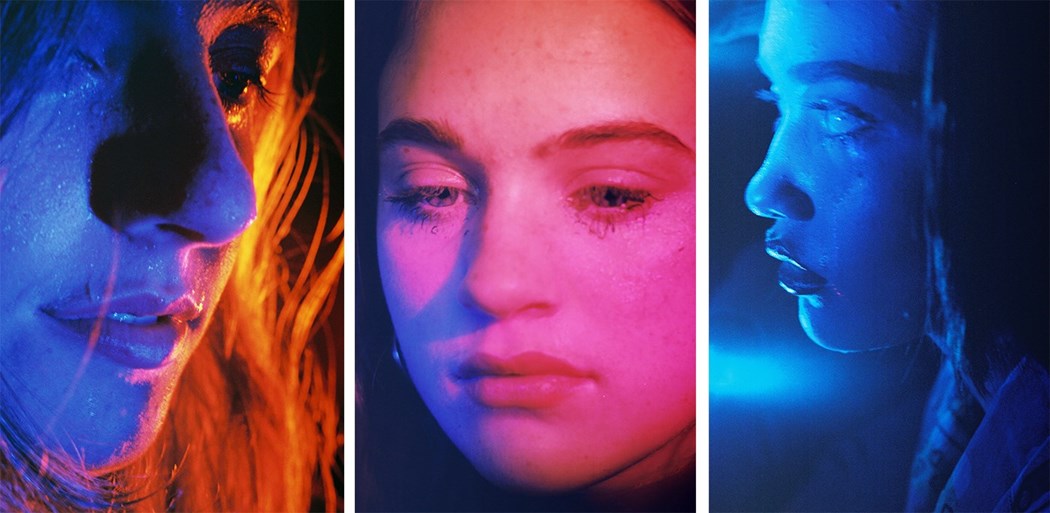
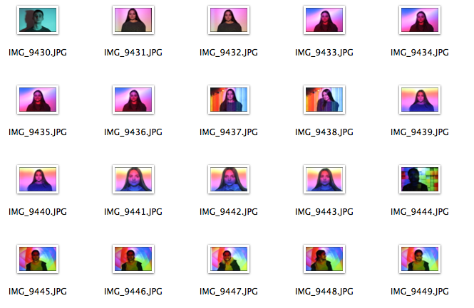
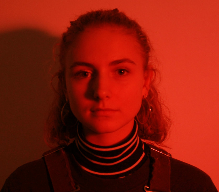
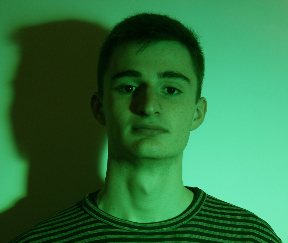
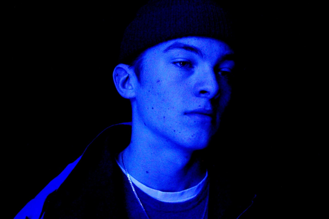
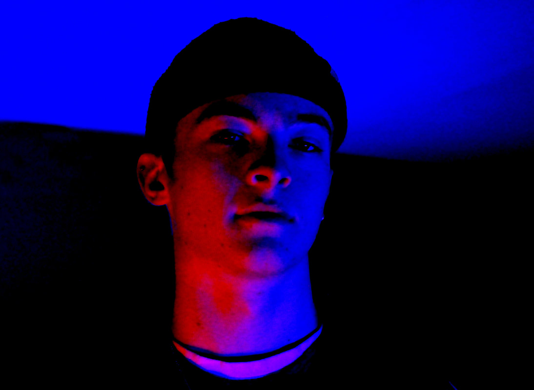
18. More coloured pictures with a male subject:
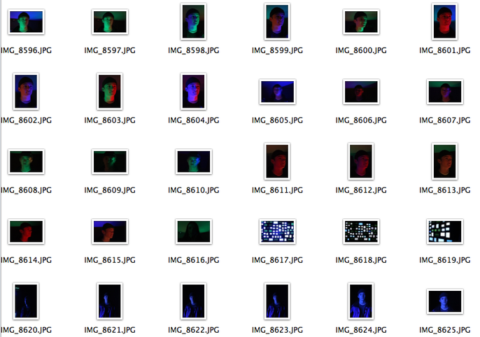
The second lot of images taken with coloured lights, which where stronger and brighter than the original images with a female subject, and a male subject seem to be more effective than the initial ones. Reasoning for this maybe due to the fact that the first set of images used weaker lights that meant the images looked more flat, the second lights used where stronger and brighter leading to the images looking less flat with the subjects face having shadows. The GIFs effectively show emotions of the subject and overall these images effectively imitate Petra Collin's style but use a slightly different style to her, essentially developing her style aden incorporating my own ideas as well to create a whole knew style of images. These set of images are taken from both the front and side views of the subject leading to depth and shadows created on the subjects face allowing more depth to the images too but I do still believe that these images are also quite flattened. However, If i were to develop these photographs even more, I would use multiple colours in the images to get more depth within the images, I find that single colours often flatten the style of the image.
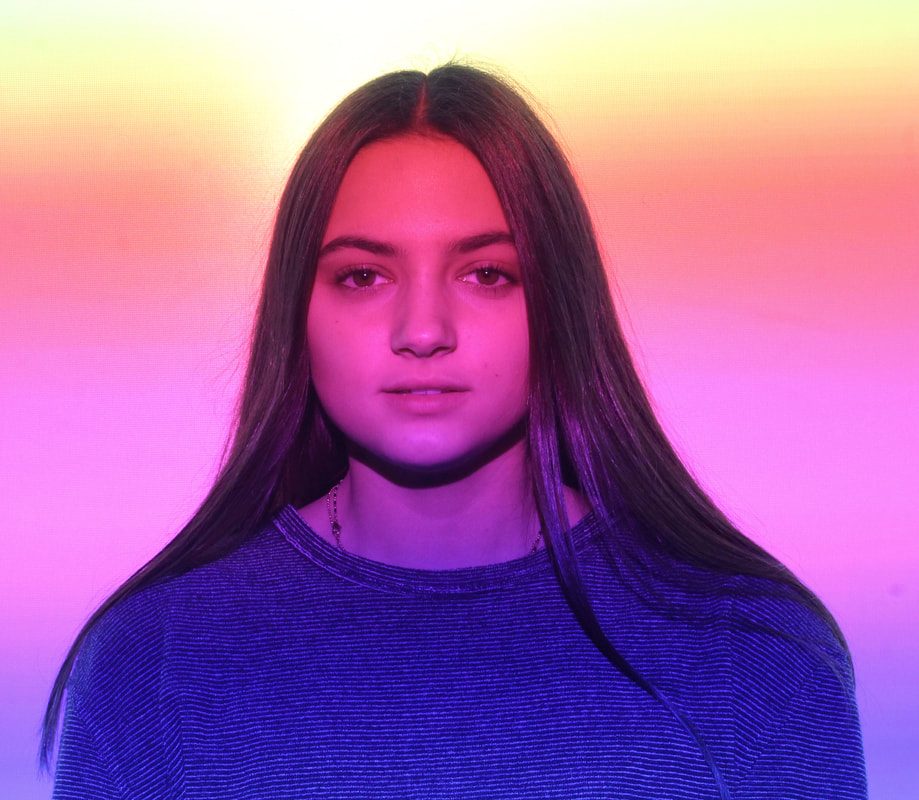
19. Everything at once - The Lisson Gallery
EVERYTHING AT ONCE is neither a chronological exhibition nor an encyclopaedic history of the gallery’s activities since 1967, rather it is an interconnected journey incorporating 45 works exploring experience, effect and event, invoking immediacy and immutability. EVERYTHING AT ONCE has been co-curated by
Greg Hilty and Ossian Ward of Lisson Gallery, in partnership with
The Vinyl Factory.
The stellar line-up will present work by a range of international artists like Ai Weiwei, Anish Kapoor, Marina Abramović, Cory Arcangel, Julian Opie, Richard Long, Lawrence Weiner and more, as well as featuring previous VF collaborators Haroon Mirza, Rodney Graham, Nathalie Djurberg and Hans Berg.
Housed in the striking brutalist environment at Store Studios – home to last year’s show-stopping music and film exhibition The Infinite Mix – Everything At Once probes the multi-sensory simultaneity of contemporary life, first articulated by John Cage in 1966, a year before Lisson Gallery opened its doors.
|
|
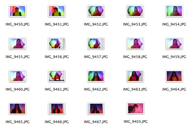
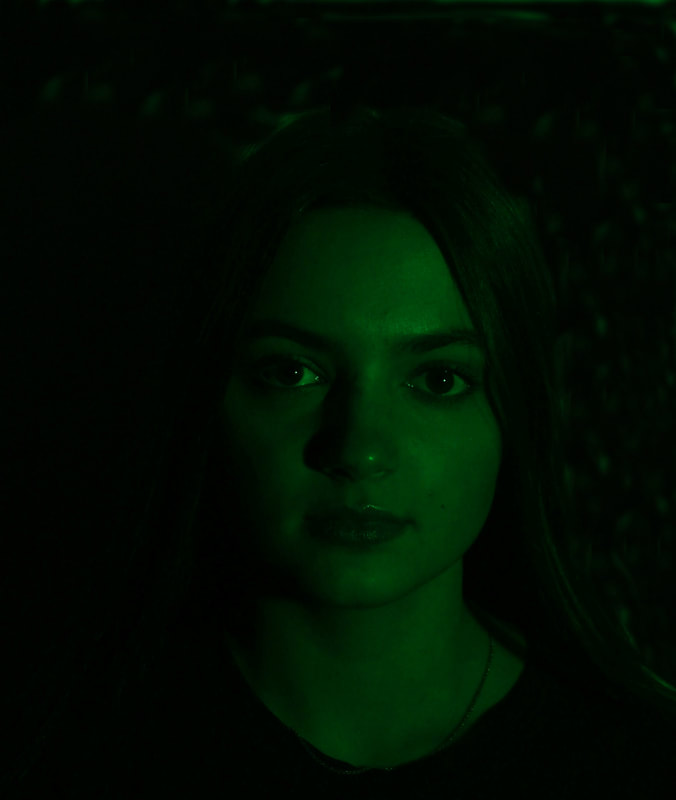
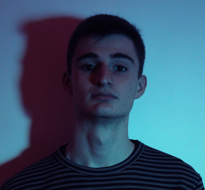
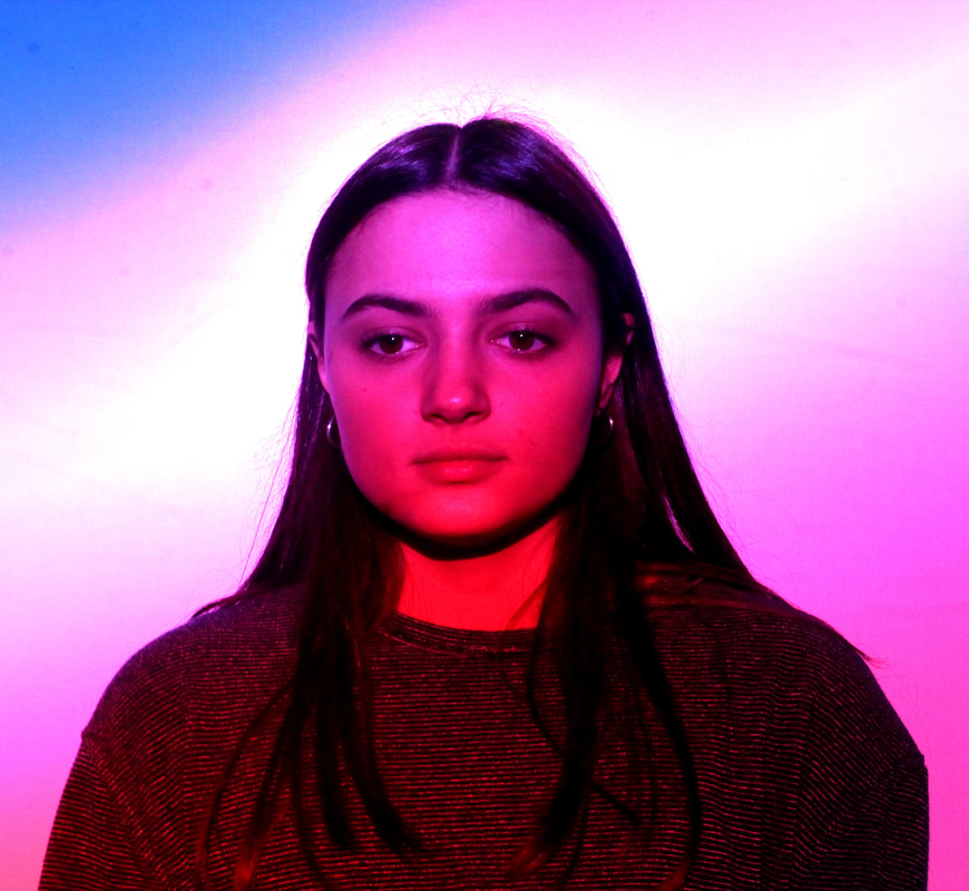
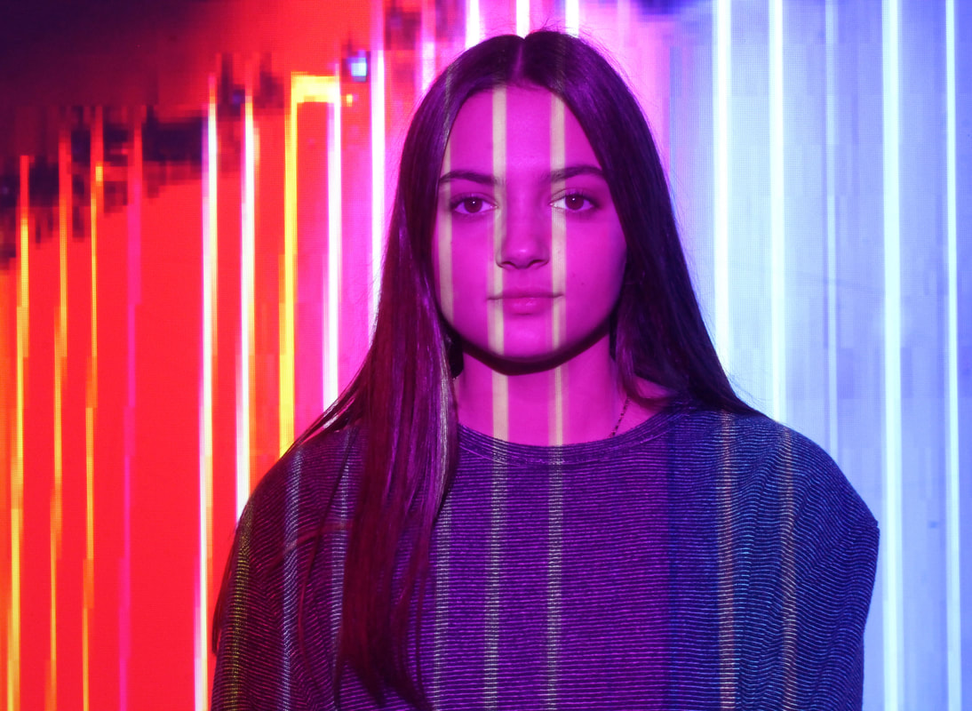
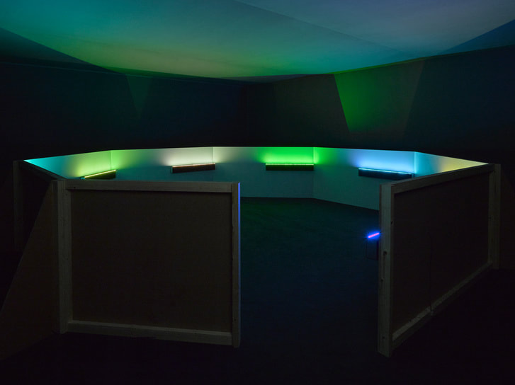
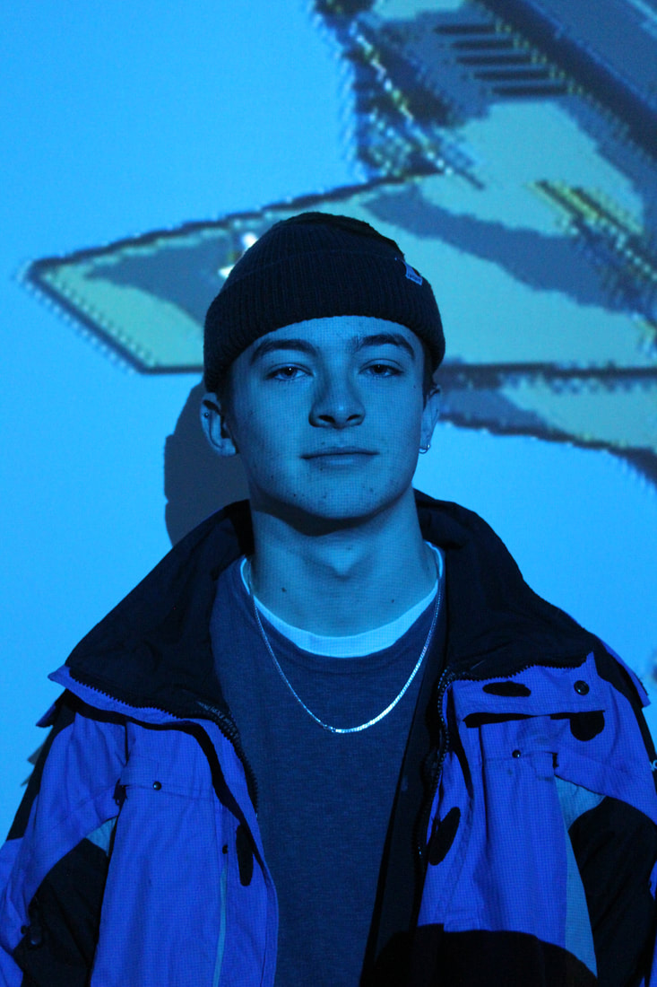
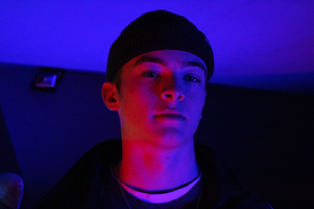
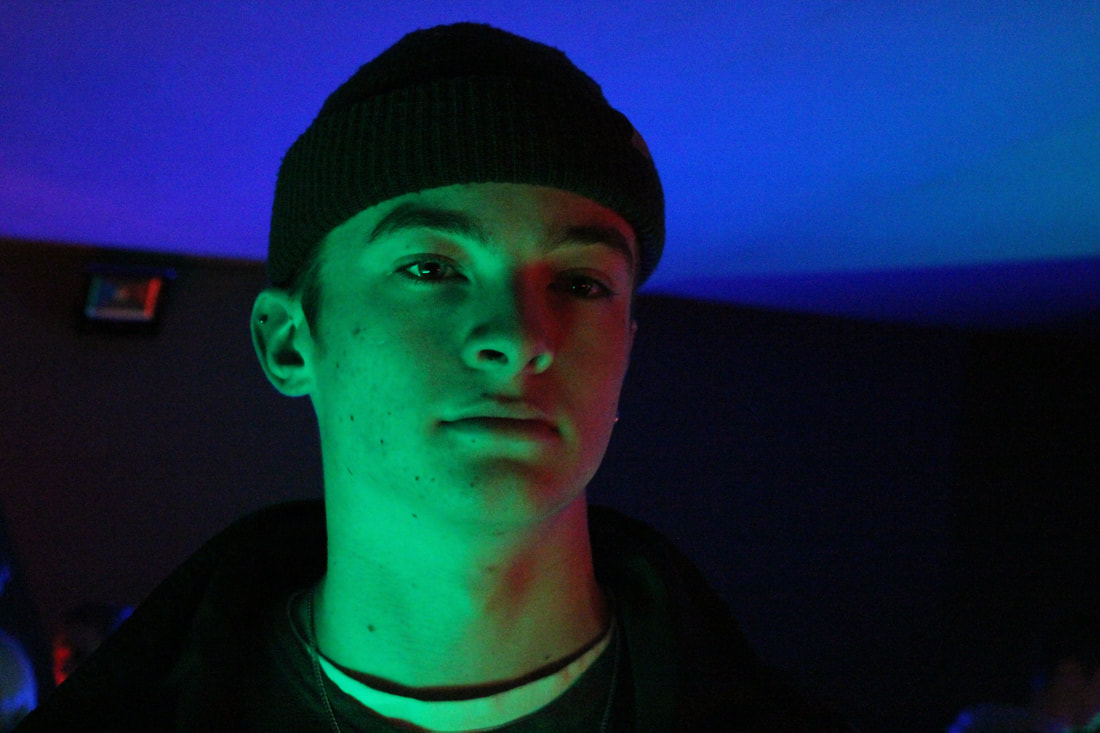
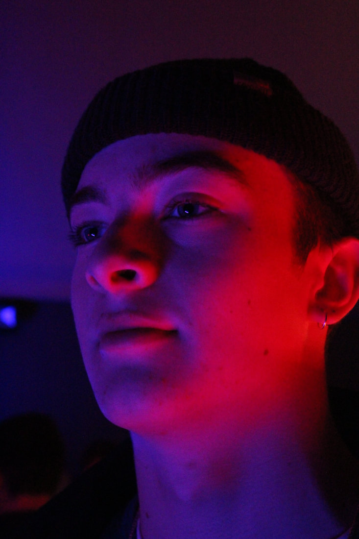
When taking images in the Everything At Once exhibition I noticed the best place within the exhibition that allowed me to have effective images was within the round circle which projected multiple different coloured lights, I found these lights allowed for the photographs I took to be much more effective in bringing multiple colours into the subjects face and creating depth and emotion within the images, allowing the images to look more prominent and less flattened unlike images taken previously with one set of light. The images below often include blue, red, green and purple colours making the images look more aesthetically pleasing. These images are my favourite in relation to the multiple sets of photoshoots I have taken that incorporate some sort of coloured lighting as they have add a better depth to the images and also add more emotion. I am happy with the outcome to these images and even the GIFs look effective and similar to the styling and emotions portrayed within the images of Petra Collins, Clark, and Teller.
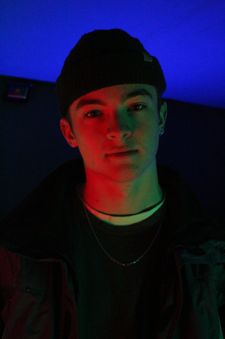
Final Images
|
|
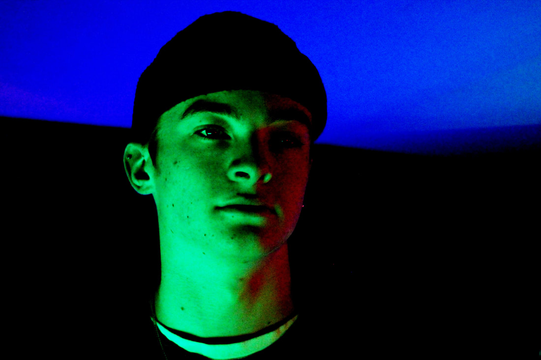
Above are my chosen final pieces, the images depict emotions and have raw connotations. I tried to involve the styles of Larry Clark, Petra collins and Corinne Day for my final images in order to portray the development of youth and the emotions they feel. Using Adobe Photoshop I edited these four images using the brightness and contrast tool in order to create a more moody look within the images. I also used the levels tool in order to darken the background of the images allowing the subject of the image, and the colours and emotions depicted on their faces to be the main focus of the image. I decided to use three images with the male subject, two with multiple colours within the image, these multi-toned images show resemblance to that of Petra Collin' and using her inspiration I tried to find ways in which to show the emotions of the subject through lighting and colours. The two other images which have blue tones to them also create depth and allow emotions to be visible through my photography. Initially I wanted to keep the coloured images lighter in order to maintain the boldness of the colours, however once experimenting with the darkness and contrast of the images I found that the images looked more effective with darker and moodier tones. I am happy with the outcome of these final images as they effectively allow the viewer to develop their own view of the emotions portrayed within them. In conclusion, I am happy with the outcome of these final images and am also happy with the editing of them to, to finish them off I will print them into large prints and mount them.
