|
|
The excess to the amounts of freedoms and limitations within the world of photography and the world itself, is endless. This means that it appears on so many scales and in so many places and therefore putting this into perspective with my photography task, it means that almost all photographer and artists can be used in order to express this theme. It is clear that both freedom and limitations are needed within most styles of photography in order for it to be effective and eye catching to the viewer. There can be no absolute freedom within photography either, as when taking the photographs themselves, the camera limits the perspective of the framing the picture takes, all objects and subjects around the frame of the camera are lost and this means that the image is limited. Photographers that look at the limitations and freedoms that photography gives you look at lots of different subjects, for example social class, subcultures, wealth, buildings and architecture and many more.
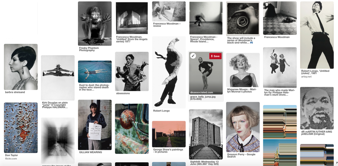
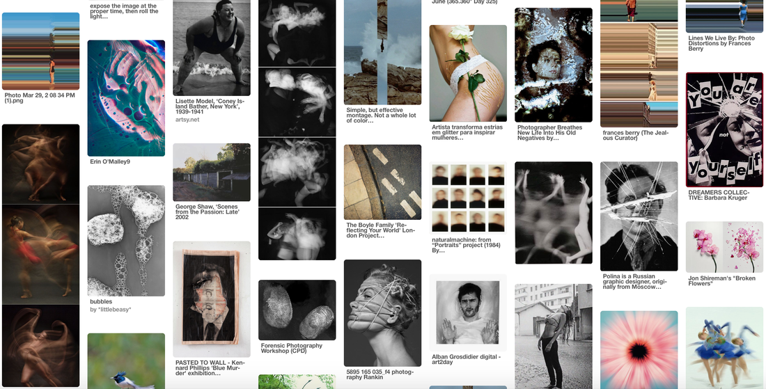
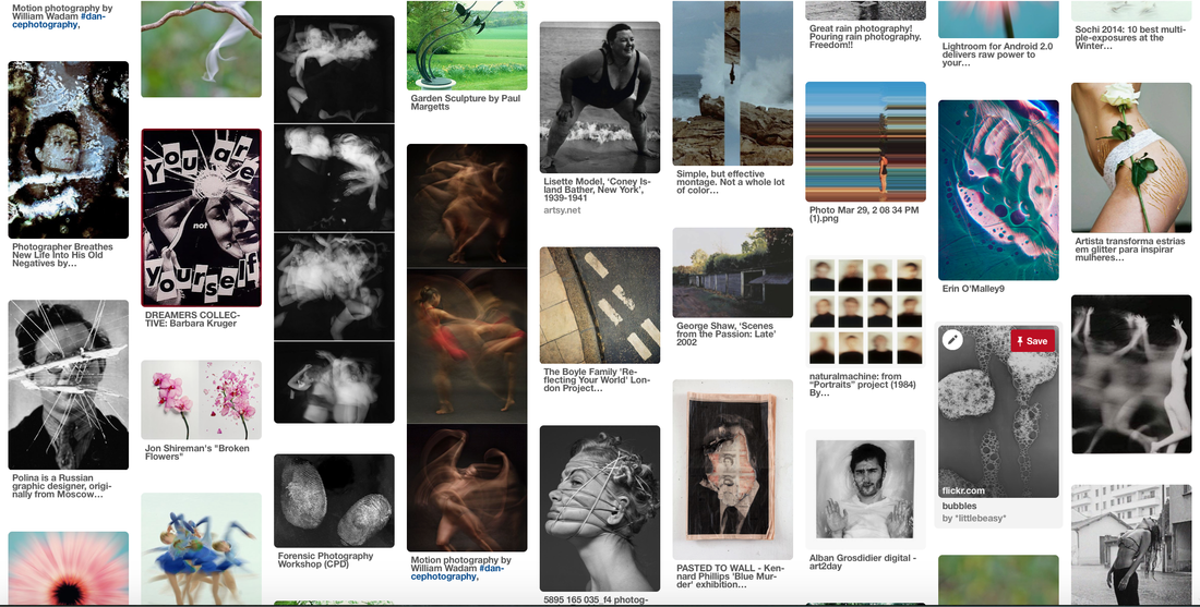
Freedom and Limitations Pinterest mood board:
Movement
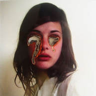
Francesca Woodman
Slow Shutter Speed:
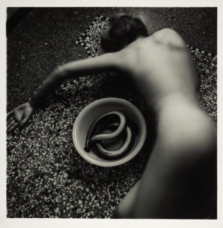
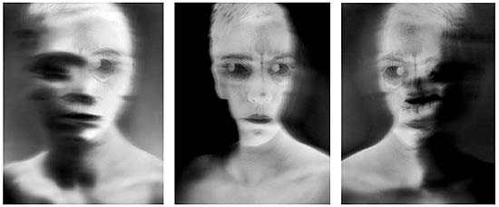
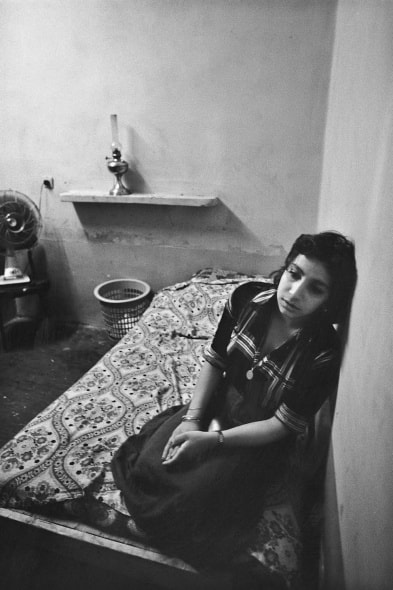
Francesca Stern Woodman (April 3, 1958 – January 19, 1981) was an American photographer best known for her black and white pictures featuring either herself or female models. Many of her photographs show women, naked or clothed, blurred due to movement and long exposure times, merging with their surroundings, or whose faces are obscured. Her work continues to be the subject of much critical acclaim and attention, years after she died by suicide at the age of 22, in 1981.
Although she was the model in most of her work, Francesca Woodman’s photographs do not function as typical self-portraits. Rather, she used her own image to explore the representation of gender and the relation of the body to its environment. Now that we know that Woodman committed suicide at 22 we can project a greater meaning on the images. Some critics have considered the images in the context of her mental health at the time and reached conclusions that she felt trapped and was looking for a way to escape.
Although she was the model in most of her work, Francesca Woodman’s photographs do not function as typical self-portraits. Rather, she used her own image to explore the representation of gender and the relation of the body to its environment. Now that we know that Woodman committed suicide at 22 we can project a greater meaning on the images. Some critics have considered the images in the context of her mental health at the time and reached conclusions that she felt trapped and was looking for a way to escape.
|
|
|
|
|
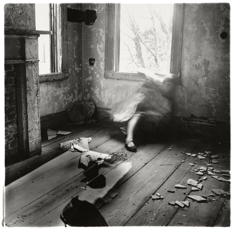
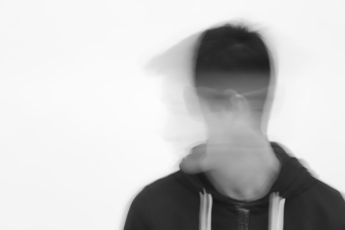
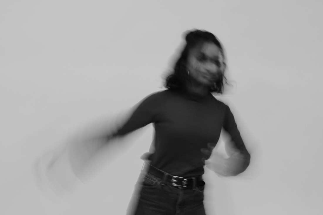
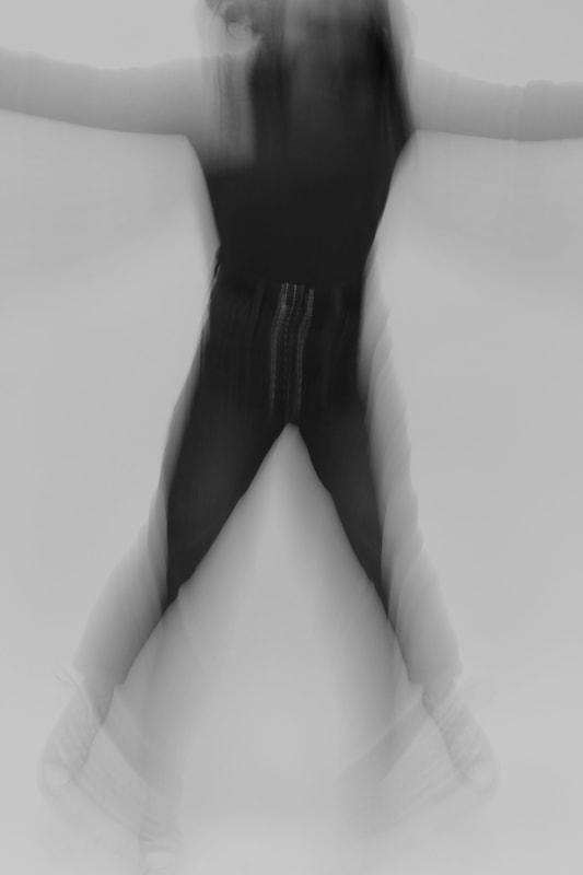
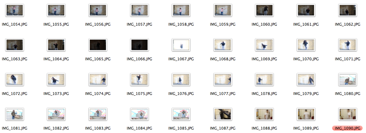
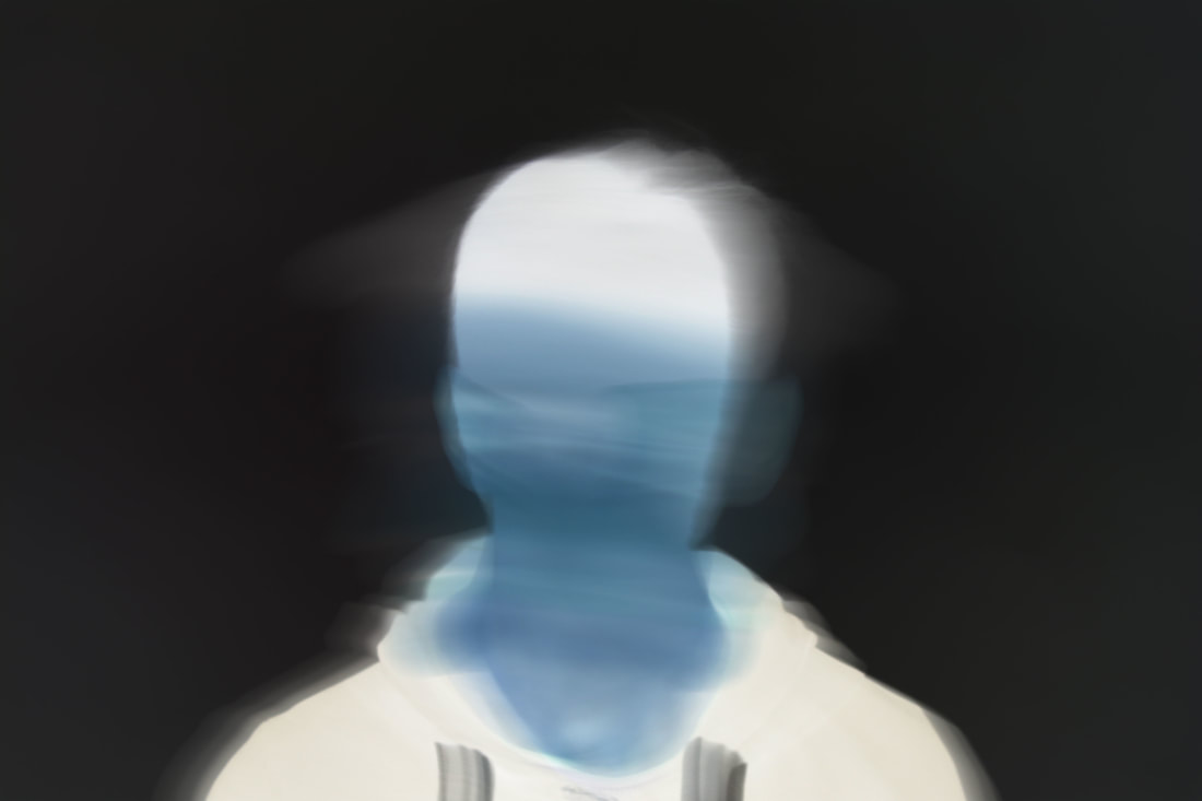
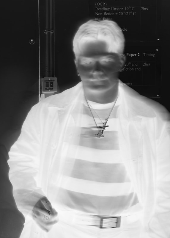
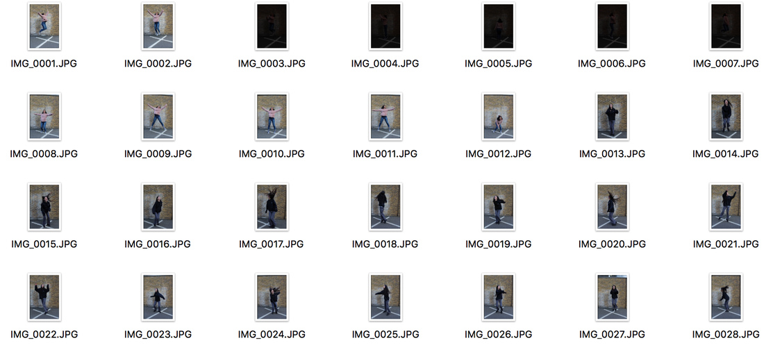
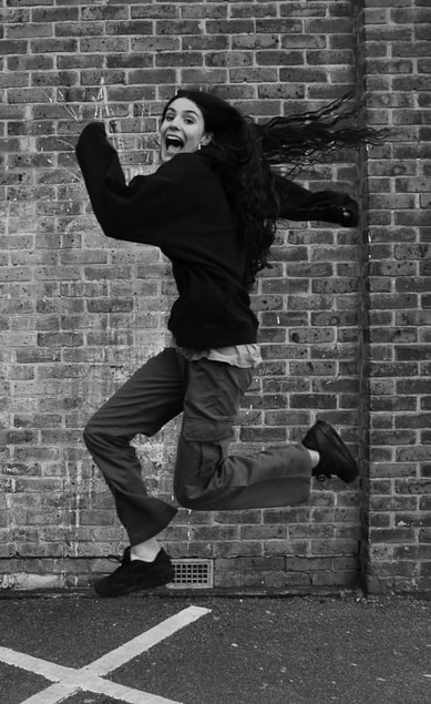
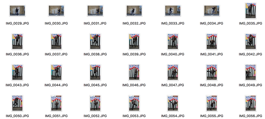
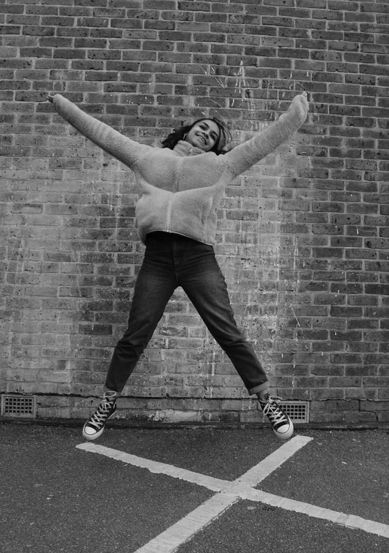
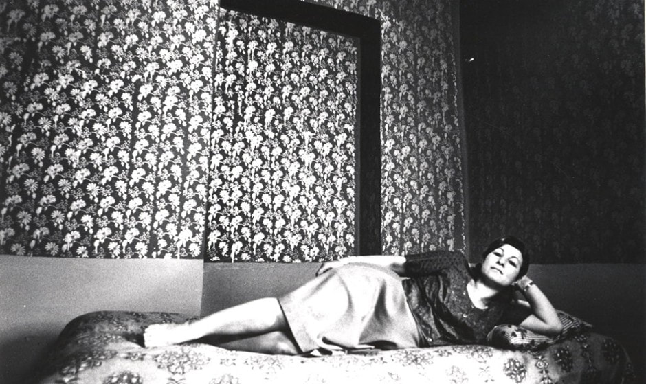
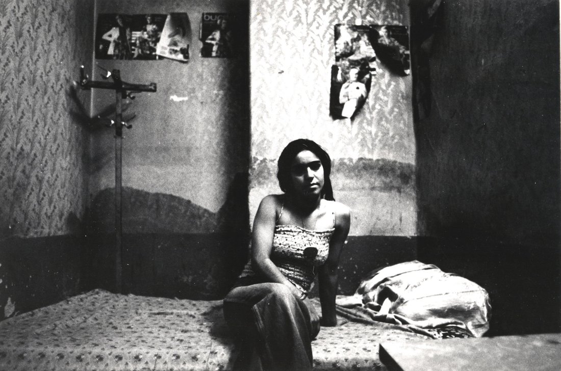
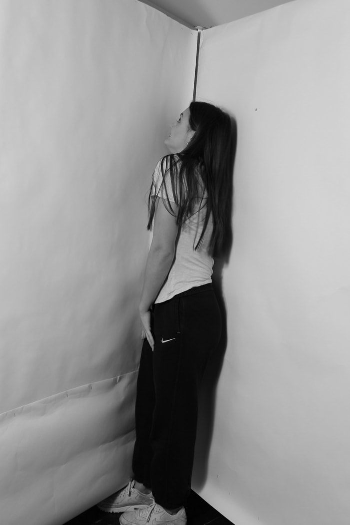
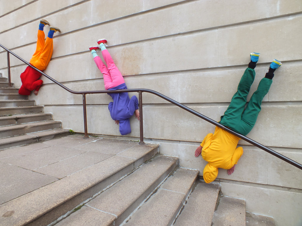
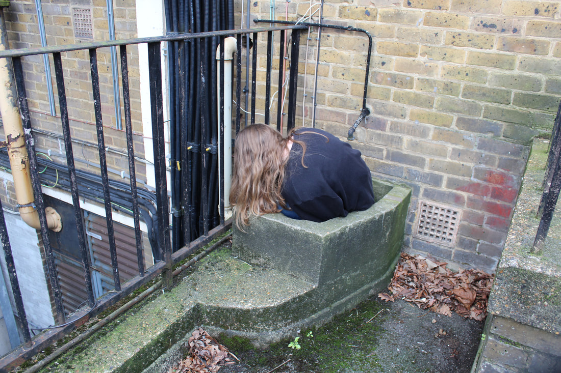
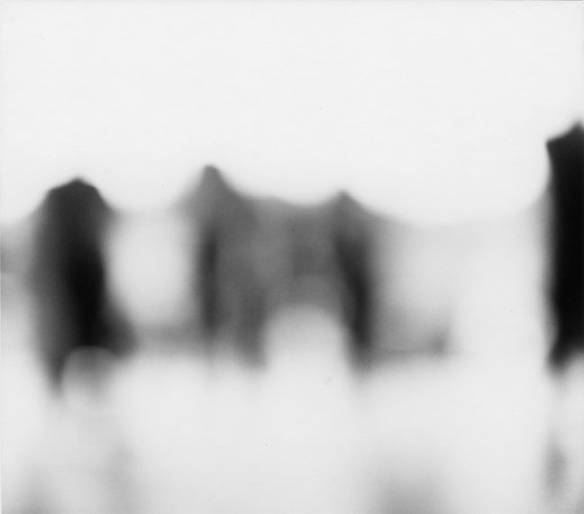
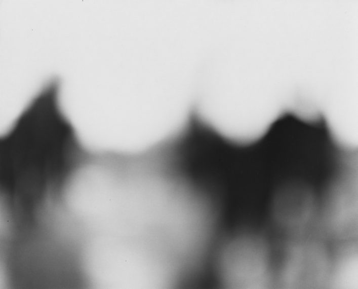
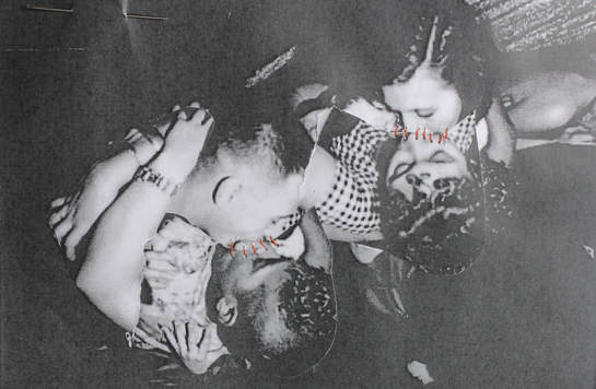
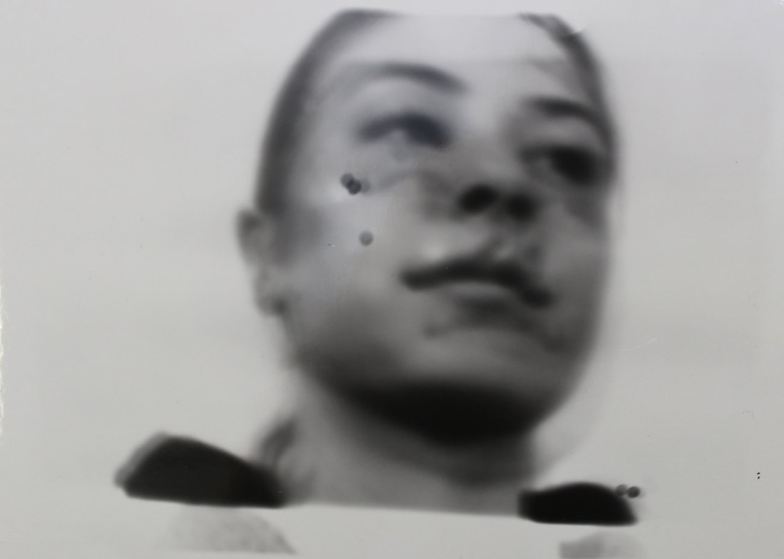
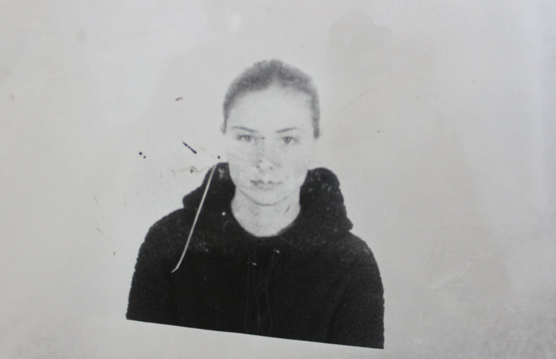
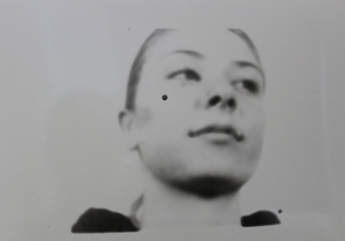
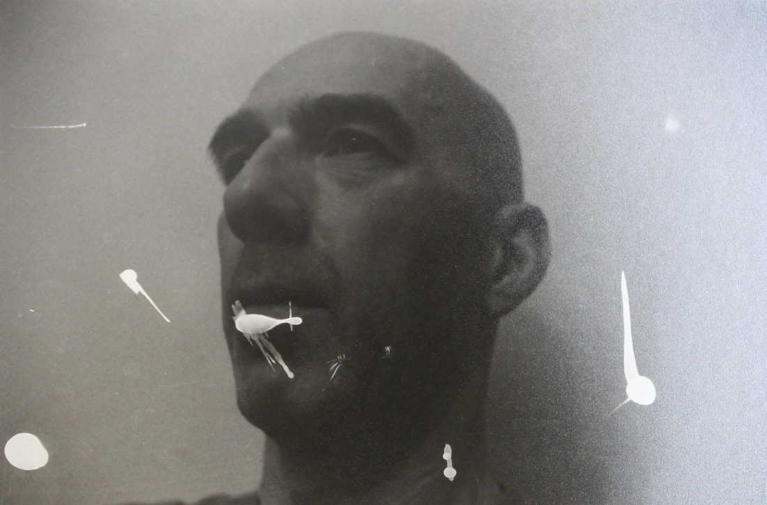
When trying to photograph my images in the same style as Francesca woodman I focused on the ideas of a reasonably slow shutter speed, as to make the images looked blurred, imitating her styled of the blur showing the limitation of Woodman's mind due to her mental health problems and inevitably portraying to the viewer her sense of mental instability through her photography.
The outcome of these images seem slightly restricted in comparison to Woodman's images, this maybe due to her professionally styled photography with such a raw message and inspiration to them. I tried to imitate the ways in which she kept focus onto specific parts of the subjects body which were still, however I found that it was increasing hard to make on part of the subjects body still, whilst the rest was in motion. Evidently this meant that when taking pictures of the moving subjects, all the image was blurred rather than just isolated parts of the subjects body. The Image of the subject spinning however is more effective in portraying and imitating Woodman's photography as parts of the face are more focused however the outcome is still not what I had initially intended. Overall, I think that my images do show effectively the ways in which a digital camera can function to create lots of different styles of images and therefore showing the freedoms a photographer has when using a digital camera to shoot specific subjects whether they are moving or still. |
|
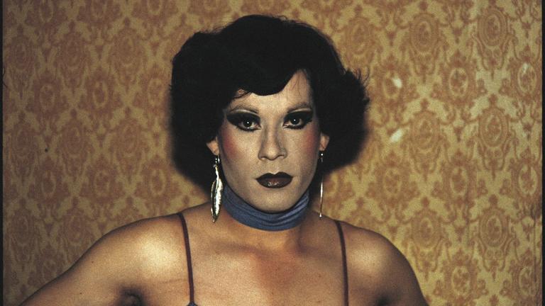
Laurence Demaison
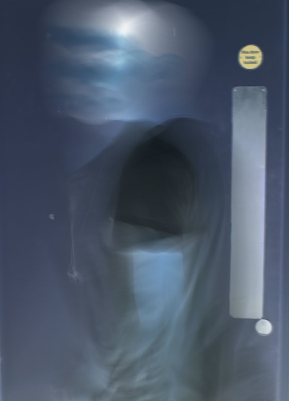
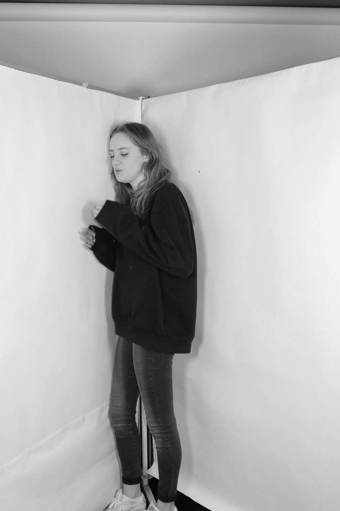
The photographic work of Laurence Demaison is exclusively constituted by self-portraits from 1993 to 2009. Since 2010 she occasionally uses mannequins or dolls. The used techniques – shot, development, print – are analogicals and realized by the author. No particular manipulation intervenes beyond the shot except chemical inversion of films for some series. Particularly interested in the female portrait and nude, and finding it difficult to adequately convey her mental images into words and direction, she gave up on the use of models and began to use herself exclusively as the subject of her photographs. Rather than portraying her body as it was, she sought to conceal, modify, even destroy it and reconstruct it in a form more acceptable to her. The result is a series of self-portraits which expertly use the reflective and distortive qualities of her materials along with the shadowy effects of light and negative images to create "paper phantoms", ghosts of herself that are there, yet disappear in an instant. It is clear that Laurence Demaison explores the freedom and limitations of the camera, using the complete exposure of her images, and switching the images into negative showing and exploring the ideas of the freedoms the camera (digital or film) and the way in which an image can be expressed using editing and the functions of the camera.
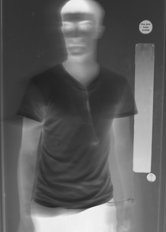
Above, are edited images created to imitate Laurence Demaison's images. To create this sort of style I put my images into Abode Photoshop depending on the image I edited them specifically, for example the blue toned image to the right was edited by inverting the colours within the image. However, images with no colour were made by making the image black and white first and then the image was inverted. Overall, I am happy with the outcome of this response as they effectively portray the limitations created using my camera, for example the camera cannot find the focus for the image, so the image created is limited to blurs. The use of the lower shutter speed allows these sort of images to be created, showing the freedom allowed when photographing subjects using a digital and modern camera, rather than a film camera, which takes more time and practise in order for the images to have the same outcome of that of the digital camera.
|
|
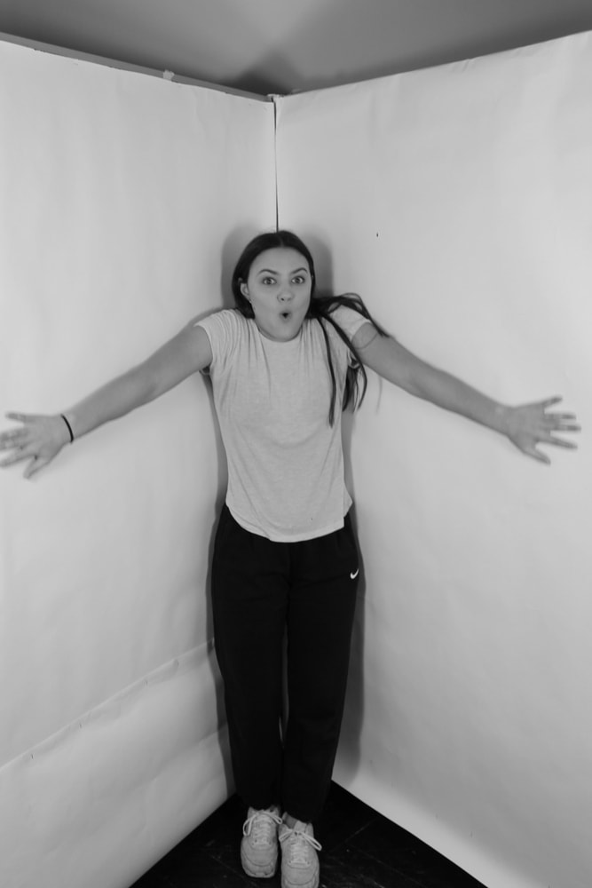
MOVEMENT: - Philippe Halsmann
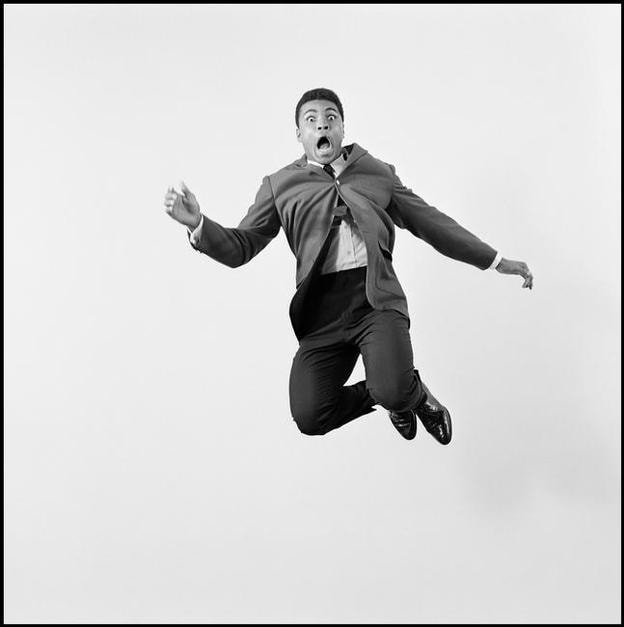
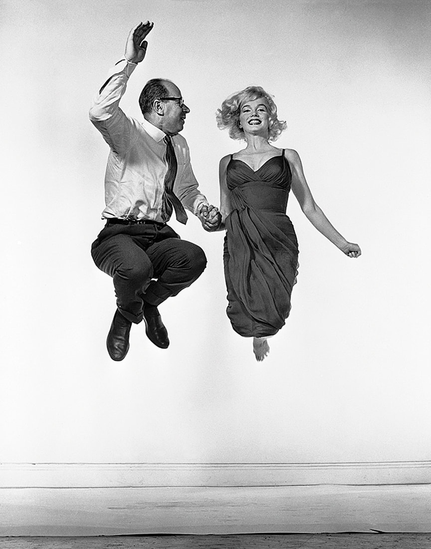
"Starting in the early 1950s I asked every famous or important person I photographed to jump for me. I was motivated by a genuine curiosity. After all, life has taught us to control and disguise our facial expressions, but it has not taught us to control our jumps. I wanted to see famous people reveal in a jump their ambition or their lack of it, their self-importance or their insecurity, and many other traits." –P.H.
When comparing my images, edited in Adobe Photoshop into black and white, to Philippe Halsmann's photography, I found that the resemblance and comparison is very similar. I am very happy with the outcome of these images as they positively portray the facial expression of the subject and provided a way to gain insight into their psychological thoughts as Halsmann calls it ' Jumpology', just as Halsmann's images did.
As you can see the images are clearly portraying the subjects facial expressions, giving a more interesting insight into the subjects thought process rather than just taking plain portraits in the studio. The backdrop, brickwork, contrasts to Halsmann's studio background however I found that these backgrounds still look effective in relation to the images as a whole. |
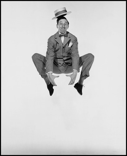
An acclaimed portrait photographer, with 101 Life Magazine covers to his name, over a period of six years Halsman asked all of his most famous and accomplished sitters to jump for his camera. He embraced the posture as an art form, finding that it opened up a whole new mode of portraiture. Through liberating his subjects from the conventions of traditional portrait photography, jumping also provided a way to gain insight into their psyche, and Halsman identified it as a new psychological tool, which he termed Jumpology. Fascinated by jumping since his childhood, Halsman was both a prolific and skilled jumper until a cracked iliac prevented him from engaging in the activity. His incorporation of jumping into his photographic practice began during a shoot of the Ford family to celebrate the company’s fiftieth birthday. The initial shoot went particularly badly, but, whilst having a drink with the family after, Halsman became overwhelmed by the desire to shoot Mrs. Edsel Ford jumping. The successive photographs saved the assignment and, from then on, Halsman asked every important sitter he photographed to jump.
Photographing my subjects allowed me to embrace the posture of the person as an art form, allowing me to find that this opened up a whole new mode of portraiture. The black and white style also adds to the mood of the images, however instead of making the images seem as a darker mood, the facial expressions of the subject allowed contrast between the colouring. Each different subject took different positions when jumping allowing for lots of different and effective images. Again this sort of exercise has allowed me to explore the ways in which the camera can be manipulated, and images themselves can be manipulated digitally in order for the outcome of them to babe more original and exciting than that of those which are plainly taken and presented.
|
Exhibition visits:
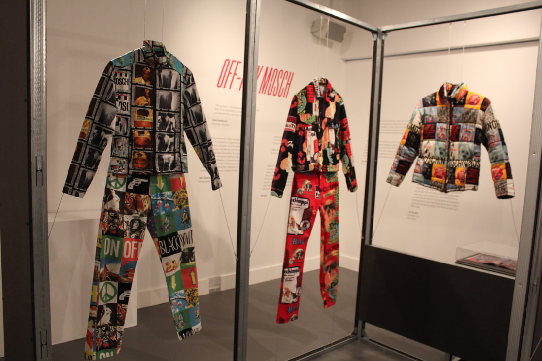
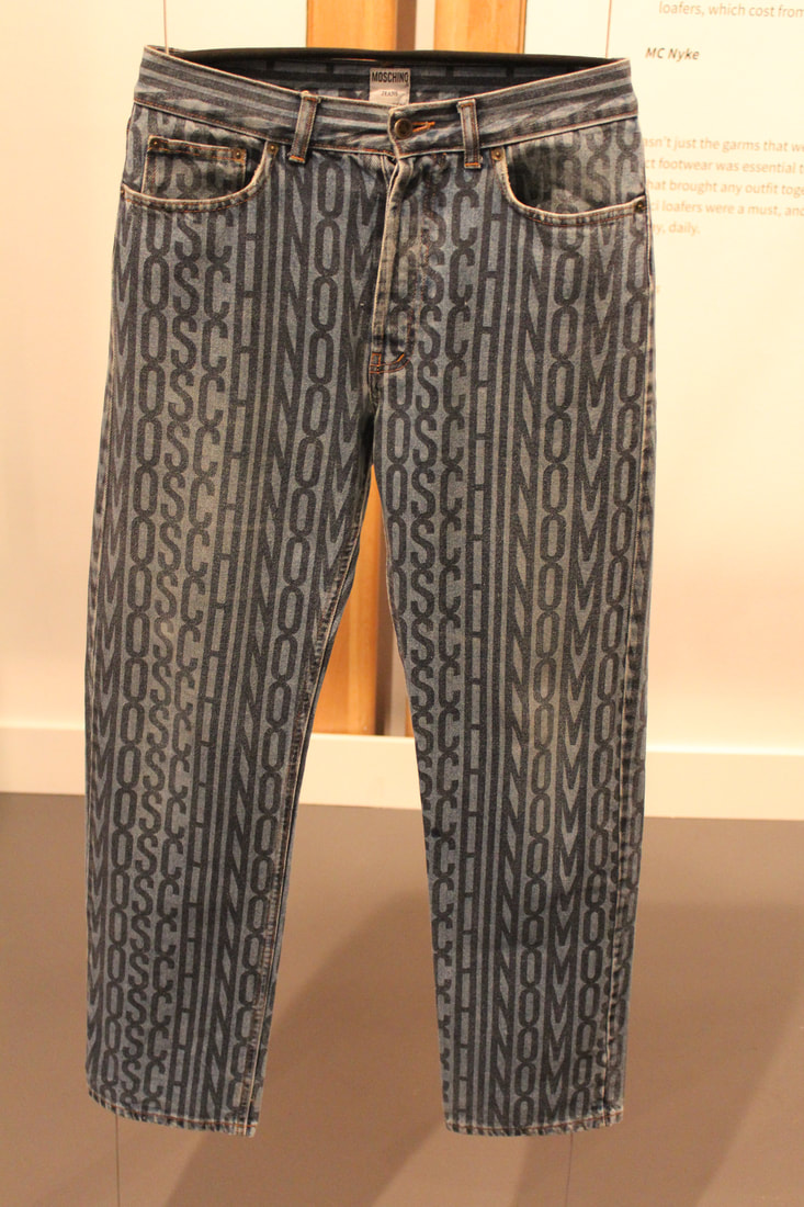
Super Sharp - Fashion Space Gallery
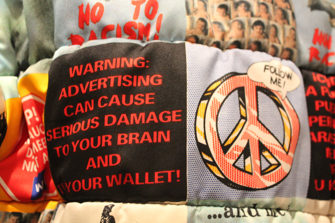
Super Sharp is curated by Tory Turk and Chase & Status’ DJ and producer Saul Milton. It explores the role of luxury Italian designer brands in the underground music scenes of Jungle and UK Garage. Versace, Moschino, Iceberg and D&G are examples of labels that ruled the dance floor in the nineties. Moschino, in particular, became synonymous with the look associated with that era. UK Garage emerged in the mid-90s in South London with hype around the genre reaching its height between 1998-2000. With its roots in the original Garage sound which began in 1980s New York it often incorporated soulful R&B-inflected vocals combined with a distinctive 4×4 percussion rhythm and heavy sub-bass. It brought with it stricter door policies, refusing entry to clubbers wearing caps and trainers. The sound attracted more females, which in turn changed the attitudes within the club. Dancing and posing became even more about flaunting affluence; it was more restricted, classier and sexier.
|
The exhibition traces the emergence of the Jungle and UK Garage music scenes and the shift in club culture and style it initiated. Jungle – a form of electronic dance music derived from old school hardcore and heavily influenced by Jamaican sound-system culture – was born out of the Bristol and London underground rave scenes in the early 1990s. Developed through pirate radio it directed its audience to licenced raves in and around London. This club venue environment inspired a new raving style – integrating the colourful look of rave culture with urban combat gear and flashy designer labels.
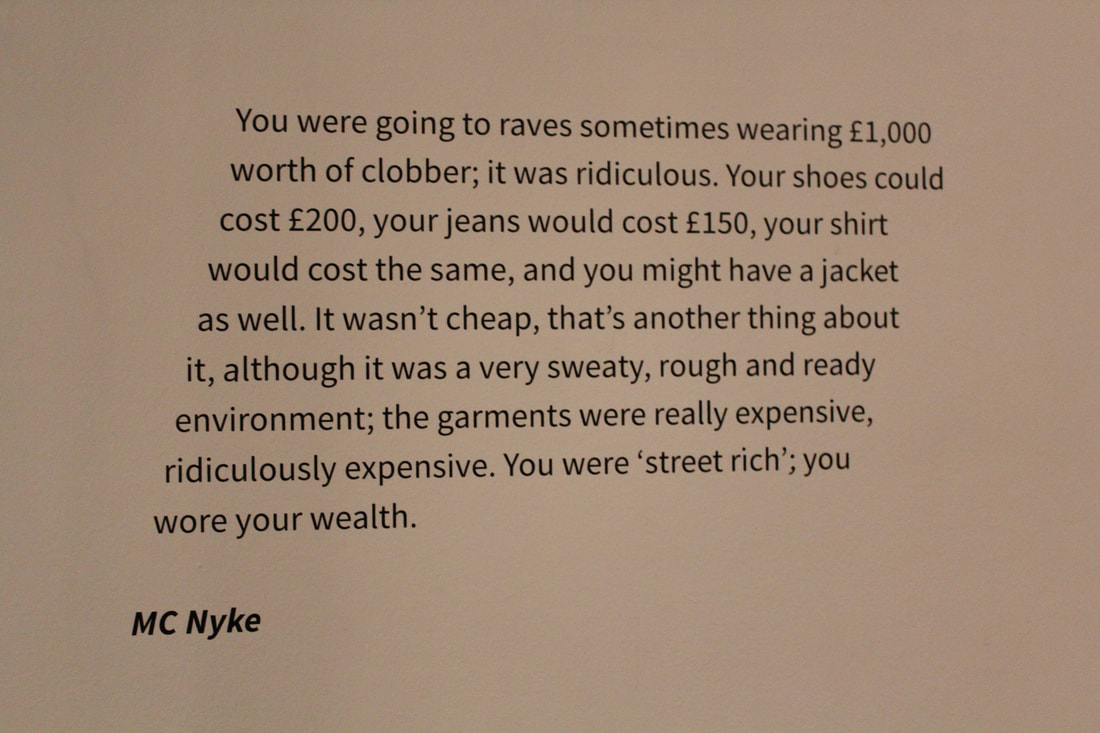
When looking at the exhibitions links to Freedom and Limitations it is evident that those who included themselves within the jungle and garage music scenes had the freedom during these times to dress as they wanted, using bold and strong graphic design incorporated within their garments, allowing them to freely express themselves and present themselves how they want. This shows the freedom to the younger youth culture of the 1990s. However, an extreme limitation to the garments associated with the jungle and garage music scenes is the fact that these sort of branded clothes, made by named brands such as Moschino, gucci and Fendi, would cost lots of money, for example some people would end up in these sweaty raves wearing £1000 worth of clothes. This costly style meant that those who could not afford such clothes would be limited within the movement, it is seen that those wearing the better and more expensive clothes are the most important. The people within this movement essentially wore their wealth as stated by MC Nyke. 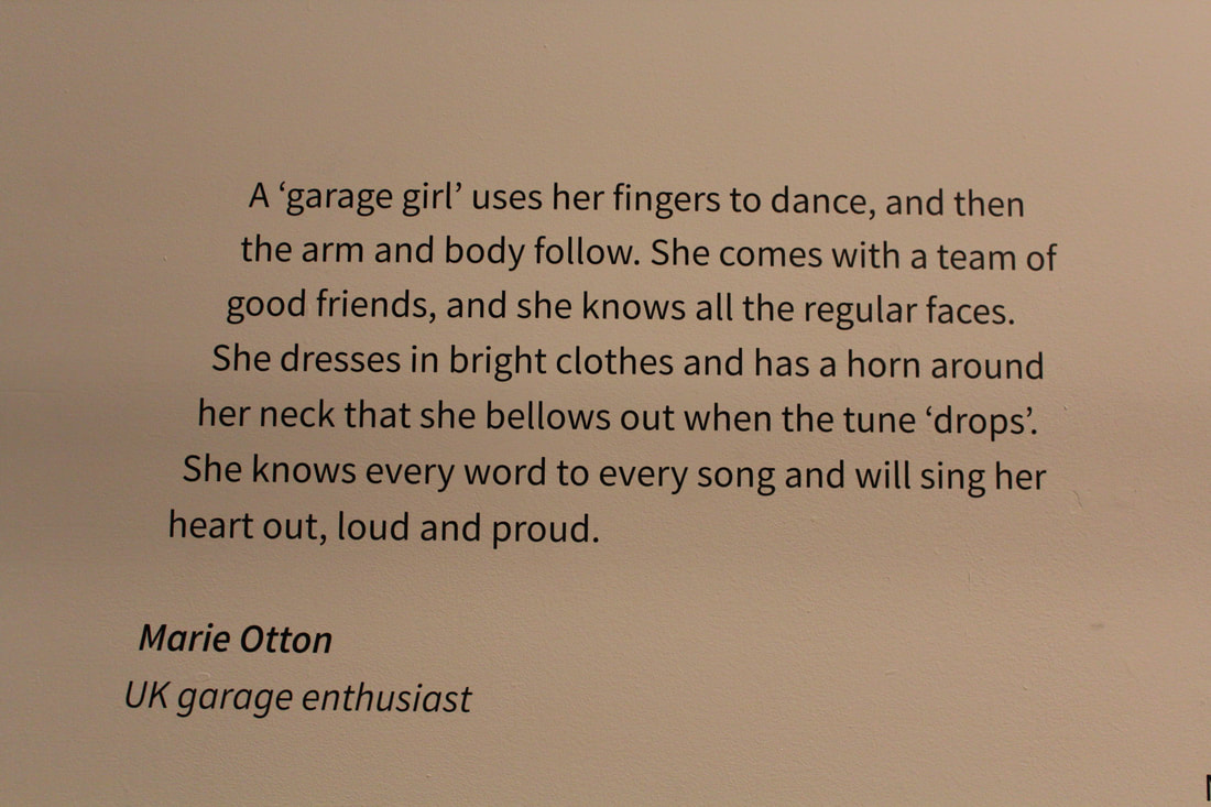
|
The Tate Modern:
Kaveh Golesta
|
Kaveh Golestan's socially engaged photography exposes the plight o people living on the margins of society. Golestan's series of portraits taken between 1975 and 1977 documents sex workers from the former red light district, Shahr-e No, in Tehran, Iran. Following the 1953 Iranian Coup a wall was erected around the area, creating an inner-city ghetto where approximately 1,500 women lived and worked. Here Golestan witnessed 'the social, financial, hygienic, behavioural and psychological problems, that exist in everyday society, magnified.'
Golestan spent several years researching the area and gaining the trust of the residents, developing a connection with his subjects evidenced by the sensitivity of his portraits. Golestan believed in the power of art to challenge accepted narratives. By documenting harsh realities with brutal honesty he hoped to raise awareness of the issues facing society and encourage the public to take action. Golestan commented, 'I want to show you images that will be like a slap in your face to shatter your security. You can look away, turn off, hide your identity ... but you cannot stop the truth. No one can.' |
During the Iranian revolution of 1979 Shahr-e No was deliberately set alight. The authorities made no attempt to put out the fire and there are no records of how many women died. Under the newly formed Islamic Republic, the area was demolished in an act of 'cultural cleansing' and today bears no reference to its past. Golestan's images are among the last know records of the women of Shahr-e No.
When connecting Golestan's emotive images to the theme of Freedom and Limitations it is evident that the women working and living in this part of Iran had limitations within their lives which made them have to turn to sex work, obviously we do not know specifically what limitations did make them have to turn to such a life style but what we do know is that Kaveh Golestan stood as their freedom, as they allowed him to take photographs of themselves allowing their stories to spread a message to others who end up seeing the images. However Golestan's images only stood as a small amount of freedom of these women and we see that the destruction this red light district stands as their life long limitation where they struggled with equality and financial stability. The burning of this area shows how hates limits these people and how the lack of respect and care they received meant that their lives ended limited, these women did not receive the freedom needed for them to grow into figure heads as their class and gender came as a constant limit for them within the Iranian society.
When connecting Golestan's emotive images to the theme of Freedom and Limitations it is evident that the women working and living in this part of Iran had limitations within their lives which made them have to turn to sex work, obviously we do not know specifically what limitations did make them have to turn to such a life style but what we do know is that Kaveh Golestan stood as their freedom, as they allowed him to take photographs of themselves allowing their stories to spread a message to others who end up seeing the images. However Golestan's images only stood as a small amount of freedom of these women and we see that the destruction this red light district stands as their life long limitation where they struggled with equality and financial stability. The burning of this area shows how hates limits these people and how the lack of respect and care they received meant that their lives ended limited, these women did not receive the freedom needed for them to grow into figure heads as their class and gender came as a constant limit for them within the Iranian society.
|
|
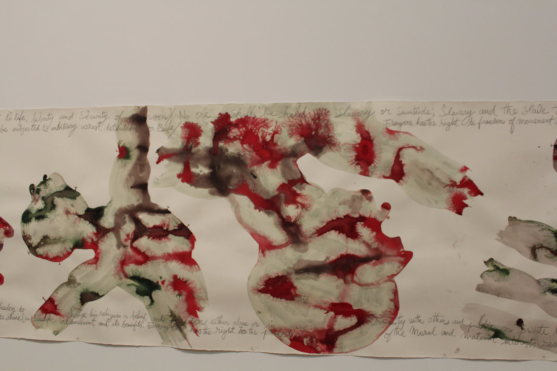
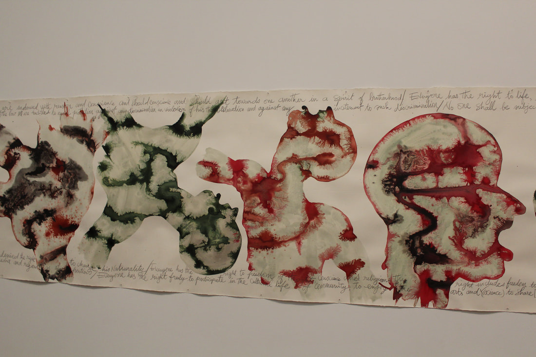
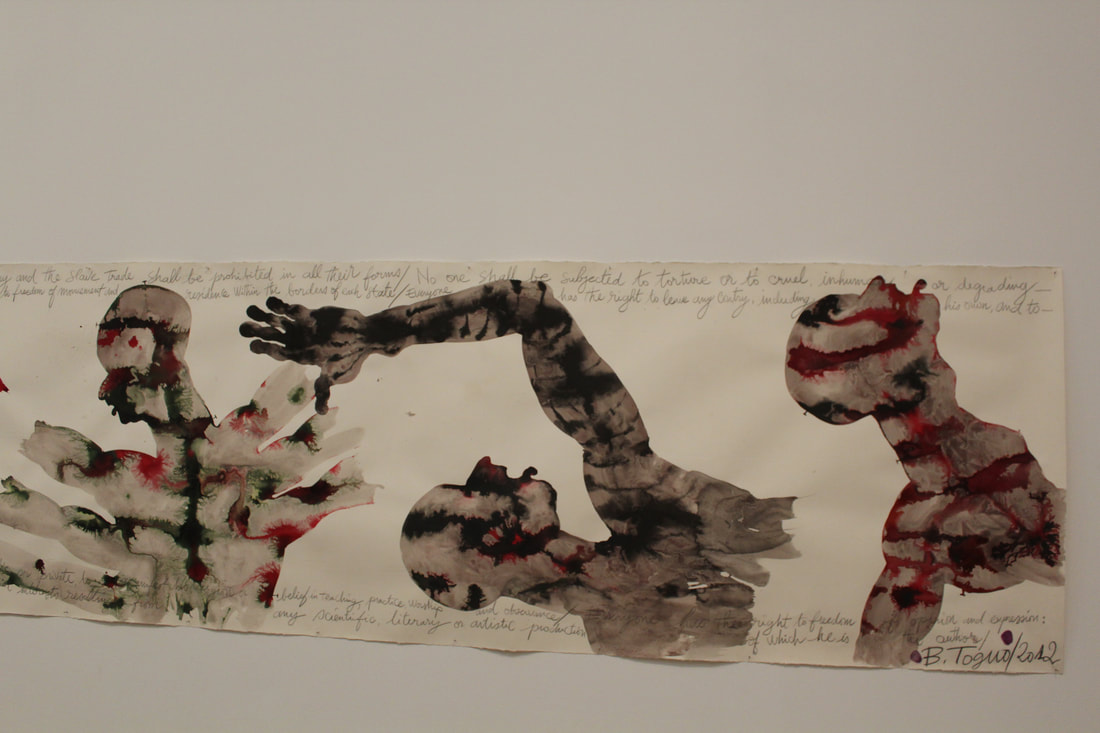
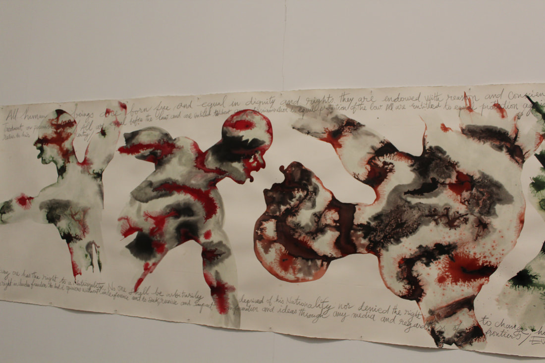
Barthélémy Togo - Purification 2012
|
|
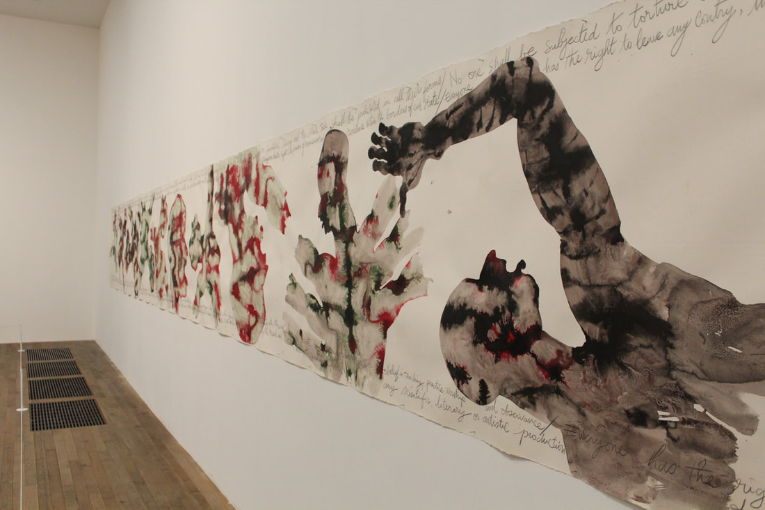
In a globalised world where, for some at least, travel and movement is easy, Barthélémy Toguo exposes the absurdities of borders and boundaries and explores the effect travel and transition have on an individual’s sense of identity, freedom and human relationships and emotions.
This vast, banner-like watercolour painting is covered with a sequence of human figures interwoven with handwritten sentences taken from the Uniter Nation's Universal declaration of Human Rights. 'Purification was born from my response to sufferings endured by various groups of people around the world, including the genocides, slaughters, decorations and discriminations during the 20th century. Togo has said. 'I have unrolled my vision in a nightmare frieze: human beings are abused, tortured, amputated, beaten to death... Man must regenerated his own culture ... HE must operate a purge over himself and purify [himself] from his crimes and horrors.' This new site-specific large watercolour for the Whitworth, Purification, is based on an interpretation of the sufferings experienced by various populations through deportations and genocides of the last century.
Toguo's work links to the freedom and limitations set within society for example how those are limited within society due to their oppression which includes dictatorship societies and societies in which dangerous and strong groups have power and make society members into unwilling slaves. The oppressors being the strong and powerful are the ones who put limits onto society members while those in power have freedom to do what they please, only through death are these limitations lifted off the oppressed and only then do the powerful loose power.
Another Kind Of Life - Photography on the margins - The Barbican
Another Kind of Life: Photography on the Margins looks at the fascination of those who live in the margins of society through photography. Some of the most powerful images of the 20th and 21st century are the result of an engagement with communities seemingly on the fringes of the mainstream society. Another Kind of Life explores photography’s relationship with this subject through the work of 20 photographers and artists, including Bruce Davidson, Paz Errázuriz, Casa Susanna, Larry Clark, Mary Ellen Mark, Boris Mikhailov, Daido Moriyama and Dayanita Singh.
Reflecting a diverse and authentic view of the world, the exhibition explores the themes of gender and sexuality, subcultures and minorities of all kinds. Using over 300 works from the 1950s to now, the exhibition includes vintage and contemporary prints, specialist magazines, rare film and photo books, from photographers who've developed relationships and bodies of works over months, years or decades. By recording and documenting those on the edges, or outside of the mainstream, the images in Another Kind of Life portray how social attitudes change across time and space, presenting how visual representation have helped shape current marginalised and alternative communities.
Reflecting a diverse and authentic view of the world, the exhibition explores the themes of gender and sexuality, subcultures and minorities of all kinds. Using over 300 works from the 1950s to now, the exhibition includes vintage and contemporary prints, specialist magazines, rare film and photo books, from photographers who've developed relationships and bodies of works over months, years or decades. By recording and documenting those on the edges, or outside of the mainstream, the images in Another Kind of Life portray how social attitudes change across time and space, presenting how visual representation have helped shape current marginalised and alternative communities.
|
|
The main interpretation I gained from this exhibition on a whole is the idea that photographers have to get personal and involved with their subjects in order to create properly raw and meaningful images that do not look staged, the more candid an image the more representative it is to the reality of the subjects life. Photographers such as Larry Clark are described within the exhibition as "Not an objective observer, fly on the wall documentarian or voyeuristic outsider, but rather as a deeply embedded insider and participant whose eye is unapologetically autobiographical. His series 'Tulsa' portrays sex, drugs and violence captured in a raw, grainy monochrome that came to define the untrammelled confessional style adopted later by Nan Goldin and Corinne Day." Similarly to this photographer Bruce Davidson states within the exhibition " I start off as an outsider, usually photographing other outsiders, then, at some point. I step over a line and become an insider. I don't do detached observation".
Another interpretation I found from the Another Kind Of Life exhibition was the idea that the photographer can successfully portray the set ideal and values each group photographed has, allowing them to present themselves differently to the rest of society showing the sense of community within these subcultures and the sense of belonging the members felt when being with their groups. Photographer Walker Pfeiffer states within the exhibition "Poloraids and films revealed a flourishing underground community intent on flouting the rigid social conventions of the time. A homage to the desire and seduction of youth, Pfeiffer's irreverent and prosaic images depict a world at odds with conventional society." Philippe Chancel's images portray a gang of outsiders trying to foster their own sense of belonging - to the gang, the tribe, the style and not belonging to the mainstream, the country and a growing nationalist identity. Similarly Chris Steele-Perking bore witness to both the subjects public displays of tom foolery and behind the scenes episodes, allowing him a position of photographic spokesman, whether as insider or an outsider.
Another interpretation I found from the Another Kind Of Life exhibition was the idea that the photographer can successfully portray the set ideal and values each group photographed has, allowing them to present themselves differently to the rest of society showing the sense of community within these subcultures and the sense of belonging the members felt when being with their groups. Photographer Walker Pfeiffer states within the exhibition "Poloraids and films revealed a flourishing underground community intent on flouting the rigid social conventions of the time. A homage to the desire and seduction of youth, Pfeiffer's irreverent and prosaic images depict a world at odds with conventional society." Philippe Chancel's images portray a gang of outsiders trying to foster their own sense of belonging - to the gang, the tribe, the style and not belonging to the mainstream, the country and a growing nationalist identity. Similarly Chris Steele-Perking bore witness to both the subjects public displays of tom foolery and behind the scenes episodes, allowing him a position of photographic spokesman, whether as insider or an outsider.
Limited space - Studio - Irving Penn
Sometime in 1948, Penn began making portraits in a small corner space made of two studio flats pushed together, the floor covered with a piece of old carpeting. To quote the photographer:
“a very rich series of pictures resulted. This confinement, surprisingly seemed to comfort people, soothing them. The walls were a surface to lean on or push against. For me the picture possibilities were interesting: limiting the subjects’ movement seemed to relieve me of part of the problem of holding on to them.” |
|
Penn’s subjects constituted a wide spectrum of writers, dancers, artists, socialites, musicians, political figures and other celebrities of the era. Among those who found their way into Penn’s corner were Noel Coward, the Duchess of Windsor, Marcel Duchamp, Joe Louis, the Gish Sisters, Duke Ellington, and Truman Capote. Penn had already begun to use the studio as an insistent environment in which the viewer is allowed to see the electrical cables, edges of backdrops, and the photographic detritus randomly scattered along the floor. This particular series, however, utilized the ruse of a sharper-than-90º corner in which the subjects position themselves. Some are wedged in as if suspended by their shoulders, others lean against it for compatible support, compressed and altered by the claustrophobic space. These are existential pictures; pictures in which “personalities” are isolated, posed in an abstract and artificial corner of the world. The pictures limn the unique and historic time in which they were made; the 1940s was a time of violent change and new beginnings, in which these daring intellects and talents thrived. Using this sort of claustrophobic setting allowed Penn to explore the change of persons expression, mannerism and positioning when forced into a limited space, therefore linking to the ideas of limitations within photography, however these limitations also allowed Penn's subjects a new type of freedom not experienced before as they are able to express themselves more prominently.

|
|
|
The above images that imitate and are meant to correspond with Irving Penn's work are produced in order to see the reactions to the subjects positioning within the claustrophobic space. As seen above, the set itself was not as professionally created as that of Irving Penn's photography. For example, where Penn used a carpet the same colour as his backdrop, I have a different coloured floor, this led to a distraction in the images as instead of a monochrome background with the focus on the shaping and positioning of the subject, instead I found that the focus of the images is drawn more to position of the feet, due to the change of colour. Therefore, if I was to develop this type of photography any further, I would try a different type of set up in the studio in order to minimise these distractions with the images, maybe by cropping the bottom of the images could also help however I then feel like the focus would be lost as the whole of the subject would no longer be in the images. I would also like to edit the top of the images in order for the top of the two white boards, used to create the space, to be no longer in the images. Overall, despite these minor set backs that could be changed if needed, I am happy with the overall outcome of these images. With the facial expressions and changes in the postures of the subjects leading to very interesting photographs. I believe Irving Penn's images are more successful than mine, however this is inevitable due to the professional status of Penn. I tried using the same black and white colouring that Penn used in order to increase the effectiveness of my images too.
Limited space - Around the school site - Willi Dorner
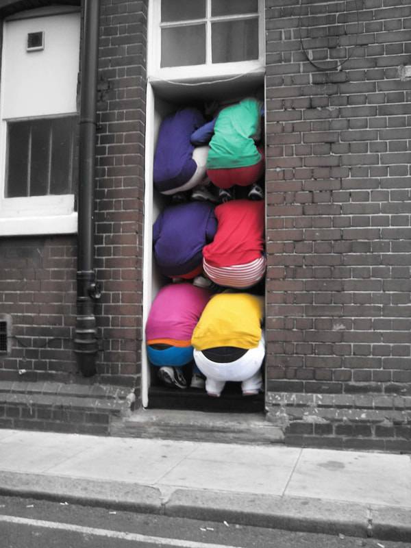
Austrian artist Willi Dorner squeezes human bodies into nooks and crannies for his Bodies in Urban Spaces project. Groups of dancers, climbers and performers wearing brightly coloured clothes run through busy malls and high streets and cram themselves into doorways, alcoves and any gap they can find in public buildings. During a tour of Austria, England, France, Norway, Sweden, Finland and the US, Willi and his cohorts have drawn attention from local police who have stopped several performances for fear they were burglars or vandals.
'Bodies in urban spaces' is a temporarily intervention in diversified urban architectonical environment. The intention of 'bodies in urban spaces' is to point out the urban functional structure and to uncover the restricted movement possibilities and behaviour as well as rules and limitations. By placing the bodies in selected spots the interventions provoke a thinking process and produce irritation. Passers by, residents and audience are motivated and prompted to reflect their urban surrounding and there own movement behaviour and habits. 'Bodies in urban spaces' invites the residents to walk their own city thus establishing a stronger relationship to their neighbourhood, district and town. The interventions are temporarily without leaving any traces behind, but imprints in the eye-witnesses memory. It is clear from Dorner's artistic presentation that he is trying to explore the limitations within society, figuratively and literally, exploring the ideas of how despite the limitations of the positions his models are put into, they have the freedom to express their positioning as they want, expressing again a type of freedom stuck within a limitation.
'Bodies in urban spaces' is a temporarily intervention in diversified urban architectonical environment. The intention of 'bodies in urban spaces' is to point out the urban functional structure and to uncover the restricted movement possibilities and behaviour as well as rules and limitations. By placing the bodies in selected spots the interventions provoke a thinking process and produce irritation. Passers by, residents and audience are motivated and prompted to reflect their urban surrounding and there own movement behaviour and habits. 'Bodies in urban spaces' invites the residents to walk their own city thus establishing a stronger relationship to their neighbourhood, district and town. The interventions are temporarily without leaving any traces behind, but imprints in the eye-witnesses memory. It is clear from Dorner's artistic presentation that he is trying to explore the limitations within society, figuratively and literally, exploring the ideas of how despite the limitations of the positions his models are put into, they have the freedom to express their positioning as they want, expressing again a type of freedom stuck within a limitation.
|
|
|
|
|
The images above are my take on Willi Dorner's 'limited spaces' shoot, this shoot allowed me to see how difficult it must have been for Dorner to get his subjects in these small spaces around London and other main cities. When looking a the comparison between my own images and that of Willi Dorner's it is clear to see that the effect that Dorner portrays with his spaces are completely different to mine. It maybe due to the fact that that the people who squeezed themselves into the spaces in Dorner's exhibition where more qualified and could essentially do acrobatic styled postitions to create amazing outcomes. Another reason why I believe my shooting was not as effective of that of Dorner's is due to the bright colours the artist's people where wearing, leading to the spaces they filled looking more contrasting. My pictures show that it is harder than you think to squeeze a person into confined spaces and adding to that trying to find interesting spaces to squeeze the person into was hard too. If I where to re-do this photography shoot, I would find more interesting places around central London, just as the artist himself does.
Overall, despite my best efforts to imitate Dorner's 'limited spaces', I found it very hard. I do still believe that some of my images such as the ones above are the best images I had taken. If I where to make these images even more effective and similar to the artist's photography, I would take my images and edit them on Adobe Photoshop in order to change the colours of the subject's clothing, who is trying to get into such confined spaces, in order to make the contrast between the space and the person as I believe the images look a lot duller than Dorner's images in which the subjects are wearing brightly coloured tops in order to create a stronger contrast. |
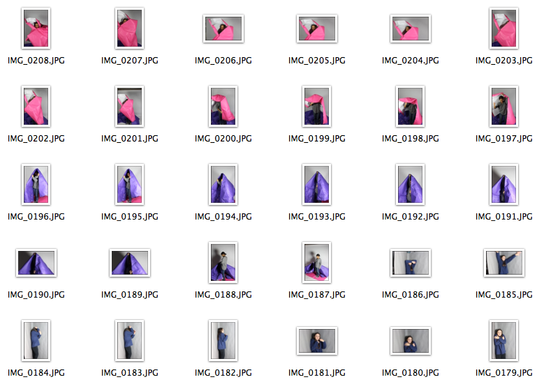
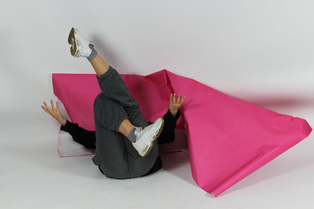
PAPER
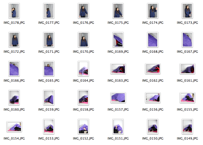
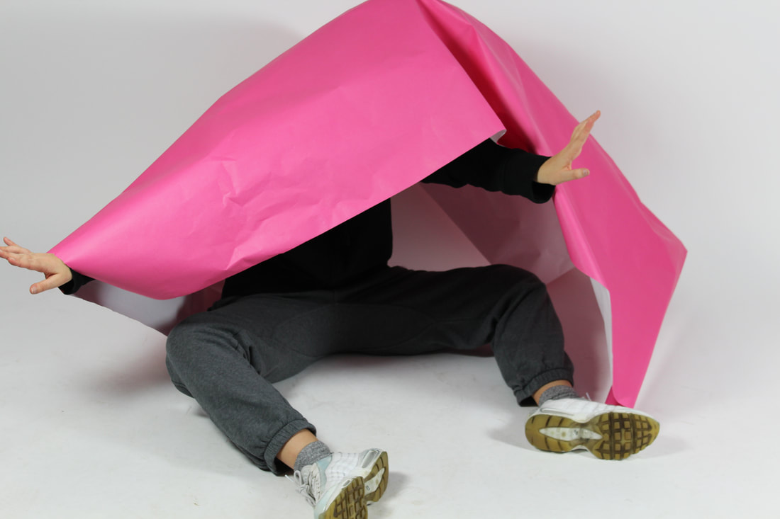
Developing my ideas from Dorner's photography I then decided to try another approach but in the studio, using massive pieces of coloured paper. The outcome of this set of images proved much more appropriate than those of the last set as I always find that when photographing subjects in the studio, the pictures almost always become more professional and essentially more effective. The contrast between the coloured paper, the dull white backdrop and the subject themselves allowed for a interesting outcome in comparison with the pictures taken around the school site. I am therefore much happier with the outcome of these images when looking at confinement and photography, in terms of the the limits the subject can be put into.
|

|
Pushing the limits of photography:
Below are my attempts at trying to challenge and change the ways that I expect a photograph to look and what I expect from that photograph itself. Looking at the themes of focus, and the ideas of blurring and re focusing the digital camera to explore if I value the image any less due to the lack of focus. I also looked at the composition of the images itself, and what the subject of the image is and how this also effects the images value to the viewer, for composition I explored whether the subject of the image was centrally focused or pushed off to the side or only focused on in half of the image. Finally, using exposure I explored ways in which the lighting of the images changed the validity of the photograph itself. Using the camera itself and the functions on a digital camera to explore these ideas was very interesting, I also explored the modernisation of the expectations of a photograph, by using editing software such as Adobe Photoshop in order to change the composition, focus and exposure of the images. I found that there are endless possibilities to the ways in which you can change and manipulate a camera and also manipulate a images digitally using an editing software. Below are the outcomes of using such elements of the camera and editing software in order to create different types of images.
Focus -RALPH EUGENE MEATYARD
|
|
Ralph Eugene Meatyard (1925-1972) spent three months looking through an unfocused camera in order to “learn to see No-Focus.” Working roughly 30 years before Uta Barth, Meatyard, an optician who practiced photography, began the project because of his initial attraction to the out-of-focus backgrounds in some of his images. Through his association with the local camera club and his connections at the university in Lexington, Kentucky, Meatyard was in contact with many other photographers, such as Van Deren Coke, whose condition for making a photograph was to find an appropriate background and put something in front of it. Like Barth, Meatyard eliminated the “thing” and looked only for the background, which he would then throw out of focus. Eventually, feeling that the background was still too recognizable, he abandoned this practice and began to contemplate his surroundings through an unfocused lens. Barbara Tannenbaum describes the process in her essay, “Fiction as Higher Truth: The Photography of Ralph Eugene Meatyard”. He would then wait two or three months before developing them (the negatives). After that interval, he was no longer able to identify the scenes or objects, he had succeeded, at least for himself, in detaching the images from a bit of reality on which they had been based. Using more or less focus allows Meatyard to explore the limitations found when focusing and un-focusing on a subject, however, also exploring the sorts of freedoms that the camera allows you to have, creating unconventional images which could be seen as a whole knew type of photography.
|
|
MY response:
|
When looking at my edited response to Ralph Eugene Meatyard's images, using Adobe Photoshop, I can see that the images that are completely unfocused look very effective when edited into black and white, when looking at these sort of images in terms of the freedom and limitations theme it is clear to see the true limitations of using a camera to capture images, in addition to this the task has also allowed me to explore the freedom, the digital camera specifically, can create and the effective images that can be created from the manipulation of the camera and its specific functions. The images that have been inverted on photoshop also have a strong effect to them positively portraying again the freedoms that come from the modern day editing softwares and functions of a digital camera. I found from this project that the images that where most out of focus actually looked more effective in mirroring Ralph Eugene Meatyard's style.
|
Ute Barth - Composition
|
|
Barth has been making images using out-of-focus photographs since the early 1990s and began her series of Fields in 1995. For her previous series of Grounds (begun in 1992) she first used a collaborator to stand in the foreground of the composition. She focussed the camera on this subject who then moved out of the frame, leaving the ‘empty’ background as the new subject of her photograph. Grounds depicts mainly indoor settings and is based on still-camera photography, exploring such pictorial notions as composition and cropping. In the Fields Barth began to experiment with the more filmic possibilities generated by moving the camera while taking the photograph. The result is even greater abstraction and a fusing of space and light. When linking Barth's work to that of the theme of Freedom and Limitations it is evident that her work is inspired by the freedoms of the camera, challenging the conventional ideas of the 'perfect photograph' using her specific composition and out of focus images, it is clear she is trying to express how a image does not need to be conventional in order for it to be interesting or aesthetically pleasing.
Barth has stated:
" The Fields … are clearly pictures of other places, outdoor scenes and at best double as a screen within the gallery environment. They … imply movement both by the camera and whatever activity that is motivating the image. One has a sense of being made aware of one’s peripheral vision, of what you see when you turn your head toward something, of what you might see while in motion."
|
|
When taking inspiration from Ute Barth's images in which she creates images using out-of-focus photographs which have ‘empty’ backgrounds as the subject of her photography I tried my own take on her photography. For this task I went around the school grounds and took pictures of the still subjects such as sheds, bins and other random and common objects. Where these objects would normally be the main subject of these images, I changed the from the conventional style of objective photography into a more creative style making these subjects be in half of the frame. The effect of these images again allowed me to effectively explore the freedoms and limitations of the camera, however instead of through editing the images using functions on the camera I instead used my own perspective through the lens instead. Overall, these images which focus more on half of the subject and allowed me to explore such pictorial notions as composition and cropping, portraying the limitations of a camera, as it is limited in on portraying what is in the frame.
Damage:
Lucas Simoes
Lucas Simoes was born in 1980 in Brazil. An independent artist, he studied architecture and design in Brazil and Italy. Many of Lucas’ pieces are heavily layered as he cuts away at different sections of each layer to produce a bizarre and distorted image you can’t help but stare at. In another project, Lucas takes rolls of the same image to create an incredible sequence-like shot.Below you will find a small sample of Lucas’ work. |
|
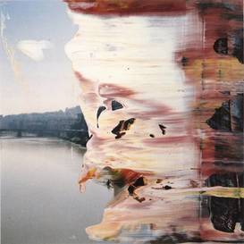
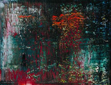
Gerhard Richter
Many of these paintings are made in a multi-step process of representations. He starts with a photograph, which he has found or taken himself, and projects it onto his canvas, where he traces it for exact form. Taking his color palette from the photograph, he paints to replicate the look of the original picture. His hallmark "blur" is achieved sometimes with a light touch of a soft brush, sometimes a hard smear by an aggressive pull with a squeegee. |
|
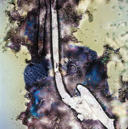
Seung-Hwan Oh
“Impermanence” is a series of portraits by Korean photographer and microbiologist Seung-Hwan Oh who drowns his films in a cultivation of fungus mushrooms. The bacteria devours the film for an abstract and destroyed result. A beautiful way to mistreat a film and to rebel against perfect and idealised images. |
|
Diane Meyer
Diana Meyer makes use of embroidery, which as she explains, ''deteriorates the original photograph and forms a pixelated version of the underlying image''. The use of cross-stitching as a technique offers an exceptional sculptural effect that intensifies the dramatization of the image and heightens the conceptual meaning of the objects. In a sense, one could say, she pushes the distorted image and its history towards the viewer. |
|
Darren Almond - Post Production
Darren Almond’s diverse practice incorporates film, installation, sculpture and photography, to produce evocative meditations on time and duration as well as the themes of personal and historical memory. Almond is interested in the notions of geographical limits and the means of getting there – in particular, culturally specific points of arrival and departure. Since 1998, Almond has been making a series of landscape photographs known as the Fullmoons. Taken during a full moon with an exposure time of 15 minutes or more, these images of remote geographical locations appear ghostly, bathed in an unexpectedly brilliant light where night seems to have been turned into day. Many of Almond’s works are filmed in wide ranging – and often inaccessible - geographical locations such as the Arctic Circle, Siberia, the holy mountains in China or the source of the Nile. The artist followed a sulphur miner in Indonesia during one of the labourer’s daily journeys from the mouth of a crater to the weighing station to produce Bearing, shot with a high definition camera.
|
|
MY response:
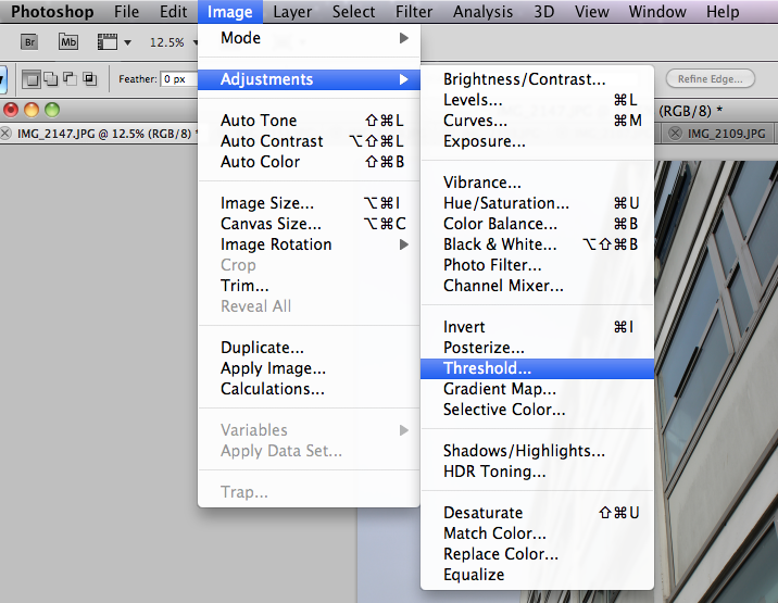
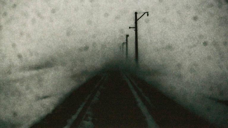
When exploring Darren Almond's photography in which he uses a high definition camera with an exposure time of 15 minutes or more, he creates these images of remote geographical locations which appear ghostly, bathed in an unexpectedly brilliant light where night seems to have been turned into day. I tried myself to imitate his photography of such 'ghostly' images, I went around Mussel Hill and shot locations that I knew would be able to look good when edited and appear similar to Almond's images. Once finished shooting, I took my images onto Adobe photoshop and used the 'adjustments' setting under 'image' and used the 'threshold' setting to create a similar effect to Darren Almond's images. Similar to Almond's photography the overall aesthetic images I had taken changed from being normal, everyday images into deeply toned and contrasted images with a completely different style to them. This task allowed me to explore again the ideas of how easily modern day editing tools can completely change the effect of an image, turning it from simple to extremely deep just by one small adjustment. Overall, I think that these images are extremely effective in exploring the freedoms given to photographers of modern day. Despite the fact that Almond uses the camera itself to create his images, the fact that it is so easy to find ways in which to change normal images to make them have the effect of a long exposure shows the freedom photographers have, and the limitations that manual cameras have, as Almond had to wait 15 minutes before getting these effects in his photography and it took me under a minute in order to change my images. Almond also photographs much more interesting geographical locations, this allows for even more depth within his images, I on the other hand was more limited in my surroundings and therefore my images are clearly less interesting as the subjects within the images are everyday objects such as houses and buildings.
MY IDEAS:
Strand 1: Darkroom portraits images taken of Dad that will then form the basis of darkroom experiments and printing look at the work of Myra greene
Myra Greene:
Myra Greene is an American artist who has worked on a number of projects, mostly photographic. Through her work, Greene prompts thought-provoking questions about how individuals are often judged based on skin color and other physical characteristics rather than on their character. Greene's use of high contrast black glass ambrotypes prompts viewers to consider the unidimensional way black individuals are viewed in society. In a response to her feelings about how society first and foremost categorized her by her skin-color rather than judging her by who she is as a person, Greene's close-up and tightly framed images of portions of her own face prompt an uncomfortable answer to the questions the collection's title implies about whether she, and black people in general, are judged by their skin color rather than by their character. Myra greene opposes the conventional ideas of a perfect image, using a close up style and harsh colourings to explore the freedoms of expression and the limitations that a persons identity holds on the subject, for example the race, religion and ethnicity of the person.
|
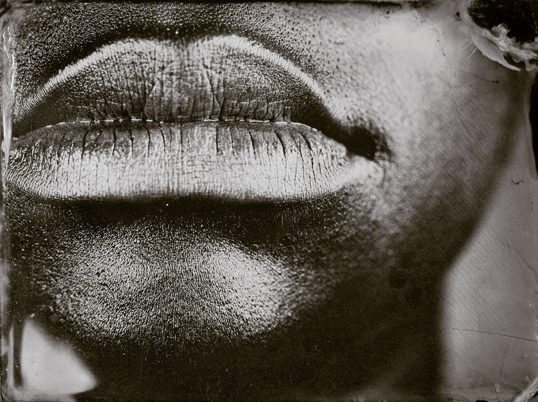
“throughout my artistic practice, I have returned to the body to explore issues of difference, beauty, physical and emotional recollections as they play out on the surface of the skin.”
Myra Greene explores the freedom and limitations of a persons appearance, she looks at identity and images relating issues to do with identity. Greene is relevant to my freedom and identity theme as her photography explores race related limitations in the presentation of the traits of different races. She uses the destruction of her images and the emphasis on the flaws and features of the face in her photography. |
|
|
|
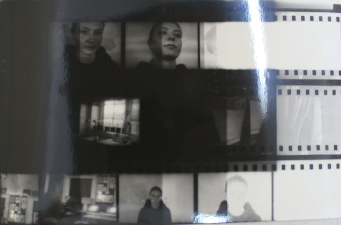
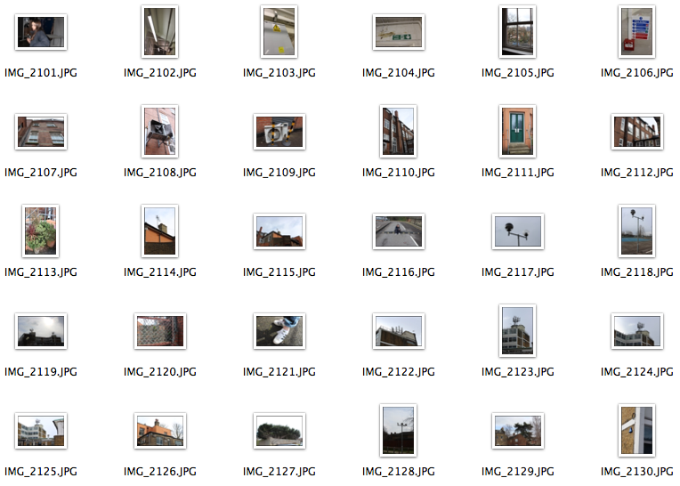
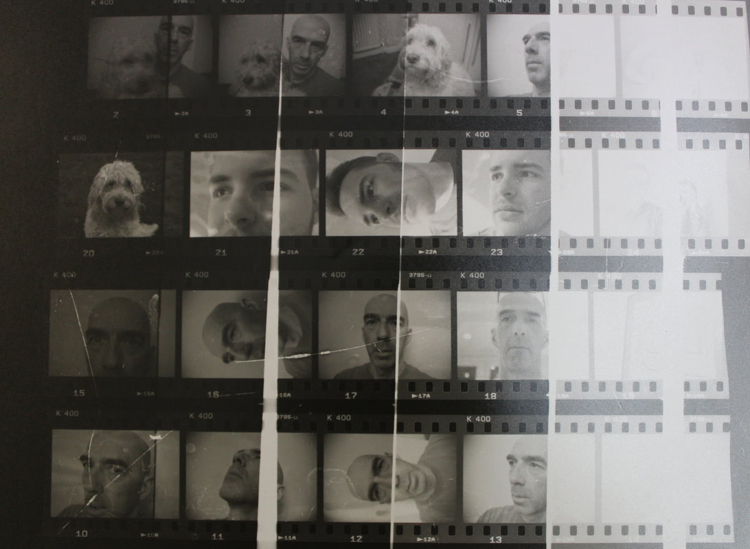
Above is a image of the contact sheet I made from my first set of negatives from a film camera. As you can see most of the images did not develop properly therefore leading to me having less images than initially needed. The contact sheet shows that in order for me to develop my images productively I will need to expose the negatives for 4-5 seconds in order for the images to be properly exposed.
|
To create the image above I experimented with exposing the same image four times onto the photographical paper, the effect from these images are not similar to Myra Greene's photography however I still believe it is an effective development of my negatives and a style which I can develop further if needed.
|
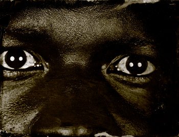
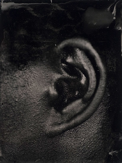
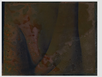
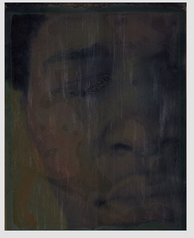
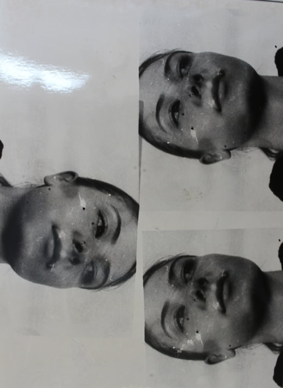
The above two images I created using the latter negatives are similar the photo I created by developing the same image four times, however, this time I used an image from my negatives that was darker and therefore more moody, similar to Myra Greene's images. Similar to Greene I tried to explore issues of difference, beauty, physical and emotional recollections as they play out on the surface of the skin using a different angle which was not straight on to explore these theme. The unflattering angle creates a more interesting image and when develops is more effective in exploring the freedoms and limitations of camera angles and the ways in which you develop the film strips. The image to the left has been developed for 5 seconds, leading to the darker and more moody style which I like, and the second image being developed for 3 seconds. Again, I do like the effect that the multiple images have on the image altogether however I prefer the image to the left due to the moodier, darker colouring showing more shadows and flaws in the face, as Myra Green does too.
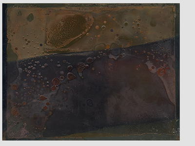
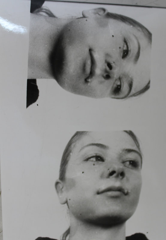
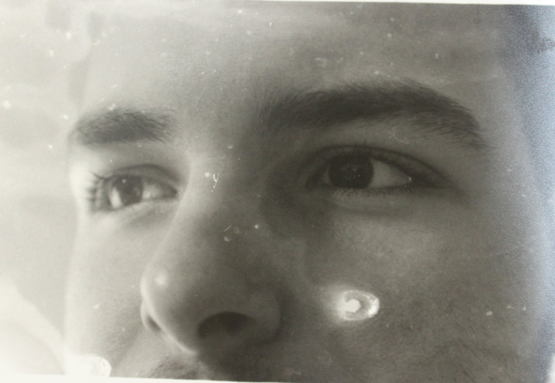
The above images are the result of just one copy of the negative being printed onto the photographic paper for around 3-4 seconds. The scratches and blotches left from developing the film allowed for a sort of damaged style to my images which I found to be interesting and allowed the ideas of the freedoms and limitations of the film camera to be explored, the fact that multiple of the images taken did not expose properly on my first film also shows the limitation of using manual cameras as you cannot know, until you have spent time developing the film, whether or not the images will even develop properly. I also experimented with not developing some of my exposed images properly and not fixing and stopping my pictures, leading to the effect seen in the second picture where some of the photograph has become grainy. Out of the six pictures seen above, my favourite picture which I think is most effective in portraying the work or Myra Greene is the first one, this is due to the similar style as the latter image in which the darkness creates a moody effect on the photograph. The first image as also been double exposed, I exposed the negative for 2 seconds, I then moved the paper slightly down and re exposed the image for another 2 seconds, this led to the darkness of the photograph, but also led to the shadow of the second exposure on the paper, this style is effective and shows the freedoms of using a film camera and developing your images yourself, as you can create any sort of style and effect very easily. The third and four image also have a grainy style to them where the negative had some sort of stain on it, this leads the images to look damaged, which contrasts effectively with the strong focus of the images and the concentration of the focus in the subjects eyes.
|
|
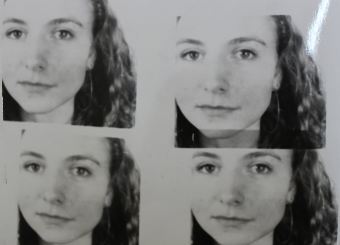
Above are the images from roll of film found in the contact sheet above. This is the second film roll I have photographed and as you can see this roll of film was more effective and every single image taken was successfully developed and therefore these negatives had the desired aim and result that I wanted. The contact sheet shows that the when the images are developed between 2-5 seconds, the photographs will appear successfully. The two images above are developed at 4 or 5 seconds, I found that the images that had been developed for 5 seconds, like the latter roll of film, where more prominent and moody and showed more resemblance to Myra Greene's photography. When photographing the second roll of film I also decided to bare in mind the angle the images where taken in, as well as the time the images were exposed onto the photographical paper for. I tried to make these images more personal, as Greene does with her photographs and the close-up and tightly framed images style she takes. The images also have imperfection in them that only appear when the photographs have been exposed onto the photographic paper and the developed. The splurged of white on the images appear to make the images more dramatic and add the moody nature of the images. Again, I believe these images are effective in exploring the freedoms and limitations of the film cameras and the progress of the development and the process in the dark room for the images.
Strand 2 - Building isolation
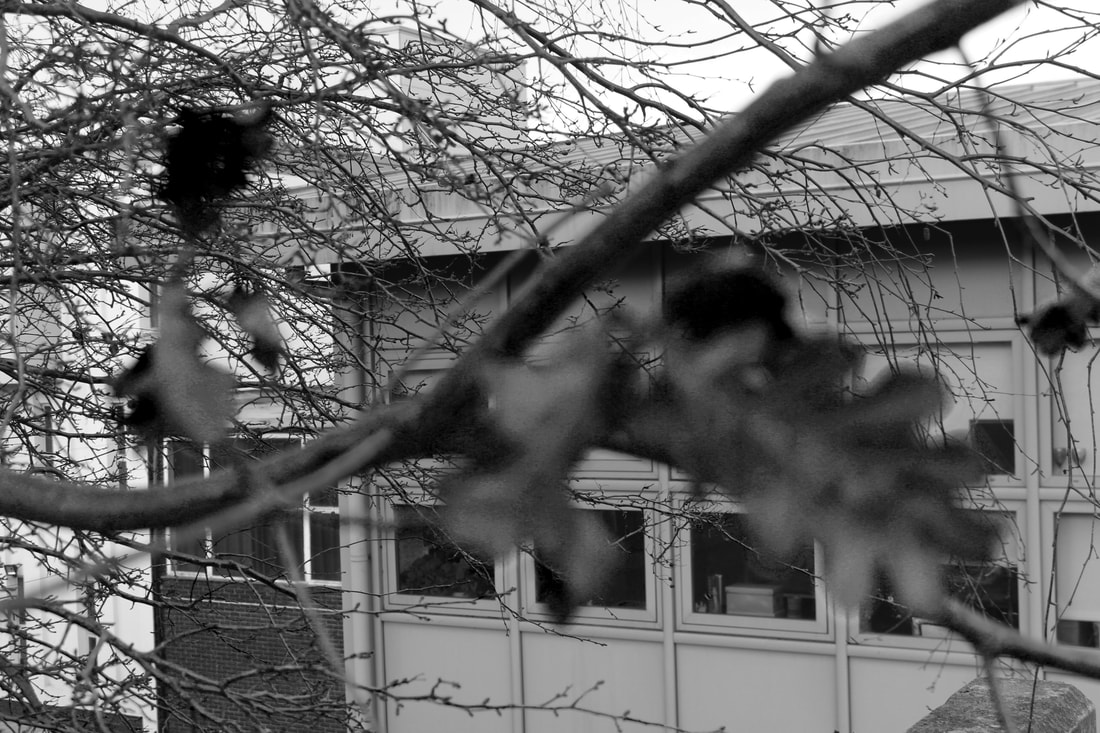
When deciding on a second strand for my photography, connecting to the theme of freedom and limitations, I tried to steer away from portraiture and human subjects in general and therefore concentrating on a structure subject such as buildings and architecture. I decided to photograph buildings with strong structures, exploring the theme of the freedoms of the structures of buildings, but also the limitations of photographing such buildings, in terms of the focus of the images and how much of the building I get in the image. When taking pictures of the theme of buildings, the camera limits the photographer, due to the cameras lens only getting in a certain amount of the structure is in the frame. However, I also decided to take my images and edit them, rather than exploring the plain theme of freedom and limitations of the photography of architecture, using Adobe Photoshop. I have not decided yet how I will do so, but I will be looking at multiple architectural photographers and artists in order to explore these ideas.
David Hockey:
In researching my final piece, I have been influenced very much by the work of British contemporary postmodern artist David Hockney. Hockney has a central obsession. He is preoccupied with what the world looks like and how human beings see it and represent it. Human ‘seeing’ takes time to ‘see’, through an understanding of not just the objects but also the space between them and what happens at the edges. He believes it is pictures that make us really see the world and believes in looking ‘long and hard’ (Gayford, 2011, p27).
Hockney’s work is concerned with finding ways to represent the world. He searches for ways to depict the world differently from the way a camera lens sees it, as he believes that the camera misses something that makes a real difference and is groping for that ‘something’. A photograph does allow us to see it all in one click, but from a single viewpoint. This contrasts sharply with human ‘seeing’ which takes time to ‘see’ through an understanding of not just the objects but also the space between them.
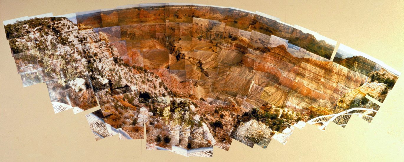
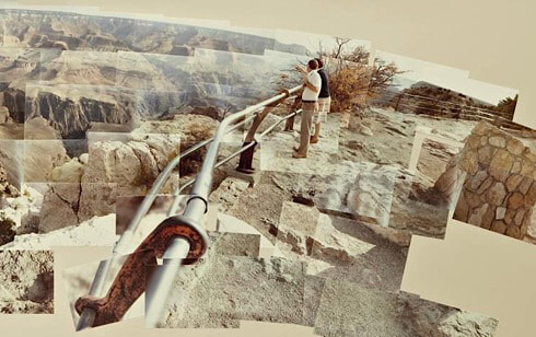
Hockney used still photography to create images of the Grand Canyon built up from hundreds of images, each representing a slightly different perspective on the Nevada landscape. Through his study of the Grand Canyon, both through photography and painting Hockney tried to challenge our view on space and perspective.
Hockney’s work is concerned with finding ways to represent the world. He searches for ways to depict the world differently from the way a camera lens sees it, as he believes that the camera misses something that makes a real difference and is groping for that ‘something’. A photograph does allow us to see it all in one click, but from a single viewpoint. This contrasts sharply with human ‘seeing’ which takes time to ‘see’ through an understanding of not just the objects but also the space between them.
Hockney used still photography to create images of the Grand Canyon built up from hundreds of images, each representing a slightly different perspective on the Nevada landscape. Through his study of the Grand Canyon, both through photography and painting Hockney tried to challenge our view on space and perspective.
|
|
Hockney wanted ‘to photograph the unphotographable. Which is to say, space … There is no question … that the thrill of standing on that rim of the Grand Canyon is spatial. It is the biggest space you can look out over, that has an edge’. Hockney himself explains:
‘when you put one piece of paper on top of another… you put two pieces of time together, [and] therefore make a space. I thought I was making time, then you realise you’re making space… Then you realise time and space are the same thing.’
In the film, Woldgate Woods, 11.30 am and 9.30 am, (2010), Hockney uses between nine and eighteen multiple simultaneous high-definition video cameras filming simultaneously. The cameras are fitted onto customised cars and capture adjacent moving images, each with unique perspectives of the same horizon line, but no two of which have the same vanishing point. The film produces imagery which, while beautiful and mesmerising, also serves to interrogate the very experience of ‘seeing’ itself.
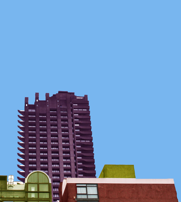
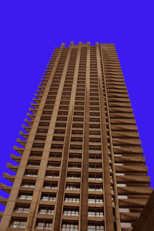
The barbican:
Malte Brandenburg:
|
|
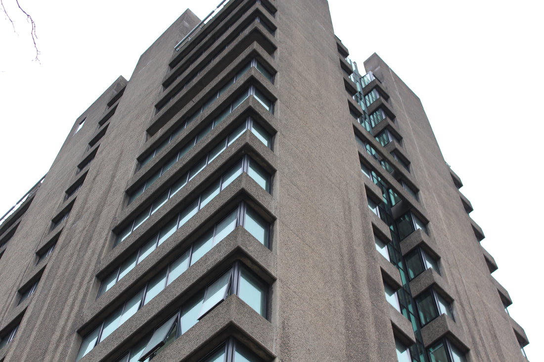
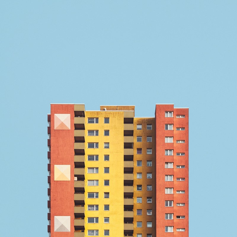
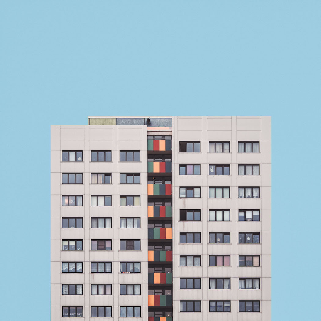
Intrigued by Berliners’ views on these 60s and 70s concrete behemoths, Brandenburg turned his lens to a selection of tower blocks in varying architectural styles, capturing each one in his trademark minimal, symmetrical style. Speaking about the idea behind the series, the self-taught photographer says, “With ‘Stacked’ I wanted to isolate these buildings in order to have a clearer view on them and in comparison to each other, as I believe they are an important part of the ever-changing puzzle called urbanization.”
Malte Brandenburg isolates each building in order to clarify their vision of each one in particular. The constant search for symmetry and perfection are evident in each catch. The bottom of each photograph is flat, artificial, lacking in depth. But at the same imperative, elegant, framing each piece of architecture consistently time. In “Stacked” Malte Brandenburg seems to convey how artificial is the new housing model. Families are stacked on each other in vertical structures, something unusual before the rural exodus.
Below are examples of these images, I decided to try and imitate his photography in order to present the freedom and limitations of the camera, as seen above not all buildings can be captured in one image. However, I will also use Adobe Photoshop in order to explore the ways in which I have the freedom to make these dark and moody brutalist images into more interesting and collected images. I will take the above images and create new pieces that are not necessarily the same as Brandenburg's pictures, but I will take inspiration from him.
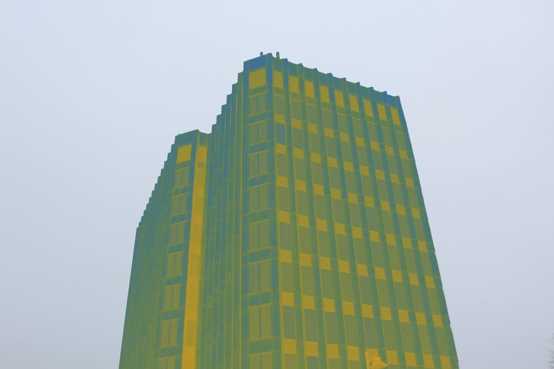
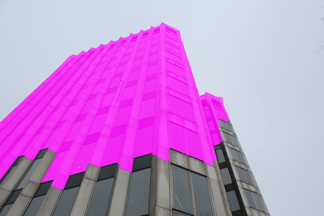
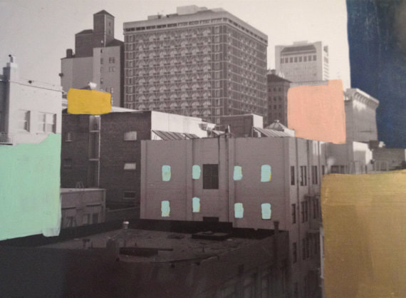
The image above has been edited using Adobe Photoshop, the backdrop colouring has been edited so it has been filled in with one whole colour in order to focus the image more on the buildings. To colour the building pieces in I used the quick selection tool and adjusted the colourings of the seperate pieces. However, I found that this image used too many colours and therefore the overall effectiveness of this image in portraying the freedom and limitations of the camera is not strong enough.
This image above is a further development from my findings when experimenting with Adobe Photoshop. Due to there only being one building in this image I decided to try using a darker colour in the background, this means that the contrast between the building and background became stronger and I again chose a orangey colour for the building to ensure a complimentary style. I think that this sort of style using only two different colours means that the image is more effective and the colours do not overpower the image itself.
|
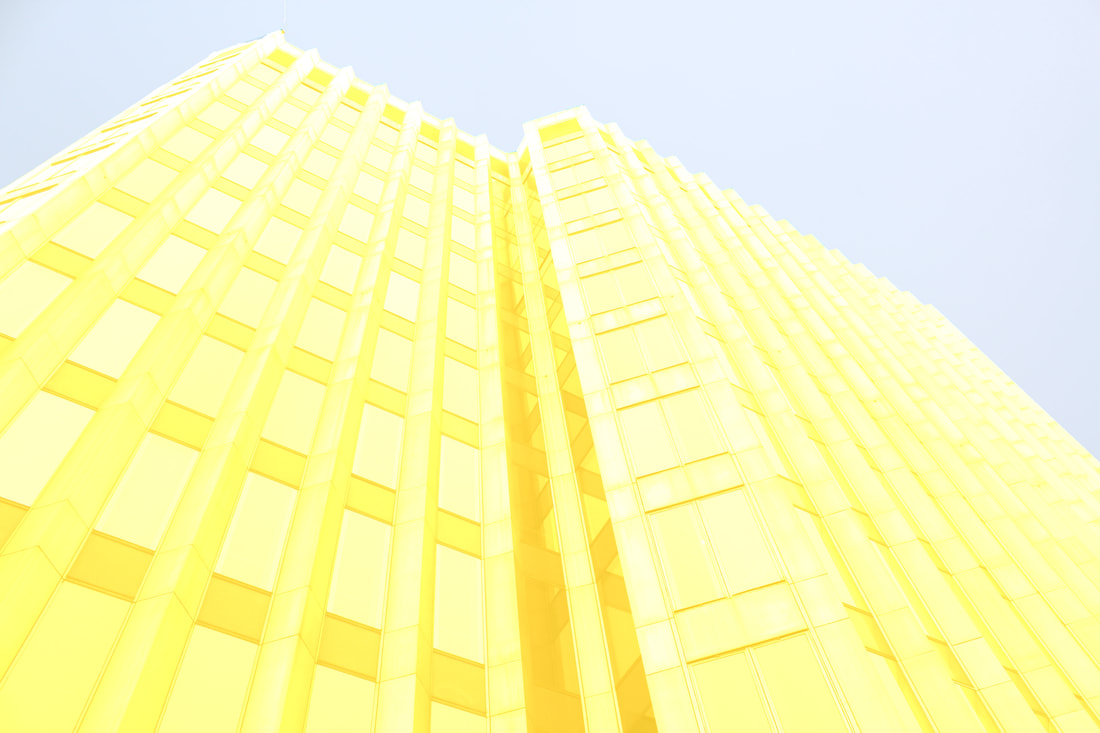
The second image I created on Adobe Photoshop I tried to make sure that the colours within the image matched more, therefore I looked at a colour wheel and decided that due to the backdrop being blue I needed to use colours complimentary to blue which is orange, I then used a lighter shade of the same blue for the other part of the building. I found that this image itself become more aesthetically pleasing to the eye in comparison to the latter image as the colours are more subtle.
This final image I created from this group of four images of the Barbican Centre, I believe to be the most effective out of all of them. By only colouring the backdrop of the image and a small portion of the building in the image led to a more stronger composition and focus drawn more to the contrast between the ugly colours in the building and the neutral colour of the sky. I also noted that in Malte Brandenburg's photography, he used buildings with only one structure, this leads to the images being more focused. Therefore when developing this idea further I will try to capture buildings on their own, rather than multiple buildings and colouring them in as it distracts from the simplicity of the images, found in Brandenburg's work.
|
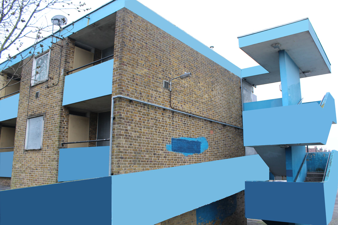
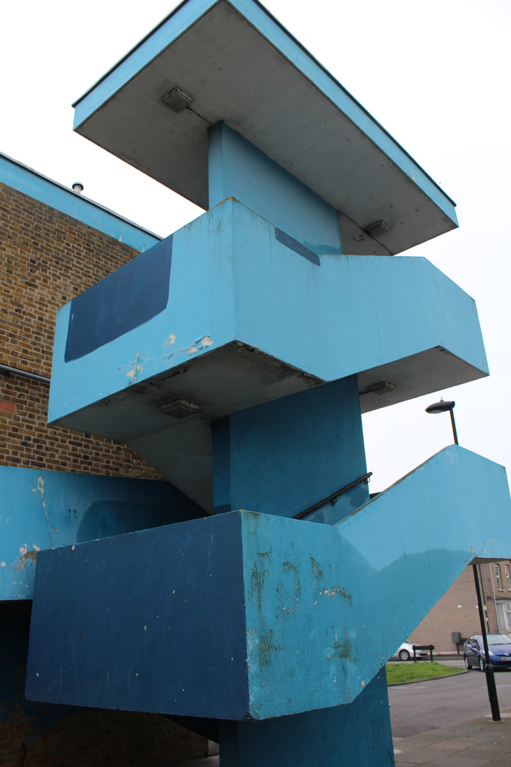
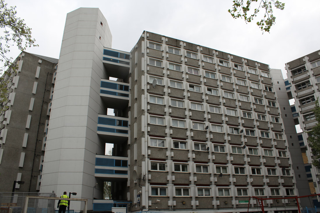
Enfield Civic Centre - development:
|
|
The above edited images are the result of my development to the latter editing style similar to that of Malte Brandenburg. To create these photos I put these images of the Civic Centre in Enfield Town into Adobe Photoshop and used the select tool in order to select the parts of the building that I wanted to edit and change the colour and mood of. I really like the style that the images with half colour and half their natural colour present, this is due to the contrasting moods given off by the two different colourings in the photo. The other two images are completely changed colour and I think these also created a positive outcome for the images, however putting them next to other photos with half colouring makes the contrast look better. If I were to re-do these images I would incorporate some of the original colourings of the building as well as that of the colouring I decide to initially add in too.
Simon Phipps
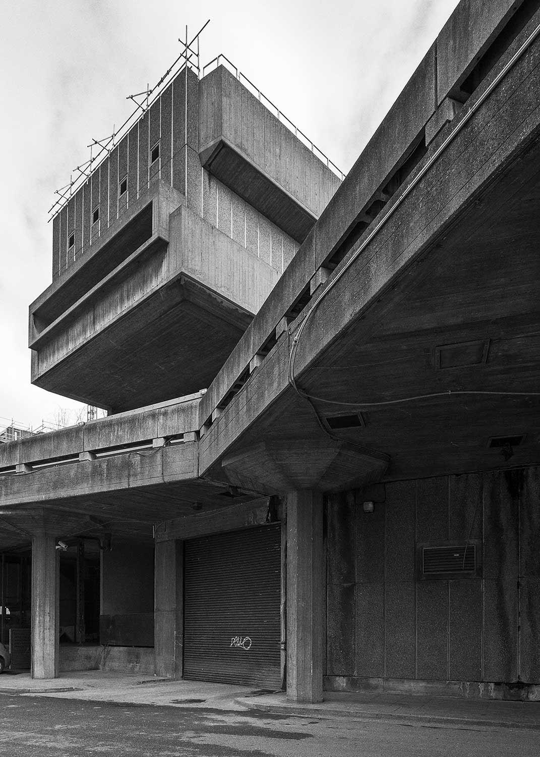
Filled with Phipps’ distinctive photographic compositions, this is a richly produced tome. The photographer spent more than 20 years, documenting brutalist architecture in Britain, creating a hefty archive of about 125 buildings. Phipps, in effect, follows through his lens the rebuilding of Britain after World War II.
|
|
His numerous photographs of Brutalist masterpieces not only appeal to the eye and refined tastes, but also ‘recognises the architects’ enormous contribution to the transformation of the political and social landscape of the country’ in the aftermath of the war, explain the publishers. Travelling north and south, east and west, the book includes Phipps’ imagery on dramatic structures, such as the Barbican Estate in London (1965-1976), by architects Chamberlin, Powell and Bon; Trinity Square Car Park in Gateshead (1962-1967), by Rodney Gordon for the Owen Luder Partnership; the Metropolitan Cathedral of Christ the King in Liverpool, by Frederick Gibberd (1962-67); and the Queen Margaret Union at the University of Glasgow, by Walter Underwood & Partners (1968).
|
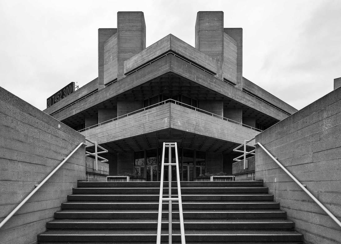
The below images are my attempt at imitating the style of Simon Phipps. Using bold brutalist buildings and simple black and white editing, he creates an amazing new look at the different styles of British brutalist architecture.
Taking some of the images I took of the brutalist buildings around London and putting them into photoshop, I played around with the contrast and brightness and changed all the images to black and white, just as Phipps does. Overall I am happy with the outcome to these images and I feel they look very similar to Simon Phipps images, however not exactly the same as my own images have different angles and contrasting to them and therefore they are unique. 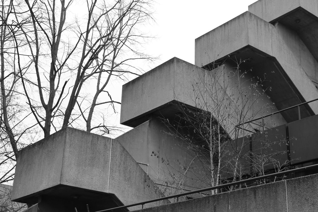
|
|
Nick Frank
|
|
|
Nick Frank is a 42-year-old photographer who lives in Munich, Germany. Frank used to be responsible solely for visual representation until he switched sides in 2013 to show his more creative side in the visual arts. His photographs can befound in numerous publications today e.g. news magazines like Spiegel, Wired or New York Times. Frank mainly photographs architecture then uses various photography programs to replace the background with a solid colour fill and enhance the brightness over the corners. He frames the subject in the middle and sometimes makes the two sides symmetrical to create a sense of security. With an exceptional sense for detail he creates eye catching visual representations of buildings that almost appear like hyper-realistic paintings. After a fruitful career in advertising, he now dedicates his time and creative mind to the realization of his own pictorial ideas, which have been published in numerous magazines and newspapers including Spiegel, Wired, Page or Süddeutsche Zeitung. While his first picture book “Habitat – the Olympic Village in Munich” has been released at Volk Verlag München in autumn 2015, Frank is now working on his second picture book we are curiously awaiting.
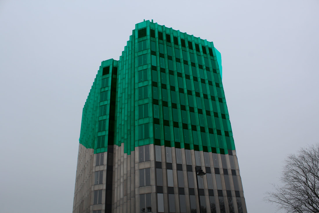
Edmonton
|

|
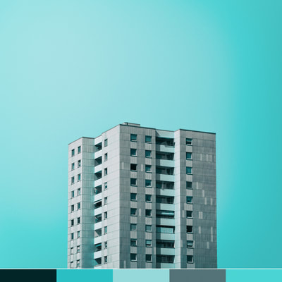
The image above edited on Abode Photoshop uses a brighter blue than the rest of the pictures in this group, being the first image in this group; the colouring are not as effective as the other images seen below, this is due to the yellow toned building not matching the almost neon styled backdrop. However, I still think this image is effective and imitates the work of Malte Brandenburg successfully and has a good overall aesthetic.
The image above has been edited in Adobe Photoshop. The backdrop has been edited so that it is completely monotoned and all one colour, I also selected the entire building and changed the colouring of it so that it matched more to the bolder background. The light blue but more turquoise colouring of the background are matched with the pinky/orange toned building. In this image I tried to keep the different colours to a minimum as after developing my ideas I have decided that this is what looks more effective.
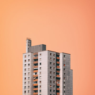
|
Different to the image to left, the image above incorporates more orange and pinky tones into it matching to the baby blue backdrop. The two building including in the image present the structures of buildings well. I also think that the rusting on the right hand side image also adds to the effectiveness of this image too. This image, like the others has been edited on Photoshop, making the background all one colour and therefore accentuating the structure and block-likeness of the buildings in the image.
To create this image above I used the 'Average Blur' tool on Adobe Photoshop to create the block-like style to this image. I found that this helped to create a stronger effect to the image and further developed the block-like architecture found in the image. When editing my pictures, I always try to make it so that the style the picture has been edited in matches the image itself, for this photo I tried matching the broken down but structured building have a similar look, but more 3D and print like. The image itself has a bolder effect once edited into a more structured style, however the detailing of the erosion of the building is lost.
|
Eliza Southwood 'Barbican'
Eliza Southwood practiced as an architect for ten years before deciding to take up a career as an artist and illustrator full-time in 2010, although she has consistently drawn and painted throughout her life. Southwood's first illustration commission was a Spanish children’s book, when she was aged just 13 years old. Having grown up in Spain, Southwood spent a year in Italy and then moved to Scotland where she graduated from Glasgow School of Art with a degree in Architecture. She later finished her postgraduate architectural studies in London. Eliza Southwood's speciality is silk screen printing, but she also works within mixed media, watercolour and acrylics. As a keen cycling fan, she is known particularly for my cycling themed artwork, but she also produce work on a wide range of subjects such as cityscapes, dogs, sports and people. Southwood's images of the brutalist and city scrapers are silk screen printed showing blocked colours and simplistic appearances. Connecting well to Malte Brandenburg Southwood uses print like styles in order to explore the shapes and overall appearances of the buildings.
|
|
Britt Bass Turner
|
|
Atlanta native Britt Bass Turner is an abstract artist known for her playful paintings full of movement. She fell in love with color and design at a young age (by way of her interior designer mother) through immersing herself in fabric samples and color swatches. She is constantly refining her eye for aesthetics and design, and hopes to bring this sense of exploration and curiosity to her current work. Britt paints full-time in her Roswell, Georgia studio and her work graces public and private collections throughout the United States and abroad. She also calls the quiet, Southern town of Roswell her home, which she shares with her husband, Render, and their Boykin Spaniel, Birdie. She also most recently served as the Art Chair for Dwell with Dignity's Atlanta chapter.
The two images, above and to the right, are my intake and attempt to imitate the work of Britt Bass Turner I have tried to take influence by the fact the Turner loved immersing herself in fabric samples and colour swatches. Therefore I decided to pick random colours and fill in small or big parts of the images, this led to my images becoming more interesting and intricate as the photograph became more refined and detailed. Overall, the outcome from these images is definitely that of a positive one as the images have become more interesting. The rusty old car garages themselves allowed me to take more detailed pictures of the rusting and decaying and then adding in the bright colours contrasts with the drabness of the rest of the image itself. I am happy with the outcome of these images and I believe they positively reflect the work of Britt Bass, I especially like the fact that some of the colourings in the images blend in and look as if they where originally in the image before editing. I also found that the subtler the colourings the more natural and original the image looked.
|
|
Development- making one big city with my images of the buildings.
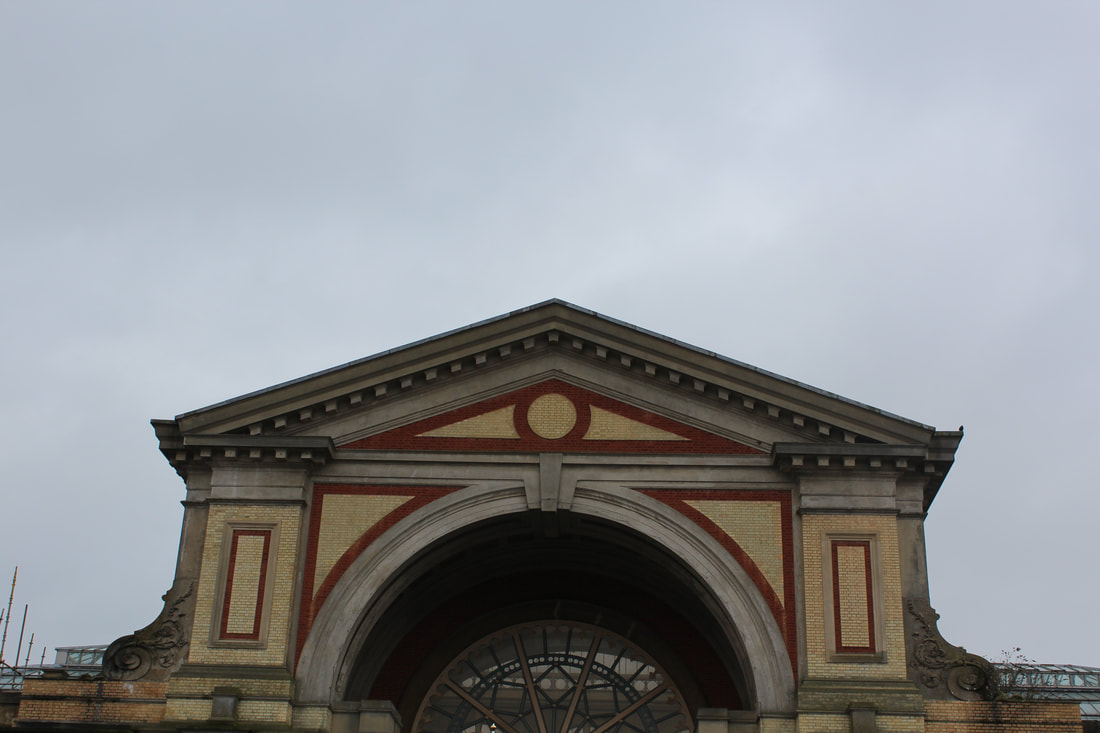
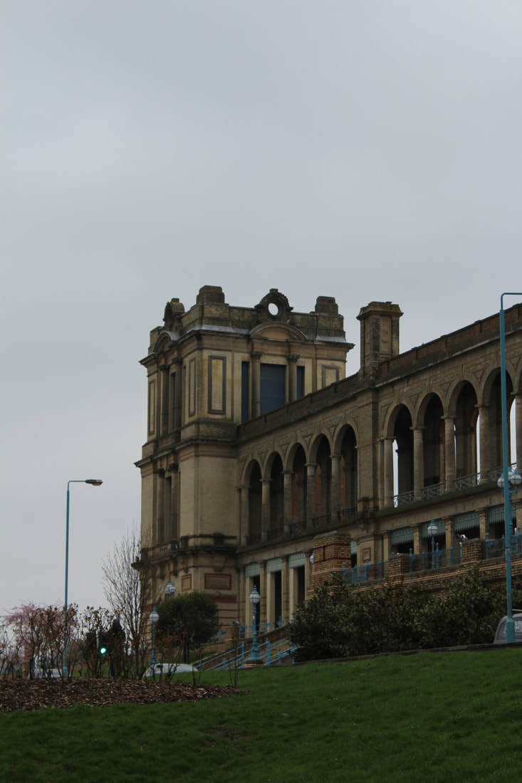
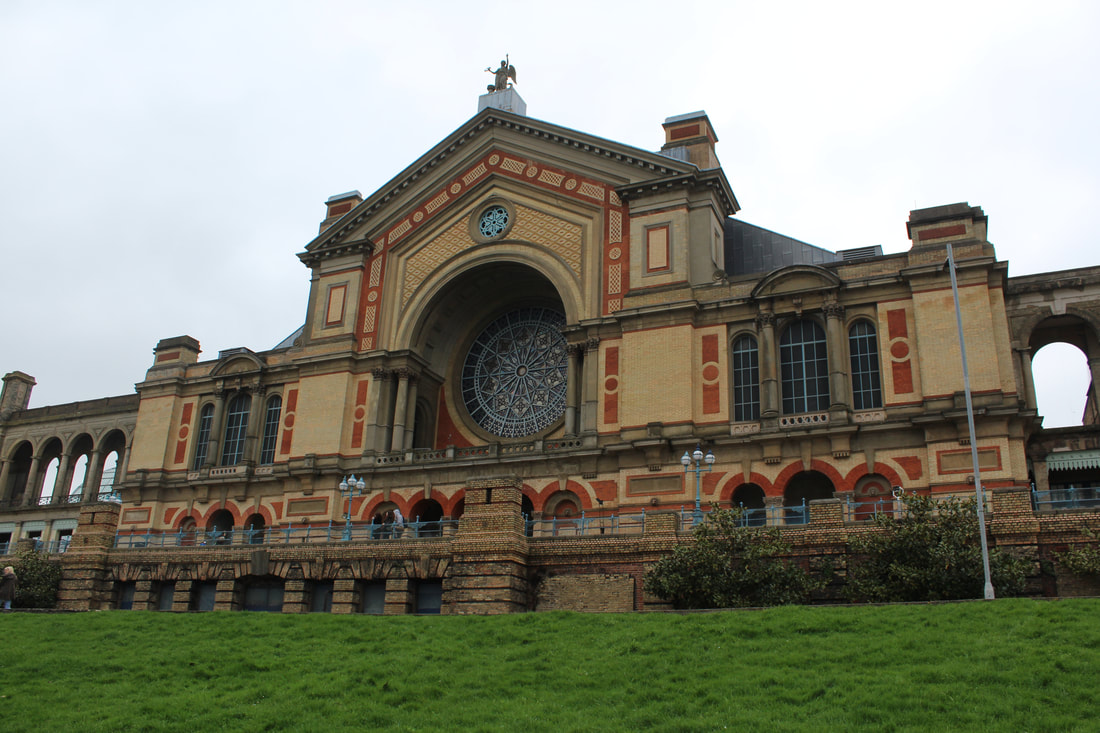
Alexandra Palace:
The following images below are taken at Alexandra Palace in North London. When taking these pictures I tried to capture the main focuses of the building, for example to arches and main structural constructions, however I did find it increasingly hard to take completely focused images, as there was often distractions in the images such as bushes or lamp posts. I tried to get most of the patterns of the building in my photographs however due to the building being re built in 1875, it seemed to be more modern, and less structured. This therefore meant that I knew I didn't like this sort of architectural style, I decided to focus on more brutalist and block-like buildings.
|
|
|
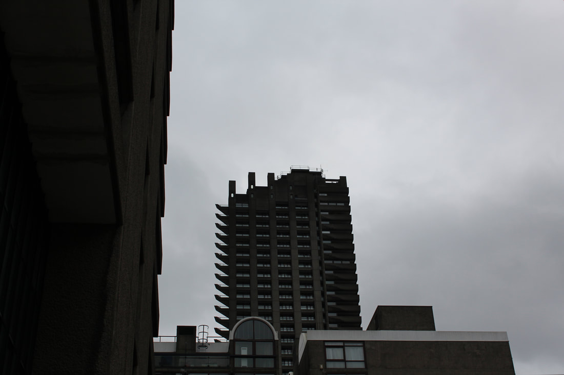
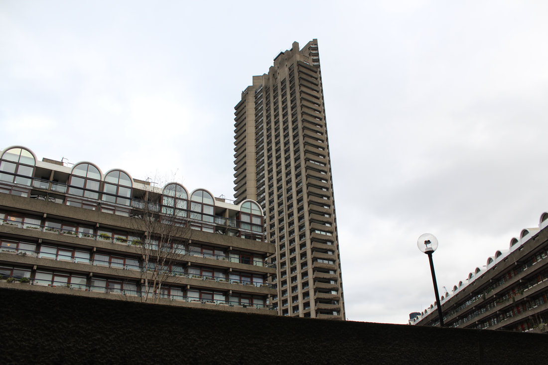
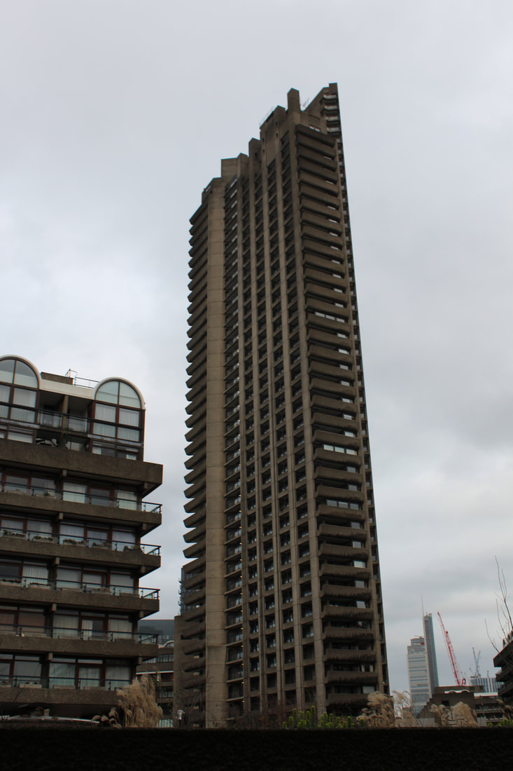
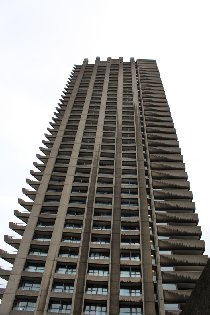
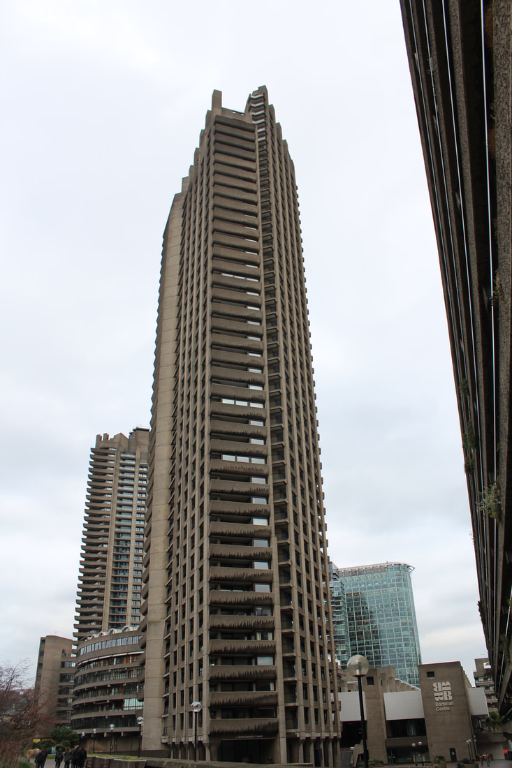
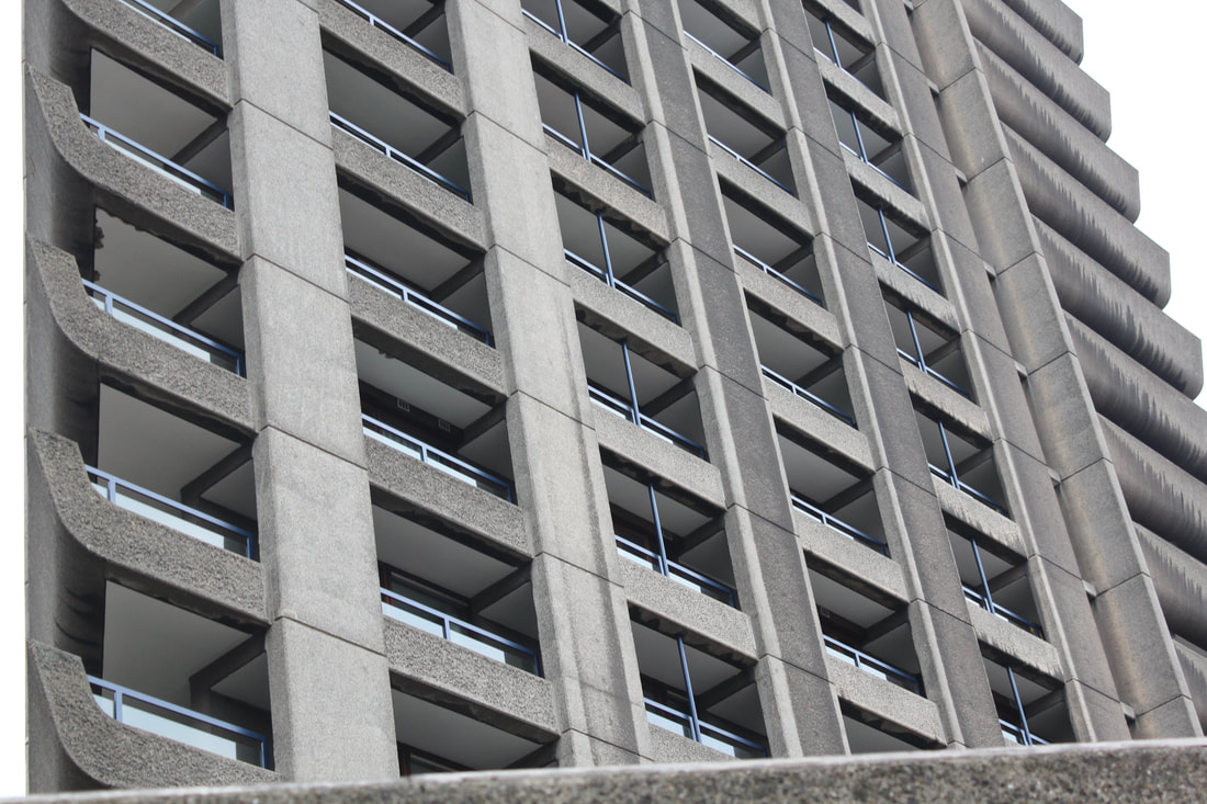
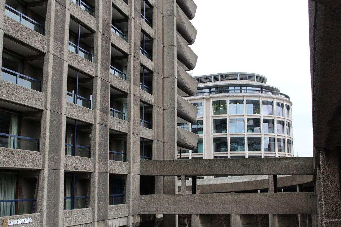
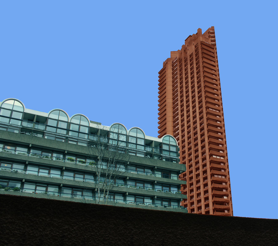
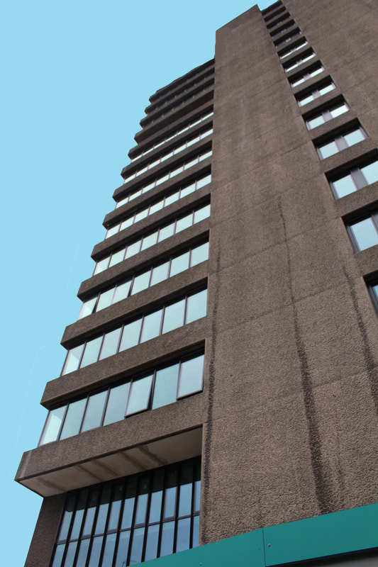
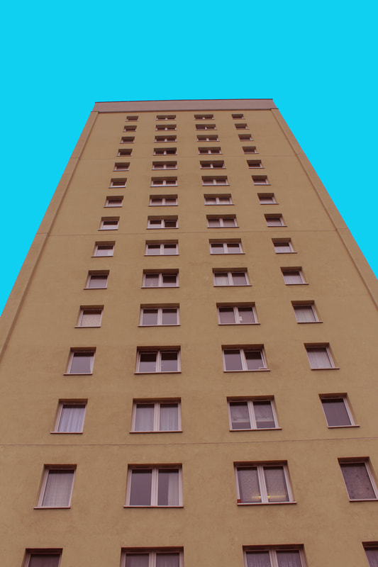
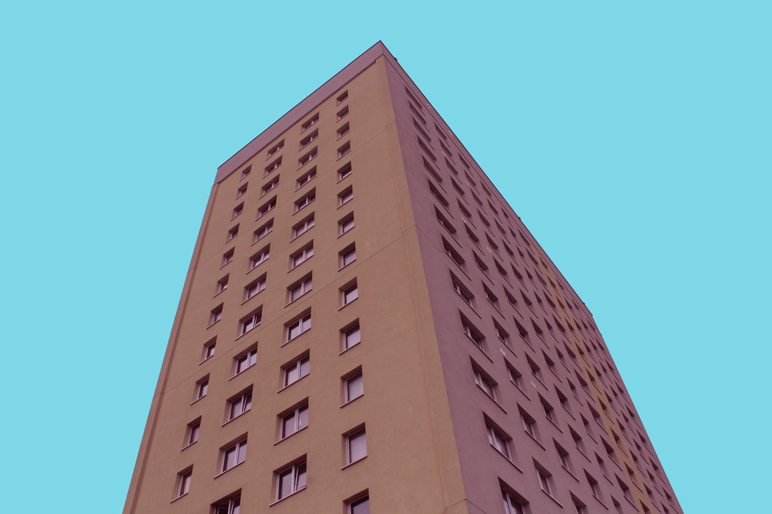
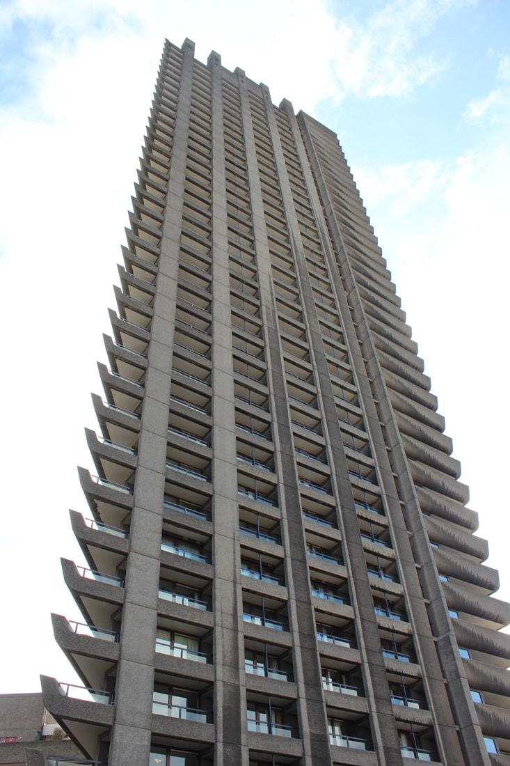
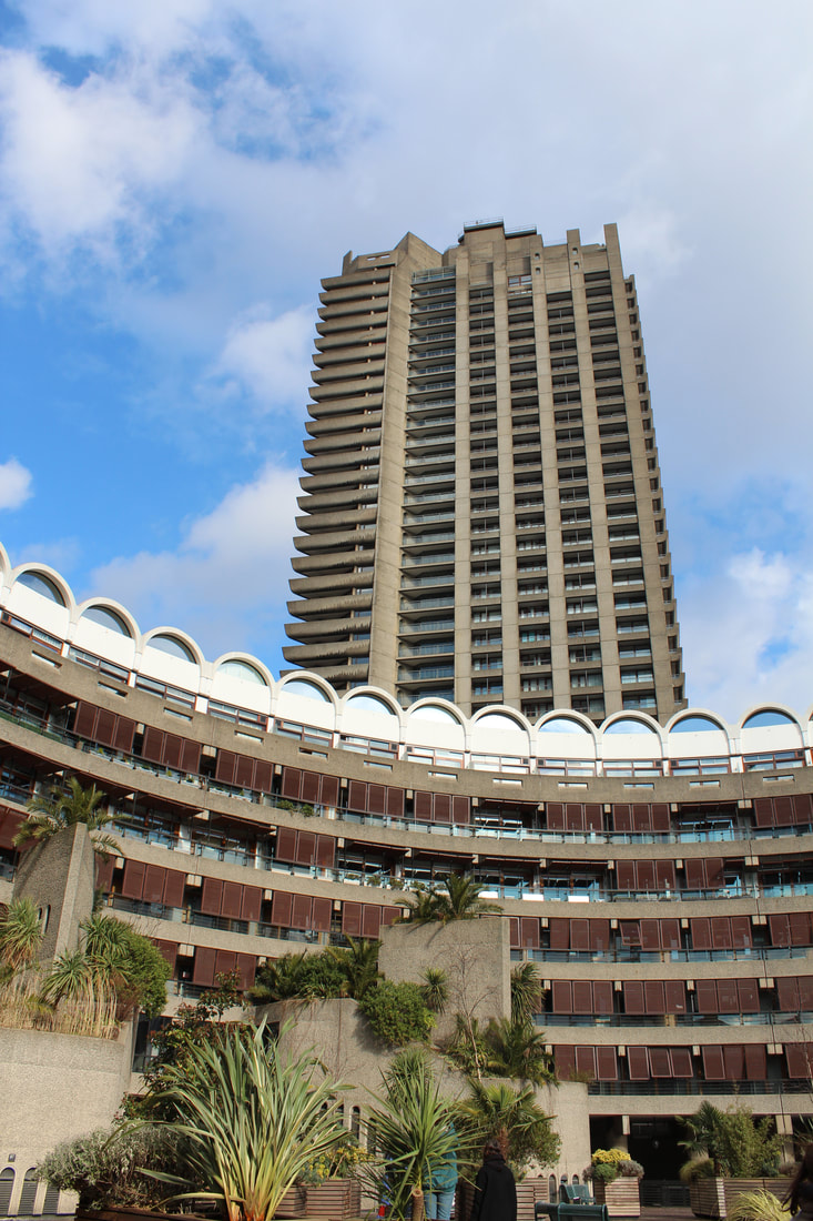
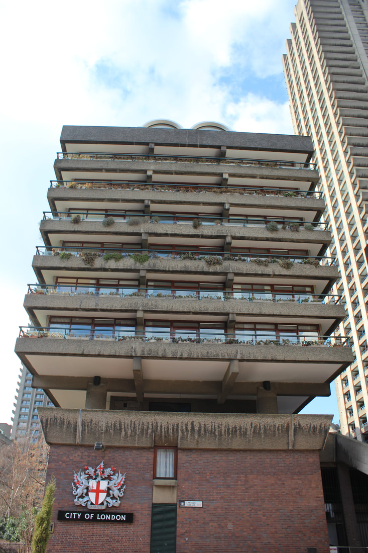
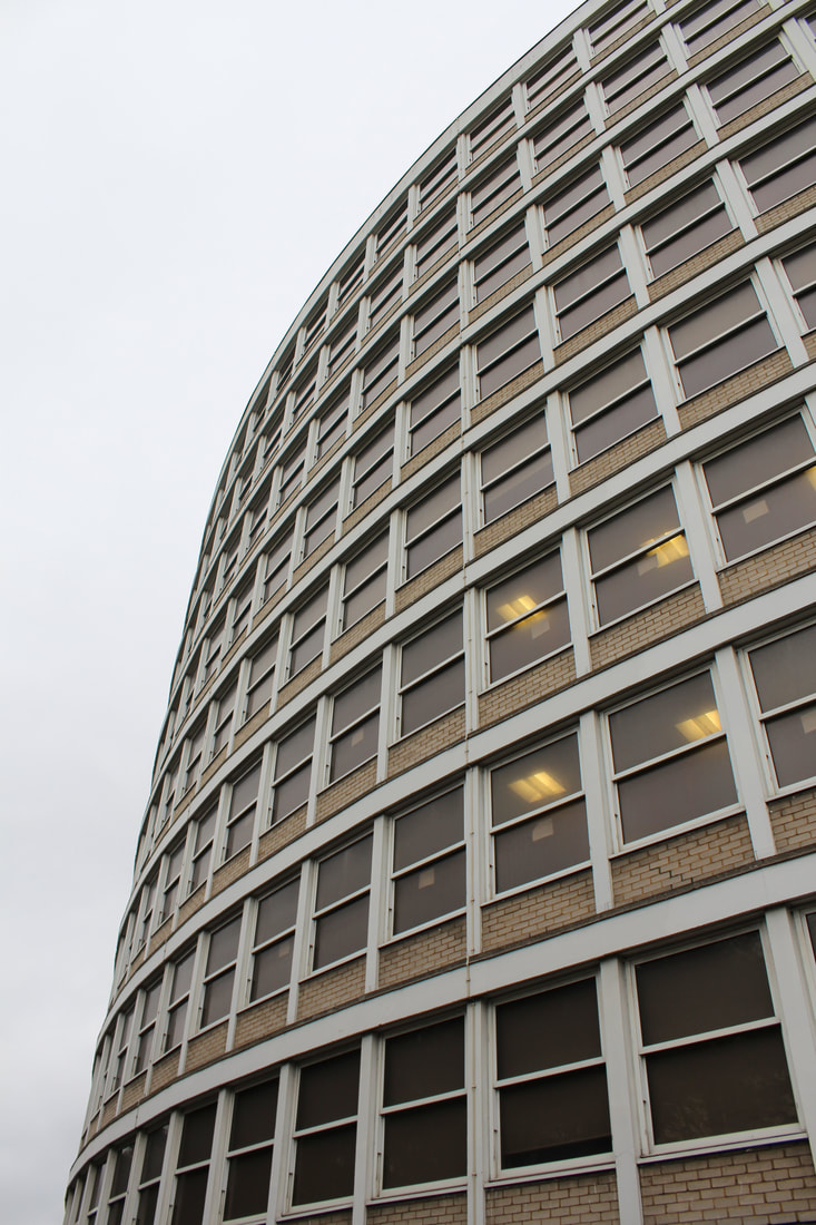
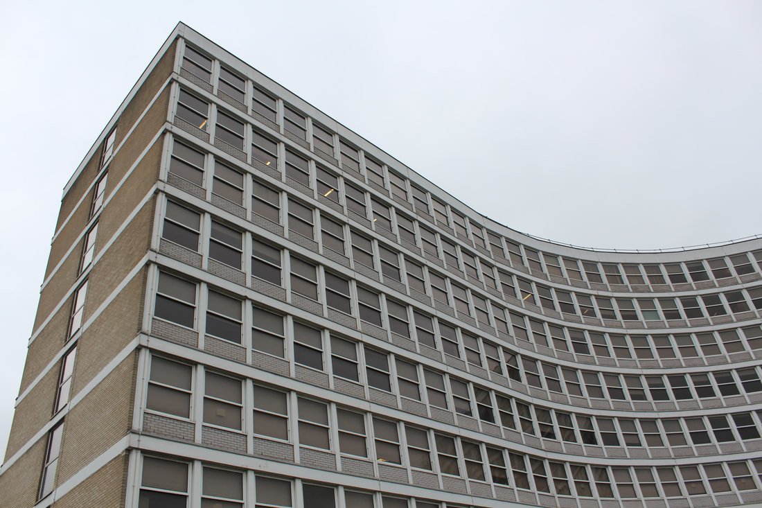
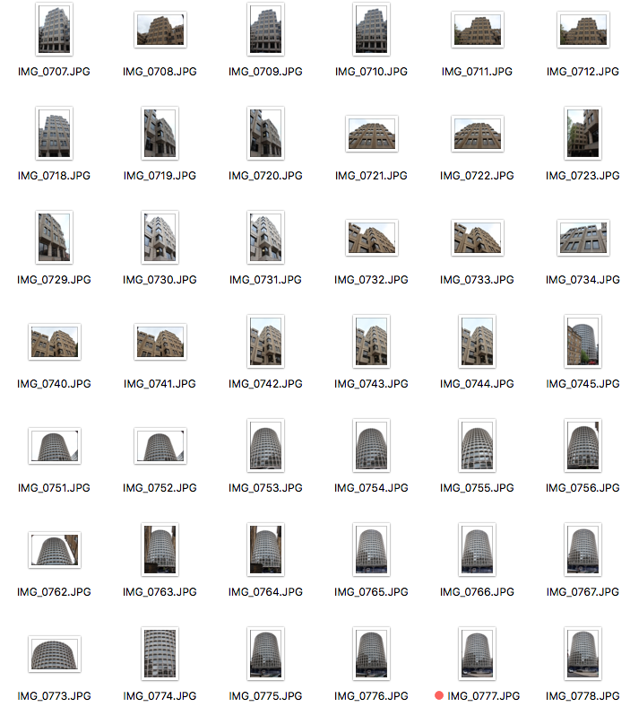
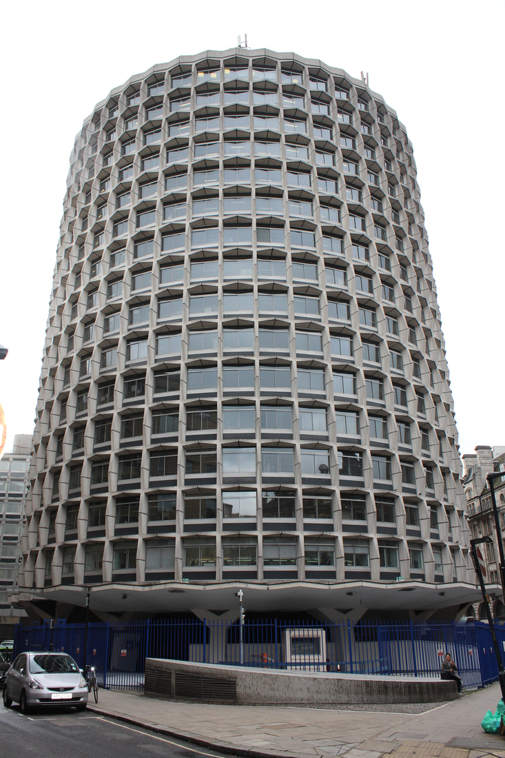
Barbican centre - Moorgate
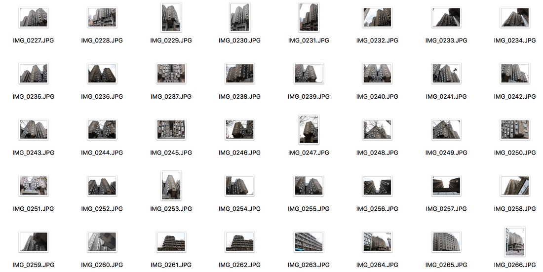
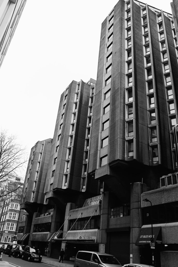
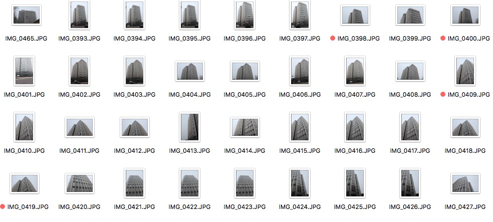
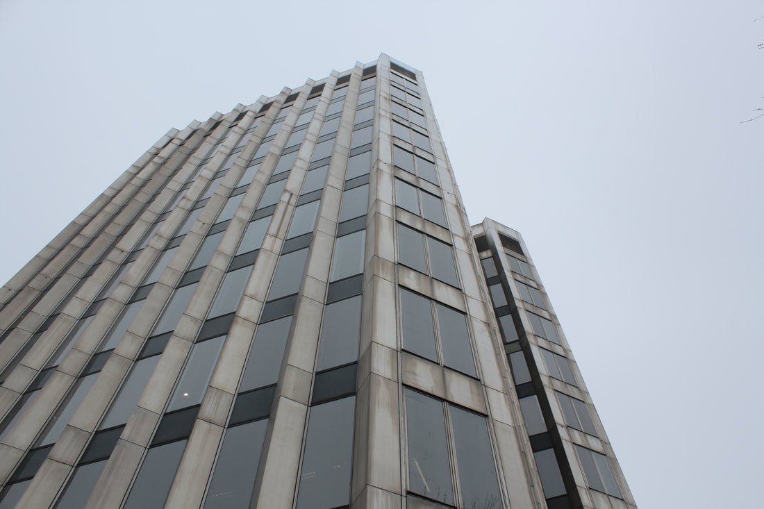
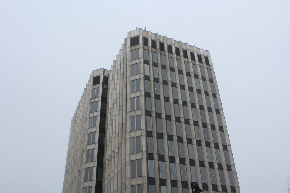
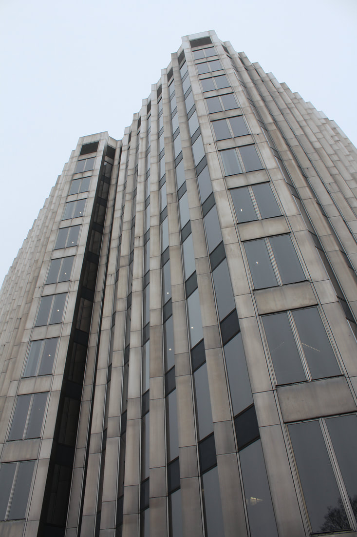
The below images are taken on the Barbican Centre in Moorgate in central London, I tried to capture the buildings from front perspectives, or trying to capture the whole of the building in the images, therefore going from the bottom of the buildings upwards in order to get the whole structure in. I also tried including two structures into my images in order to explore the dead of the contrasts of the structures. The Barbican itself is the perfect place for the photographs I needed to take and they fit well with my freedom and limitations theme. I tried to make sure the patterns of the buildings where clearly seen as well.
|
|
|
|
|
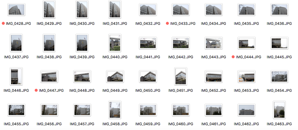
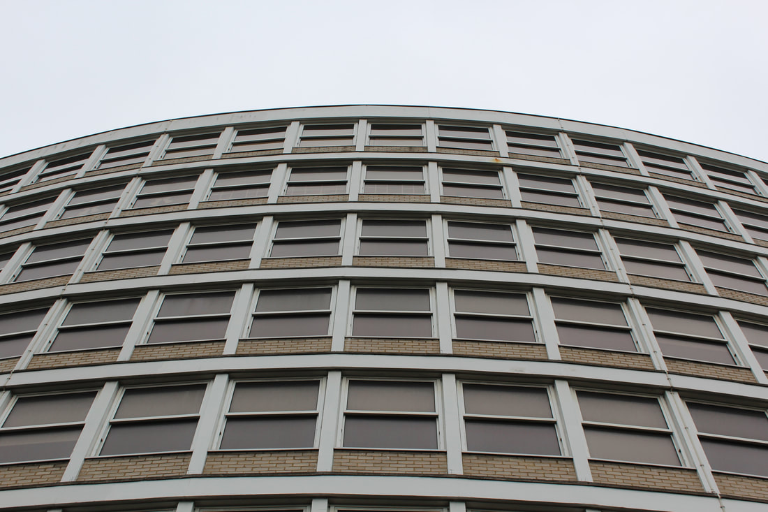
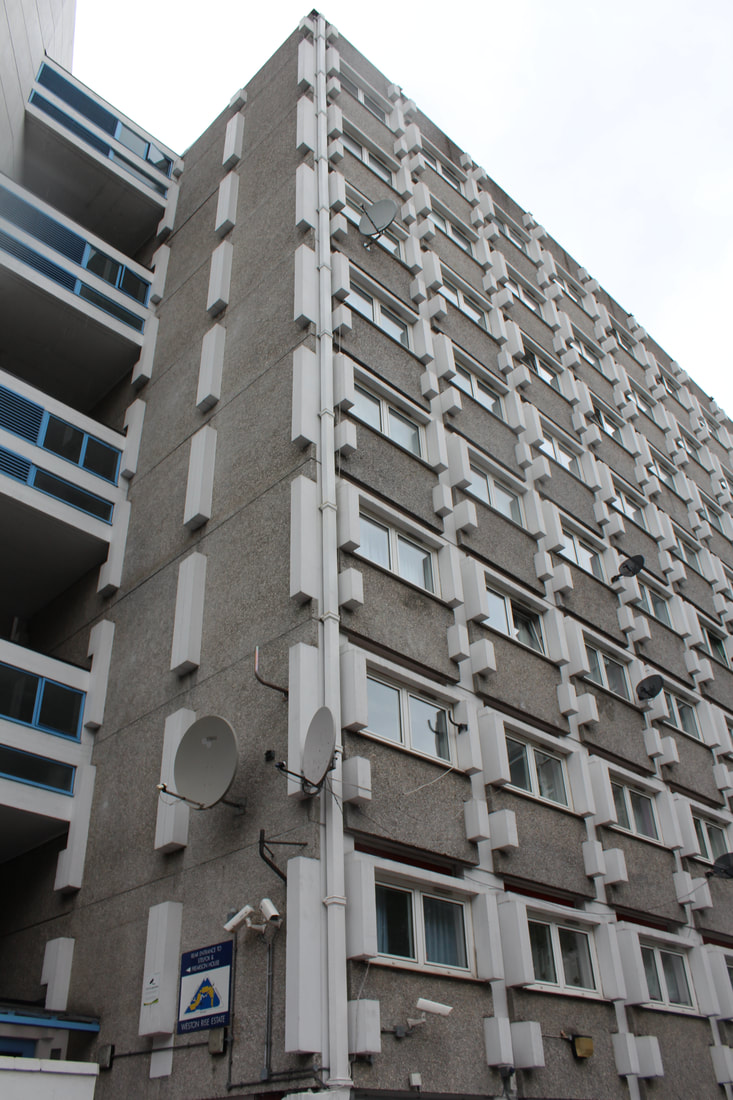
Civic Centre - Enfield Town
The below images are of the Civic Centre in Enfield town in North London, this building is typically seen as brutalist built in 1967. I really liked the block-like structure of this building and tried again to get all the building in one image. I tried to develop the way I was photographing in order to incorporate the patterns of the buildings and the windows structures as well in order for my images to be more effective and fit with the freedoms and limitations themes. The patterns of this building fits with the similar themes of the Barbican and therefore is productive for later editing.
|
|
|
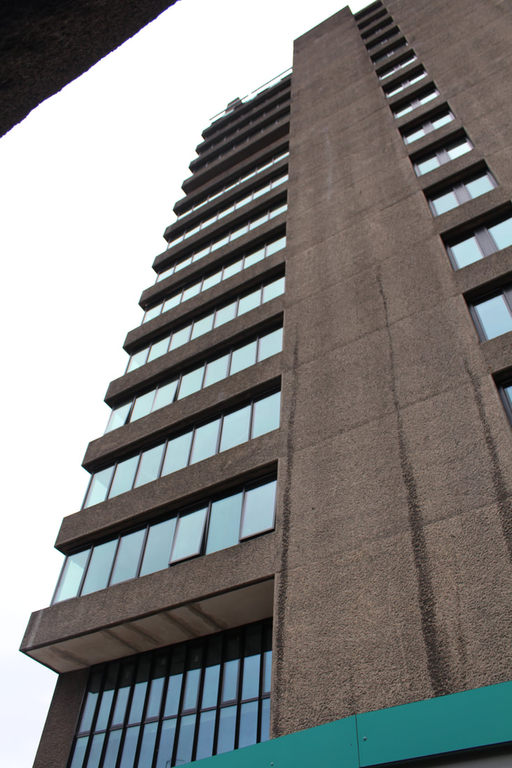
Cockfosters - Black Horse Tower
The following images of the Black Horse Tower in North London, Cockfosters. Due to this building being rounded yet rectangular on the top, I had to manipulate the camera and the zoom in order to make sure the majority of the building is in the image. Similarly to the Barbican and the Civic Centre the block filled windows make a good effect and show the pattern of the architectural structure. However, despite the difficulty of trying to include the whole building within my photos, I found that some images only including the building top to bottom still looked effective and presented the building as whole very well.
|
|
|
|
|
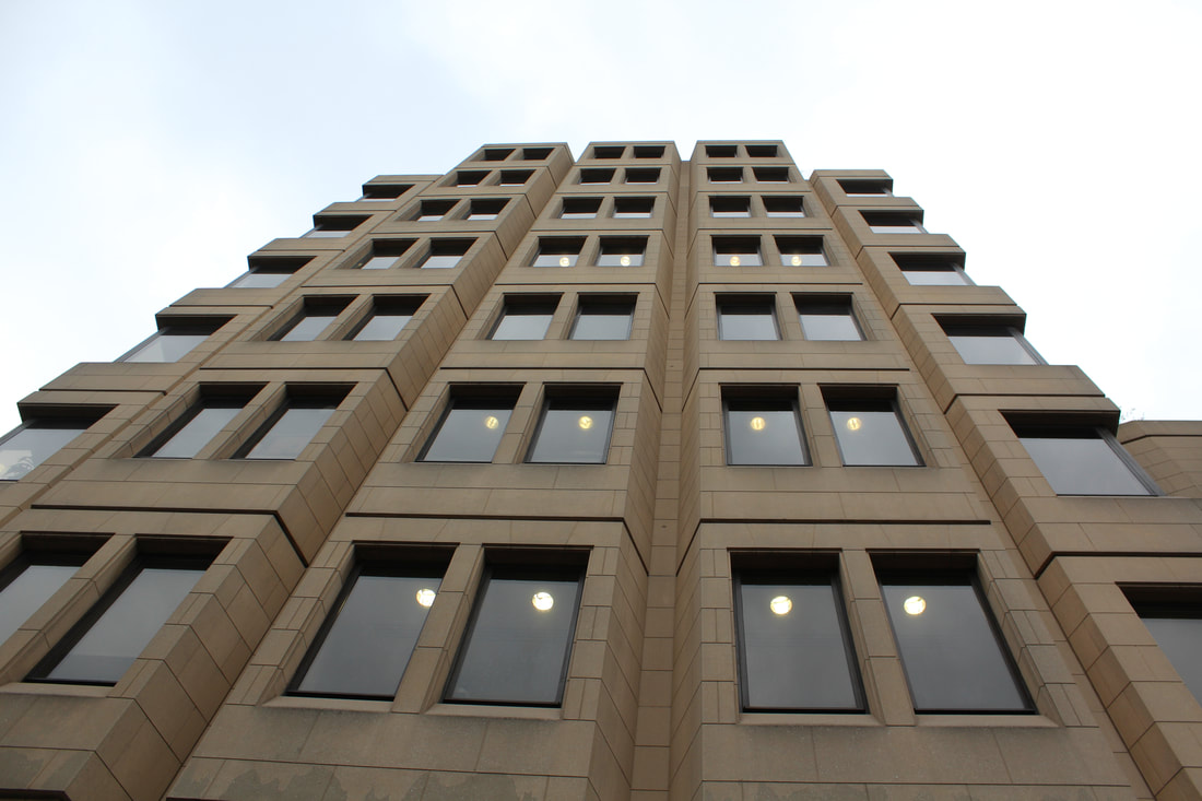
Covent Garden - Toscafund and H M Crown Prosecution Service Inspectorate
The two buildings photographed below in central London in Covent garden both have the same type of windows, seen in most Brutalist structures. The Toscafund building has darker browner colours bringing a different overall effect to the images. The second building however, I found hard to photograph as it was increasingly difficult to take a picture of the whole building itself, due to its size and the buildings and street signs surrounding it. I had to go all the way around the building in order to find a perspective that though the lens of the camera, fit all the building in. I also tried putting the round building in perspective with other buildings surrounding it however, they did not compare the structure of the H M Crown Prosecution Service Inspectorate.
|
|
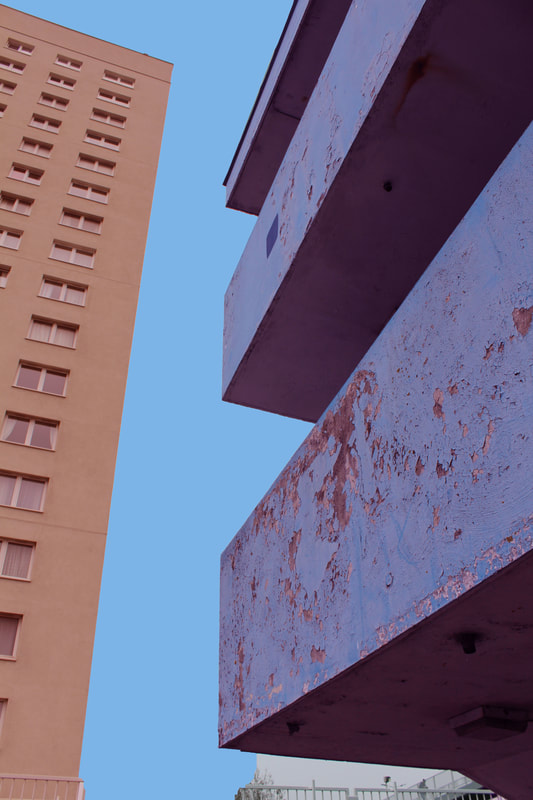
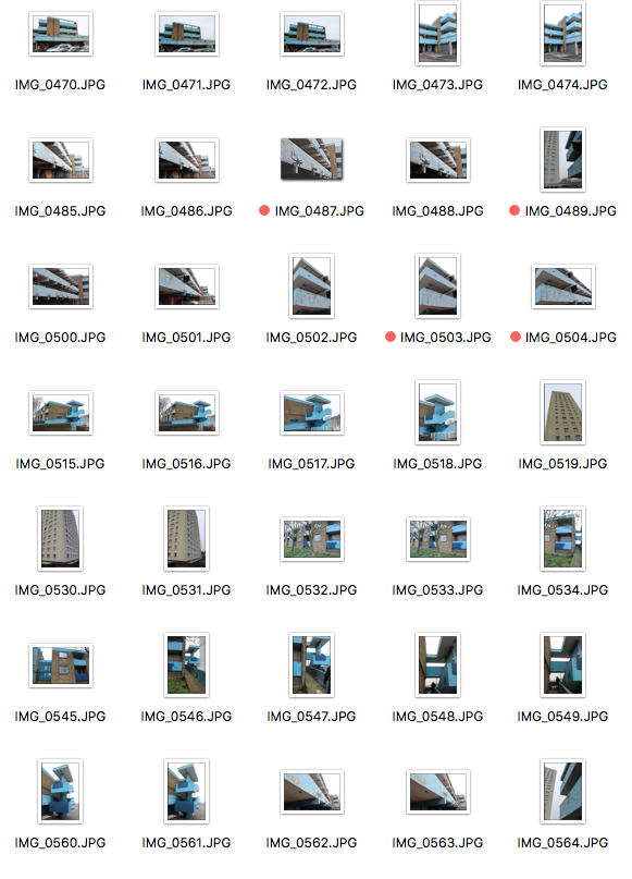
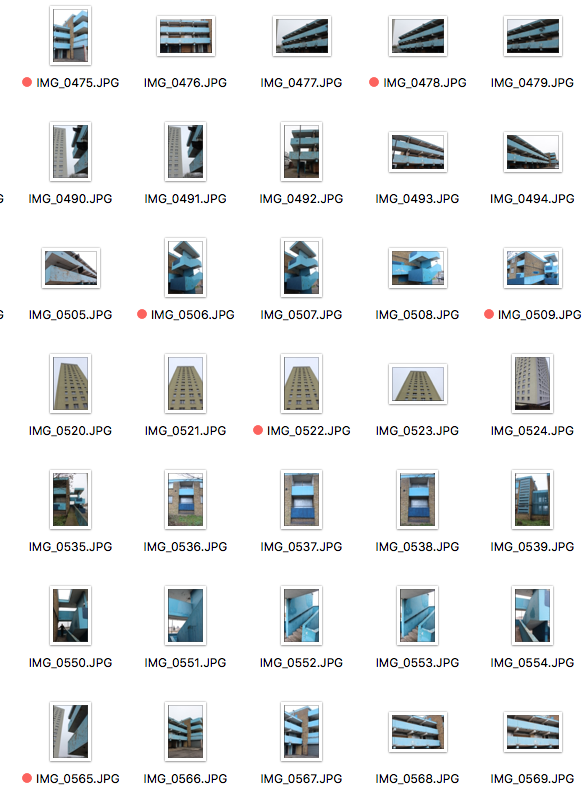
Edmonton - Scott House flats and garages next door
The buildings that are in the images below were found in Edmonton in North London. I was looking for flats to take pictures of when I came across the Scott House Flat, this flat had a set of out of use garages next to it and they were great for photographing. The light blue colouring has long been faded due to lack of up keep and the rusting gave the structure a great edge. The block like structure went well also with the flats next to it and when contrasted next to each other in an image, they looked extremely effective in terms of my theme of brutalism and structure. The contrasting colours of the buildings found so close to each other also looked effective within my photography.
|
|
|
|
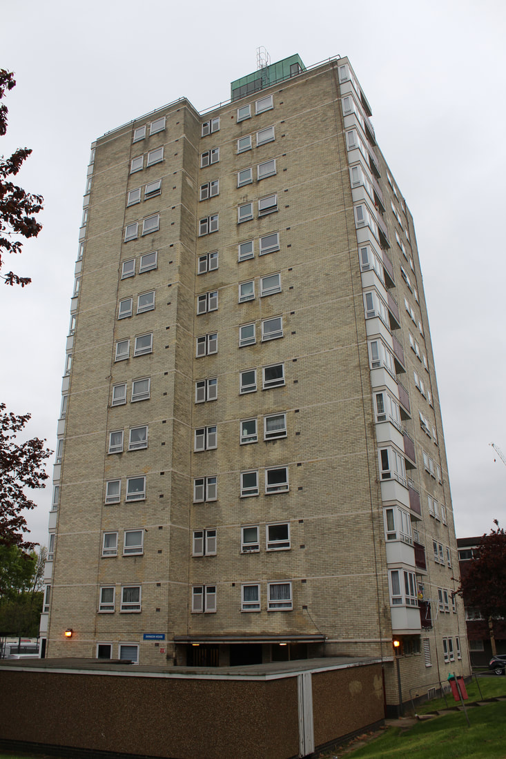
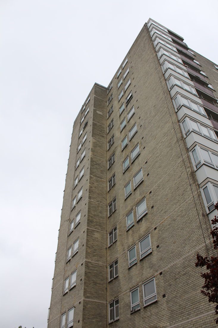
Flats on the North Circular - Highview Gardens
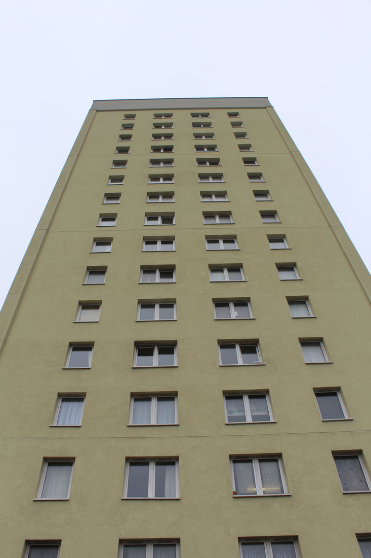
When driving around the Arnos Grove and Southgate area I came across these two sets of flats by the North Circular. These flats struck my attention due to the structure of them, they are very plain but have a block like structure and all the windows and the balconies are mirrored on all sides of the flats. This meant that the images from these flats were interesting and I believe that although they are slightly different style to that of the proper brutalist buildings such as the Barbican Centre, they still cooperate with my other images and go with the theme. The idea of using sets of Flats appeals to me as most flats are old, slightly decrepit and almost always in a tall and block like structure. When photographing these flats, as I have done with the other buildings, I tried to include the whole of the building rather than cropping it out, as this would limit me hen developing my images and editing them.
|
|
|
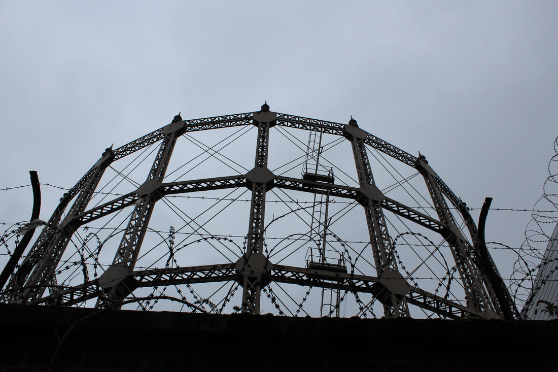
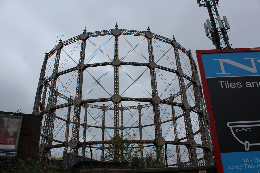
Station Road Gas Works - North Circular
The Station Road Gas Works centre on the North Circular proved challenging to photograph, this is due to the fact that it was increasingly difficult to get close enough to the structure in order to get effective images. Therefore explaining the lack of images from this structure, I tried going all the way around the gas works in order to find an angle that would have the whole of the building in, whilst also having a good background however this proved impossible. Therefore a predominant amount of the images show only half of the structure. The round and rusty style seemed to be effective in relation to the rest of my images, but due to the lack of framing of the images I doubt that I will use these images in my later developments.
|
|
Kings Cross
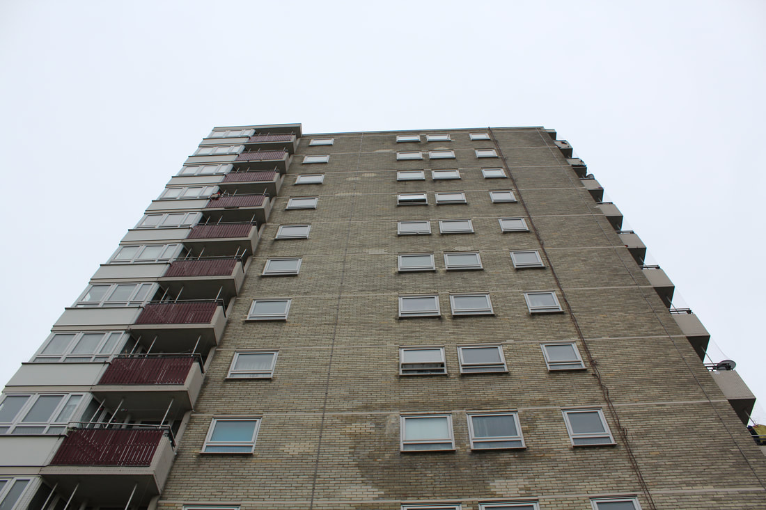
The following images taken of a block of flats in Kings Cross, similar to the block flats found on the North circular have the same repetitive and symmetrical style. I found that photographing this structure again was hard as not all the building could fit in the frame of the camera. The building itself had interesting block sticking out of it, linking well to the brutalist style seen in previous photographs. Learning from previous shoots, I tried to keep all the building in the frame to avoid uneven images.
|
|
Potters bar - Canada Life Building
The following two buildings found next to each other in Potters Bar, North London. These buildings, in comparison with the other images of the buildings taken, are a lot more plain and therefore give a good effect when looking at the building in isolation with its structure. With their minimalistic styles, the two buildings fit well with the brutalist structure and also cooperate with the rest of the images. When photographing these buildings I again ensured that the outline of the building was completely in the image, to ensure when editing later that I could have a whole building to edit, rather than having a cropped version.
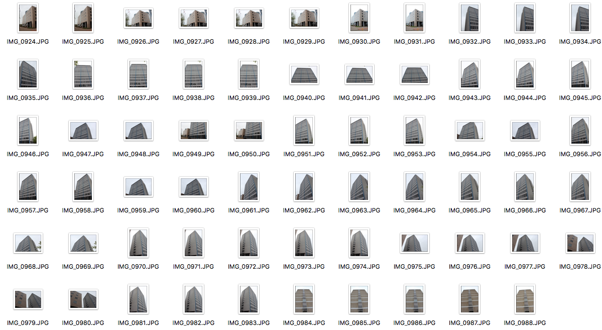
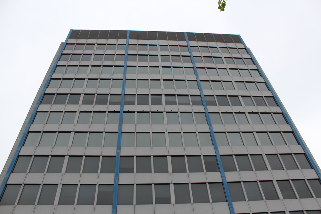
|
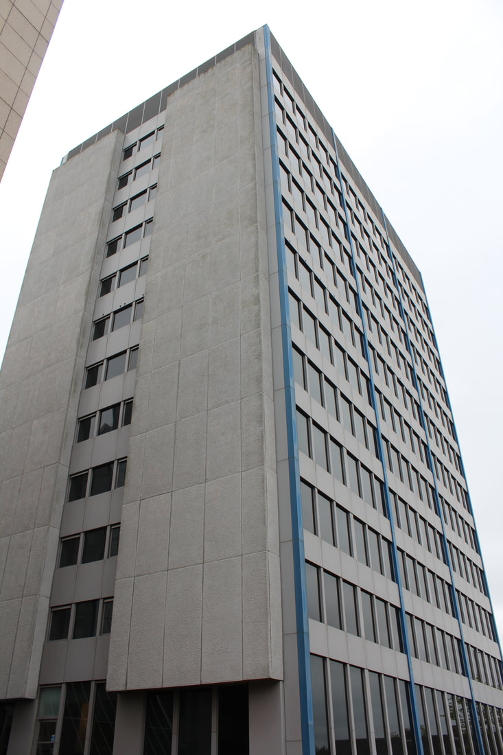
|
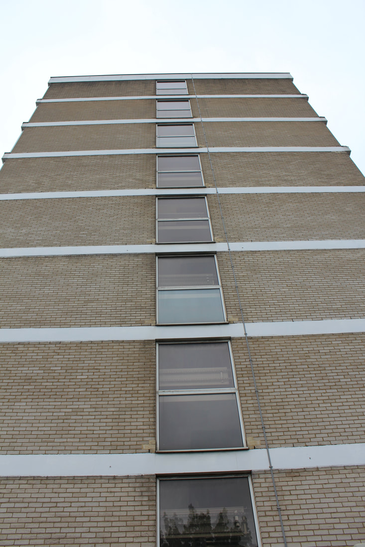
|
Trellick Tower - W10
The last place I went to take pictures of was Trellick Tower in West London, however once arriving in West London I found that the majority of the tower itself was covered in scaffolding and blue mesh covering. This meant that of course it was hard to take pictures of the entire building as the top part was the only part not covered in scaffolding. The top part however, I took pictures of and zoomed in specifically on the actual tower structure seen to the side of the tower. Once I had taken a few pictures of the Tower, I went around the area and took more pictures, this was in oder to not waste the time I had taken to journey all the way to West London. There were some flat blocks down the road from Trellick Tower on a smaller scale, these were effective to take picture of and again similarly to other flat blocks I photographed, they have the same sort of symmetrical and blcok like structure and style.
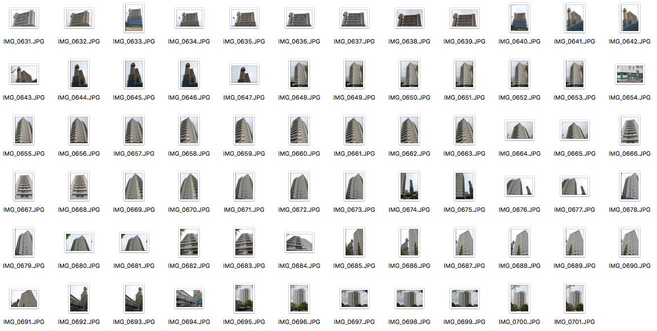
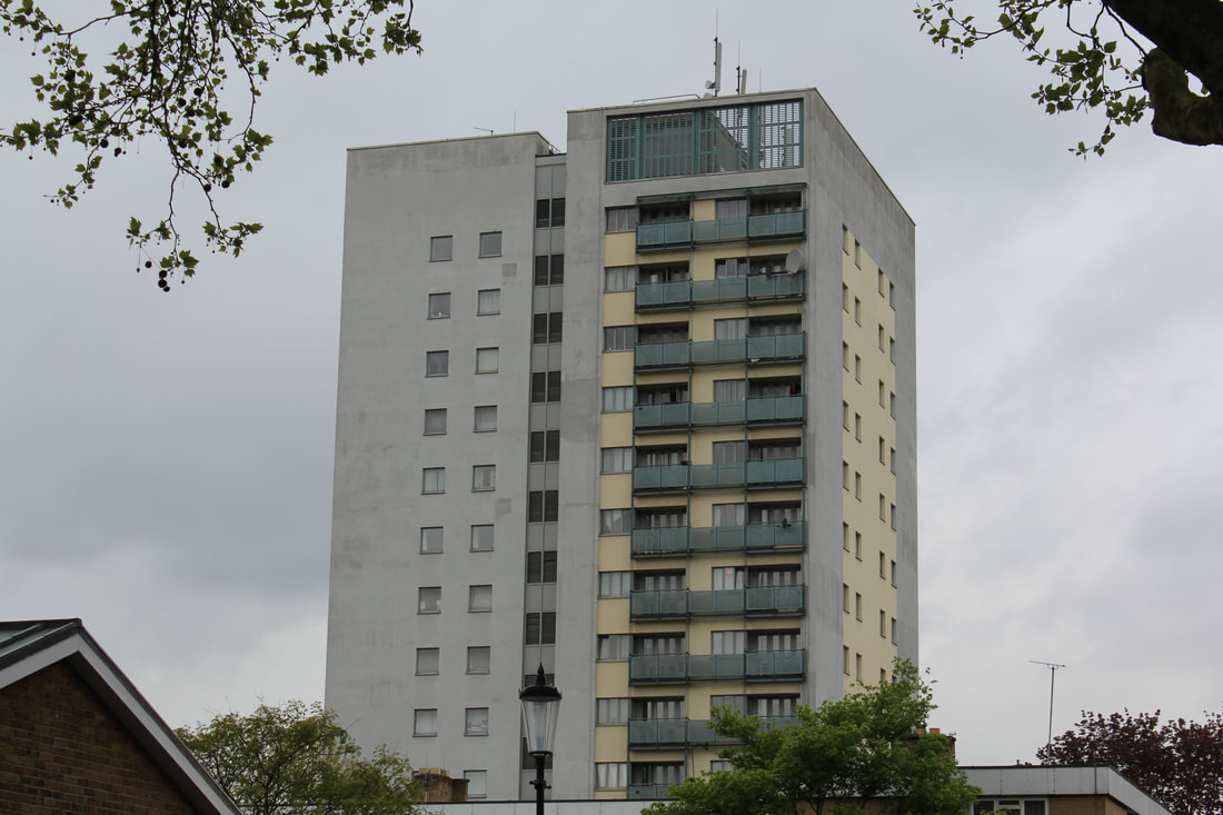
|
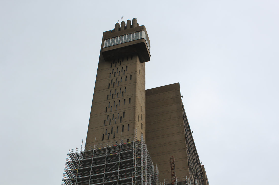
|
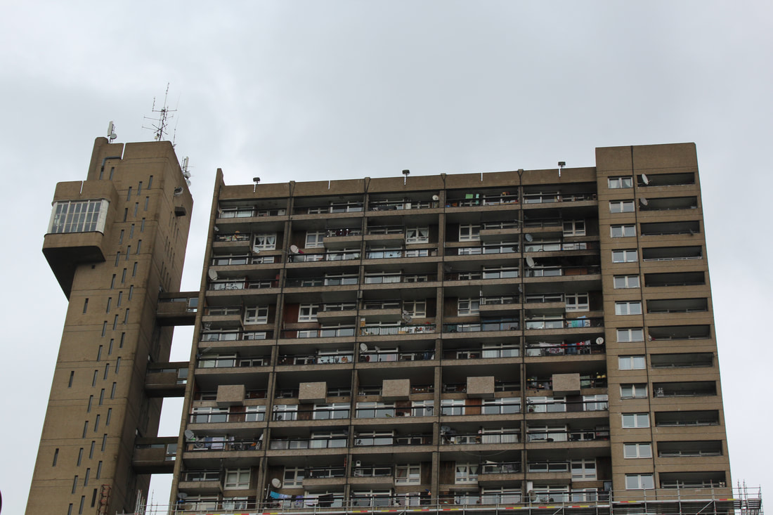
|
Anastasia Savinova
Sweden-based artist Anastasia Savinova found herself traveling through cities across different countries, looking closely at the architecture of the culture that inhabits them. ‘I take pictures of buildings, look into windows sneakily, go to local shops, flea markets and bars, watch everyday life — all this helps to build the feeling of the place,’ savinova says. in identifying the key differences and similarities between the habitable spaces, savinova uses the collected visual material as the foundation for a series of large-scale collages, which integrate several images with dozens of associations into a single amalgamated architectural representation. the series of collages titled ‘genius loci’ sees large dwellings composed of many different buildings typical to a particular city or country. in connection with the land and the spirit of the place, the compositions illustrate not only a fictional architectural reality — replete with haphazard, zany constructions and towers of windows and doors — but also a mentality and way of life for the culture that they are akin to.
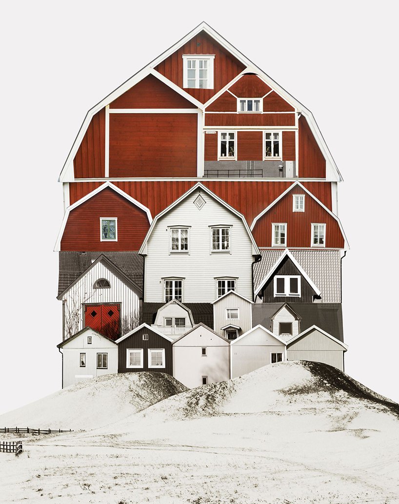
|
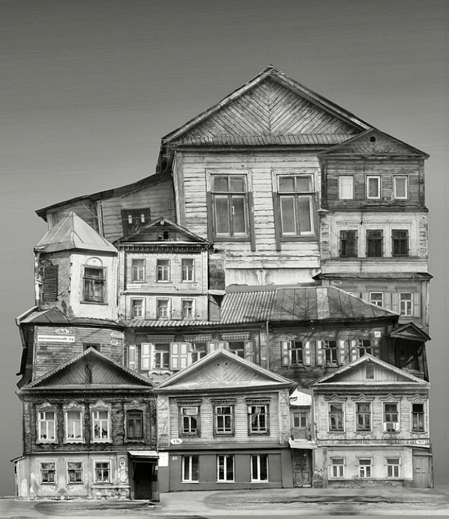
|
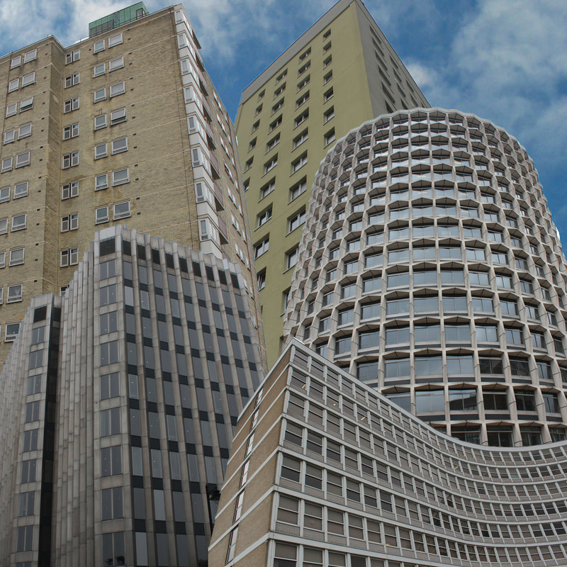
|
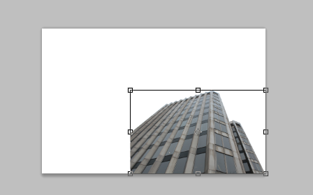
To create the image above I used Adobe Photoshop and took five of my favourite images on buildings I had taken, bearing in mind the structure of the building in order to make sure that the images went well together with each other. I then selected the image I wanted to take and impose onto a plain document on photoshop, I then copied this selected part of the building and pasted onto the other paper. I then transformed the building in order to place it in a specific place on the page, I then repeated these steps for the rest of the buildings. Once I was done I pasted a sky background onto the image to finish it off.
|
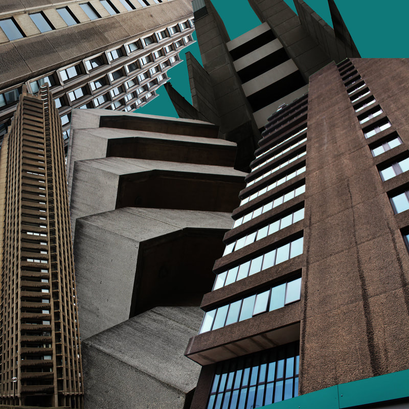
When creating the image above, I tried to incorporate the ideas of the photography from artists such as Anastasia Savinova and Chris Lord for the actual idea of creating a whole new city or building with multiple different images of selected buildings and architecture. I then took influence from the photography of Malte Brandenburg and Nick Frank for the colouring in the image, I tried to take a colour already present in the buildings in the image therefore creating a more succinct image as the colour is not random, but still bold next to the dark and moody architecture. In order to get these multiple images into one photograph, I selected the parts of the buildings that I wanted to be in my images and pasted them onto a whole new page in photoshop. To create the coloured sky, I selected the eyedropper tool and clicked on the colouring that I wanted for the sky. Overall, I am happy with the outcome of this image and it is effectively similar to multiple different artists and photographers however I did find when initially trying to make these type of edits that the buildings themselves needed to be relatively similar in order for the image on a whole to look effective.
SUN Ji - 'memory city'
Sun Ji, a Shanghai-born artist whose photo collages suggest a nuanced view of the city’s past and present. A curator says the 29-year-old artist’s two-part “Memory City” series is “part cubist collage and part hyperreal landscape.” In one work from his “Memory City I” series, Sun juxtaposes black-and-white photographs of factories, smokestacks, and industrial errata. Glimpsed from across an art gallery, the kitchen-window-sized collage resembles a real photograph. But move closer, and the skewed lines of perspective and improbably dense arrangement of buildings reveal a whimsical critique of China’s late-twentieth-century economic “miracle.”
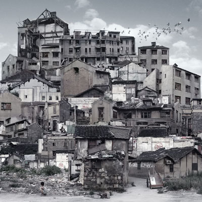
|
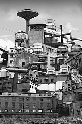
|
Percy Wyndham Lewis
|
Percy Wyndham Lewis creates artistic pieces that propose art suited to the energy of the modern world, before the first world war. Using angles and diagonals suggesting the geometry of modern buildings. Using harsh colours and lines to imitate the attack on traditional harmony in the modern city of London. Using an aggressive and angular style, Lewis’ work allow us to focus on the modernity linking to Italian futurists, using the context of the war devastating the reality of men against machines. Using his work Lewis wants us to consider the ideas of the captivity the first world war created for those working in the being industrial corporations creating ammo and many other need supplies in order to help the work effort, using this geometric style to imitate such buildings and factories.
Lewis’ concentration is clearly on industrial England, stemming from the then still common description of England as the ‘workshop of the World’. The composition of Lewis’ work demonstrates his capability to translate his complex ideas into visual art forms, it is clear to see that his uncomfortable, prison like structures gives the expression that ‘men should be pinned and herded into their time’. The harsh and bold choice of colours are clearly deliberate. Lewis states ‘Even if painting remains intact, it will contain all the elements of discord and ugliness consequent on the attack of traditional harmony’. When looking at Percy Wyndham Lewis' work in relation to the theme of Freedoms and Limitations, it is clear to see that his work allows him to clearly express his personal feelings on the confinement of his own personal expression and the confinement for men of the time of World War One in which everyone was expected to help the war effort. Using his depictions of his perspective of the city and its industries through block like and geometric style, this links very well to my ideas and developments of Freedom and Limitations. Lewis' inspirations are to portray the confinement through his expression of the Vorticist movement has allowed me to develop my ideas even further, looking more at the colourings of the buildings, creating even more abstract images and using bright colours also. |
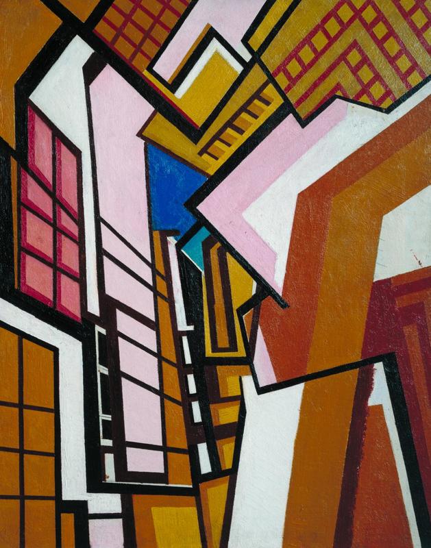
|
Final Images and editing:
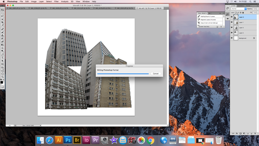
3.

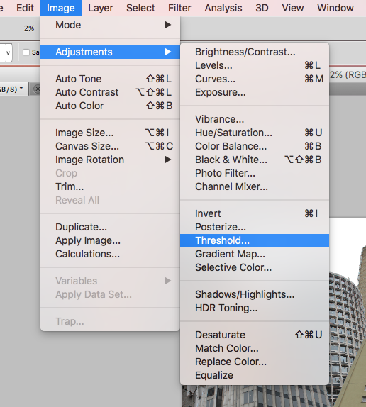
4.
|
2.
Above is the details for the editing of the images of buildings, in order to create a whole new city. First I had to create a whole new page for the images to be pasted onto, I then decided to take the original images and make them a lot small and change the resolution, this is in order for all the images to fit onto the new page, and not be too big, as I knew that if I put multiple of the original images onto one page, this would be too much for Photoshop to handle. I changed all the images to 20 cm wide with 200 resolution. Secondly, I selected the specific parts of the buildings that I wanted to be in my new image and pasted them into the page. Once I had done this with all the images, and placed them in the places that I wanted them to be in I flattened the image in order for all the layers to become one. Once flattened, I went onto Image, Adjustments and Threshold, this is what creates the black and white effect however it is not like the basic black and white, as the contrast for Threshold is a lot higher and therefore specific parts of the patterning on the buildings became more prominent. Once the editing was finished, I picked specific colours for the sky, I decided to stay with the blue colouring in order to mimic the sky, however due to it being a block colour it went well with the bold black and white buildings which jolted into the block blue, I chose complementary but different blues for each final images.
|
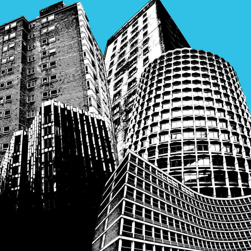
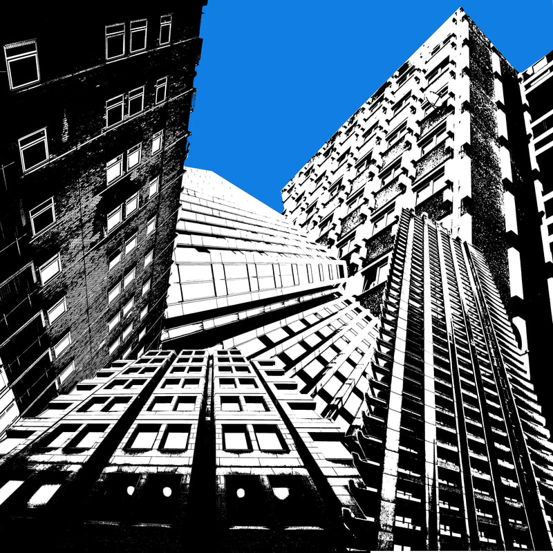
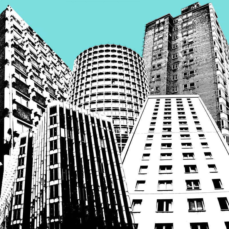
Above are the final edits created for my final piece. Using inspiration from multiple photographers such as Darren Almond for the dark and juxtaposing colouring, however contrasting with this I used inspiration from Malte Brandenburg and Nick Frank for the bright blue background colours as I believe their images look extremely effective and attractive to the eye with some sort of bold colouring in it in order to contrast with the dark colours and gradients of the buildings. Anastasia Savinova, Chris Lord and Sun Ji being my main inspirations for the main idea for the incorporation of multiple photographs of buildings into one image in order to create a new sort of city or sky view. I found that Chris Lord was most influential in the style of the way I presented my images as he too put the buildings all next to each other into one square or rectangular image, rather than creating a new structure as seen in Anastasia Savinova's editing, where she creates new buildings out of the ones she has already photographed. Incorporating multiple styles into my final images, including the colourings of the sky and backdrop has allowed me create some extremely original images and edits. Overall, I am very happy with the outcome of these images, where I first attempted this style but with plain buildings, it is clear to see that development and inspiration from other artists and photographers allowed me to evolve my editing in order to create even more effective and attractive images. In relation to the theme of Freedom and Limitations, the creation of a new sort of city was inspired by the ideas of the freedoms within the modern world, which sees new buildings and structures developed everyday. Living in London also inspired me, as their are thousands of different styled buildings all forced and squeezed into tiny spaces, linking with my edits in which I have tried to squeeze in architectural structures by manipulating their size and scale. The black and white colouring next to the bright blue colours also suggest the ideas of the limitations of society and how people are forced to conform to these black and white lives, such as office jobs and constant strain financially, when really just above the surface, a bright and colourful world can be found in which all limitations are gone and society is free.
