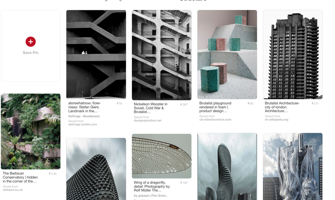
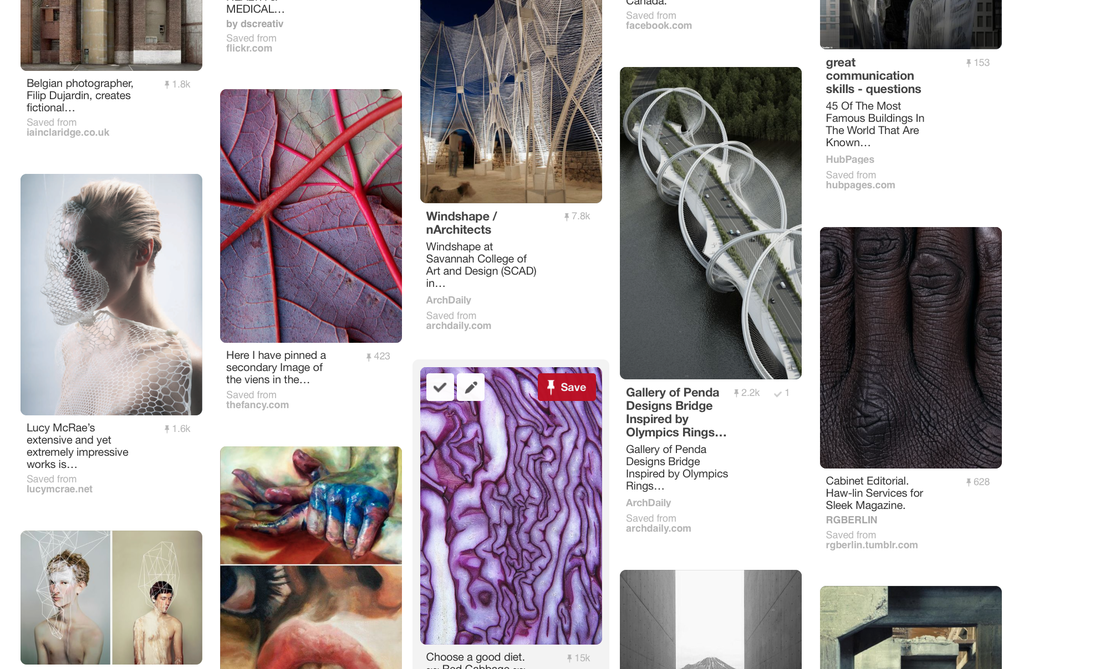
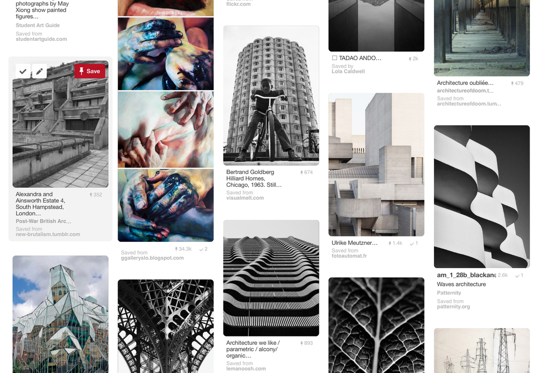
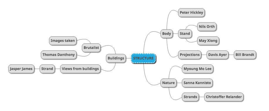
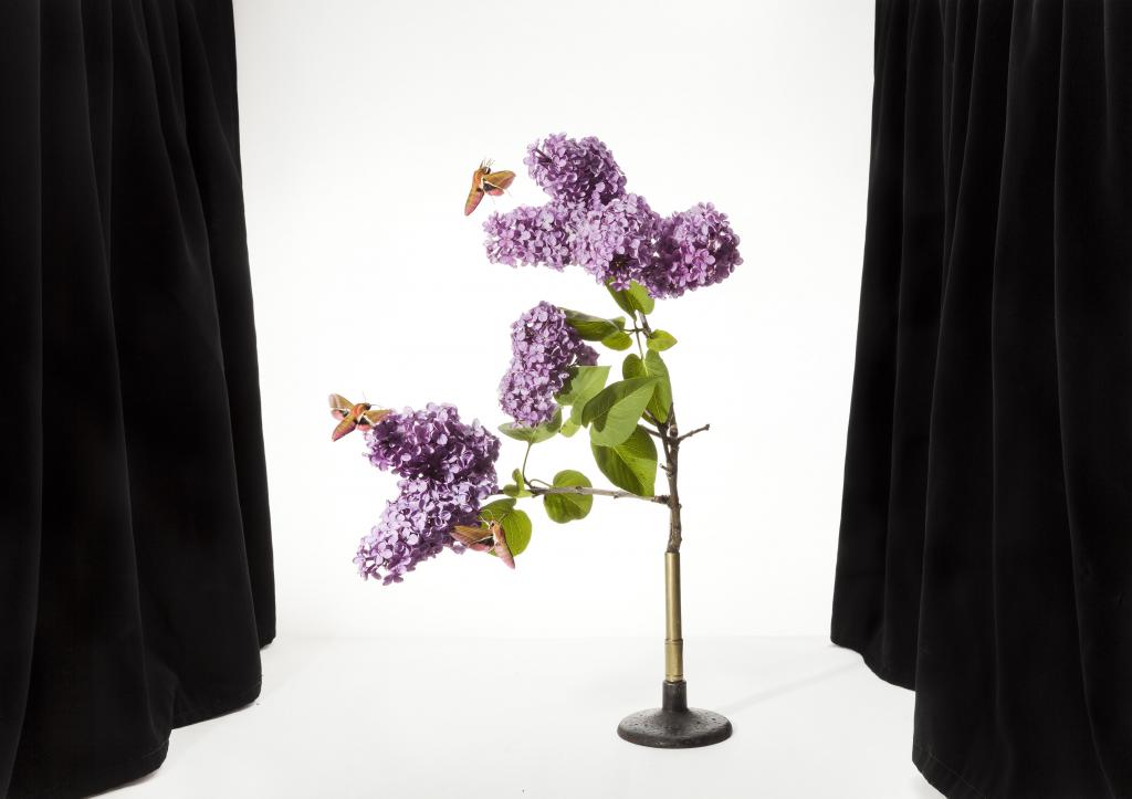
Pinterest Visual Interpretation:
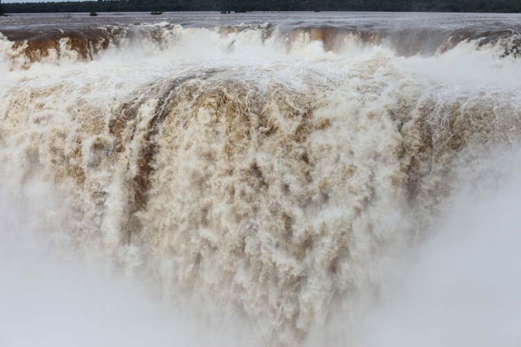
Using my own Pinterest account, I create a album full of images which I feel are connected some way to structure. I looked at the structure of buildings, plants, people and bodies. This has helped me to be inspired and collect ideas for later on for my final piece. In photo composition the four structural elements shape, form, pattern and texture is important. Images where one or more of these structural elements are used tend to be of an abstract nature. Structure is important when taking pictures as your ability to identify and see the potential in shapes, forms, textures and patterns can be very important if you want to shoot different images standing out from other photographer and being more unique.
MY MAIN IDEAS
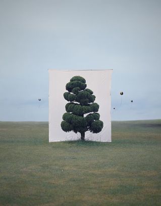
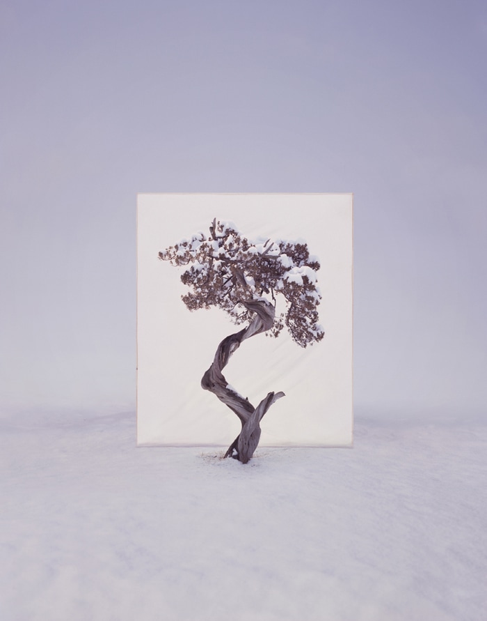
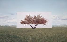
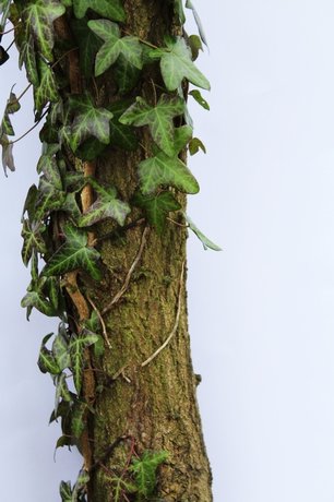
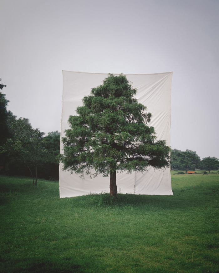
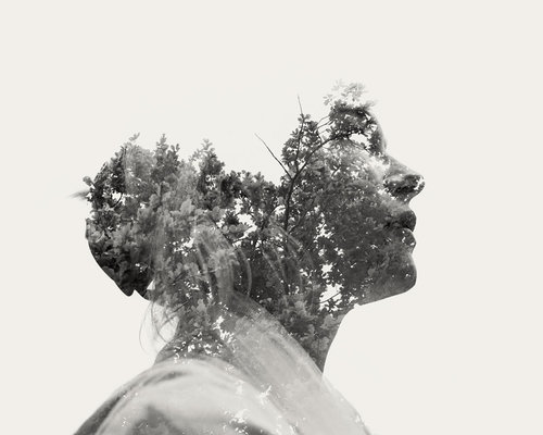
Myoung Mo Lee - A beautiful and intellectual meditation on trees, nature, environment and perception by South Korean photographer Myoung Ho Lee.
|
|
|
MYoung ho Lee works slowly, observing each tree for four seasons before photographing it. Through digital retouching, he removes evidence of the canvas’s support structure, so that it appears to float unaided behind the tree that it frames. At once deadpan and playful, the resulting photographs highlight the beauty and physicality of the trees, while also flattening them, causing them to appear as unreal, two-dimensional images inserted into the landscape.
|
Background
Young Ho Lee, a young artist from South Korea, has produced an elaborate series of photographs that pose some unusual questions about representation, reality, art, environment and seeing. Simple in concept, complex in execution, he makes us look at a tree in its natural surroundings, but separates the tree artificially from nature by presenting it on an immense white ground, as one would see a painting or photograph on a billboard. Physical Isolation and its Visual Confirmation - Myoung Ho Lee separates subjects from their original circumstances to shows the difference between subject and image. His work reveals nature by twists and turns, a little fabrication and optical illusion. Myoung Ho Lee enacts his works as ‘a series of discourses on deconstruction in the photography-act’. His works are largely composed by following four procedures: 1. Selection of The Subject 2. Separation of The Subject 3. Photographing 4. Confirmation of The Separation |
MY DEVELOPMENT:
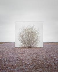
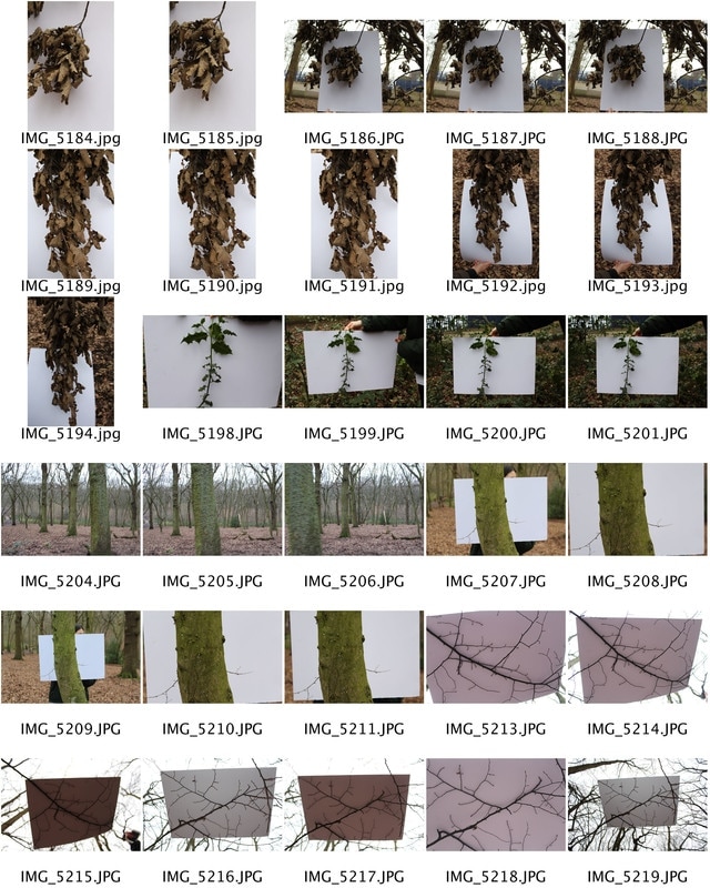
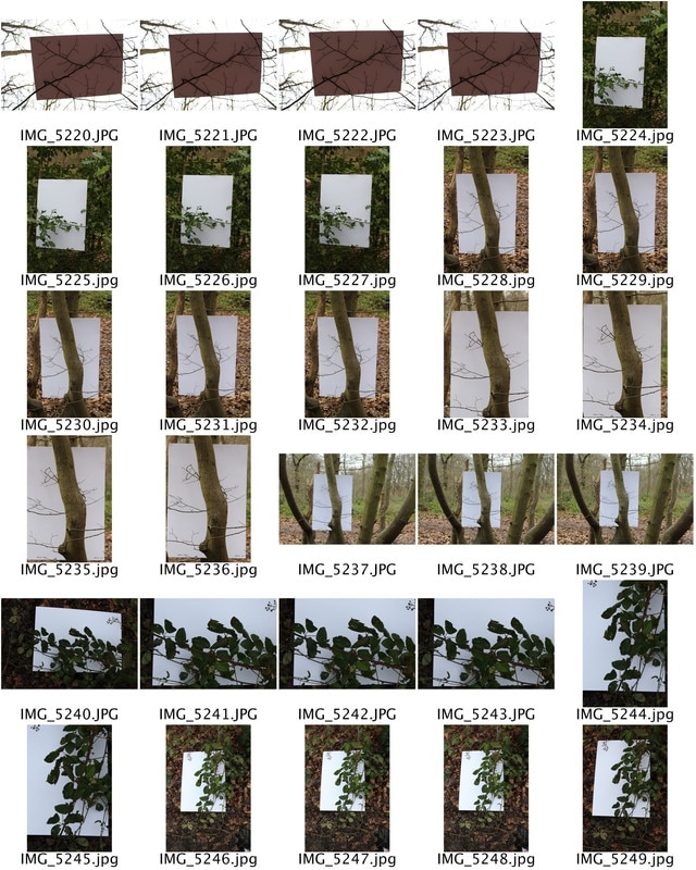
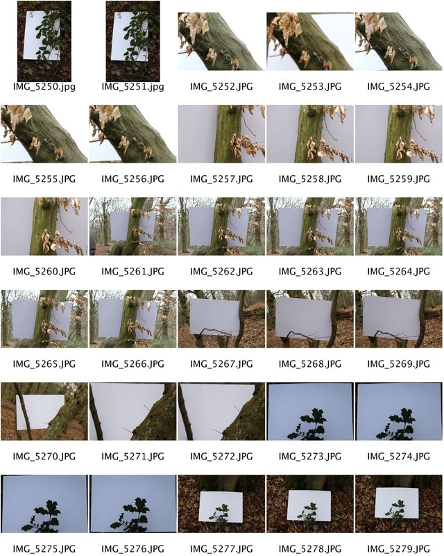
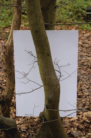
To imitate Lee's styling of photographs I went into a woods and took images with a plain piece of white cardboard, this was used to copy the massive white sheets Lee puts behind his images. I firstly took images of the plant with the paper behind, but concealed the background as to make it look like the plant had been moved from the woods, this meant that all concentration was directly on the plant and the looks and designs of it. After taking a few pictures with the white board concealing the background, I then took pictures with the background in the back as to give the image context, this meant that the plant was not so singularized as the background helped to drag the focus from the plant only to what was going on behind the image and where the image was taken. When taking these images I found that the images with the white background allowed the viewer to concentrate solely on the details of the plant and the white background made the dark colourings and features more prominent. The white background made it easier to outline the visual structure of nature and allows the viewer to easily see the characteristics of the plant. Therefore overall, when putting the white background image and the same plant image with a contextual background, I found that they are effective together in showing how natures structure is bizarre and delicate. Due to the fact that MYoung mo Lee's images are taken on a larger scale with bigger trees and plants and bigger white backdrops, my development could have been improved by creating a larger scale photoshoot with bigger equipment to help make more convincing and professional images.
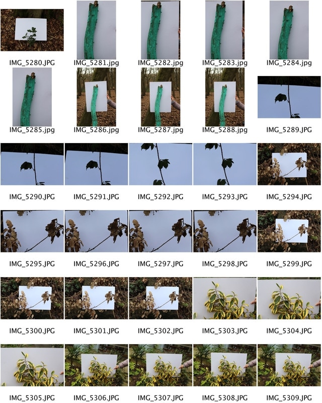
Here, is one of my best final images. As you can see I have isolated the tree and plant growing up the tree and tried to imitate Lee's images. Overall, I think that this image is effective as it shows the structure of nature and the fact that the white background makes the plant stand out more is very effective. I really like this image and did not have to edit it at all in photoshop to increase its effectiveness or increase brightness.
|
This second image shows the effectiveness of having the background of the image still in the image as it gives context to the image. I like this image and i think is effective in showing the structure of nature however, I think that the tree used is not necessarily effective enough as it is quite dull. If I were to take these images again, i would try and pick plants that would look more interesting and effective when looking at nature in context.
Artist and me:Here, you can see the left that Myoung Ho Lee's shows a clear distinction between the nature and structure of the tree and context the tree comes in. Due to Lee's massive scale I found it difficult to imitate her images, but I tried to do them and imitate them on a smaller scale. Overall, the two images above show clear connections to Lee's style, but I believe that I should have made the second image with the context in better by using a better plant or tree, the branch/trunk I used had little detail in and is not very interesting.
The top left image however is more effective as it shows the clear structure and small details that are in nature and the image is effective in terms of structure. Overall, I would say that despite some lack of detail in images with background and context, the images without context show detail and enforce the ideas of the structure of nature well. |
THE RADICAL EYE: MODERNIST PHOTOGRAPHY FROM THE SIR ELTON JOHN
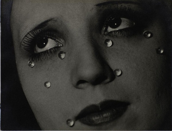 Glass Tears, 1932 by Man Ray
"When I was living with Bernie [Taupin] I had a poster of Glass Tears – I never imagined I would one day end up owning it" - Sir Elton John
The Radical Eye is a Modernist Photography exhibition from the Sir Elton John Collection, showing at the Tate Modern. It focuses on the classic modernist period of the 1920s-50s, often referred to the 'coming of age' period of photography. This is the first time over the past twenty five years where a group of Man Ray portraits are brought together with portraits by Matisse, Picasso and Breton. Additionally, it displays 150 rare vintage prints by iconic figures such as Brassai, Imogen Cunningham, Andre Kertesz, Dorothea Lange, Tina Modotti and Aleksandr Rodchenko. Therefore displaying the work of artists who at the time were transforming the use of photography via experimentation and innovations and ultimately have had an extensive impact on artists over time, still today, by altering their perception of photography.
Each of these photographs serves as inspiration for me in my life; they line the walls of my home
and I consider them precious gems. I want people to think, ‘I’ve never seen anything like that before,
never knew this kind of thing existed’ – just as I did when I first saw these photographs."
— Sir Elton John
Room 1: The Radical Eye
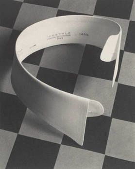 Outerbridge's Ide collar
This image is the 'Ide Collar' by Paul Outerbridge and was taken in 1922. Ide Collar, one of Outerbridge's most iconic photographs, was also his first advertising assignment, and was published in Vanity Fair magazine the year after it was made. This was a period when some photographers were intent on establishing their medium as a fine art, and would have frowned on its use for commercial work. Outerbridge embraced both possibilities. His dramatic use of light and dark, his paring down of objects to basic forms, and the contrast of the geometric checkerboard with the curving men's shirt collar demonstrate his stylistic engagement with the art of the time. In the image, the shadows effect the composition by distorting the proportions of the image making the checkered background look edited or changed and morphed.
Room 2: Portraits
Penn's 'Corner portraits"
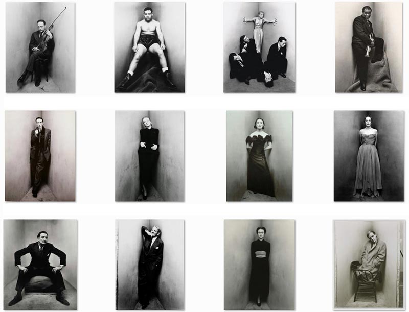
Around 1948, photographer Irving Penn began making unusual portraits of a number of writers, artists, musicians, politicians, dancers and other celebrities. Each one was asked to position in a small corner which was sharper than 90°, created with two studio flats pushed together and a carpet on the floor. The photographic studio ceases to be a neutral environment to become an active agent in the creation of the photographic reality. Irving Penn had already begun to use the studio as a place revelead in the photograph, as the viewer is allowed to see electrical cables and photographic material scattered on the floor. With the corner portraits, the studio becomes a veritable architectural limiter of the subject movements and the resulting compressed and claustrophobic environment isolates the subjects’ personalities in an abstract, artificial corner of the world. I found these images extremely interesting as different people fit in the corner in different ways and some look comfortable and some don't showing how proportions effect the way a image is taken and produced.
Room 3: Portraits/Bodies
|
George Platt Lynes was the preeminent celebrity portraitist of his day, shooting for Vogue and Harper s Bazaar and creating distinctive photographs of iconic cultural figures such as Diana Vreeland, Salvador Dali, and Orson Welles. But he also produced a separate body of work, kept largely hidden during his lifetime: photographs of the male nude. Many of these photos were shot in the studio and, like his fashion and dance work, were painstakingly posed and lit. They have a cinematic allure that evokes 1940s Hollywood and the lost era of New York s cafe society. Many seem to illustrate some unwritten mythology. Others reveal private obsessions of the photographer, who was always alert to the sculptural qualities of a young man at his most vital.
|
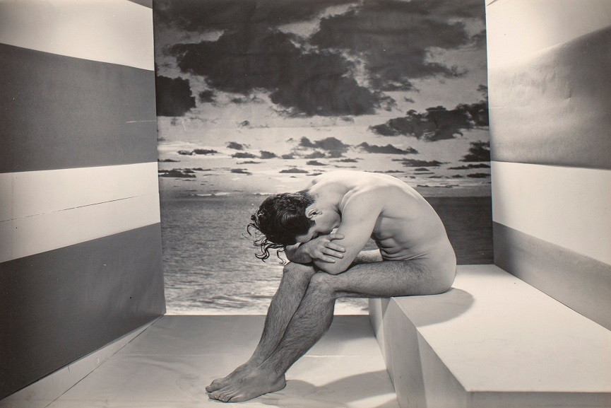
Lyne's 'forgotten model'
|
The Migrant Mother by Dorothea Lange - Favourite image in exhibition
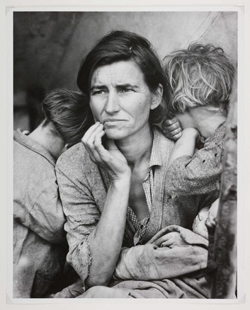
The photograph that has become known as "Migrant Mother" is one of a series of photographs that Dorothea Lange made of Florence Owens Thompson and her children in February or March of 1936 in Nipomo, California. The images were made using a Graflex camera. The original negatives are 4x5" film. It is not possible to determine on the basis of the negative numbers (which were assigned later at the Resettlement Administration) the order in which the photographs were taken.
"I saw and approached the hungry and desperate mother, as if drawn by a magnet. I do not remember how I explained my presence or my camera to her, but I do remember she asked me no questions. I made five exposures, working closer and closer from the same direction. I did not ask her name or her history. She told me her age, that she was thirty-two. She said that they had been living on frozen vegetables from the surrounding fields, and birds that the children killed. She had just sold the tires from her car to buy food. There she sat in that lean- to tent with her children huddled around her, and seemed to know that my pictures might help her, and so she helped me. There was a sort of equality about it." - Dorothea Lange
"I saw and approached the hungry and desperate mother, as if drawn by a magnet. I do not remember how I explained my presence or my camera to her, but I do remember she asked me no questions. I made five exposures, working closer and closer from the same direction. I did not ask her name or her history. She told me her age, that she was thirty-two. She said that they had been living on frozen vegetables from the surrounding fields, and birds that the children killed. She had just sold the tires from her car to buy food. There she sat in that lean- to tent with her children huddled around her, and seemed to know that my pictures might help her, and so she helped me. There was a sort of equality about it." - Dorothea Lange
Sanna Kannisto - Field Work
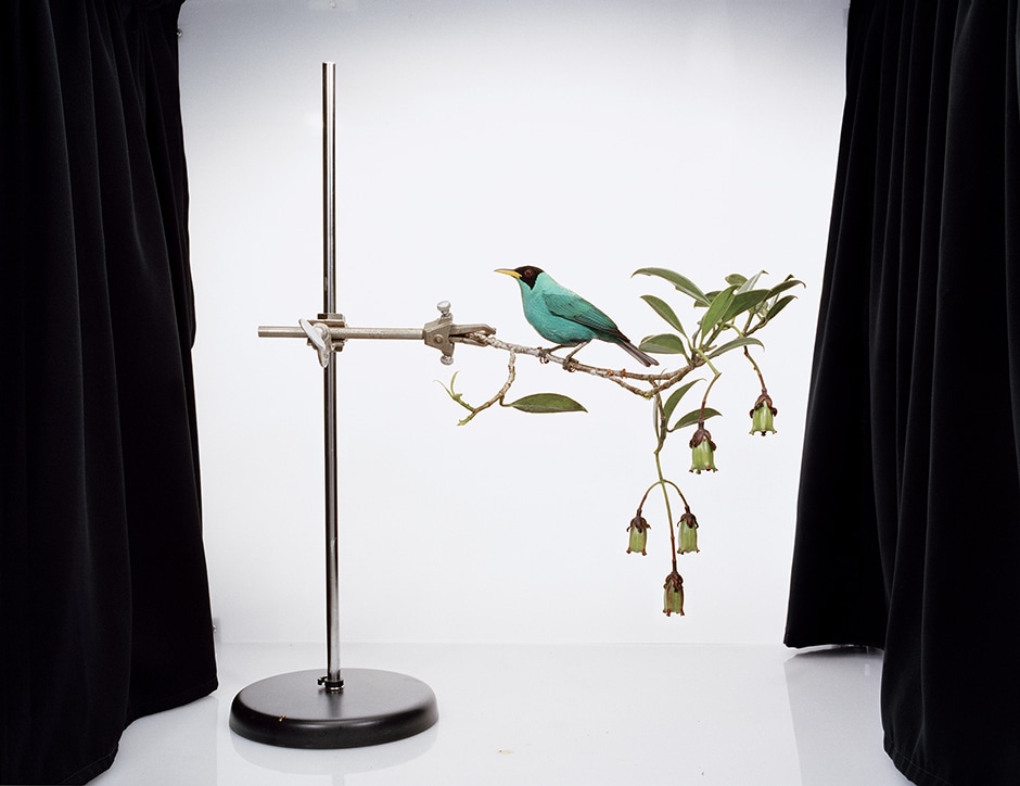
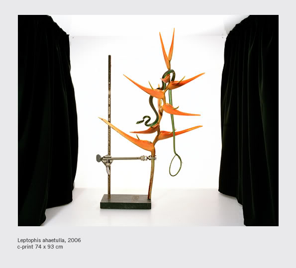
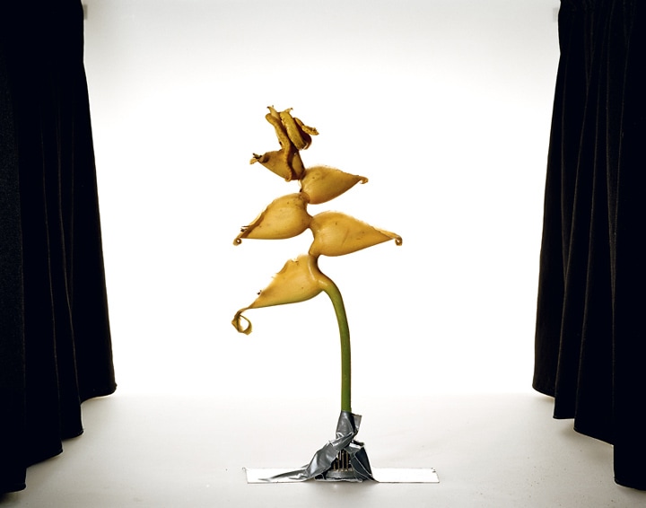
In the first picture above, Kannisto has digitally manipulated the image to add in a bird to her image, this creates a vivid sense of nature and in some senses completes the image as it adds a natural bird next the harsh science stand and black curtains. The second image also has a snake manipulated into it, this next to the plant, brings out the bright orange colours and gives the plant something to contrast with. The final image shows how a flowered plant has been stuck upright to the ground with ducktape, again this un-natural object next to the natural flower makes the plant stand out and makes a great disparity. In all three images the black curtains around the sides juxtaposes the plants and flowers as it makes the colours stand out and the curtains are un-natural and the plants are. Overall, Kannisto's use of digital manipulation and her use of contrasting colours make the images stand out and allows the concentration of the image to focus solely on the plant and its structure, she is a perfect artist to imitate as she portrays the structure of nature effectively
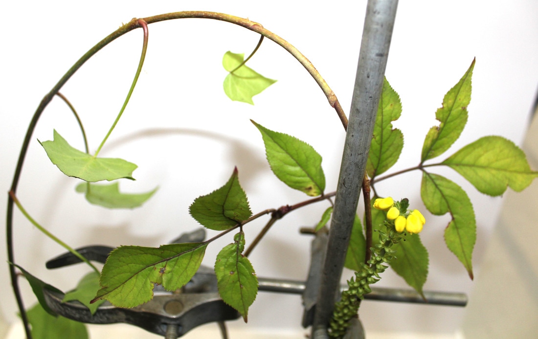
To create pictures that immitate Sanna Kannisto 'field work' images, I was given different items found in the woods. I then attached them to a clamp stand and proceeded to take pictures of them. I found that some pictures taken with the flash showed the shadowing for the plant really well but in other cases the shadows made the plants darker and therefore all detailing was lost.
The work of Finnish photographer Sanna Kannisto explores the complex space that exists between the natural world and those humans who desire to isolate, possess, and understand it in some way. Sanna Kannisto is known for exposing the methods used in conventional nature photography. In her newly released monograph Field Work, the Finnish photographer documents her process, her relationship with her subjects and their relationship with nature.
The work of Finnish photographer Sanna Kannisto explores the complex space that exists between the natural world and those humans who desire to isolate, possess, and understand it in some way. Sanna Kannisto is known for exposing the methods used in conventional nature photography. In her newly released monograph Field Work, the Finnish photographer documents her process, her relationship with her subjects and their relationship with nature.

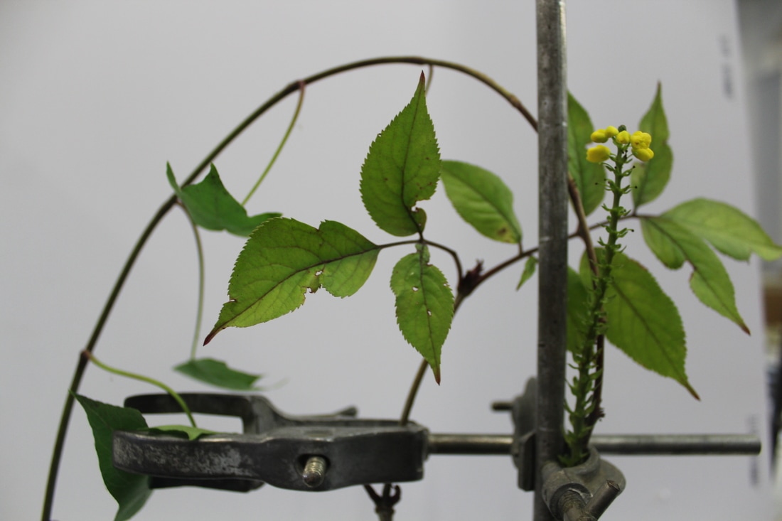
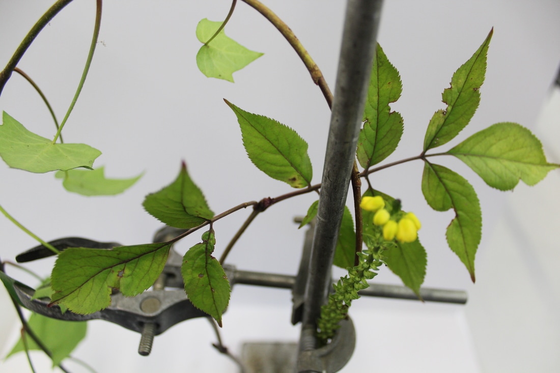
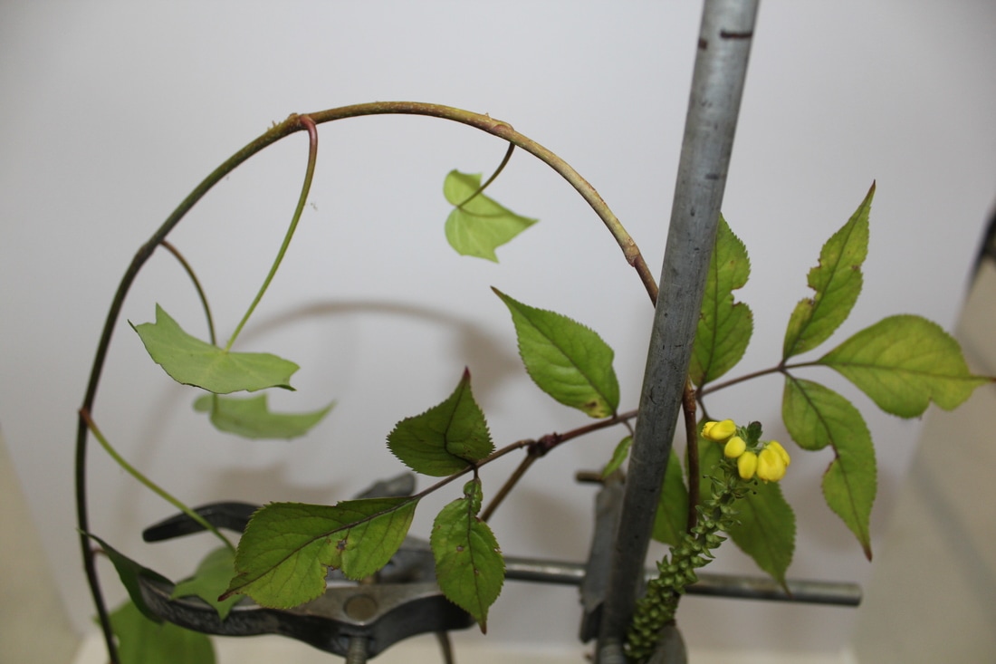
Here is one set up of a plant with a flower put in the scientific clamp. I have taken four different shots of the same image, this shows how different angles have a different effect on the depth and construction of the plant. I love the way Sanna Kannisto uses the digitally edited parts to make the plants look more interesting and enticing to the viewer.
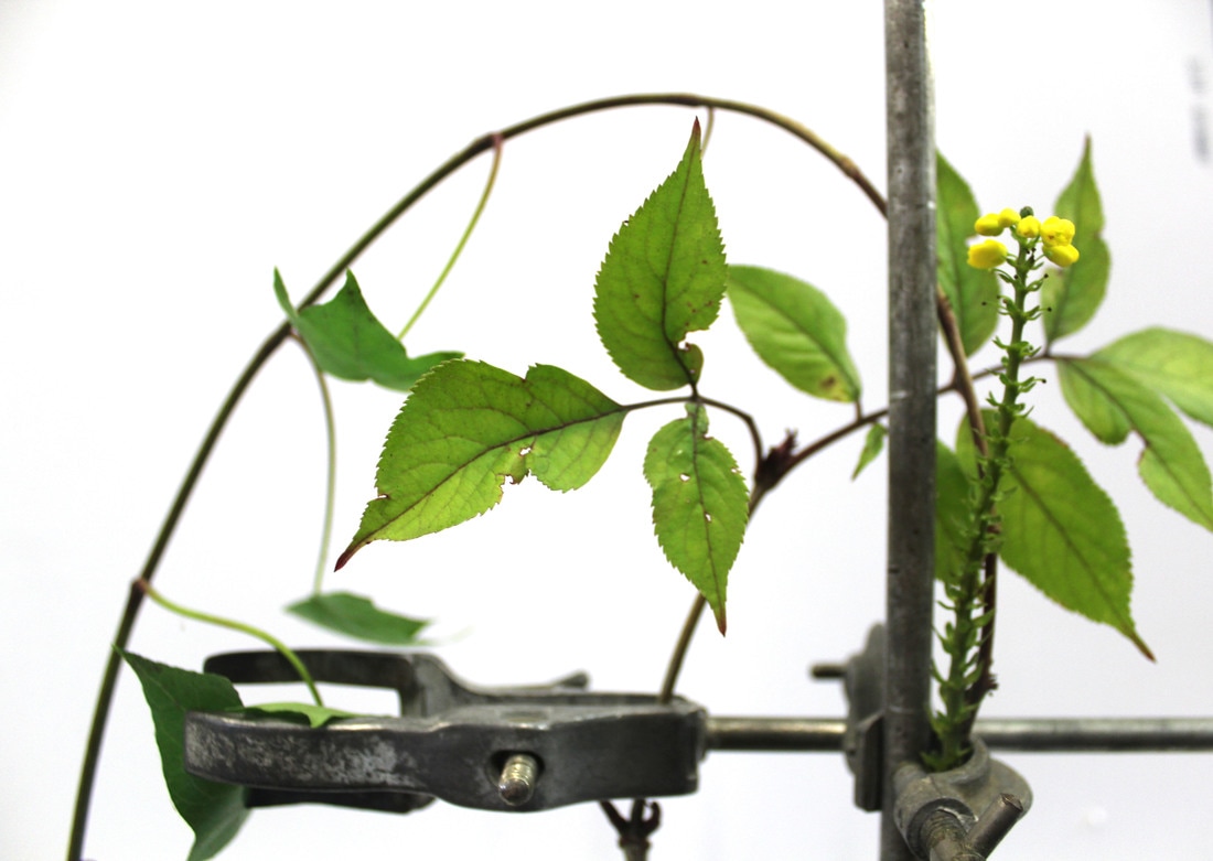
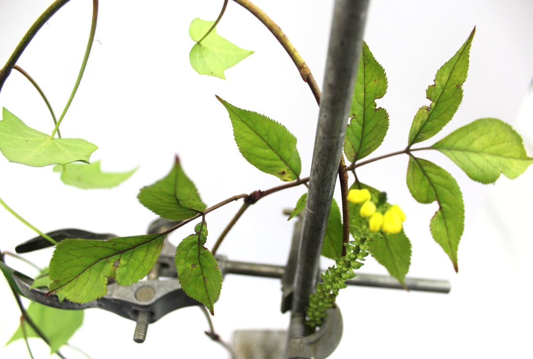
Here you can see I have edited all four images and made them lighter so the image is clearer and more defined. I took the four images onto Adobe Photoshop and used the levels tool to increase the brightness of the images, I then cropped some of the images to ensure nothing else was in the background and the image fully focused on the plant. This made the images more effective as they isolate the plant more and show the true structures of the plants.
Artist vs me:
|
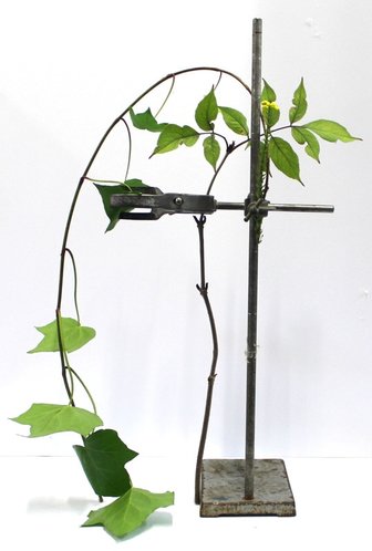
Overall, I believe that my final images effectively show the structure of nature and plants. The shadows and background have been reduce and this helps to allow the plant to more isolated. The science stands contrast well with the plants as it puts something strong and striking next to something delicate and simple.
|
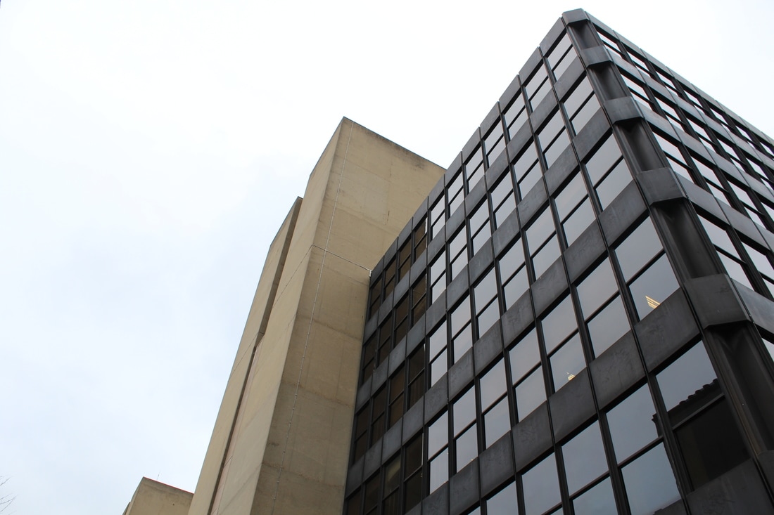
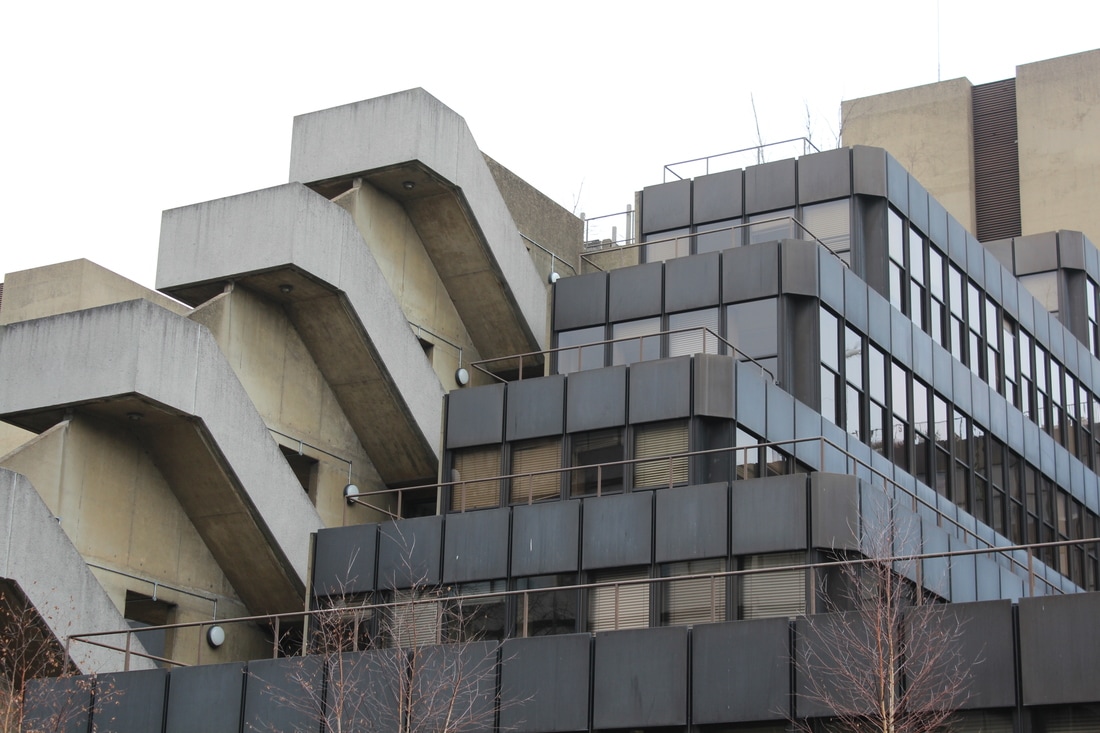
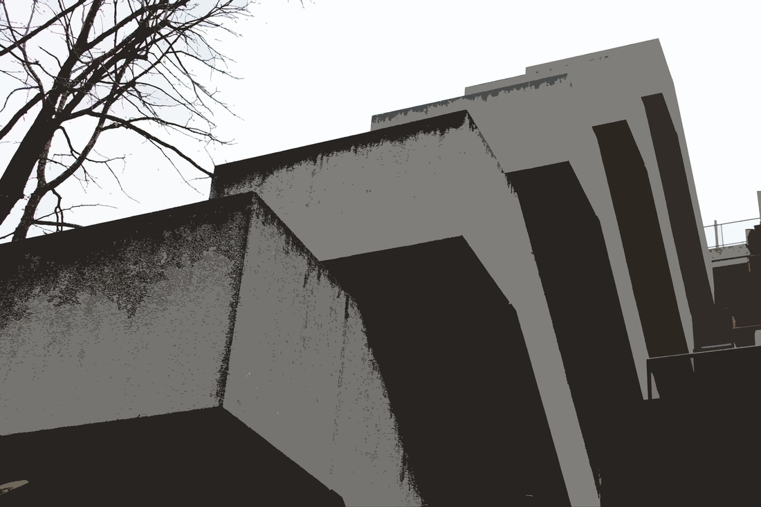
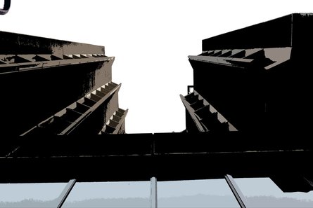
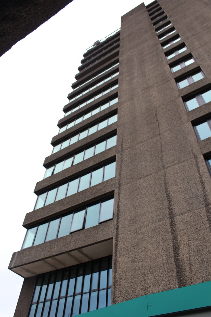
Brutalist images:
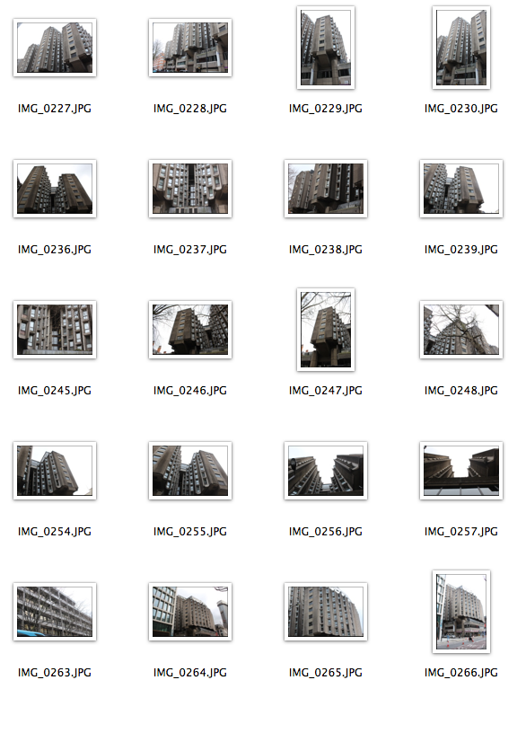
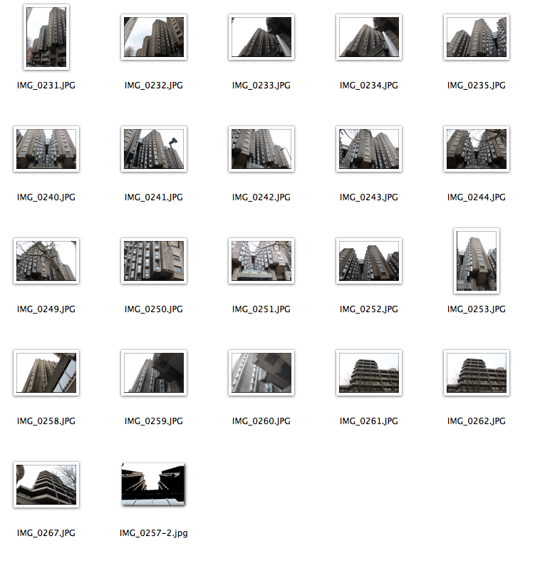
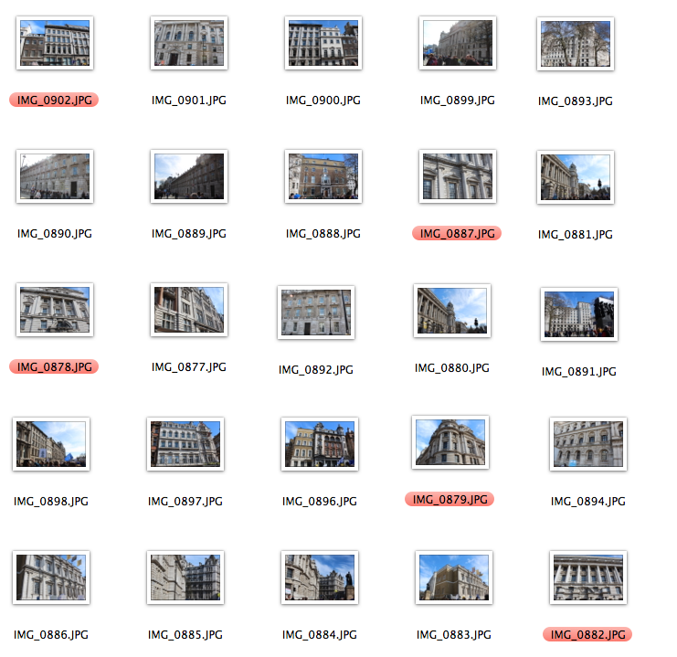
I was set the task to go into London and find Brutalist architecture and Brutalist buildings and take images of them to then develop later and use for further tasks. Brutalist architecture is a movement in architecture that flourished from the 1950s to the mid-1970s, descending from the modernist architectural movement of the early 20th century. In its ruggedness and lack of concern to look comfortable or easy, Brutalism can be seen as a reaction by a younger generation to the lightness, optimism, and frivolity of some 1930s and 1940s architecture. "Brutalism" as an architectural critical term was not always consistently used by critics; architects themselves usually avoided using it altogether. More recently, "brutalism" has become used in popular discourse to refer to buildings of the late twentieth century that are large or unpopular – as a synonym for "brutal." The term "brutalism" was originally coined by the Swedish architect Hans Asplund to describe Villa Göth in Uppsala, designed in 1949 by his contemporaries Bengt Edman and Lennart Holm.
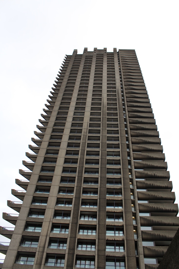
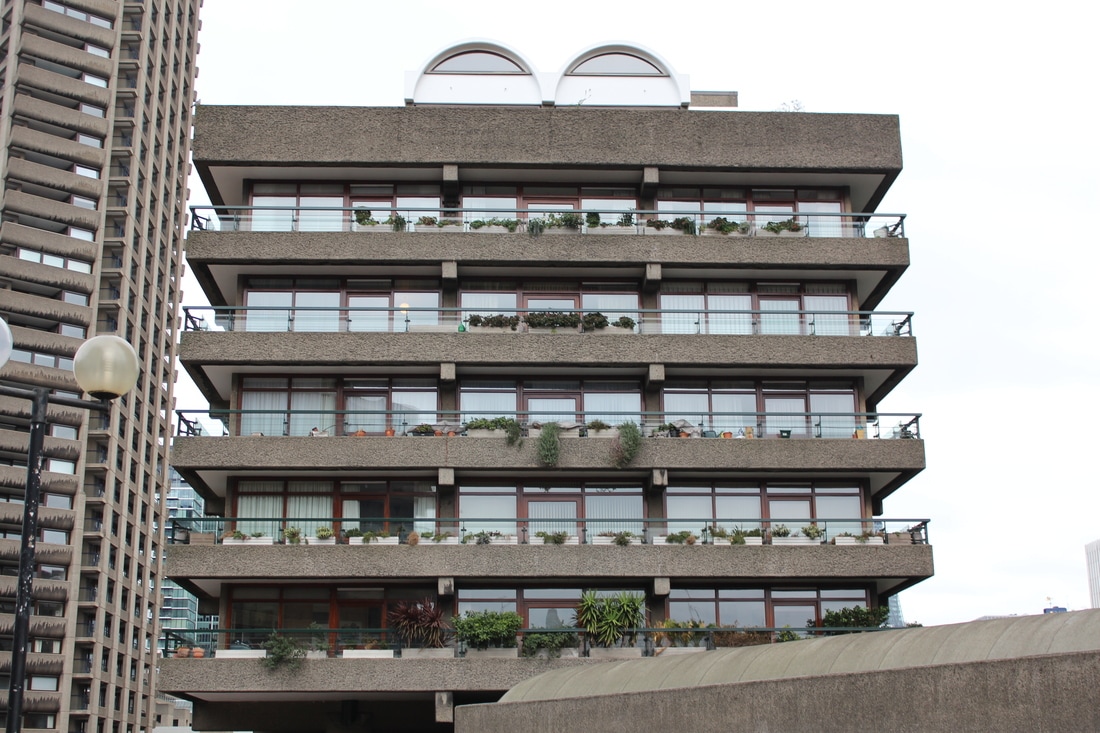
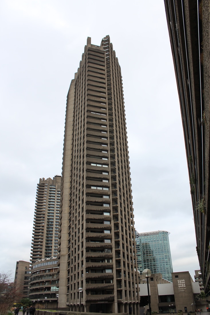
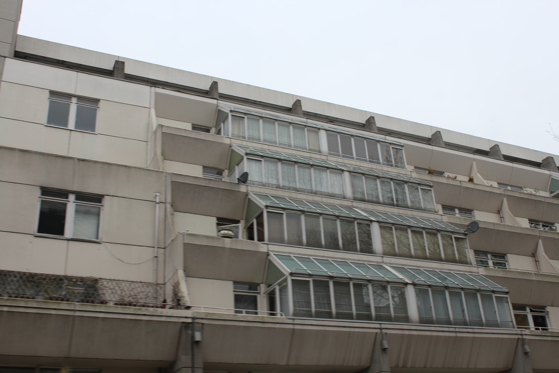
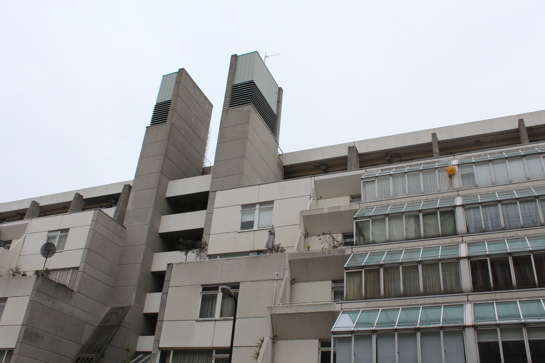
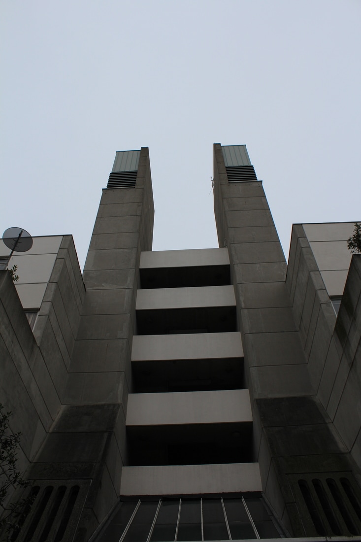
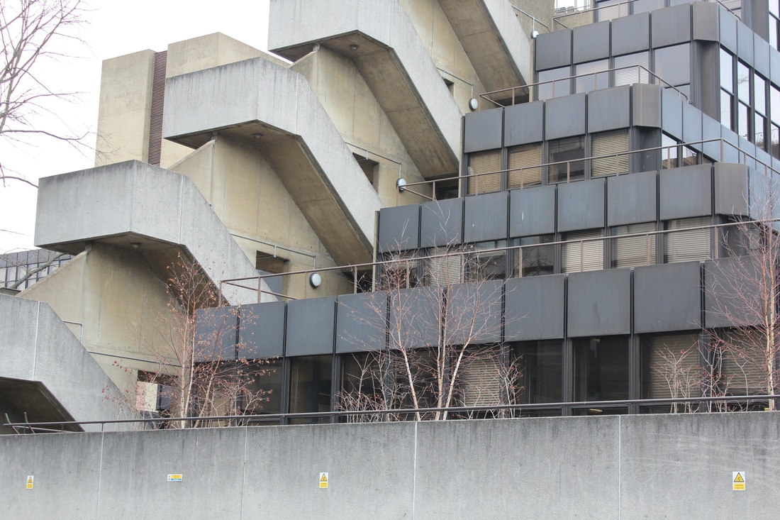
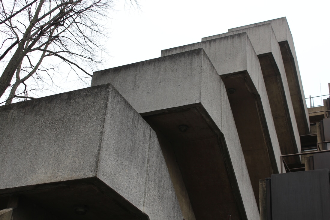
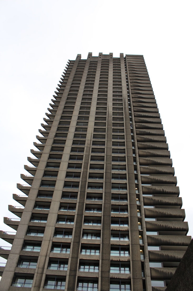
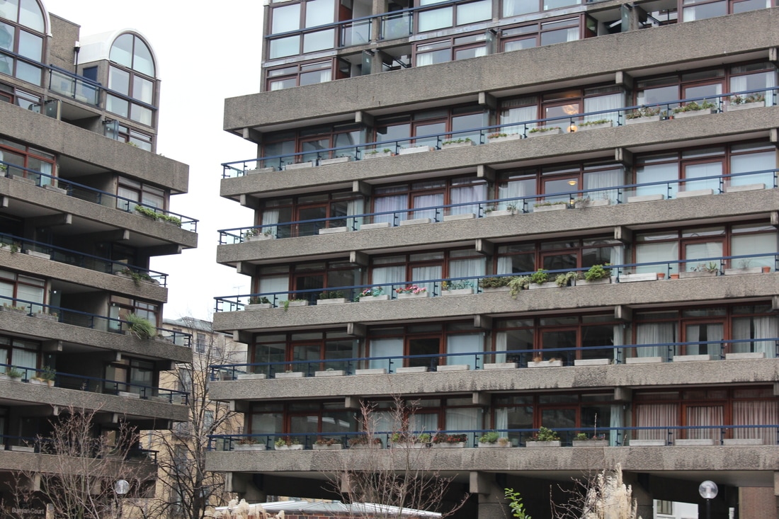
The Barbican:

|

|
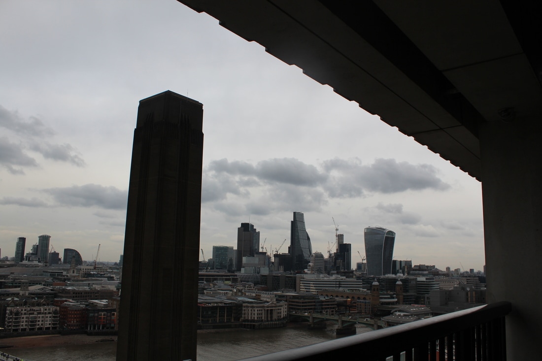
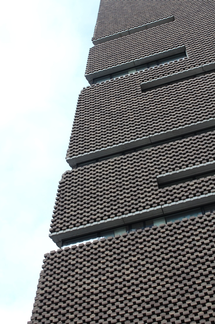
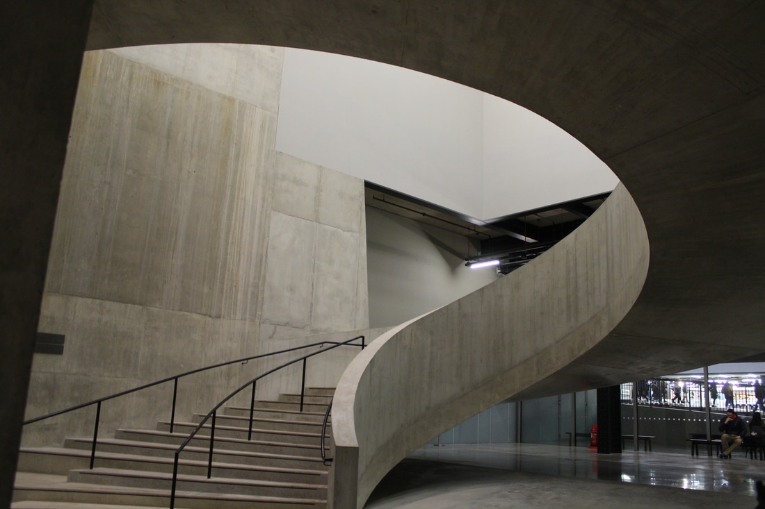
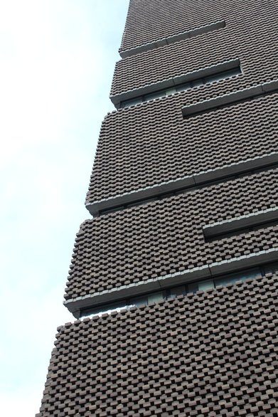
The Tate:
|
|
The Brunswick Centre:
|
|
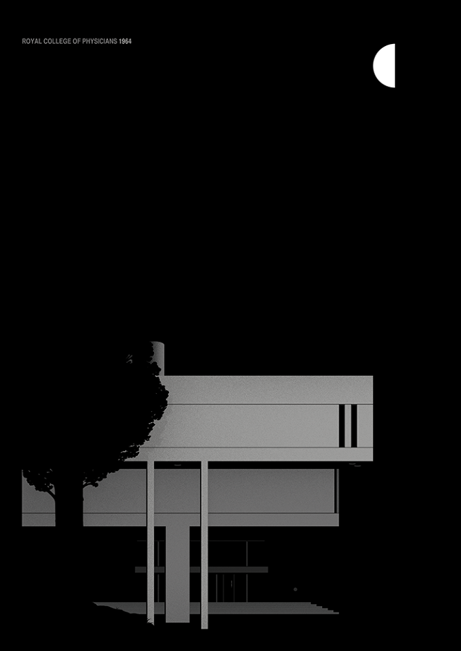
Institute of Advanced Legal Studies:
|
|
Thomas Danthony - Brutalism
|
|
Thomas Danthony is a French artist based in London. Often narrative, Thomas's work is characterised by a clever use of light, bold compositions and a dose of mystery. In trying to recreate Danthony's work, using Photoshop, the photographs appear like basic, colourful drawings. However, in my own work I use very little range of colour in capturing brutalist architecture. Danthony's client list includes, among others, Ray Ban, Google, The New York Time, TFL, Mondo, Liberty, Penguin, English National Opera, Netflix, Arte, Nokia, Sadler's Wells Theatre. Thomas has also been developing his painting over the last few years, leading to his first solo show in Paris in 2015 Sergeant Paper Gallery.
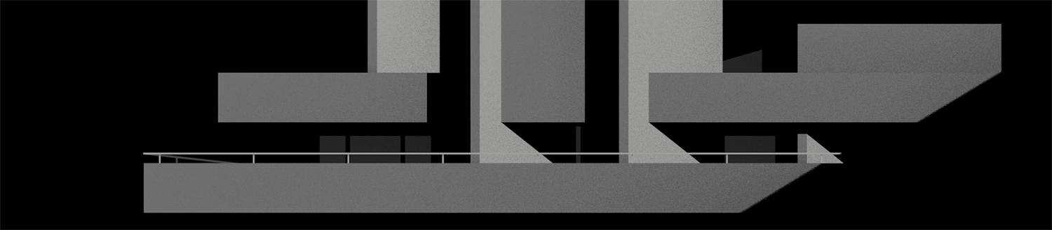
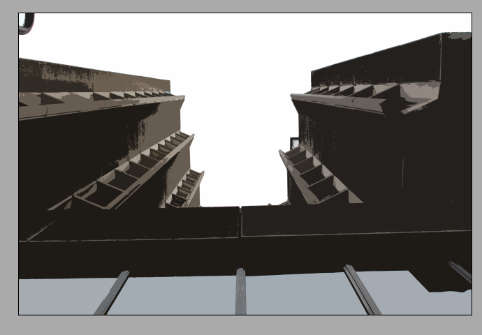
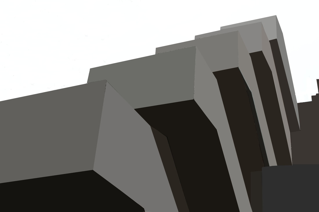
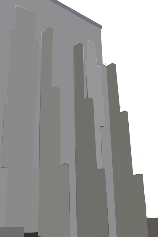
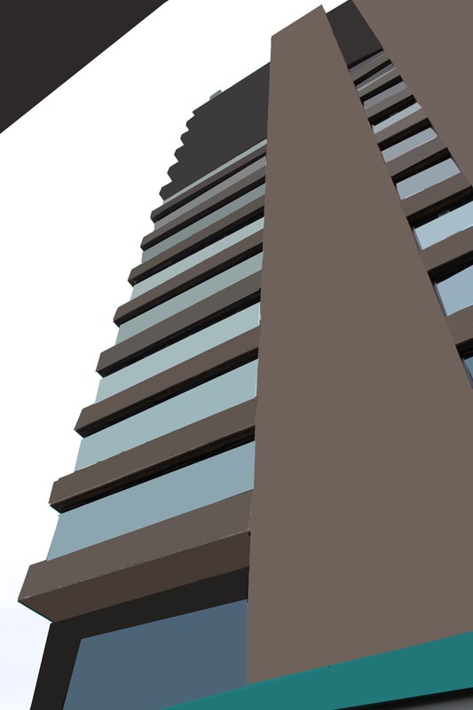
Artistic - Cutout:
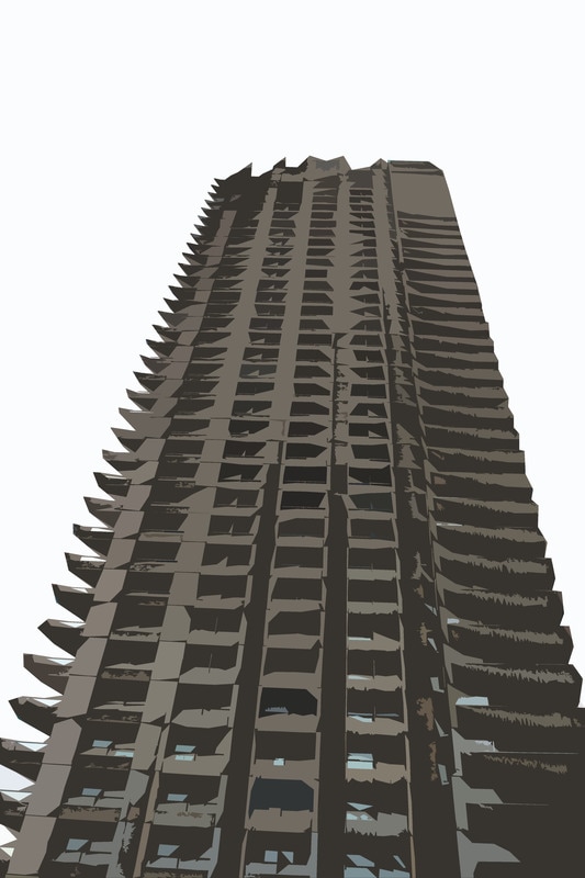
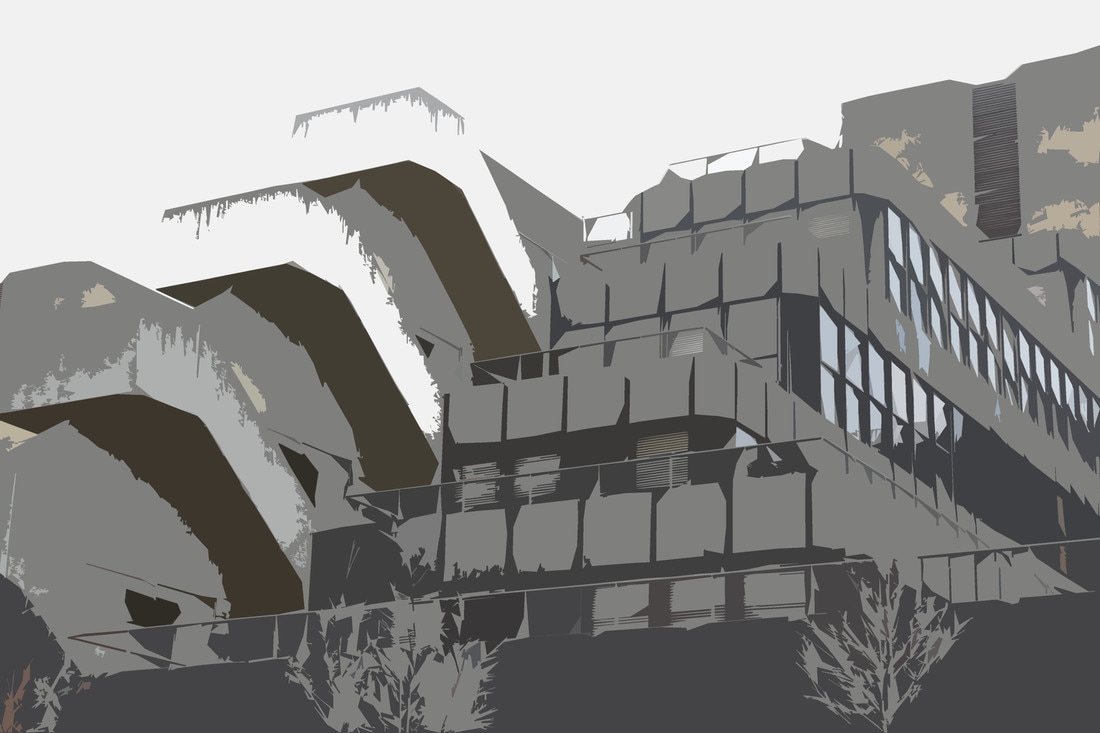

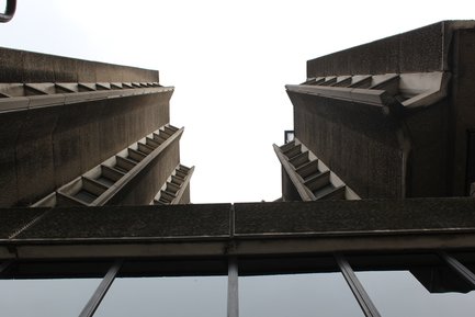
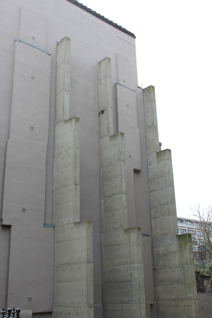
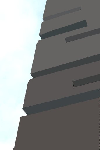
The above four images are my own images taken around central London with the theme of Brutalist Structure, I have then taken them into Adobe Photoshop and edited them. When editing these images I learnt that the more specific detailing and smaller subjects in the image make the editing a lot harder to do as they take the concentration from the building itself and make the block-like printing style of the image harder to show. Overall the first image of one of the barbican buildings is very effective as there is no other things in the image to take the viewers attention away from. The last image of the Institute of Advanced Legal Studies is another effective image as the sides of the building are block colours, this will be effective to screen print as the image will look good printed, however the graining on the top parts of the building could be edited to make all the colours the same. Overall, I have learnt that the images look much more effective when there are less colours in the image. Therefore if i were to go out and take the images again to re do this task, I would find building with minimal colours and also reduced things in the background that can take the main attention away from the building, but overall I found responding to this task quite enjoyable.
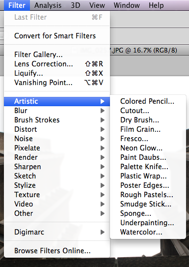
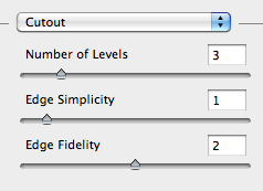
How to create this type of image:
|
.
|
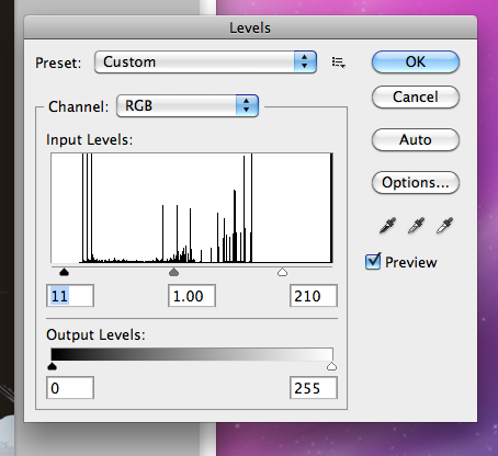
To create the 2D look, I went onto Photoshop, filters- artistic - cutout. Then in the second image you can change the number of colours in the image and you can also change the edge simplicity and fidelity. The third image shows how the picture looks with 4 different sets of colours in it. And finally, I played around with the darkness of the image and above you cans ee the image before and after. I think that my images based on Danthony's are quite effective as they go from the 3D structure to a 2D one. Using the cutout filter in Adobe Photoshop brings out all specific colouring and depth for the image but it is not as effective as doing one piece of the image at a time as the cutout filter makes the image look grainy and doesn't completely flatten the image, this means that once the images are finished and I want to screen print them it will be a lot harder to make straight and specify lines and the smaller detailers and kept in the image and therefore would make it harder to print out. However, overall the images do have some similarities to Danthony's images but they are not completely effective as they still have too much detail left in them.
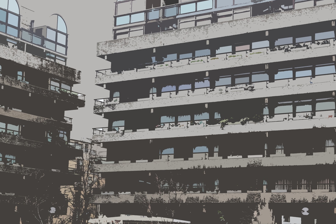
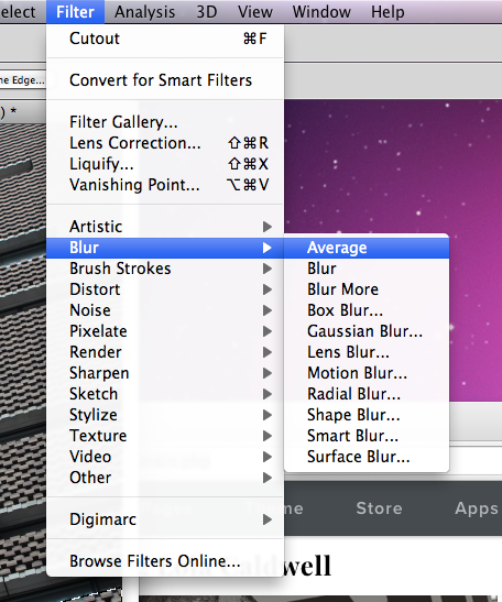
Blur - Average:

Using Adobe Photoshop, I then tried to create new images which also imitated Danthony's, however despite this editing filter taking longer to do, it was the most successful way of trying to imitate Danthony's images. The blur- average filter allows the image to become extremely 2D and reduces the details and amount of colours in the image. The first image of the Institute of Advanced Legal Studies is extremely effective because it will be easy to print screen as the block style of the editing I did imitates Danthony's style. In the image I also edited out the tree to gravitate the concentration of the image to the building and its brutalist style. The second image was not edited as well and you can see that I have missed out parts of the building and it doesn't look like brutalist structure. The final image I believe is effective as the colours of the windows work well with the darker building, again this image will be a lot easier to screen print that other images with more detailing and more colours. Overall, this filter was more effective than the other and it allowed me to single out each part of the building and average the colour of it, it makes the image look flat but still gives it a bit of dimension.
How to create this type of image:
|
|

|
Above is one of the final images that have been inspired by Thomas Anthony, and to the left one of his images. Overall, the connections between my images and those of Danthony's are similar and share ideas, however I do believe that to make my images, specifically the one above, more like Danthony's I need to remove more of the detail from the images, to allow myself more room for the block like editing. Despite this I do think my images are effective in showing the structure of buildings, especially brutalist structure.
|
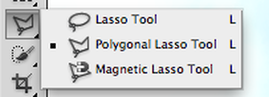
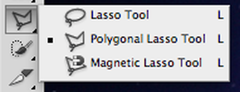
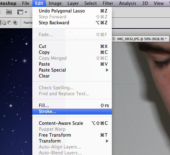
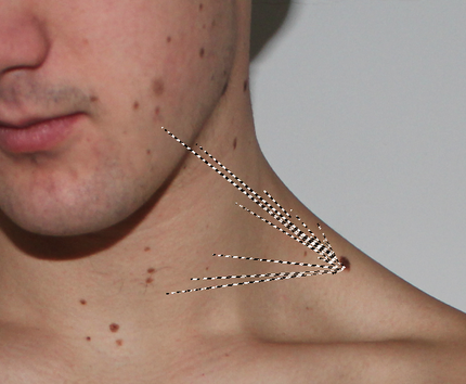
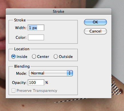
To create this different 2D effect on the image I took the picture and put it onto Adobe Photoshop, I then selected Polygonal Lasso Tool and selected the area which I wanted to work on. I then went onto filters, Blur and then average, this effectively averaged out all colour of the selected area.
To the left is the image before and after, you can see that I have managed to keep the dimensions of the image and also the sky colour, this image is effective as it imitates Thomas' style correctly and can easily be screen printed. The fact that this way of editing removes main details but keeps the overall structure well is great for me to use when editing my images as the main aspect that I need to highlight and keep in the images is the harsh, brutalist structure, not little specific details. |
Exhibition visit:
The Tate Modern- Wolfgang Tillmans
This is Wolfgang Tillmans’ first ever exhibition at Tate Modern and brings together works in an exciting variety of media – photographs, video, digital slide projections, publications, curatorial projects and recorded music – all staged by the artist in characteristically innovative style. The year 2003 is the exhibition’s point of departure, representing for Tillmans the moment the world changed, with the invasion of Iraq and anti-war demonstrations. The social and political form a rich vein throughout the artist’s work. Alongside portraiture, landscape and intimate still life, Tillmans pushes the boundaries of the photographic form in abstract artworks that range from the sculptural to the immersive. German-born, international in outlook and exhibited around the world, Tillmans spent many years in the UK and is currently based in Berlin. In 2000, he was the first photographer and first non-British artist to receive the Turner Prize.
I enjoyed visiting this exhibition as Tillmans photographs his everyday life and this makes for a brilliant amount of interesting, and some extremely generic, images. Tillmans also puts all images together and groups those that relate to each other, it was interesting to see how he believed each image should be grouped and many of Tillmans images included the structure of random objects and all his images had depth and allowed the viewer to easily understand why he took the image and also what he was thinking and what view he has of the images he has taken.
I enjoyed visiting this exhibition as Tillmans photographs his everyday life and this makes for a brilliant amount of interesting, and some extremely generic, images. Tillmans also puts all images together and groups those that relate to each other, it was interesting to see how he believed each image should be grouped and many of Tillmans images included the structure of random objects and all his images had depth and allowed the viewer to easily understand why he took the image and also what he was thinking and what view he has of the images he has taken.
My own images from the exhibition:
“Politics are part of my life and have always been an interest of mine, but working here, day and night, for the past two weeks, reminded me again of how making art is really the centre of what I do” – Wolfgang Tillmans
Chris Dercon, curator, art historian and ex-director of the Tate Modern, introduced Wolfgang Tillmans, the subject of the museum’s newest exhibition, by describing the German-born, Turner Prize-winning artist and photographer as “a renaissance man of the 21st century”. With work that’s difficult to define and, as Dercon admitted, equally as difficult to curate it’s no surprise that Tillmans is one of the world’s most innovative and engaging artists working today.
Entitled Wolfgang Tillmans: 2017, the exhibition explores Tillmans’ production across different media from 2003 to the present day – but this is no retrospective. “Each room in the exhibition has been specifically configured by Tillmans as a personal response to the present moment”, reads the exhibition’s booklet. It adds, “Ever conscious of his role as an artist, his works engage us with themes of community and sociability, empathy and vulnerability.”
Entitled Wolfgang Tillmans: 2017, the exhibition explores Tillmans’ production across different media from 2003 to the present day – but this is no retrospective. “Each room in the exhibition has been specifically configured by Tillmans as a personal response to the present moment”, reads the exhibition’s booklet. It adds, “Ever conscious of his role as an artist, his works engage us with themes of community and sociability, empathy and vulnerability.”
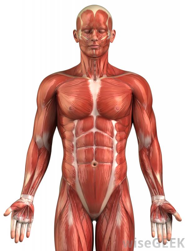
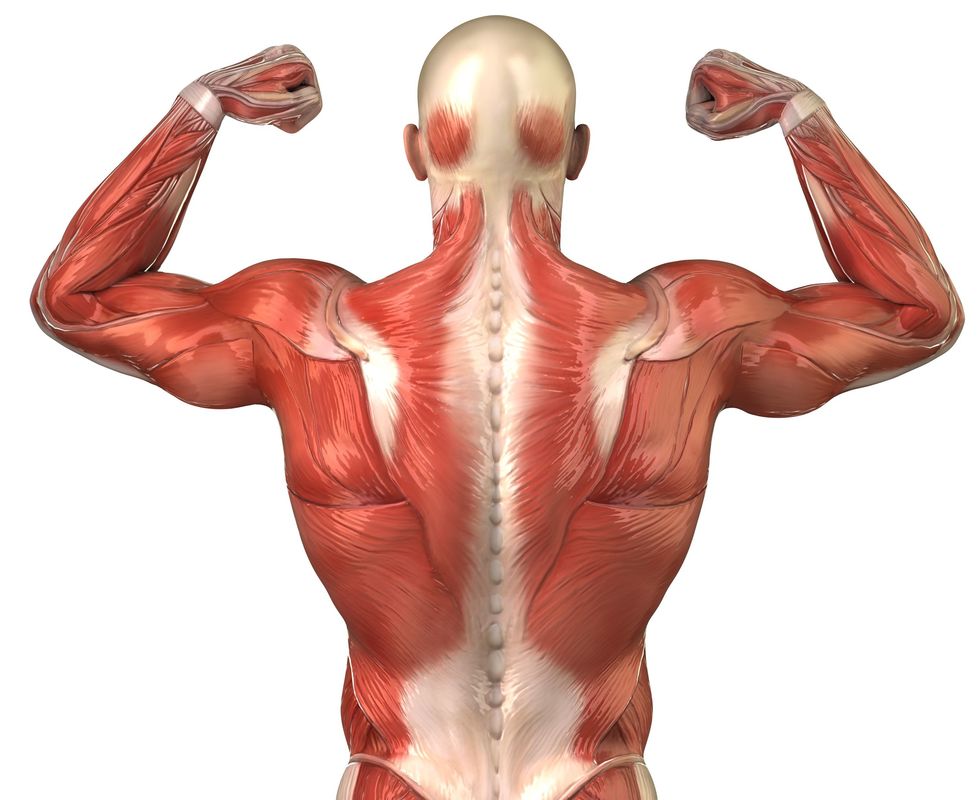
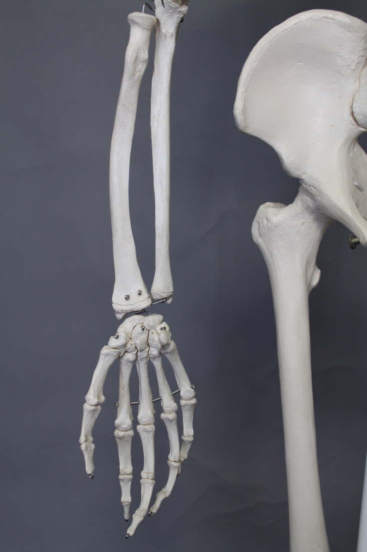
Structure of the body
Peter Hickley:
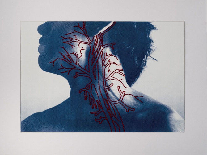
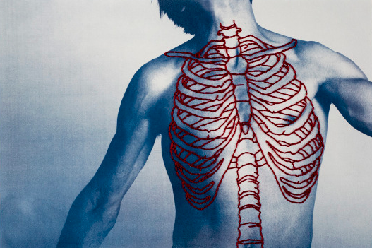
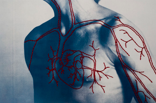
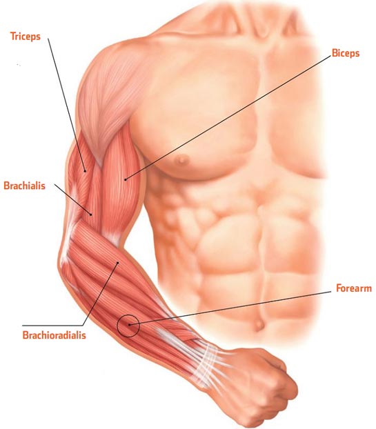
MY RESPONSE:
|
|
|
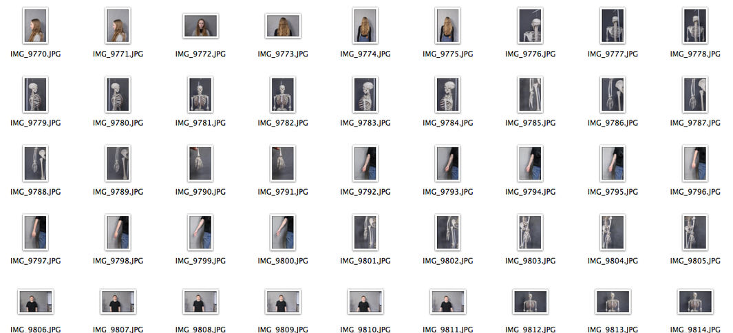
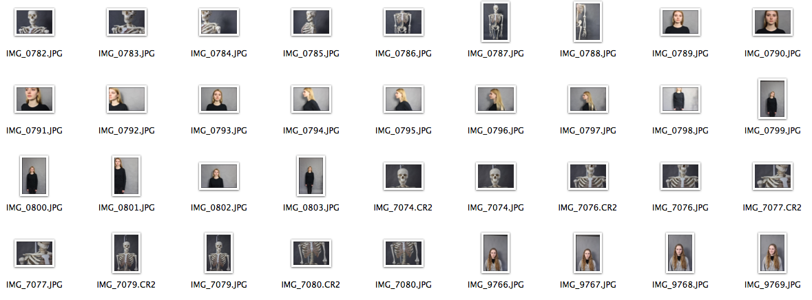
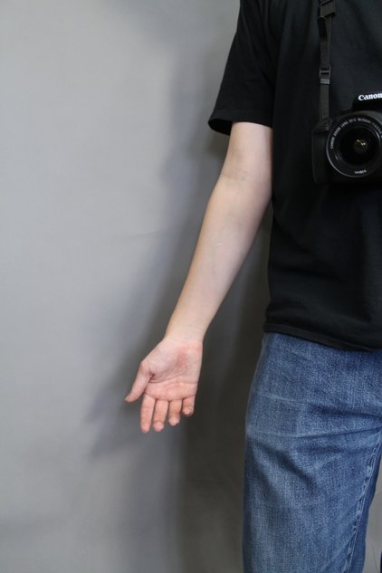
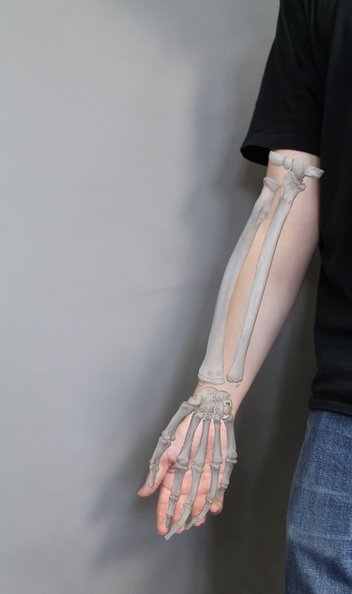
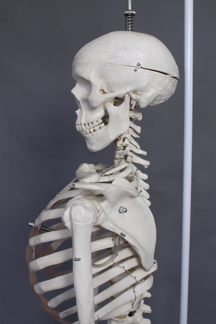
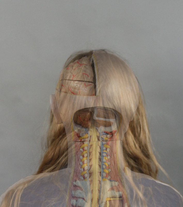
Here you can see how I have digitally manipulated two images together and fitted the skeleton arms onto ,the image of a models arm. I did this by editing on Adobe Photoshop and firstly selected the part of the image of the skeleton that I wanted to bring onto the other image, I then copied and pasted it and moved the pasted part so it fit in proportion with the real human arm. When editing this I found that it was hard to completely fit the two images together so they looked proportionate and real as the skeleton I photographer was not the same size as my model, however it was quite simple to change the size of the skeleton to fit the arm but it did not 100% fit perfectly as I wanted it to. If I were to re do this task I would either get a smaller skeleton to fit well with the model that I photographer, or pick the person that would fit the skeleton size well.
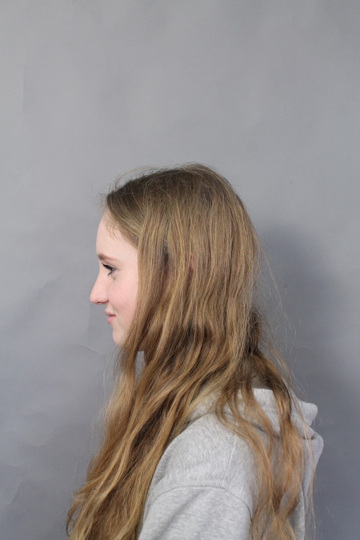
I first chose two images that I think would fit well together and in which the model and the skeleton were facing and posed in the same position, this was done so I could ensure that when editing both images together they would fit well and look natural. When taking the images I had to take this into account and made sure for every image of the skeleton, I had a similar image of a person.
|
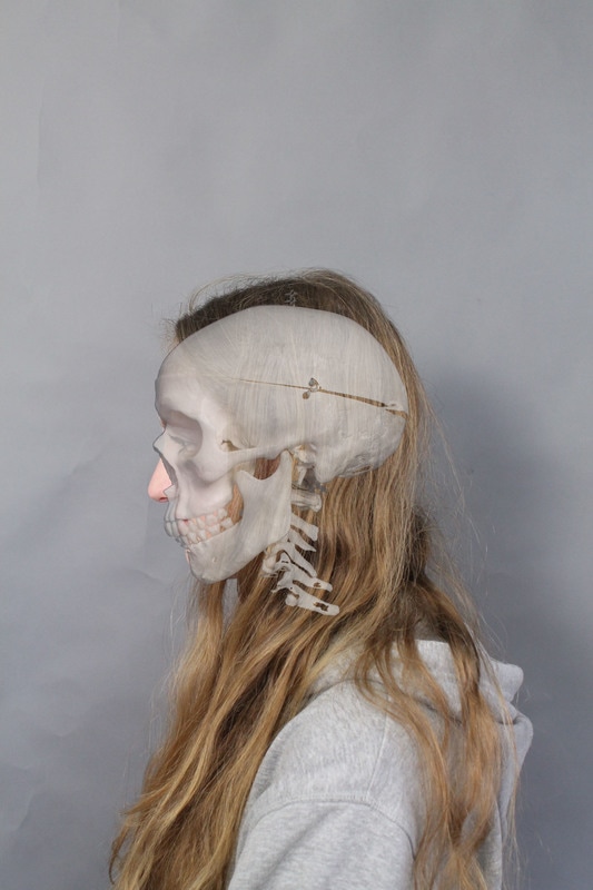
I then selected the magic wand tool to select part of the image that I wanted to the put on the models face.
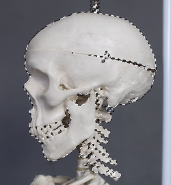
Here you can see I have selected part of the skull which I can then edit on to Charlotte's face. I had to ensure that when doing this I had selected all the right parts of the skull and that there were no gaps which then be visible on my final image.
|
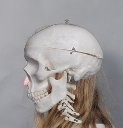
Here I have then copied and pasted the selected skull onto the full image of Charlotte. As you can see it didn't fit Charlotte's head shape so I then re sized it to make it fit.
|
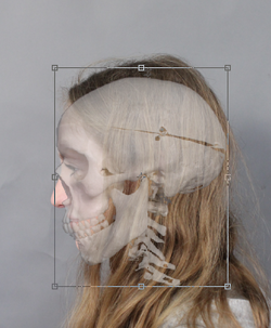
Here, I have turned down the opacity of the skull as to be able to fit the image onto Charlotte's face easily. I kept the opacity at 69% for the final image as then you could visibly see that the skull fitted Charlotte's head. It also made it look as though the image was imitating an x-ray.
|
|
|
|
Here you can see the original copy of the two images i took, one of a model and one of a skeleton.I then merged the two images together using Adobe Photoshop. The final image on the right shows the effect the image has, due to the skeleton not properly fitting Charlotte's face/skull size, the skeleton does not fit properly, however by making the skull more opaque the skull fits slightly better, i also like the fact that her nose pops out behind the nose of the skull and shows effectively the shape and structure of the body and head and also hows how different everyones body structures are to each other.
Internal organs
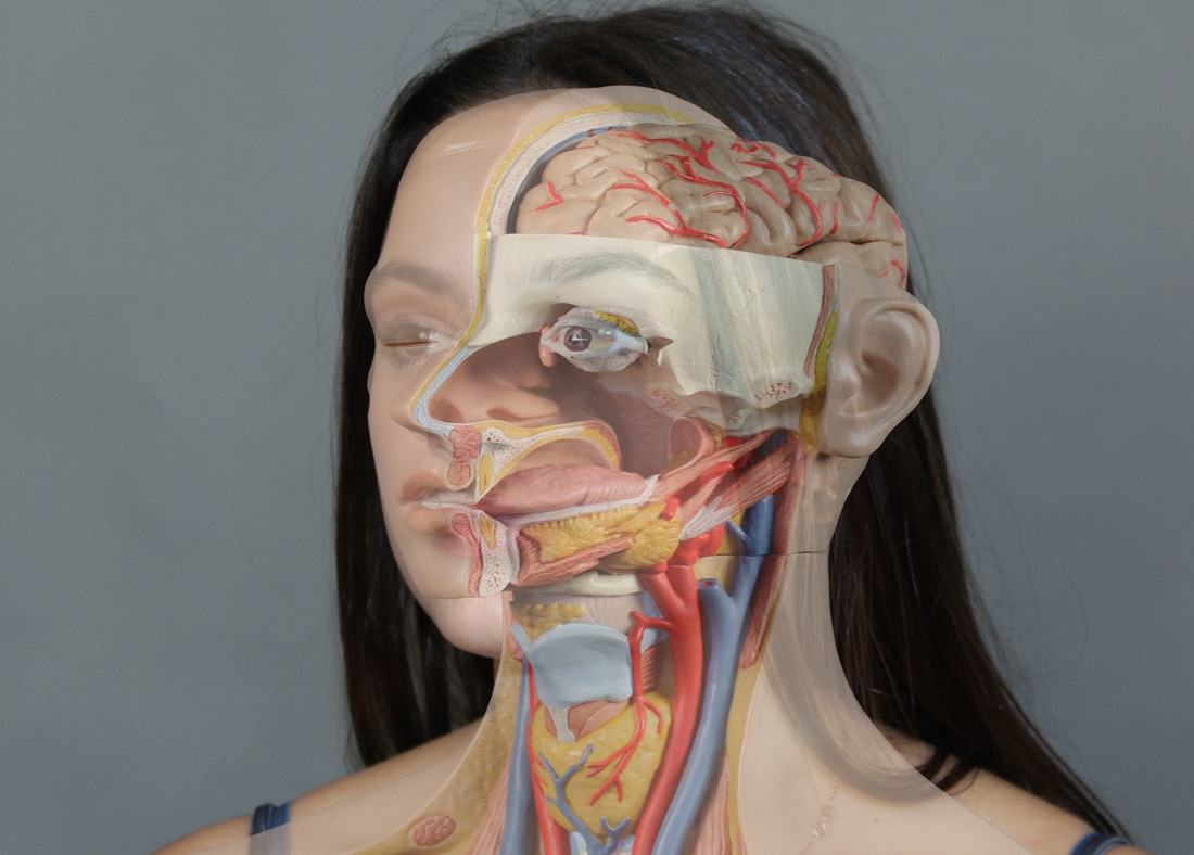
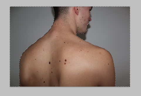
when doing the internal organ edits, I found that it was quite difficult to make the fake body, that I imposed onto the model I used, look like the real body. This was due to the fact that the body didn't fit into the models body, to try and make this look more effect and fit better with the model, I free transformed it on Adobe Photoshop, this was quite difficult. I also tried using different models to see if any of them would fit the same size as the fake body with fake organs in. Overall, if I where to re-do these images and editing, I would make sure to find a model who specifically matches the fake body and also spend more time editing and transforming the image so that it will definitely fit and look more aesthetically pleasing.
Three Strands
STRAND 1:
Nils Orth:
Untitled faces:
|
|
|
"I've always been very interested in portraits," said Nils from his studio. "Capturing them well is the fundamental of photography."
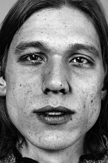
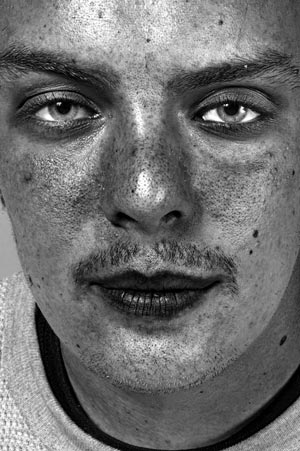
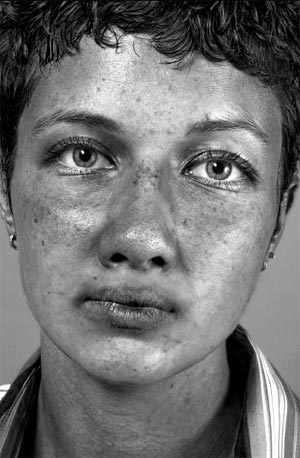
Untitled Faces aren’t particularly flattering images, however they’re quite compelling, rubbing against many photographic conventions. I chose to look at Nils Orth as her images are quite raw and I like how there's no shying away from the models imperfections.
As we are expected to look a certain way, imperfections are not the ideal. In the beginning, Nils had no plans to composite. He saw up to six models a day and shot 100 to 150 photos of each. As he amassed a large body of images, a new direction for his project began to take form. Orth noticed the "perfection" of the capture of a singular body part on a model. Perfection being a relative term, Orth, for instance, thought the reflection in one model's eyes was great in one shot, but wished her nose was pointed up more or that her lips were open in that same shot. As he admired certain features in certain captures of his work, he decided he couldn't call back models to reenact his vision but he could create art. Although the images intentionally show imperfections, the photographer said the faces were not designed as an antidote to the classic portrait or as a result of rebellion. Rather, the artist wanted to communicate to his audience on many levels.
Response:
Favourite images:
|
|
|
|
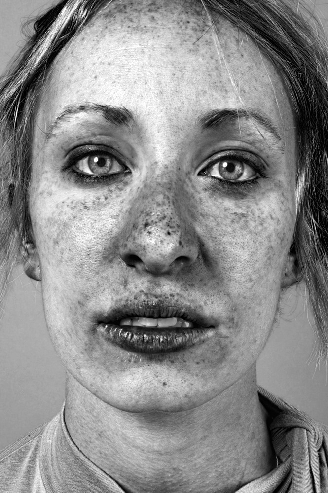
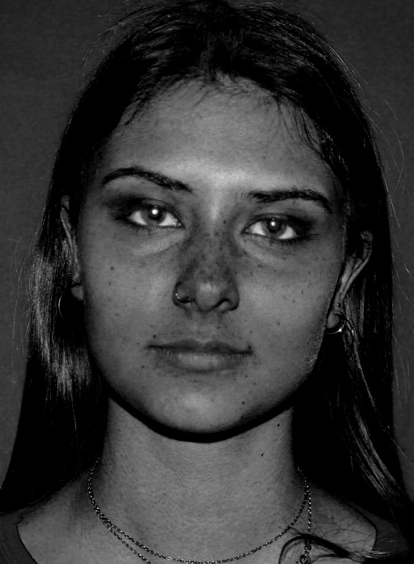
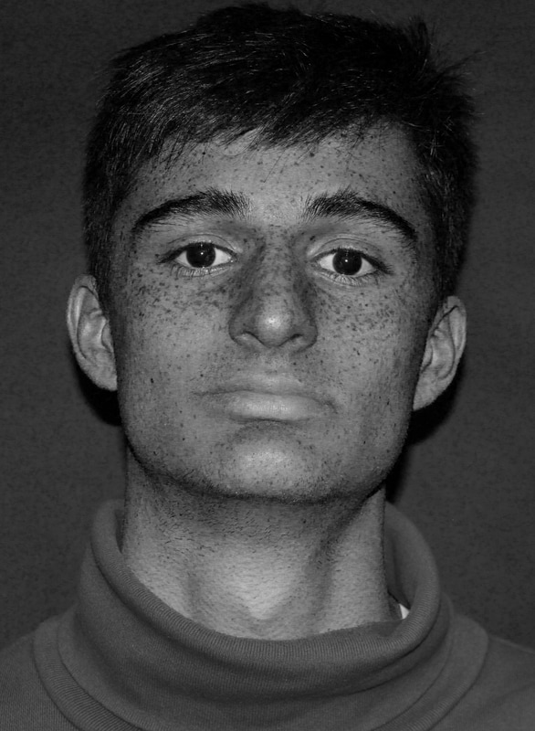
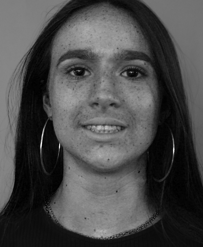
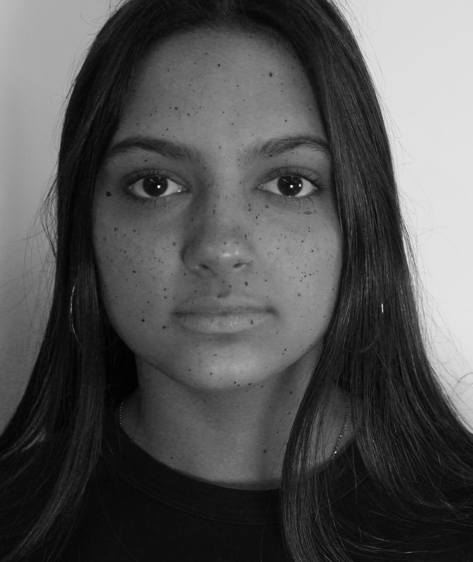
Overall, these images taken and edited look effective and bring out the emphasis on the flaws and parts of the face which man not naturally stand out with no editing. To get this effect I put the images onto Adobe Photoshop and increased the contrast of the images, I then made the purple colours more increased in the images which essentially bought out the freckles and flaws on the faces of the models. When completing these images, I noticed that people with no freckles on their faces could no be used as models as the contrasting did nothing different to their faces. When finished with the contrasting of the images I then decided they looked better in black and white as it made the images stand out more. The bottom right image shows Noemi, who does not have freckles, to get this editing to work on her face I had to put freckles on her by drawing them or splatting paint onto her face, even after doing this and taking pictures and editing them I noticed that the freckles where not as effective and looked very fake. If I where to do this editing and photographing again, I would pick several models with clear and noticeable freckles on their faces for the actual editing to work well. However, overall I do think the three images, which use people with real freckles, are effective in copying and imitating Nils Orth's photography of Unknown faces. Next to Nils Orth's original image above, my images share some similarities, but overall, if I were to develop my images further, I would have edited my images in a way that the image was kept brighter, as the brightness is lost I'm my images, which I think makes it look not as effective, but overall, my images share the connection with Orth's images in showing the structure of faces and flaws they have.
Development: May Xiong
May Xiong is a twenty-six year old photography Graduate from the Academy of Art University in San Francisco, CA and now resides in Seattle, Washington. Heavily inspired by light, music scores, and attention to detail, she creates photographs that encapsulates unusual beauty; bringing forth her subjects delicately and intimately with the surrounding environment that sometimes may seem heavy or harsh. She continues to focus further on creating cinematic portraiture in hopes to expand her creativity and move towards cinematography in the film industry.
|
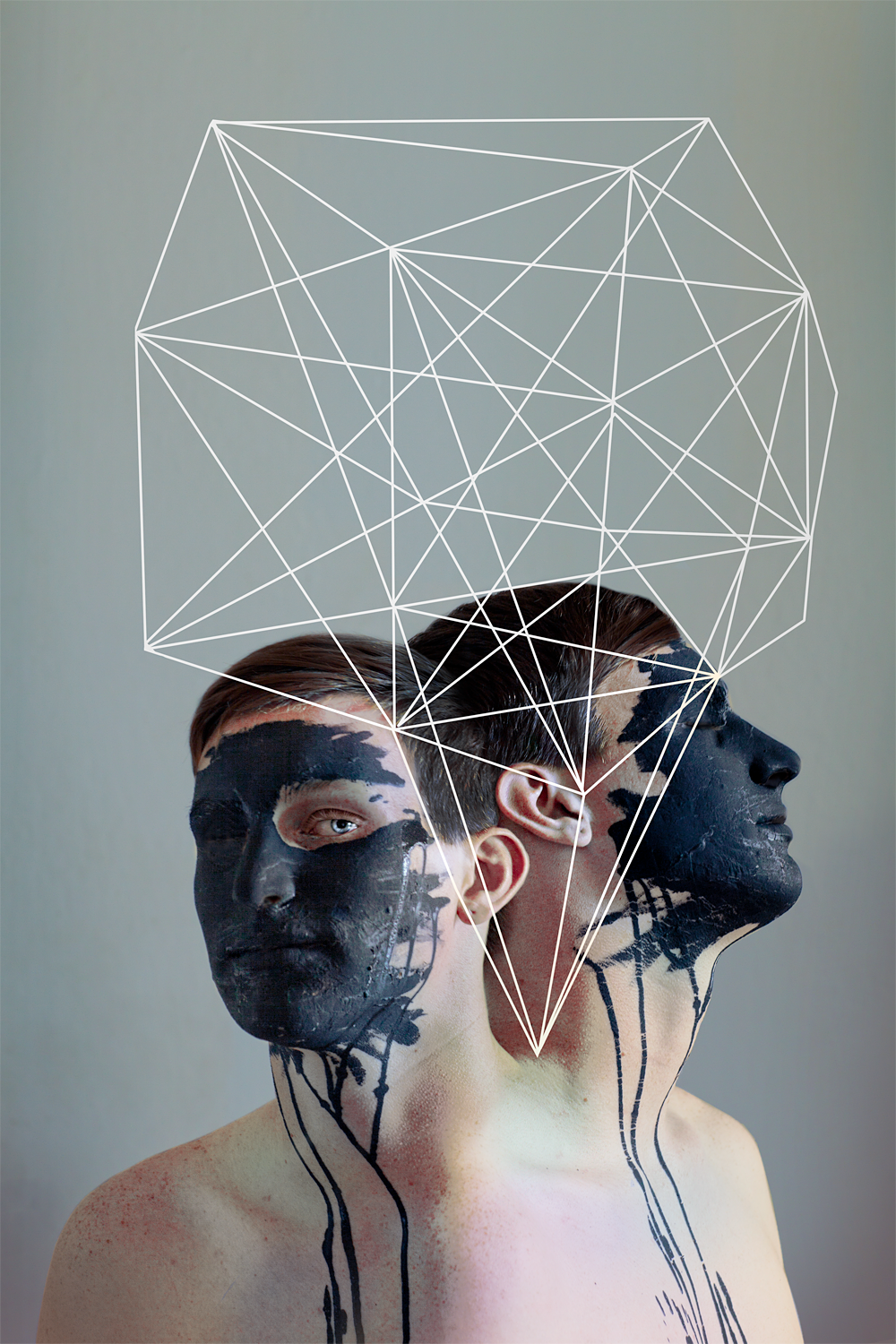
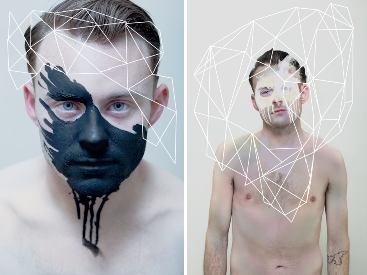
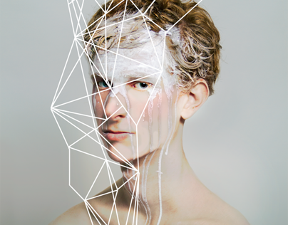
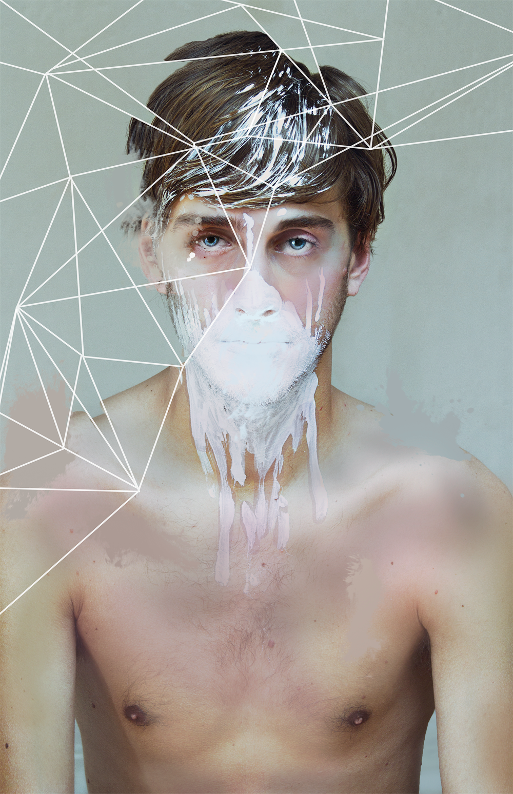
I am going to develop the ideas of the structure of the body by taking images similar to May Xiong, I will use my brother as a model and get him to pose with just underwear on in positions similar to Xiong's models. My brother has lots of moles so once the images have been taken I will attempt to add the geometric patterns by connecting them to his moles and freckles. I will use photoshop first to add the pattern, and also try drawing, painting and maybe sewing the pattern onto the images. I will increase the brightness to make his skin and moles stand out. I will not add the black and white paint onto his face as it does not relate as well to structure and my themes and may not be effective for my final images. Xiong pays attention to all details of her models and I will do so too to ensure the geometric patterns that I edit onto the image will fit well with the images.
|
First type of editing:
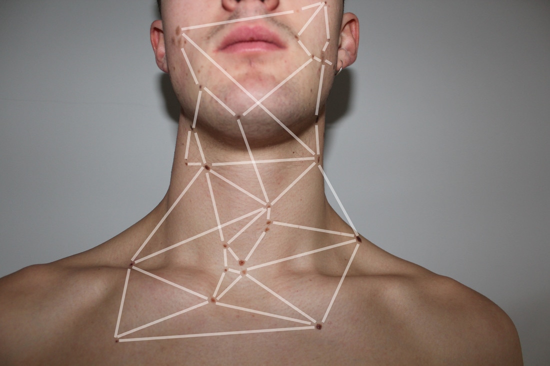
Here, you can see I have taken aspects of May Xiong's edits with the geometric patterns and tried to imitate them using my brother's freckles as a starting point, like dot to dot. However, I do not like the way these lines are too fat and the fact they look rather dull on his back, they are not effective and un-aesthetically pleasing and that is why I will not take this part of my work any further or attempt to use it for my final piece, however I will try one other type of geometric pattern and see the effectiveness.
Second type of editing:
|
|
|
|
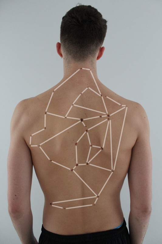
Here, I have again tried to imitate May Xiong's images, but using a different technique on Photoshop. As you can see here, I have used thin and black lines to connect the moles and freckles all together and have used a made it into a spider web type edit. I prefer this edit to the latter one but overall, I am unhappy with the way they have come out and are presented. I have decided not to develop this aspect of my strands any further, as Ido not think they look good enough when looking at it in perspective with the structure of the human body. As you can see, rather than imitating Xiong's images completely, I have taken my own ideas and used Xiong as a inspiration, however, I do think Xiong's images are more aesthetically pleasing.
STRAND 2:
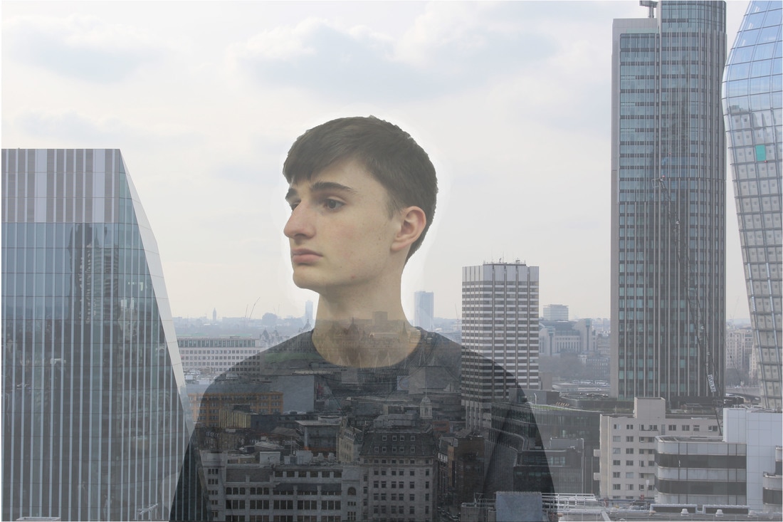
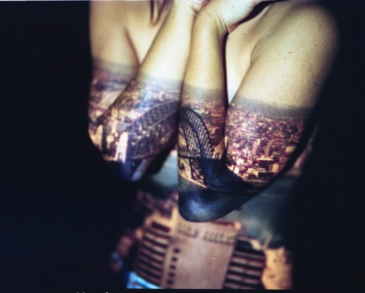
Jasper James
City silhouettes:
Beijing’s population has skyrocketed to over 20 million inhabitants, and London-Beijing-based photographer Jasper James captures the metro tastefully by juxtaposing the megacity with the individuals who live in it. The technique of shooting multiple exposures is a photographer favorite because it’s like killing two birds with one stone. Well, more like capturing two shots in one frame. As seen in the City Silhouettes series by James, each photo shows two subjects as well as two styles—portraits and cityscapes. James’ travels through China were the inspiration for this series, which gives us bird’s eye views with an unusual perspective. Using light and reflections from glass, James illustrates a picture of the city through the person viewing it, creating a familiar silhouette with splendid results. These pictures add a highly personal perspective to the vast, anonymous landscapes of Tokyo, Shenzhen and Shanghai. James has also been commissioned by a range of clients including British Airways, Vanity Fair, Ferrari and more.
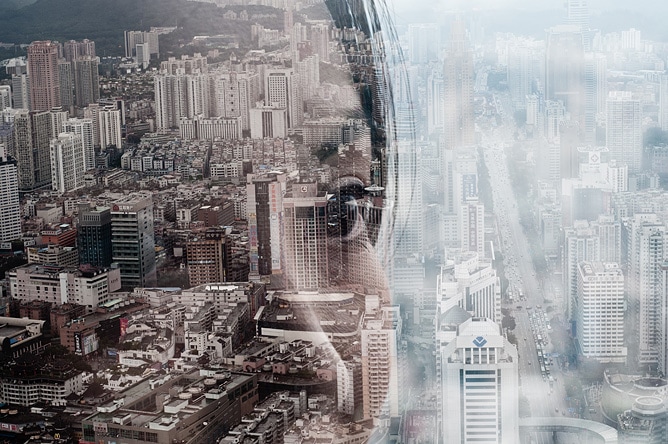
"I've been involved with photography for about 20 years. I spent three years on the London College of Printing photography degree course in the early 90's, followed by five years working as a photo assistant to various photographers in London and New York. For the past twelve years I've been working as a photographer in various different areas of commercial photography, including portraiture, interiors, fashion, travel and advertising." - James Jasper
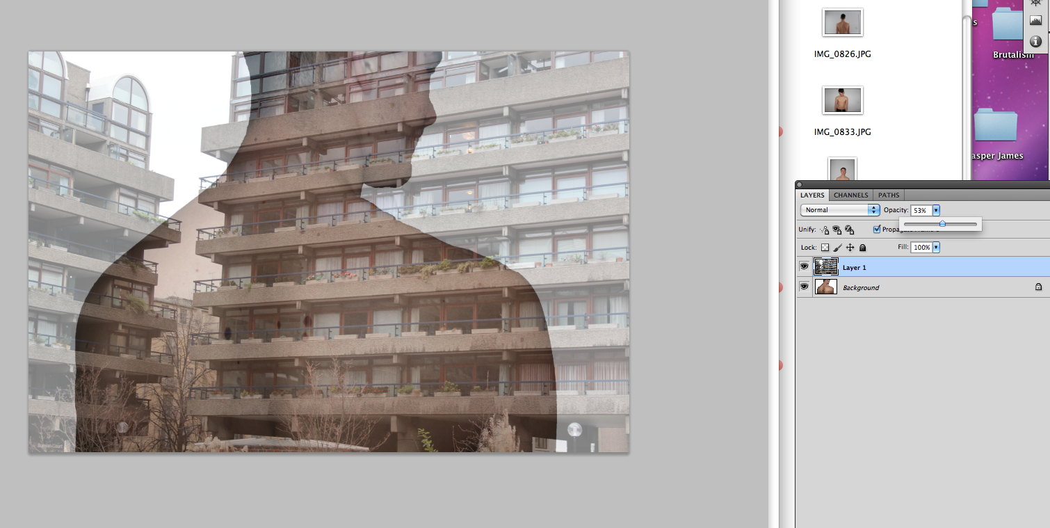
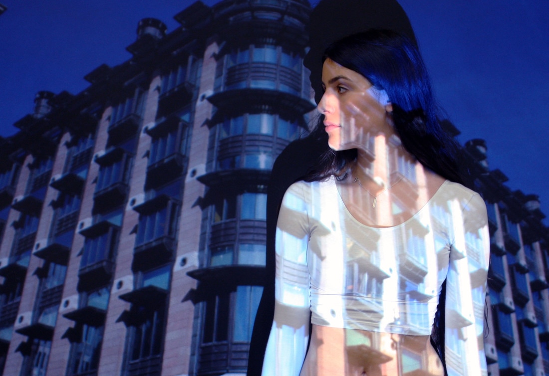
my response: Two layers
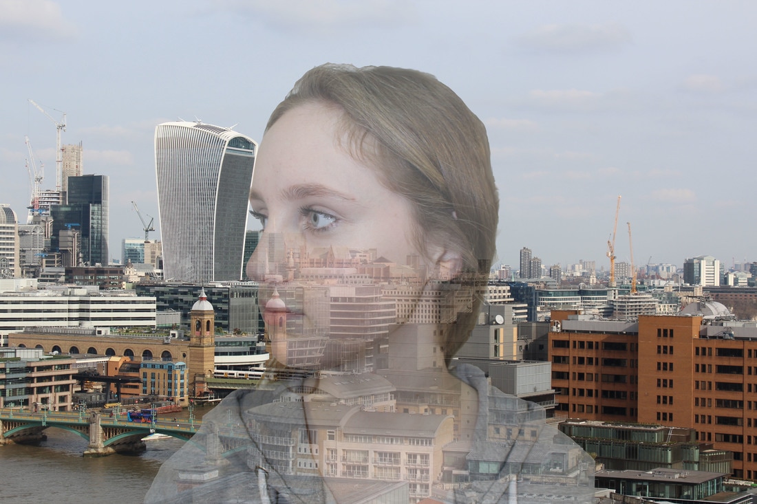
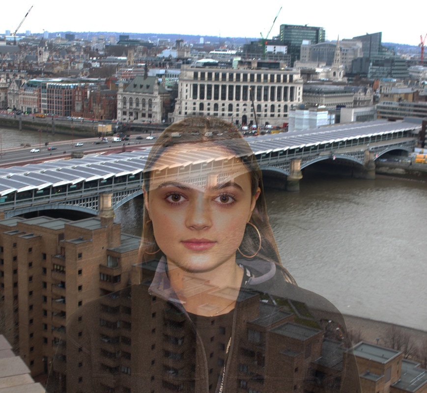
my development: background ontop, image flattened
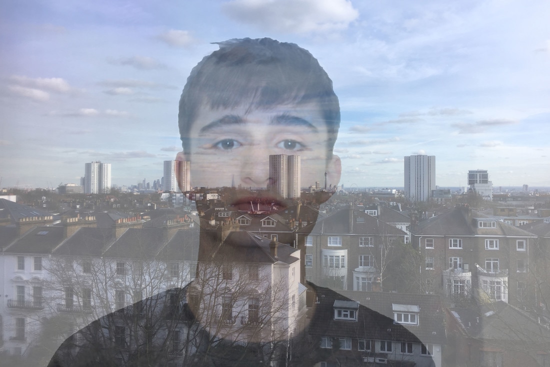
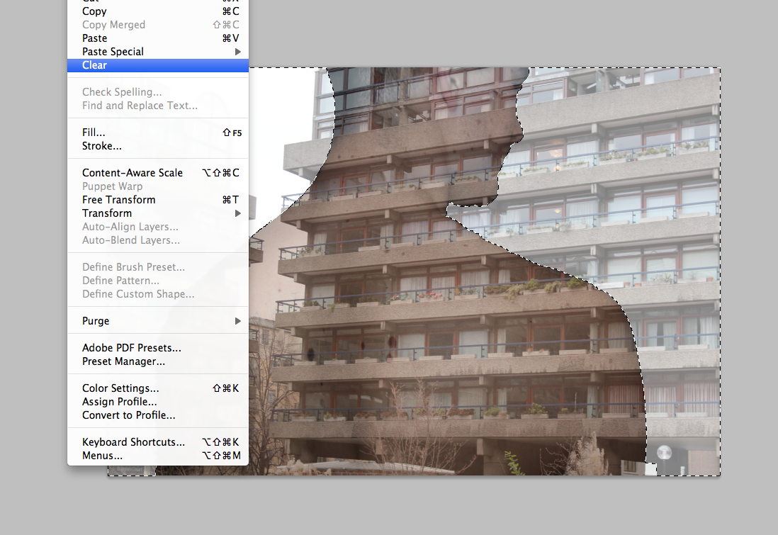
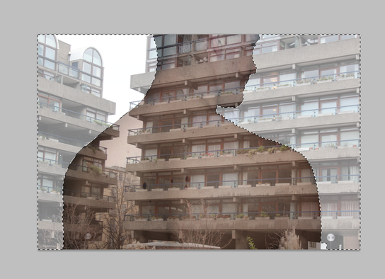
Here, this shows how I edited the Image of Theo on Adobe Photoshop. I first selected the background of the image and cleared it. I then flattened the image and pasted the building and view image on top. I then made it fit onto of the picture of Theo and changed the opacity to fit the image and so they look well together.
Development:
|
|
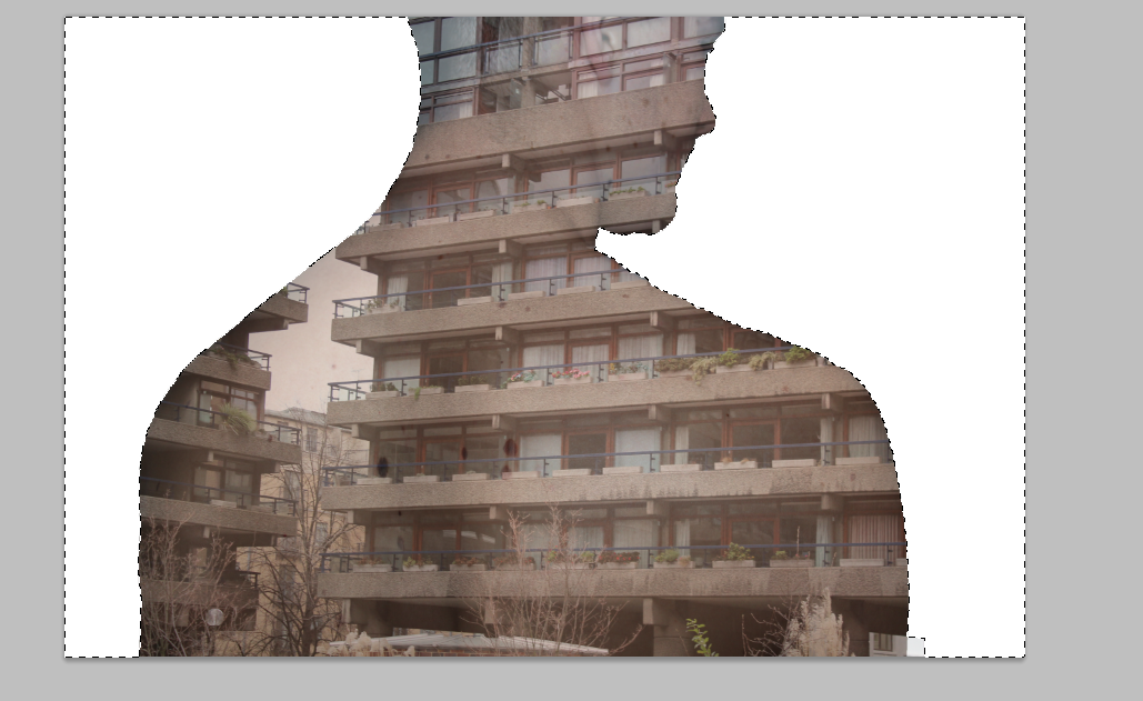
Here, I have again taken inspiration from Jasper James, but developed the idea to the structure of buildings and the body. I used the buildings to effectively make the models body change and curve to the image of the building. The fact that the last image shows a building which is rounded, that is then edited onto the back makes the model's back look more rounded and shaped. Overall, when the images match up the body parts such as the spine or the shoulders, the all together image looks very effective and depicts the structure of bodies and buildings well.
STRAND 3:
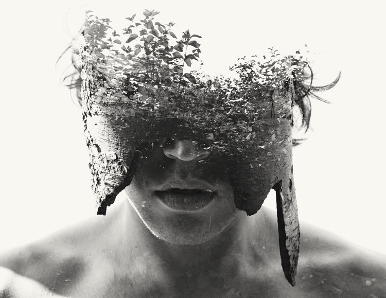
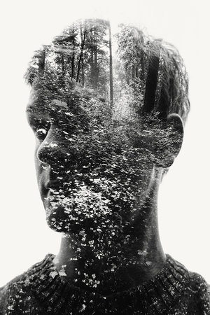
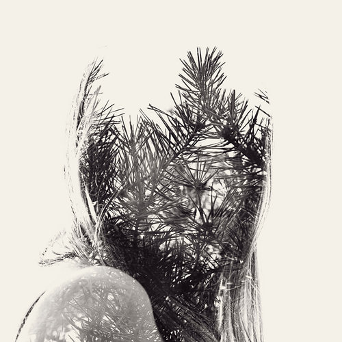
Christoffer Relander
Christoffer Relander was born in Finland December 1986 and grew up in the countryside of Ekenäs. Relander's interest in art started at an early age, but it was not until he served the Finnish Marines between 2008-2009 that he got interested in photography.
“Reality can be beautiful, but the surreal often absorbs me. Photography to me is a way to express and stimulate my imagination. Nature is simply the world. With alternative and experimental camera techniques I am able to create artworks that otherwise only would be possible through painting or digital manipulation in an external software.”
— Christoffer relander
Miki Takahashi
|
|
Brutalist structure developed from Jasper James' ideas and body structure:
|
|
|
|
Here, you can see I have done the same editing as the initial editing for the May Xiong images. I have developed my ideas so that the images are more concentrated on the body and buildings structure rather than the background. Therefore showing that the images are more concentrated on the actual images rather than details in the background. However, when doing this I found it extremely difficult to make the edges of the body straight, making the images look ineffective and unprofessional. I think that some of these images are effective in the idea of achieving good representations of structure of the body and structure of the buildings.
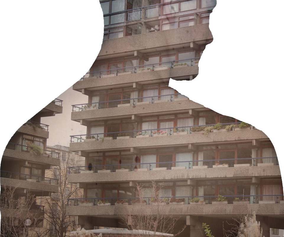
Here, you can see again I have used multiple photographers to inspire my editing on Adobe Photoshop. Overall, I have taken into account the effect that different structure of buildings have on the shape of the images and overall effect and aesthetic of the image. From these four images above, the first two images are not as effective, this is due to the fact that they do not fit well with the body part the building image is placed on. The second image doesn't fit at all, but does look nice, however as I must consider structure, it is not suitable for my piece. The last and second last images are effective as they shape well with each other and the body and the building go well together. The last image connects together well as the spine structure fits with the building.
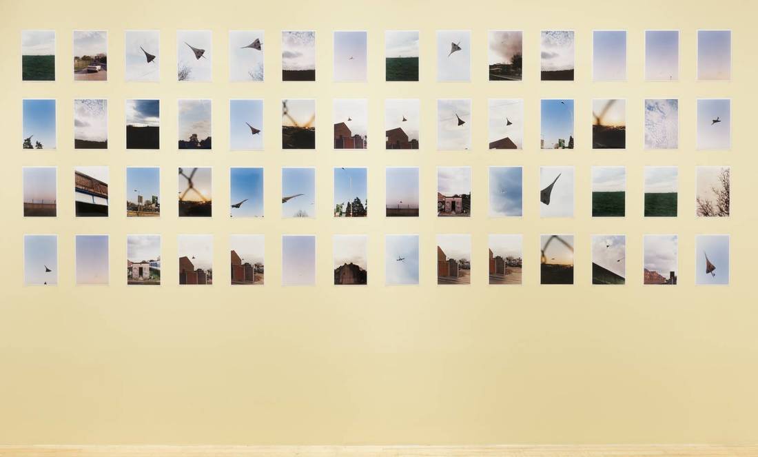
More photos of Central London at night:
Davis Ayre - projections on bodies:
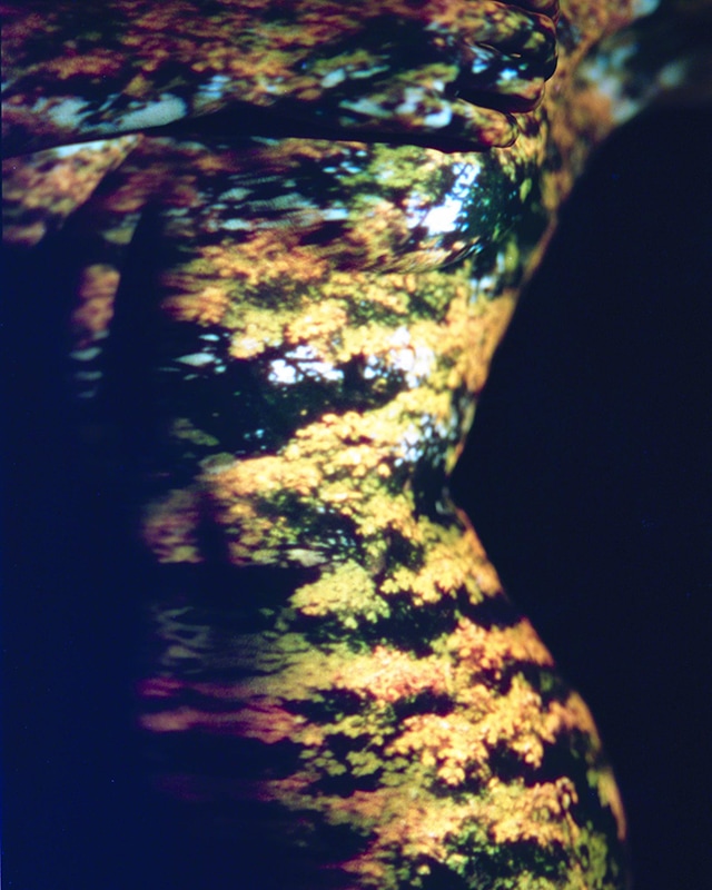
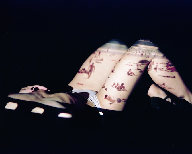
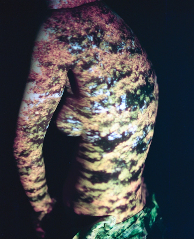
Davis Ayer is an LA based photographer who shoots on a Mamiya RZ, has mastered the art of the double exposure, and has an unbending attraction toward what is beautiful. A true nostalgist, Ayer’s work features a dreamy host of colors and moods. His photos have a hauntingly droney saturation about them. His work comes forth through the precision of technicality but ultimately breaks most every rule there is with stunning alacrity. He often photographs women in desolate places and there lingers a level of timelessness that none of the other kids working with distressed film seem to get. The timelessness is essential because it allows the viewer to insert their own subconscious desires into the narrative. The timelessness keeps it relevant. If it’s not dated then it can’t go out of style. He knows the angle to work, and because of that his photographs will always be interesting and beautiful to look at.
Bill Brandt - projection on isolated body parts:
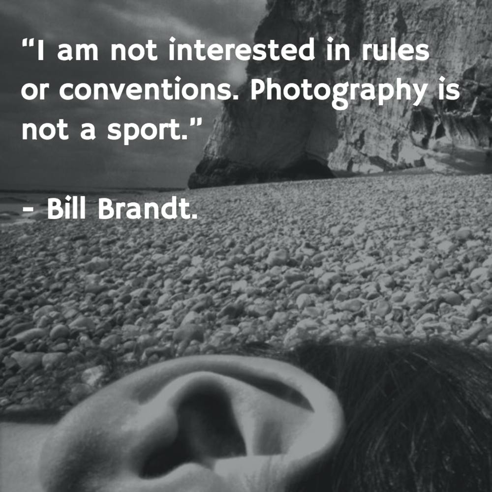
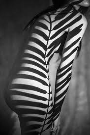
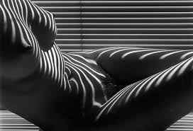
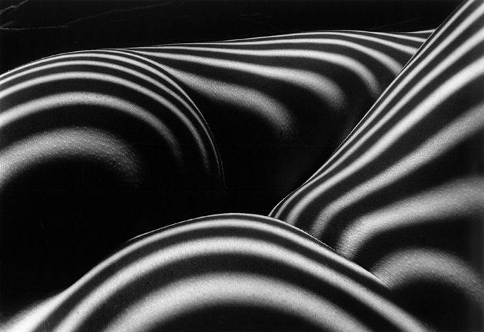
Bill Brandt was a British photographer and photojournalist. Although born in Germany, Brandt moved to England, where he became known for his images of British society for such magazine as Lilliput and Picture Post, later his distorted nudes, portraits of famous artists and landscapes. He is widely considered to be one of the most important British photographers of the 20th century. Brandt concentrated on many subjects – as can be seen in his "Camera in London" but excelled in portraiture and landscape. To mark the arrival of peace in 1945 he began a celebrated series of nudes. His major books from the post-war period are Literary Britain, and Perspective of Nudes, followed by a compilation of his best work, Shadow of Light. Brandt became Britain's most influential and internationally admired photographer of the 20th century. Many of his works have important social commentary but also poetic resonance. His landscapes and nudes are dynamic, intense and powerful, often using wide-angle lenses and distortion.
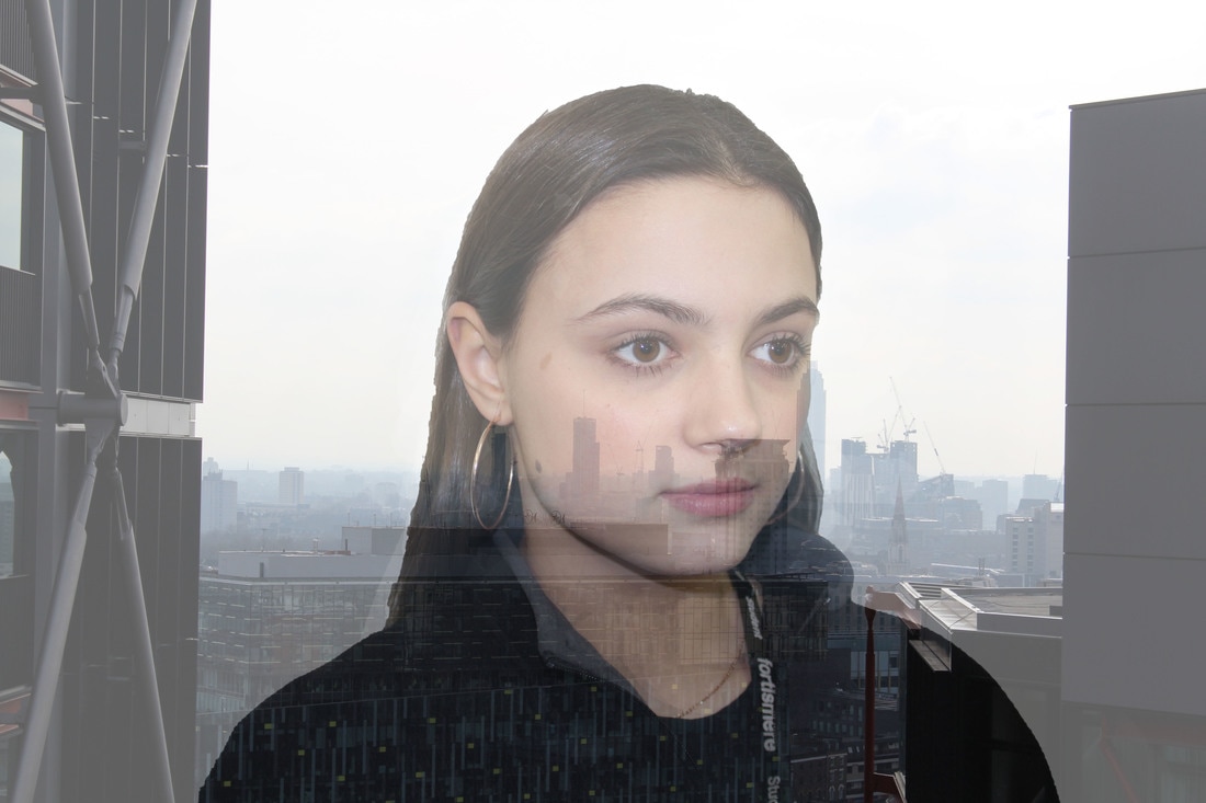
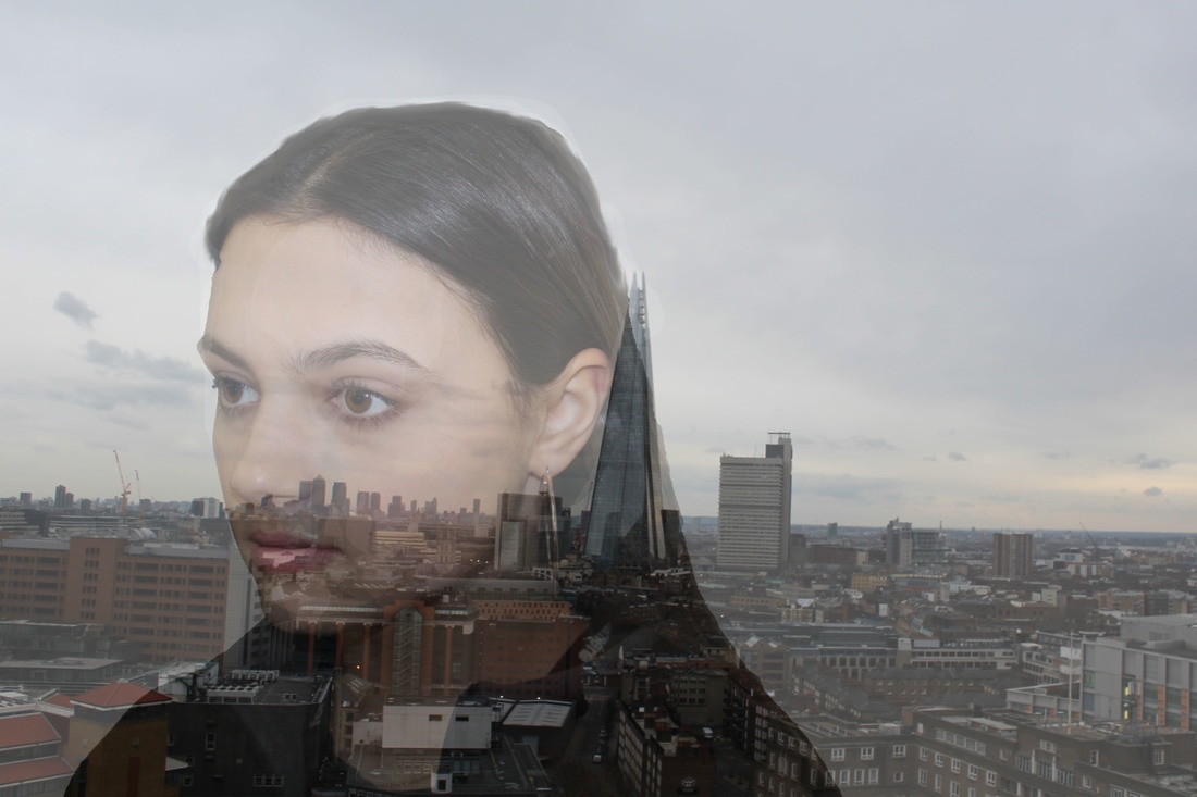
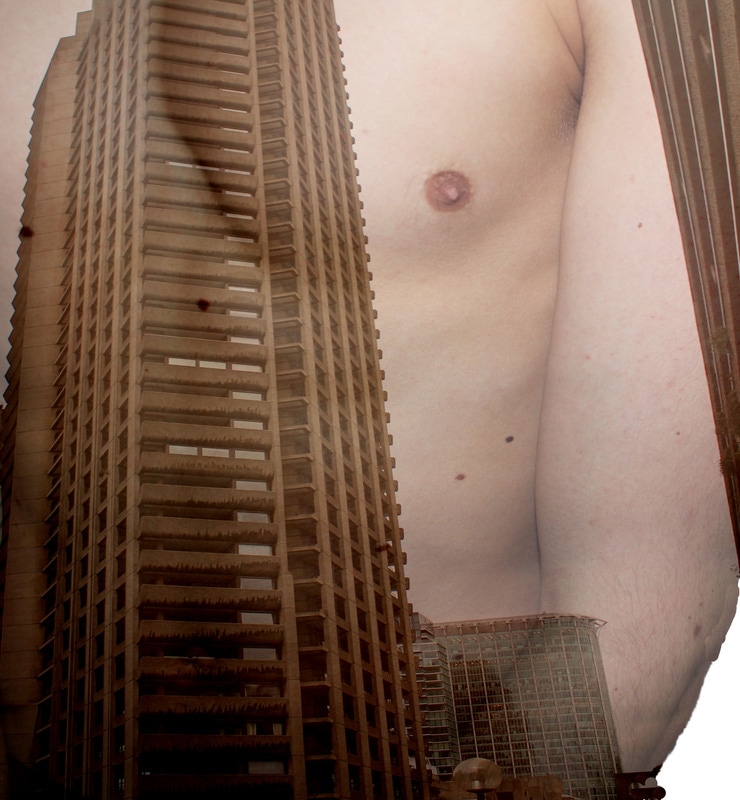
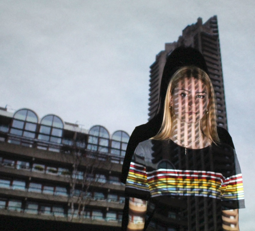
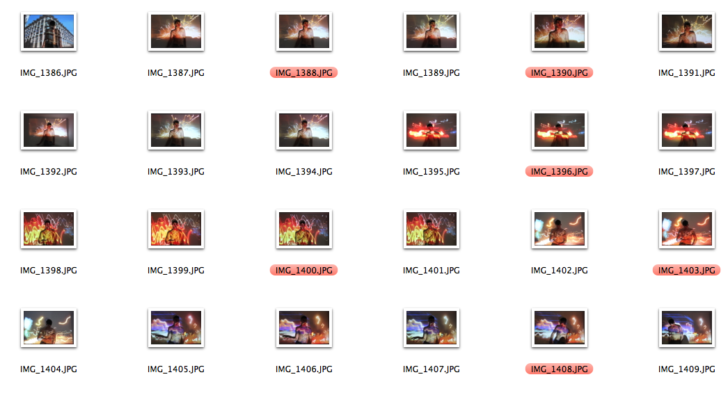
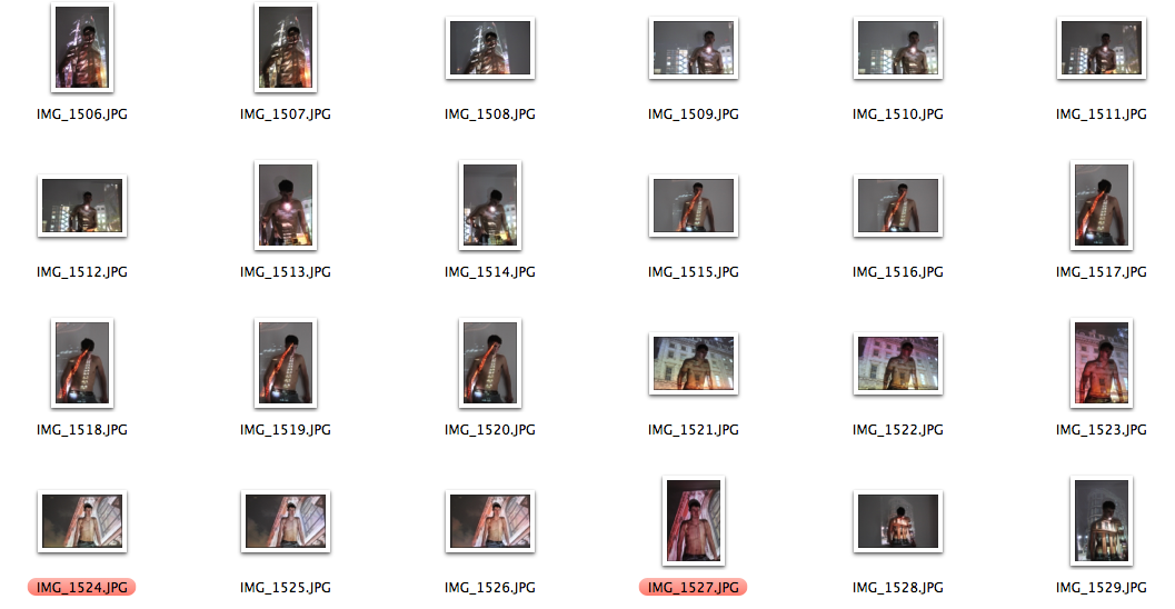
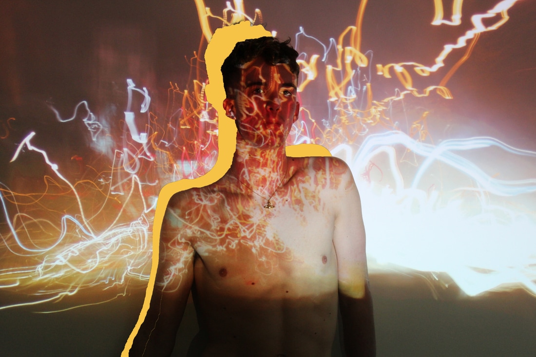
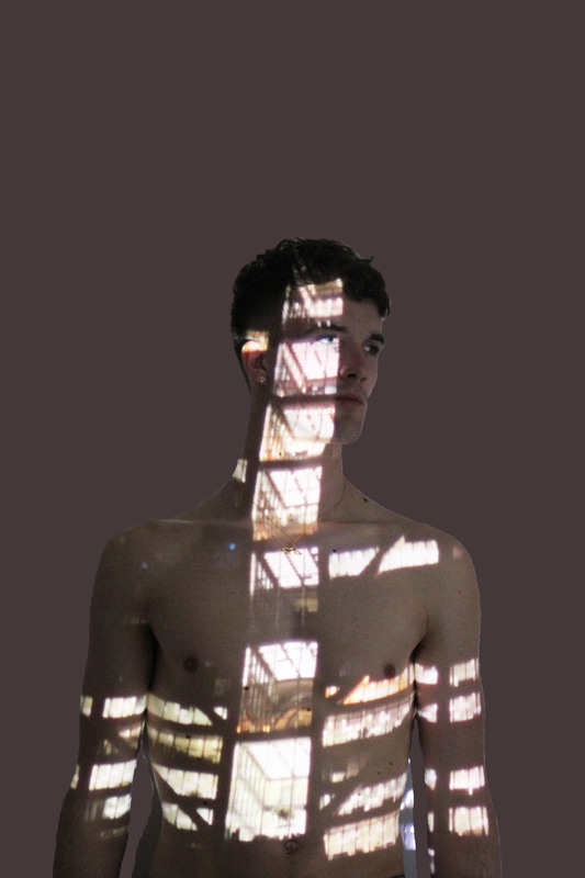
Final piece experimenting:
When deciding what to choose for my final piece, I decided to incorporate ideas from photographer such as Jasper James, Bill Brandt and Davis Ayer. I like how they use projectors and images to make bodies look distorted and different.
|
|
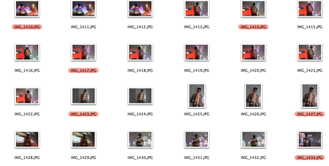
From looking at these pictures, I decided that I needed to edit them down to make them more cropped so you couldn't see the edges and just see the projection. I also decided that these images are not good enough for a final piece as they are not effectively bright, meaning that I should use a white background when taking the next group of images, I also decided to change the model to a boy and make them topless, this means that it is easier for the image to be seen when projected onto the body as it is essentially a blank canvas for the projector to project onto. However I still decided to edit these images and crop them down, I also decided to edit the images and increase contrast and remove the background.
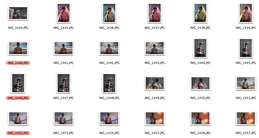
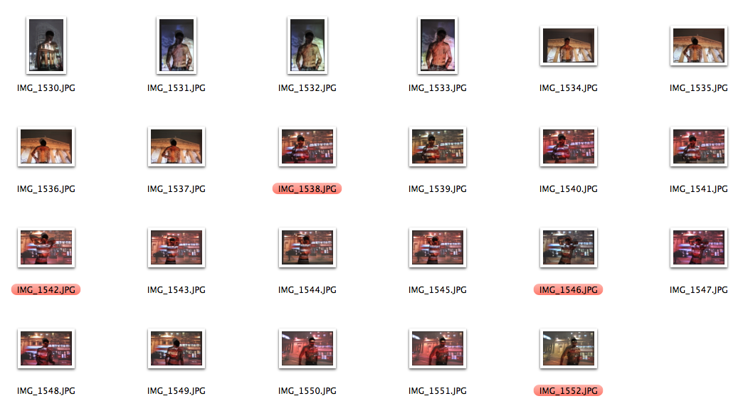
projected images, edited:
Here is one of the orginal images that I have edited with the Shadow different colour, so it was one of my inspiration images.
|
|
|
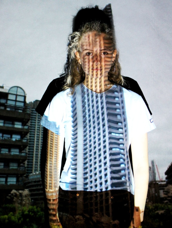

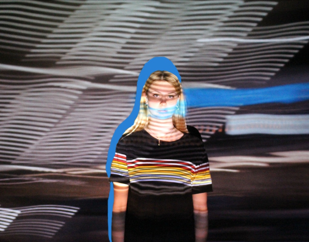
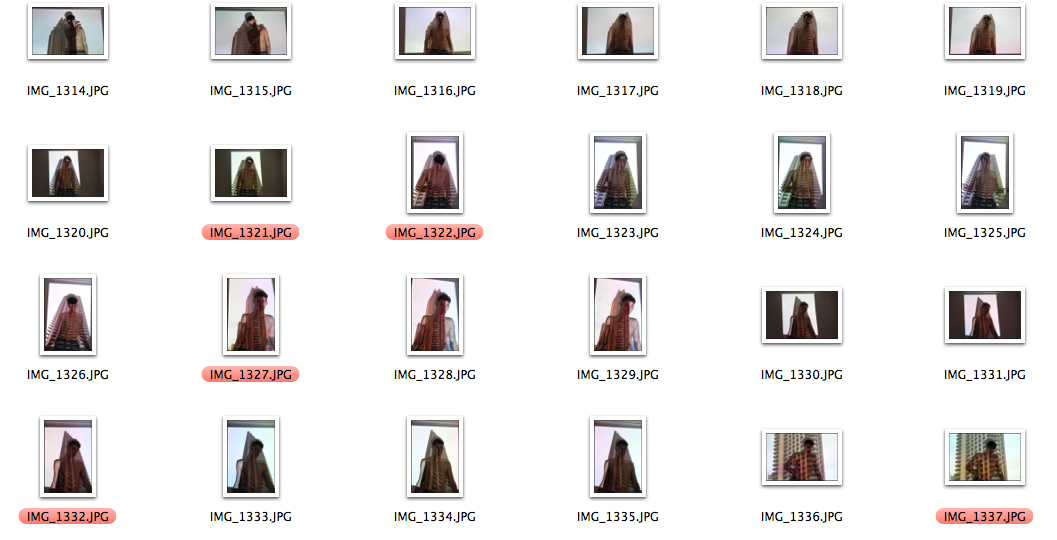
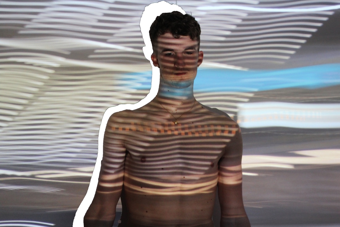
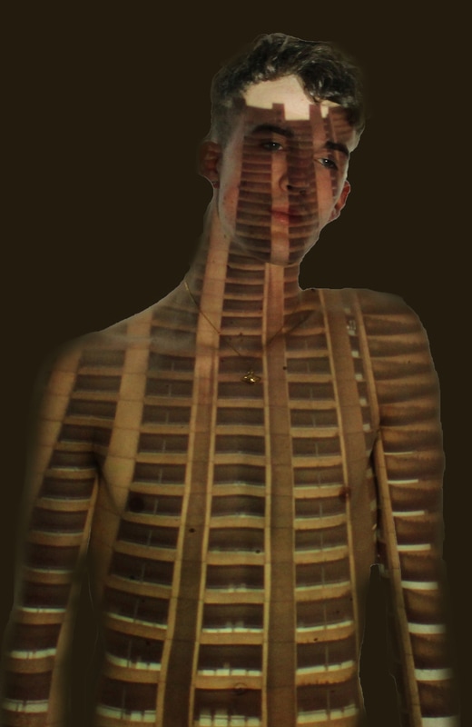
Here, you can see I have edited the best images I have taken in order to make them look more like my strand photographers. In all images I have cropped them down in order to make them look neater and more focused on the projection on the body. However, these images did not work as well as I would have liked, I believe this is due to the fact that the models in the images, especially those wearing coloured clothes, distract the focus from the structure of the buildings projected and make them less clear. When doing these image projections again, I will make sure the model is wearing minimal and neutrally toned clothes to reduce distraction from the focus of structure. When editing these images, I noticed that the shadows of the models create a black space around them and act as a silhouette, I think in some images, such as the one to left, this means the actual projection of the building is effectively lost. To try and change this I experimented with clone tooling the shadow out, which led to the whole image looking badly edited. I then attempted to change the colour of the shadow and use a colour already used in the image, as you can see above. Overall, the shadow does not effect all images,but in some it is too big and reduces the effectiveness of the presentation of the structure, and some images suit the block coloured shadow well, and some do not.
|
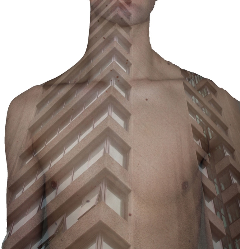
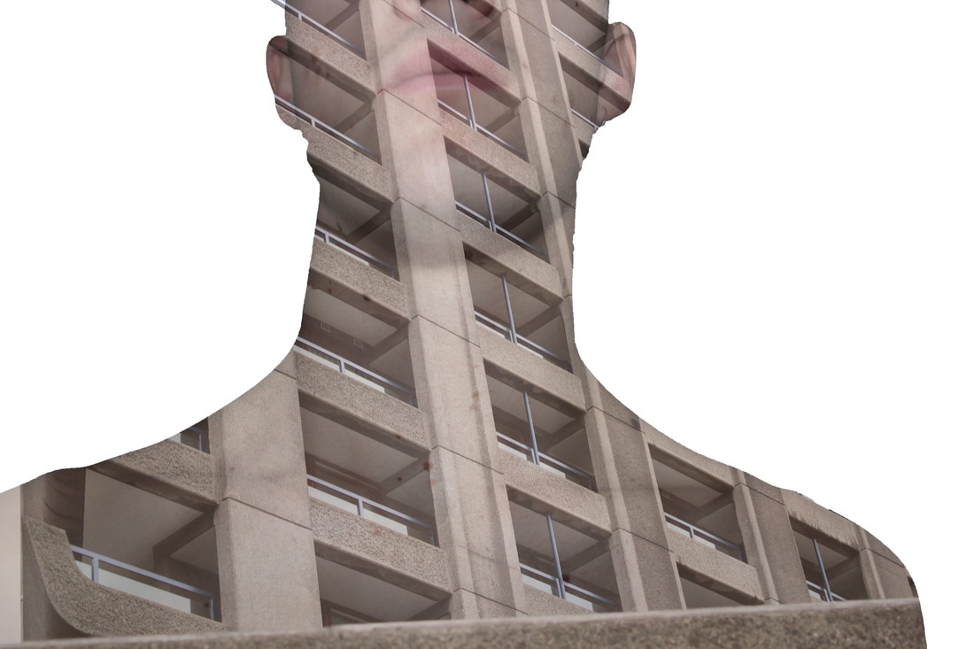
Final Piece
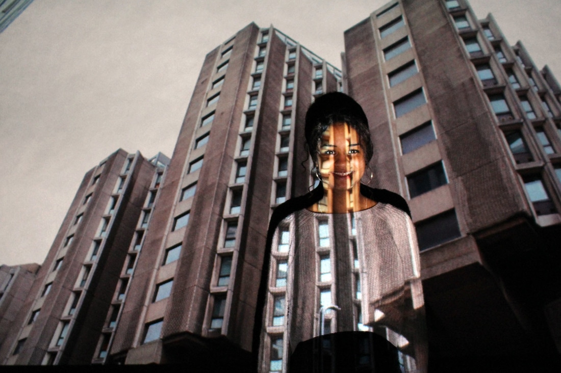
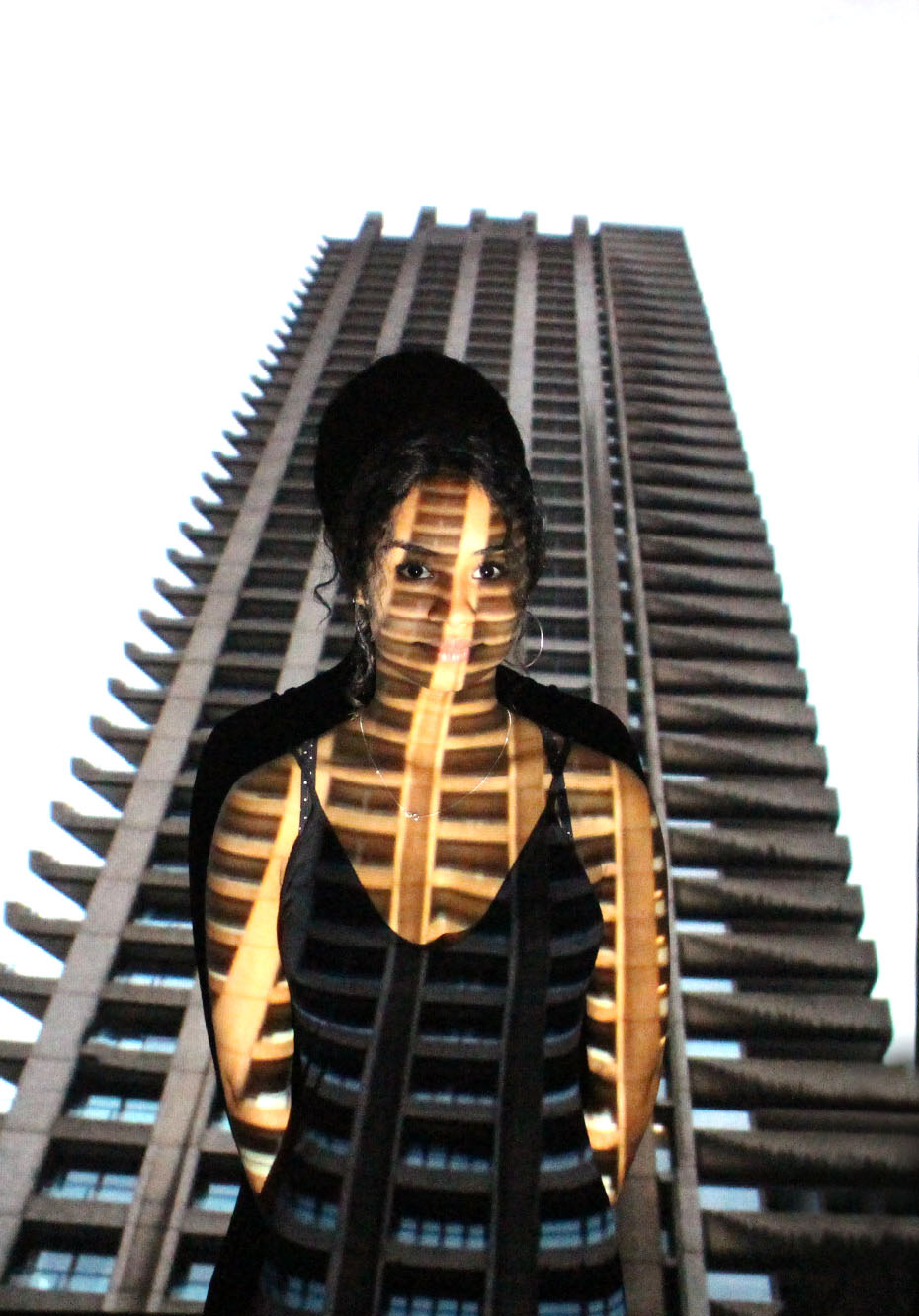
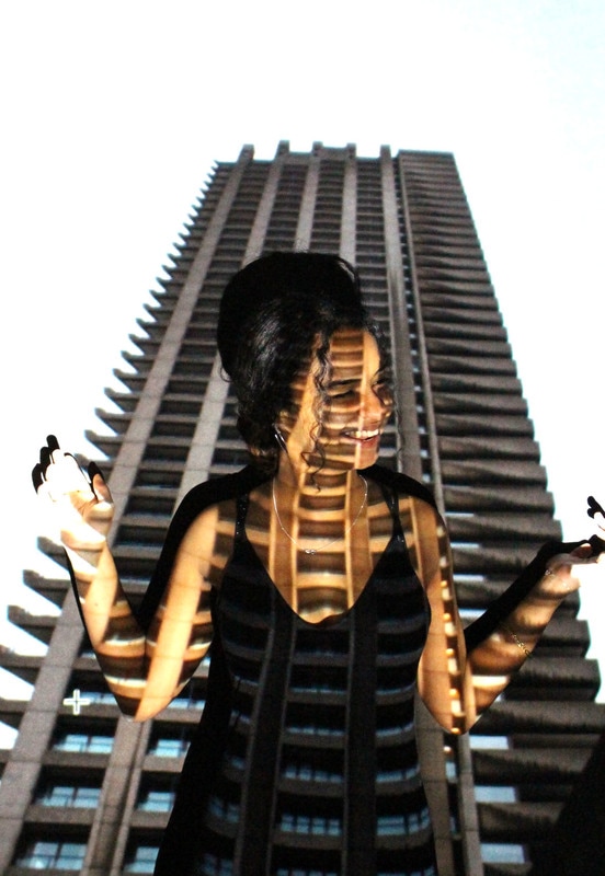
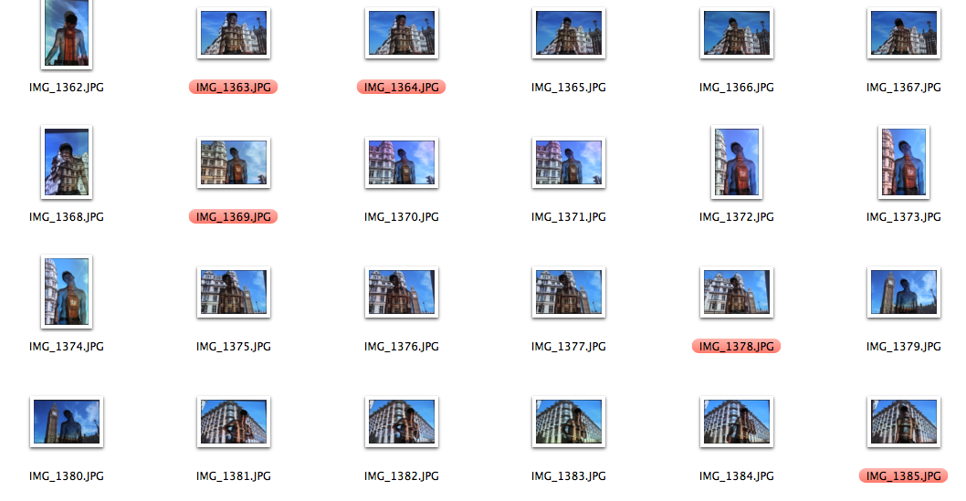
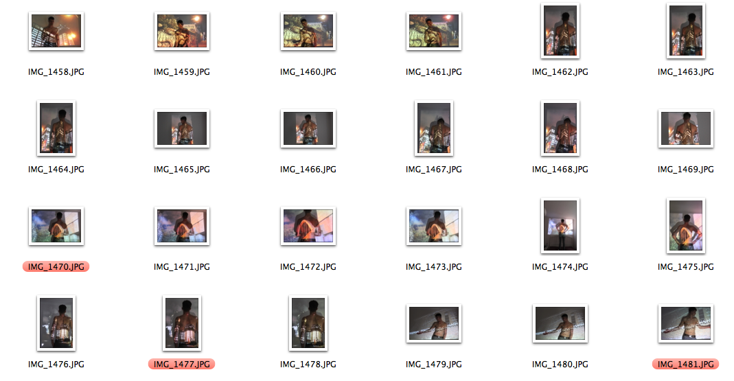
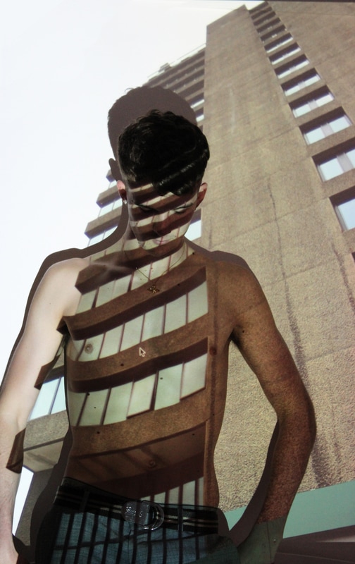
Due to all strands relating to what I wanted to produce for my final images, I have decided to incorporate all aspects into my final images. For example, I am using images of buildings to get a sense of structure and then projecting them onto the my brothers upper torso, this incorporates both body and building structure. I have also used some images of moving lights and cars and i used a lower shutter speed to achieve this. Below are the pictures that I took when projecting the images onto my brother. I decided to re-do the projection images, but with a white background and more light being visable when taking the images. This made the images look more focused and lighter and also meant that both detail and structure of the building and also structure of the body was visible and well focused.
|
|
|
|
|
|
|
|
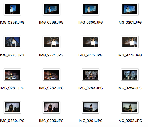
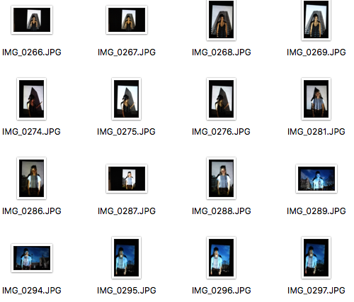
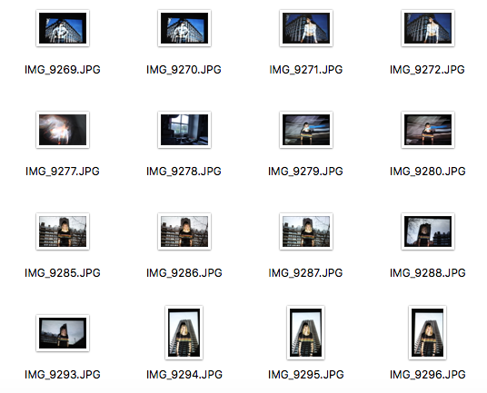
Best images unedited:
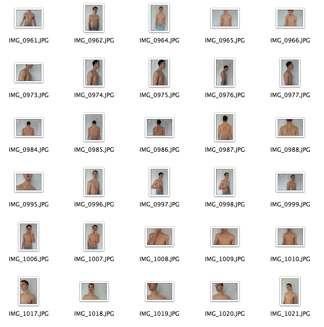
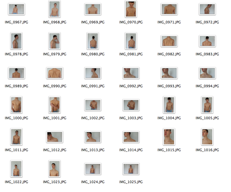
Here, after taking 300 separate images of my brother, I have picked 20 of the best images. When looking at these image, I have chosen ones in which my brother in not necessarily facing the camera, meaning his poses are more candid. I have also picked ones in which my brother has placed his body well with the image to make his body structure, and the structure of the building fit well. Overall, the main thing that I considered when I took the images, was that the building in the projection must fit, if only lightly, the structure of the building. Overall, these 20 images need to be cropped and edited before I use them for my final piece.
When looking through my best images, I noticed that some of them had the mouse from the computer projected onto my brother. I reduced the amount of my final images by getting rid of images which where blurry or if louis was not in focus. Finally i put the last 13 images into photoshop and cropped and edited them to ensure there was no curser on the images.
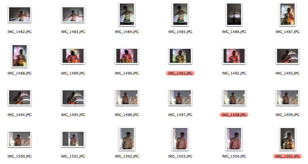
Different ways to edit my images:
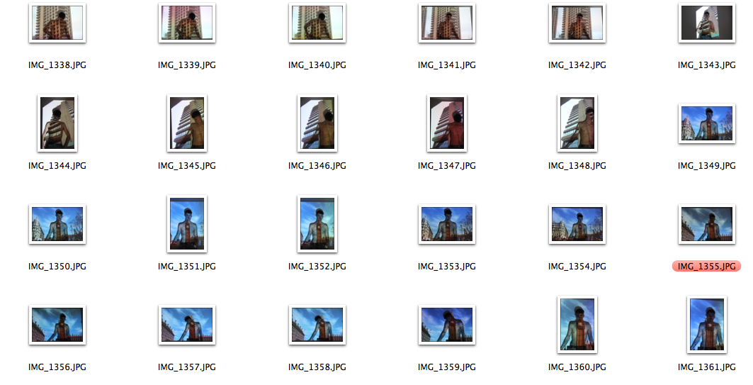
Images like this with the background taken out do not look effective as the sides of the body look wobbly and not smooth.
Again, I have edited the background out of this image, however it looks ineffective as the editing is sloppy and doesnt go with the image.
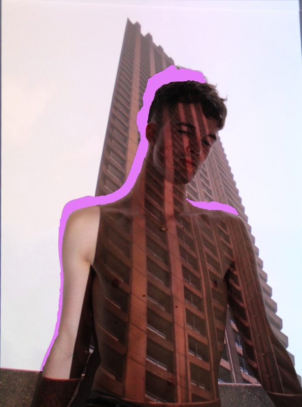
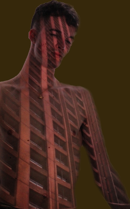
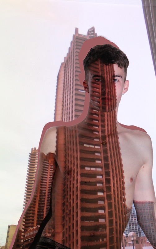
Here, I have edited the shadow of this image and made it a bright pink, like the bright yellow, the bright colours distract from the main concentration of the image and therefore when editing again, i will use a colour that is already present in the image.
This is one of my better edited images, with the shadow edited,I have taken a colour from the image and changed the shadow colour. Overall, this colour is too bright and takes away attraction to the body in the image, but would look good with another colour.
Like the image above, I have changed the colour of the shadow to white, which is a lot better than the bright yellow as it complements the image.
The edited mages have let me understand that the shadow editing is effective and look good, however I cannot use bright colours to fill in the shadow as it takes away focus from the projection and the building. On the other hand, images edited that have no background do not look effective as it makes the image look message and distracts from the main focus of structure of buildings and bodies.
|
Here, I have made the background of these images to a browny/greeny colour, but it doesnt look effective as the edges are faded and not very sharp, so it obvious the image has been edited.
Like the image above, I have changed the background colour, it is again ineffective and sloppy. I dont like this type of editing.
Here, I have taken a pre-made pattern from photoshop and placed it into the shadow of my image. Overall, I love the effect the changing of the shadow makes but overall, the pattern doesnt fit with the image.
|
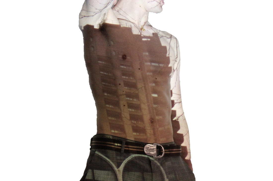
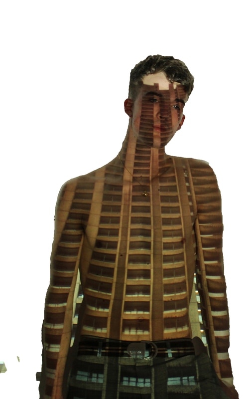
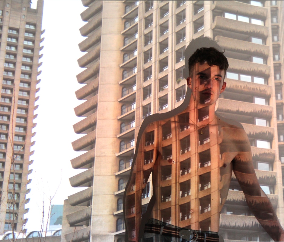
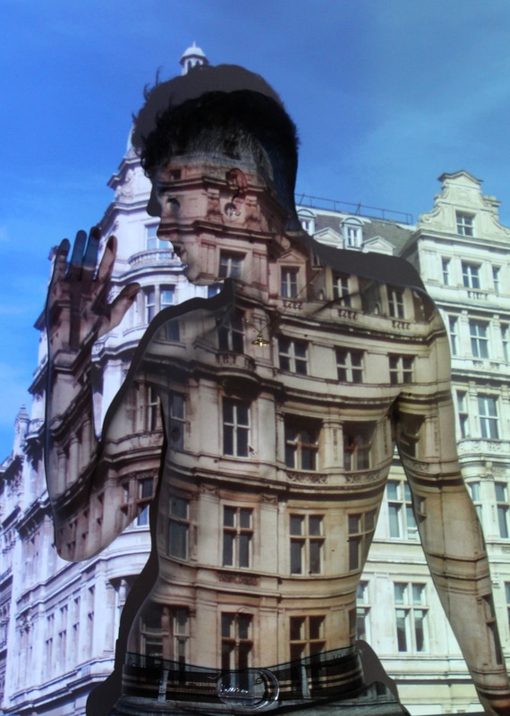
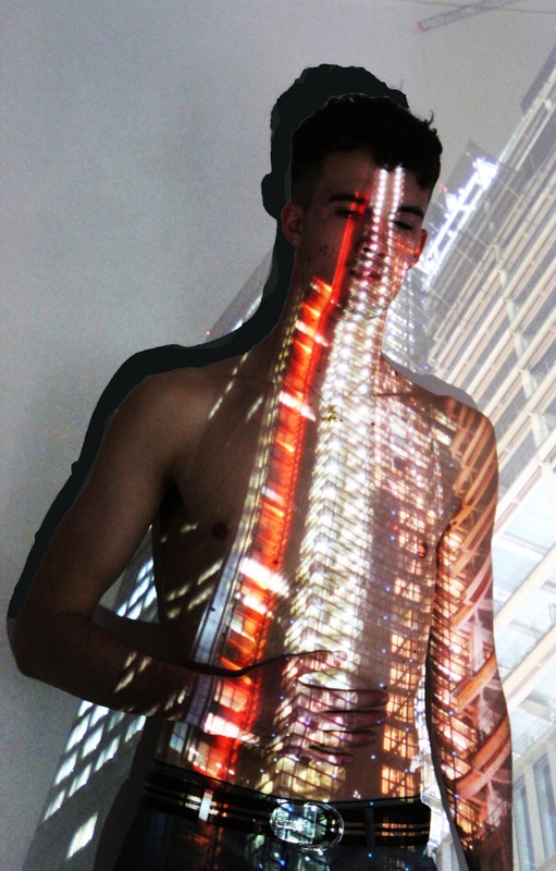
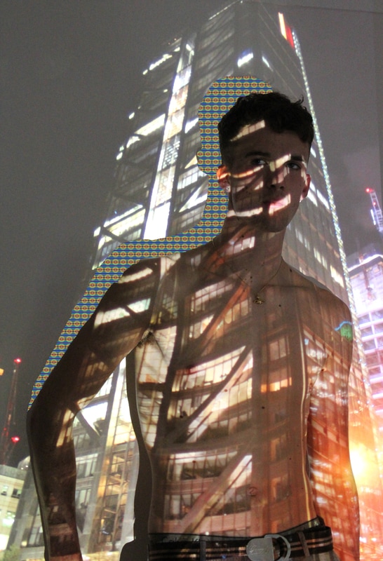
FINAL IMAGES EDITED AND COMPLETED:
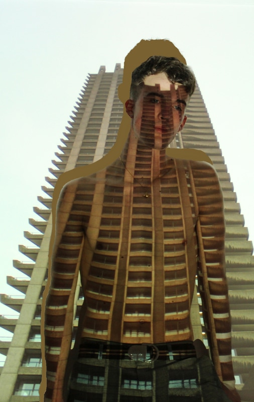
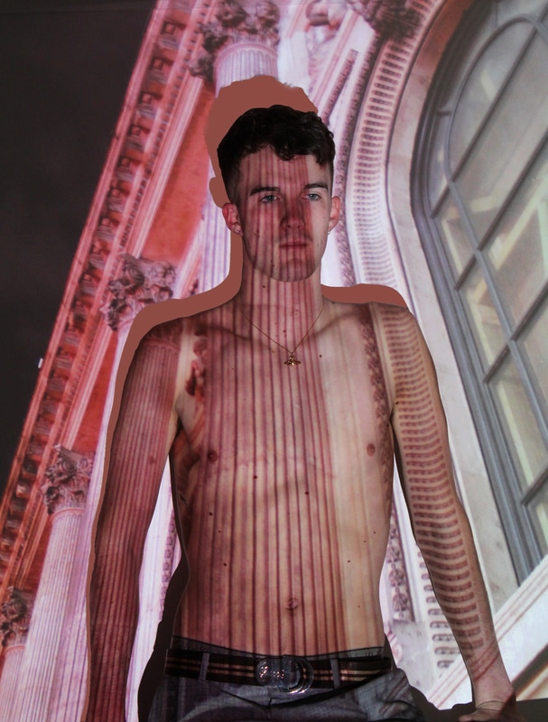
Finally, these are my final three images that show clear structure of body and buildings put together as one. I have chosen these three images as I think they perfectly depict how buildings and bodies can connect and have similar structures. In terms of the three images, I decided to pick two, with pinky colours and one with browny grey colours which will be placed in the middle of the other two prints to create a contrast and make it differ to the other two. When my prints finally came in, I was initially worried about whether or not my photoshop editing would look good with the images enlarged so much, but when the images came in I found that the A2 edited images looked find despite worries. I really like and am impressed by my final pieces and enjoyed editing them and making them as clear and vibrant as possible. When editing the images and the shadow, I ensured all bits of then shadow were coloured completely so ensure they looked good when enlarged as I knew that any errors would show very easily in the A2 print. The reason I decided to edit the shadow was due to the fact that I wanted to change a small bit of my image, but not enough to take the main concentration from my image and keep the idea of structure as the main theme. In conclusion, I am very pleased with the final outcome of my images and the way I have edited them has come out well on the final mounted A2 images.
